Whether the type of business you are in, customers are your backbone. Without customers, no…
April upgrade in Analytics|BusinessQ app
Hi all,
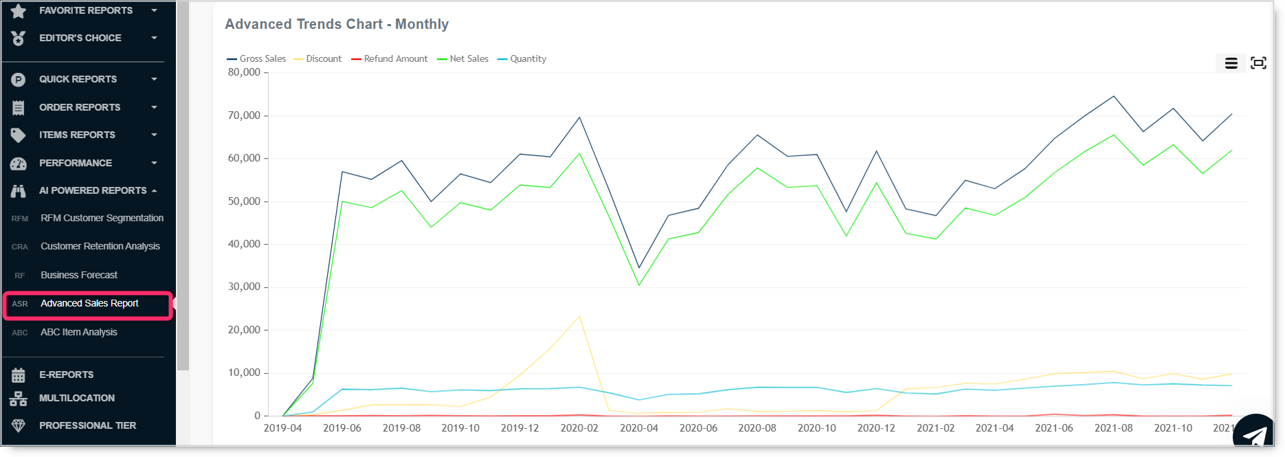
Recently, we are in the 5th gear with adding new reports & features to the Analytics | BusinessQ app. Some of you already noticed that and we received great feedback on the new layout, new reports, and all that the new Professional tier is offering. Above all, we believe they make your app experience even better.
Are you excited the same as us? Let’s go through minor fixes & changes we put into production recently. All those changes are now up and running, and depending on the used tier, you have them available or not. Before checking all those new things, let me remind you of our tiers, available reports, and other features.
PLAN - PRICE
Description
text
text
text
text
text
text
text
text
text
text
text
text
features
Multi-location feature
Employee commission
Support level
Available reports
Max. period selection - Orders
Custom report creation
Automatic emailing
Inventory management reports
AI & Machine Learning analysis
RFM Customer segment
Business Forecast reports
ABC Product Analysis
LITE
Normal
5
62 days
BASIC
Medium
34
62 days
ADVANCED
High
46
124 days
Up to 60
MOST POPULAR
PROFESSIONAL
High
57
unlimited
Up to 60
Employee Shifts report
The shifts report is the youngest in the Analytics app. As with most of the reports, it’s something users asked us to prepare. To see your employee’s shifts in the app, first, you need to use this option in Clover. If your employees register in and out, we recommend using this report since you can easily track the hours your employees work. There are two ways how you can get shift data for your employees:
- Revenue per Employee
- eReport Employee Shifts
Revenue per Employee with Shifts report
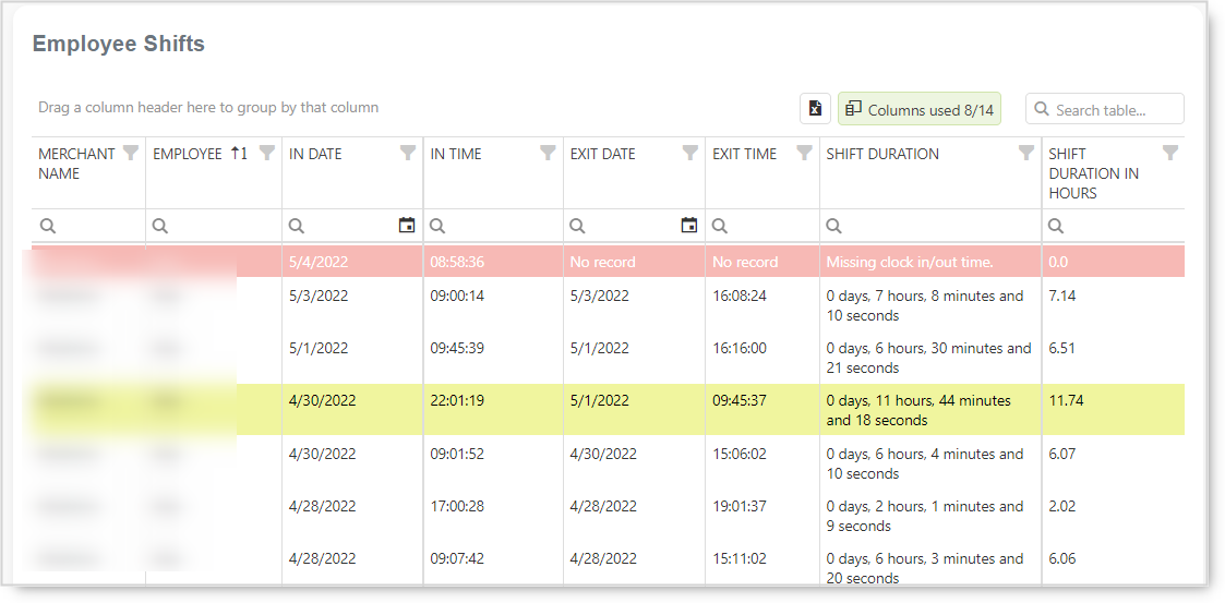
Depending on the selected period, you will get the data. We defined three basic categories and colored them for easier understanding.
- white – regular hours
- yellow – more than 9 hours in a day
- red – no data for the date
For instance, in this example, one employee didn’t log out after login in on April 27th. If you look at other employees’ registered time, you can see most of them are between 2 and 8 hours. With a yellow color mark, you can see one employee working more than 11 hours. Therefore, he either didn’t log out on the day he started working or worked 11h and 44 minutes.
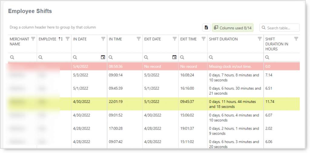
This report is very useful since you can track how many hours your employees are working. Of course, your employees need to register they are coming in and going out to see the data.
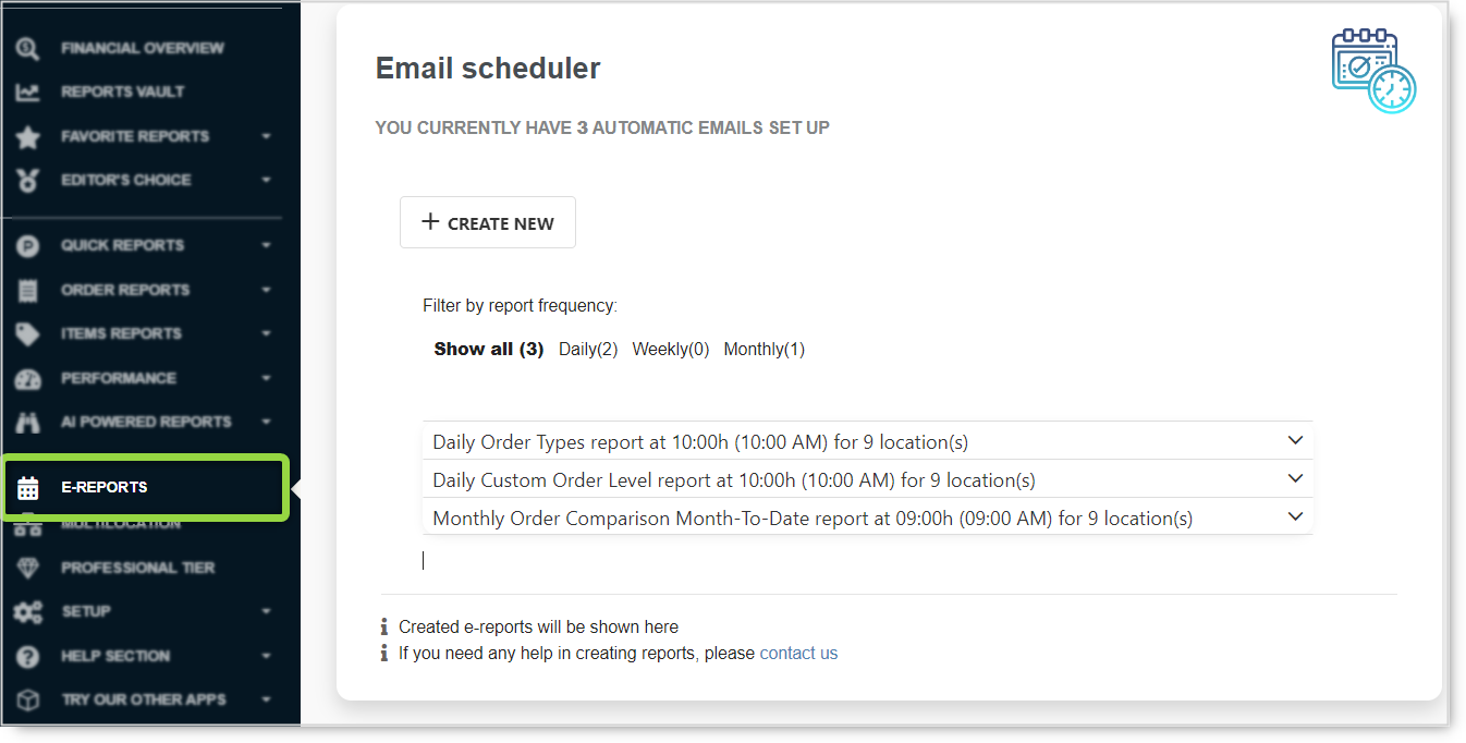
Employee Shifts eReport
To check out shifts for your employees, we recommend using the eReports option. In this way, you can have a daily, weekly, or monthly view of the data. Therefore, with daily information, you will always have fresh information right on your hand.
Creating an Employee Shifts report, it’s pretty easy. The steps for creating an eReport are:
- choose Employees Shift report
- select the location for which you want to report (if you have multilocation active)
- define the time of message sending, determine frequency and data period
- enter email(s) for report receiving
- choose CSV or Excel
- save the report
And that is all, your report is ready. Depending on the setup, you will start receiving your reports in your email. At the same time, you can have one or more daily news, weekly and monthly. Therefore, use it as there is no limitation to the number of active reports!
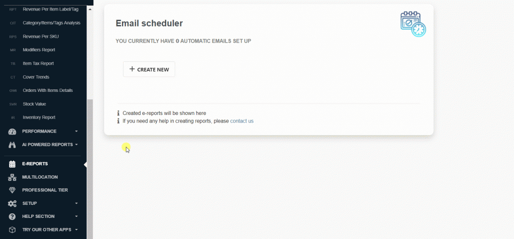
There are no limits on the number of eReports you can have. If you are an Advanced tier user, you can prepare as many eReports as you like.
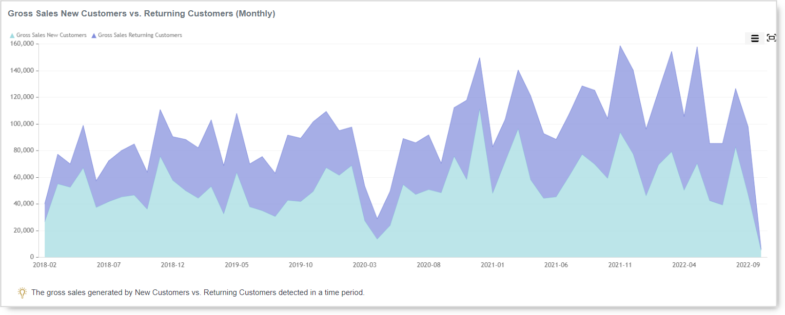
Revenue per Customers
Are you often wondering how much your average per Customer is, who they are, and what they are buying? One of the reports where you can find such information in Analytics | BusinessQ is the Revenue per Customer report.
Revue per Customer is one of the most used reports in Analytics because it quickly and simply shows you how many sales you are collecting your customer data. Why is this important? If you have customer data like name, email, address, or phone, you can make special promotions or arrangements for them. Knowing your customers is crucial for the growth of your business.
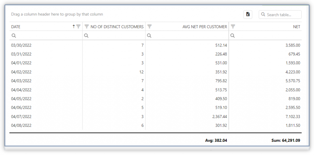
Besides graphs where you can find out which customers are buying the most often, which customers spent the most, and the average Net amount per transaction for each Customer, now you will find a graph with the number of customers per day.
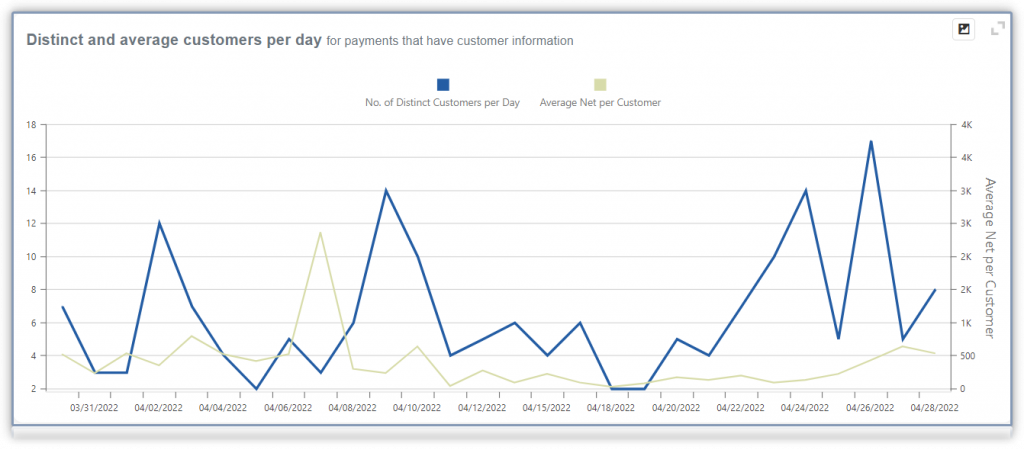
Since the last update, values from that graph you can find in the table for better insights.
Depending on the used tier, you can analyze data for a maximum of 62 days (Basic tier) and up to 124 days (Advanced tier). For the Professional tier users, there is no limitation in analyzing period. Even if you started with Clover 5 or 10 years ago, you could get a report for the whole period. Isn’t that wonderful? We hope you will use this option and gain more insights about your customers.
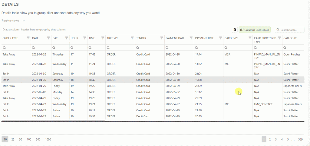
Column chooser and table scroller
Many of us sometimes have a hard time finding the value we would like to see in the detailed table when looking into the data. There are so many values in some detailed tables that it is hard to find what you need. We added a search option in most of the detailed tables for easier finding of values. If there are 12 or more table values, now you will find the search option.
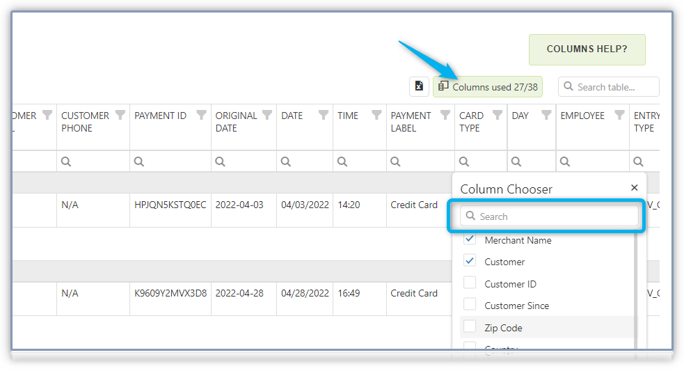
Besides the new search option, most of the tables now can be scrolled left-right with the mouse. In other words, place the mouse at any position on the table, and scroll it right and left. To check this and some other table possibilities, check out the short video.
A new period for eReports > Date-to-end-of-Month
Recently, one of our users requested to get a report from the 15th of the month until the last day. When we created eReports, this type of period never crossed our mind, but that’s why we have you, our users, to ask what you need. And, when we can, we make your wish come true.
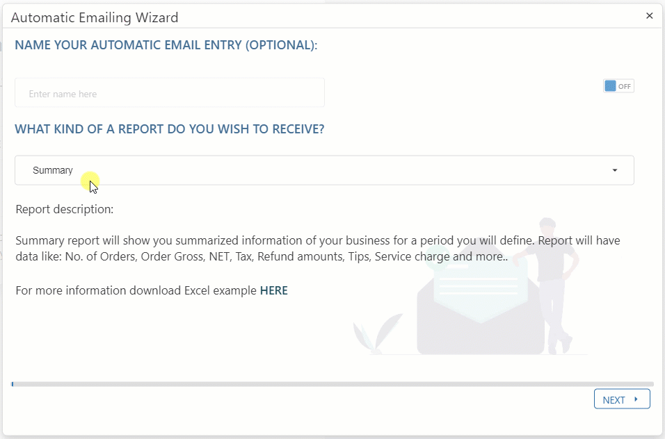
Not only from the 15th till the last day, but you can also choose any date in the month. If you choose the 15th as a starting date, you will get values from that date till the last day. In this way, different lengths of the month don’t give you a headache when you want this type of information. With Analytics options, it is easy and comfortable.
We believe you will find this helpful and use it to your benefit.
Date & Time on Stock Value eReport
One of the largely used eReports is the Stock Value report. Stock Value report enables all users to have daily insights on your stock count. But, even more importantly, if you save each Stock eReport, once you will need it, you can go back to the past and get detailed information on your stock count on the specific date. Set it, so you receive it every day/night after closing.
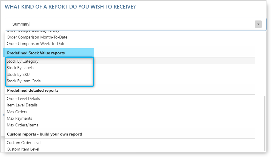
As you can see, there are four types of Stock Value eReport stock by category, by labels, by SKU, and stock by item code. You can use only one or all offered eReports; it is up to you. The more reports you get, you will have better information.
As always, we want to hear any suggestions you may have. After all, we are building this app for you. Have any new ideas or suggestions? Write to us!
Happy Analyzing!
Your Analytics | BusinessQ App Team
Qualia Data Sciences LTD
Related posts