

Basic information
What is Analytics for Clover?
Analytics App provides business insights for managers and business owners. Visually, it tracks how your business is doing, time trends, Key Performance Indicators, periods comparisons and more… It helps companies to see otherwise hidden patterns, to spot business problems on time as well as to identify useful opportunities in their business data.
Analytics App provides MULTI-LOCATION, detailed and visual REPORTS, DASHBOARDS, COMMISSIONS and other business insights for managers and business owners. „If You Can’t Monitor It, You Can’t Manage It“ It is a must-have reporting web app for Clover Merchant: you can access it on any device via a web browser, at any time.
Installing Analytics App
You can get Analytics for Clover on Clover App Market here:
1. For US market: ![]()
2. For EU market: ![]()
How to: Install
To install Analytics, just go to Clover App Market, select Analytics and click on INSTALL button
Check our How to start video:
Choosing Analytics App Tier
Analytics Application provides four Tiers (or Plans) to choose from
- LITE,
- BASIC,
- ADVANCED and
- PROFESSIONAL
To check prices for the US and EU markets, please check the details available here.
TIER DIFFERENCES:
The reports’ availability varies depending on the tier you are using. Except for available reports, the data period during which you can analyze data varies.
LITE Tier
Available Reports:
Payments based overview reports: (period selection up to 365 days)
- Today at a Glance
- Payments overview
Order based reports: (period selection up to 62 days)
- Order overview and Order Types
- Revenue per Device
- Revenue per Daypart
BASIC Tier
Available Reports:
Payments-based overview reports (period selection up to 365 days)
- Today at a Glance
- Two-period comparison overview
- Payments overview
- Employees overview
- Item Categories overview
- Revenue per Customer
- Cash Log
Order-based reports: (period selection up to 62 days)
- Order Overview and Order Types
- Profit overview
- Revenue per Employee
- Revenue per Payment Type
- Revenue per Device
- Revenue per Customer
- Revenue per Merchant location
- Revenue per Item
- Revenue per Category
- Revenue per Item/label/tag
- Revenue per SKU
- Modifiers report
- Orders with Items details
- Discounts report
- Revenue per Daypart
- Revenue trends
- Revenue per Day in a week
- Over/Under-paid Orders
- FULL Orders Details
- Open Orders
- Voided Items
Available Dashboards:
- Today’s Performance
- Day vs. Day performance
- Revenue by Hour
- Month-to-date performance
- Category / Items / Tags Analysis
- Stock Value
With all these reports and dashboards above, you can also set up employee commissions as a fixed percentage by categories and category commissions.
Additionally, the Basic tier supports multi-location features, allowing you to compare your locations.
ADVANCED TIER
Advanced Tier has everything that Basic Tier has, with the addition of:
- Master Summary Report – You can choose your favorite reports and display them on one page.
- Custom Pivot order-level data report – The Pivot Order Level Data report is a report that allows you to create up to 20 of your reports in the Analytics App. This report is based on order-level data, and in the pivot table, you can select columns found on orders created in the specified period.
- Custom Pivot item-level data report—This report is the same as the one described above, but it is based on Items from Orders.
- Custom Pivot Payment level data – a custom section for creating reports based on the payment information
- Item Categories TreeMap report- Visualize best-selling items and items that bring revenue in the selected period.
- Automatic Emailing – get daily reports by email in Excel format
- Item / Order Averages – get a detailed view of items sold and order-made averages over an extended period
- Item Tax – get a view of the taxes that were applied to your items within your orders
- Inventory Management / Report – track your stock count, set the minimal and maximal quantity you want to have for items, and then analyze what needs to be restocked or cleared out of your inventory
If you choose the Advanced Tier, in addition to 30+ reports and dashboards, you can create up to 60 custom reports. Additionally, for all order-based reports, the fetching period is now 90 days at a time.
All reports feature a one-click export of table Data to Excel, and all graphs and charts can be exported in various formats (JPEG, PNG, PDF, etc.).
PROFESSIONAL
The Professional tier of the Analytics app is our latest tier and is continually under development. What is not possible elsewhere, you can achieve here. All reports are available for an unlimited period, up to 10 years. We believe this is more than anyone will need from their historical data. Not only is the unlimited period available, but the fetching time of all reports is also significantly shorter in the Professional tier.
We will continue working on this tier and add more reports to meet your satisfaction.
Upgrading Analytics App Tier
If you want to upgrade or downgrade to any Analytics Tier, you can do it easily from your Clover web dashboard.
- Login into Clover web dashboard and go to Clover App Market or press the GET MORE APPS button on the right side of the dashboard
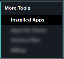
- Once you are on the App Market page, click on ‘Installed Apps
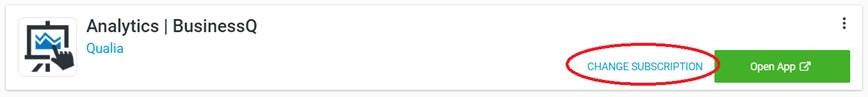
- In Installed apps, looks for Analytics app

- Select Analytics by Qualia app and on the right side, you would see the Change subscription button:
- Clicking on that button you would be able to change Analytics Tier.
Once you upgrade to the ESSENTIAL, BASIC, or ADVANCED tier, make an initial login to Analytics App.
Free trial and billing
The first time you download and install any tier of Analytics App, you will enter a 14-day free trial on the Analytics Advanced tier. During this period, you will not be charged and you will have access to all of our reports. At the end of the 14-day free trial, you will be charged for the tier you initially selected. If you uninstall Analytics App before the trial expiration date, you will not be charged anything.
A free trial is available only within the first 14 days of installing Analytics. For example, if you installed Analytics five days ago and now you wish to try out the Basic tier, from the moment you start the Free trial, you will only have 9 days of free trial left.
Note: FREE Tier Analytics is always free but with limited features.
Canceling subscription after passing the free trial period
Subscription can be canceled anytime via the Clover app market. In that case, you will be refunded for the amount of time you didn’t use Analytics. Example: You installed Analytics App, and the free trial is now over. You get charged for the next month. You wish to continue using it for another week. After that week you wish to cancel. You will be charged only for that week, and you will be automatically refunded the rest of what you paid for the whole month (in this case you will get ¾ of the whole month’s amount refunded).
Uninstalling Analytics App
How to: Uninstall
As we are 3rd party developers for Clover and we can’t install nor uninstall the Analytics app for you. You will need to do it yourself by going to the Clover dashboard.
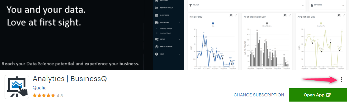
In Clover Dashboard go to Installed Apps. Find the Analytics app and select the following option:
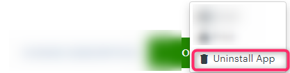
After you clicked on three dots as shown in the picture above you will get to the option to Uninstall App
Financial Overview
The Financial Overview for Clover Merchants is available to all users regardless of the plan/tier. The Overview page is accessed from the main menu, right under the Welcome page.
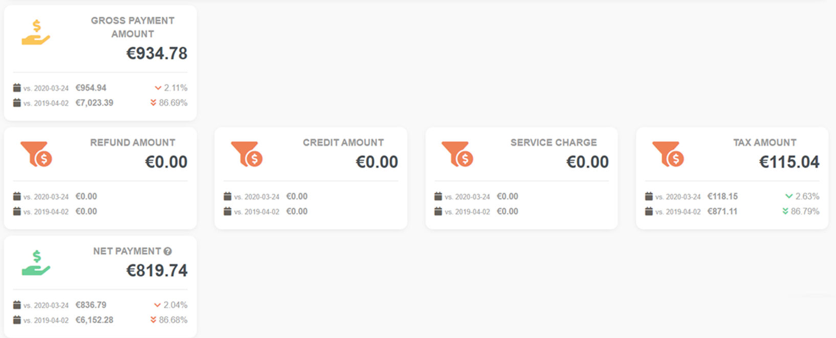
The Financial Overview provides a very simple and visual view of the most important KPIs and metrics for each business. Moreover, in the Financial Overview, you can compare payment data received today with payments from the same day last week. Likewise, the closest date that falls on the same day last year is compared as well. This should give you a very good sense of direction your business is going to.
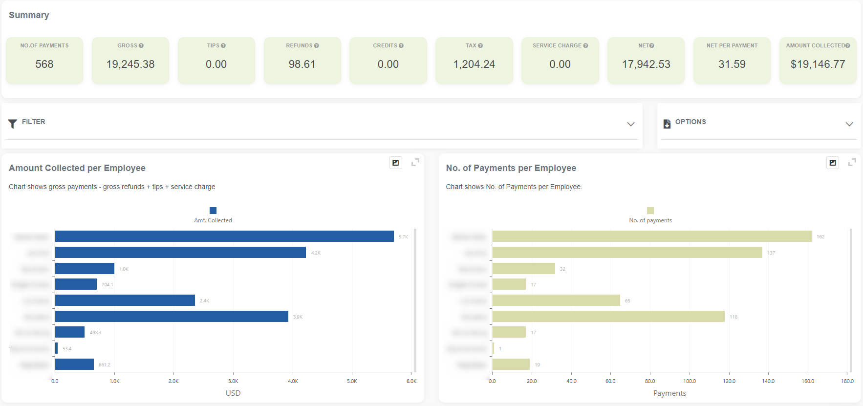
Some metrics that you can compare in the Financial Overview are Gross payment amount, Refund amount, Credit amount, Service charge, or No of orders. Data that you see in the Dashboard, are fetched at the moment you are activating Dashboard and only for the location you are currently logged in.
Metrics that you can compare are grouped into two groups, financial and numeric. The full list of KPIs that you can compare in the Financial Overview are:
Financial metrics:
- Gross payment amount
- Refund amount
- Credit amount
- Service charge
- Tax amount
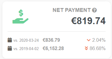
- Net payment
- Average net per order
Numeric metrics:
- Number of payments
- Number of orders
In financial metrics, you can compare all values in your currency. In addition to that, in numerical metrics, you can compare the number of payments and the number of orders.
How to compare data?
For example, for the Gross Payment Amount on one example:
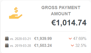
Upon reviewing the data, we can see that today’s gross payment was € 1,014.74. On the same day last week (2020-03-21), the gross payment was 1,939.99 €. That means today’s gross payment decreased by 47.69% compared to the previous week’s payment. Furthermore, examining data from last year (2019-03-28), we see that today’s gross payment is 32.5% smaller than the previous year.
In the same way, you can compare all other metrics.
Analytic App Reports
In this article, you will find several basin information about reports in Analytics like what type of reports we have, what are the most usual parts in all reports, how you can find the right report for your needs, etc. All the information that you can find here is general. Each report is explained in detail later on.
Report type based on tier
Reports in the Analytics app are divided into four main groups:
- Lite – reports that come in the Lite tier
- Basic – reports that come in the Basic tier
- Advanced – reports that only come in the Advanced tier
- Professional – reports that only come in the Professional tier
More on which report belongs to which tier you can find here.
Report type based on data collection
Regardless of a tier, all Analytics reports belong to one of two main groups:
- Payment-based reports
- Orders-based reports
Payment-based reports
- Today / Yesterday at a glance
- Payments overview
- Two-period comparison overview
- Employees overview
- Item categories overview
- Item categories treemap
Order-based reports
The primary difference between payment-based reports and order-based reports lies in speed and the level of detail or information that can be retrieved. Payment-based reports are speedy and can cover a more extensive period, but are less detailed. Order-based reports can have a maximum period, depending on the tier used, and are slower but provide more detailed information.
Period selection for the order-based reports is:
-
- up to 62 days for the Lite and Basic tiers
- up to 90 days for the Advanced tier
- up to 3650 days (10 years) for the Professional tier
Usual parts in Analytics reports:
Most reports in the Analytics app have been constructed from several components that are repeated across all reports.
The report name and explanation box
Here, you will see the report’s name, a brief explanation, and a tag indicating whether it pertains to orders or payments. On the left, there is a star. If you mark it yellow, it means it is a favorite report.

Report period box
The second box in reports is usually where you define the period you want to analyze. You can use the quick period time buttons to select the period you’re interested in quickly. The period you selected will be highlighted in dark blue. The period box is found in all reports, where you can define a special period. A stock value report will not have this box, as it always provides value at the time of report creation.
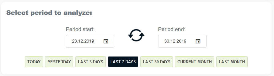
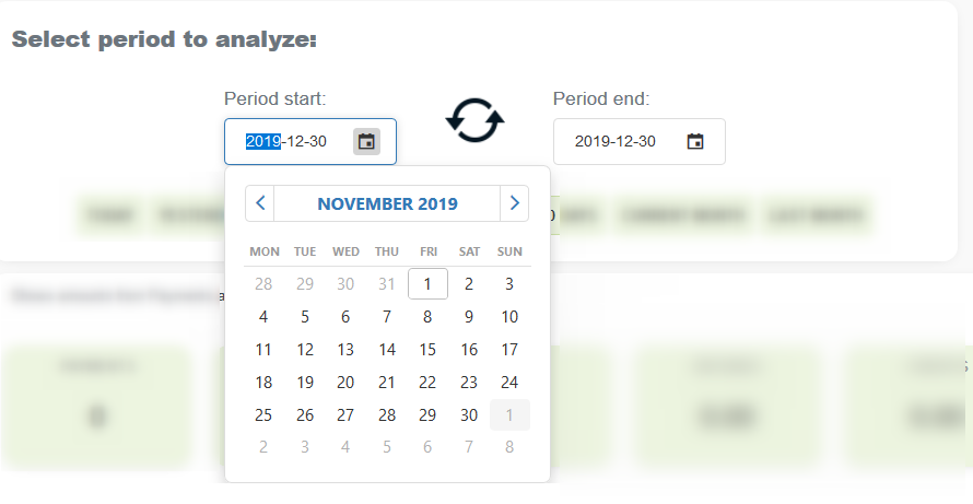
If those quick period time buttons are not enough, you can select a period manually by clicking the calendar icon, choosing a start date and end date, and then clicking the Refresh button.
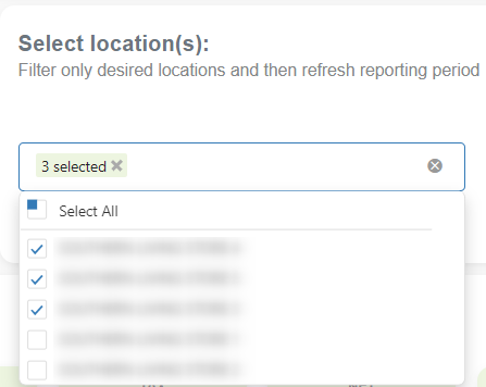
Select Location(s) box
If you have more than one location linked with a multi-location feature, reports in Analytics could be prepared for only one, a few, or all linked locations. By default, reports are ready for all locations. In case you wish to generate a report only for some places, in this box, you can choose for which to generate a particular report. In that case, you mark this specific location.
Summary box
You will find different summary data in this box. The data depends on the box. Most reports in Analytics include this section.
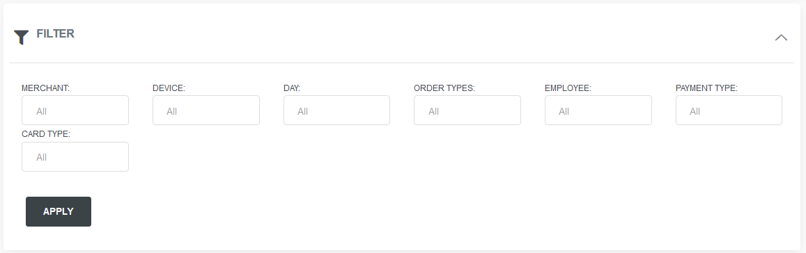
Filter box
You can find some values for additional filtering in reports in the filter box. Filters vary from report to report.
Options
In the option box, you can find several options, including printing or downloading a CSV file containing information on all orders or items. CSV files are displayed in the order-based reports.
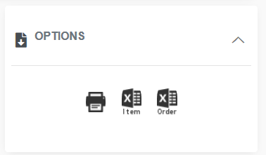
Chart section
For some, the chart section is most important. Charts are a quick and visual way to get basic information. Charts vary from report to report, and even more so from period to period, depending on the data to be presented. Here are some examples.
Details section
In the details section in most of the reports, you can find one or more tables. The details section, with tables, is always located at the bottom. Scroll down in the report to view the tables. Most of the tables in Analytics have the same possibilities, like:
- Add/remove columns in “Column chooser”
- Export table to Excel
- Rearrange columns (move columns left, right)
- Group by one more value
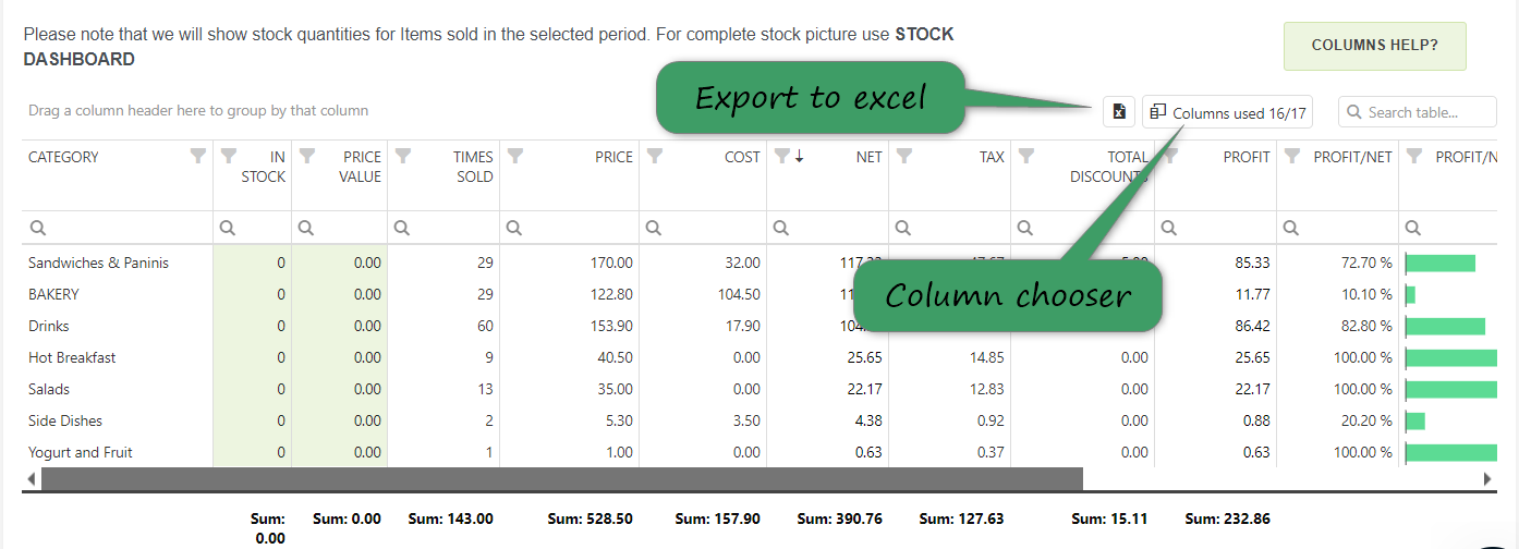
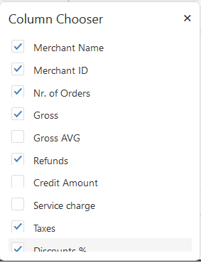
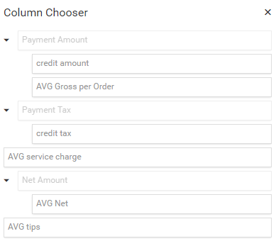
After clicking on “Columns chooser”, you will see all values that could be presented in the table. Simply click the ones you want, or unclick them if you don’t need them.
In the Reports vault, you can search for a report that suits your needs. Here you will see all available reports in the tier you are using. If you have an Advanced tier, all reports will be available to you.
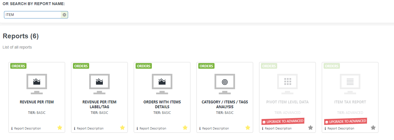
Searching for the proper report can be done in two ways:
- Search by the report content
- Search by a report name
Search by report
To find a report, go to Reports vault and define several details like:
- What kind of tier are you using: Lite, Basic, or Advanced
- The baseline for reports: Payments and/or Orders
- information available
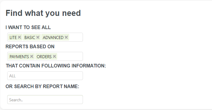
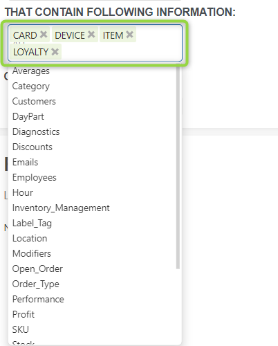
To search for a report you would like to see, in the field “That contains the following information,” mark all the fields for which you would like to see a report. In our example, we marked Customers, Employees, and Loyalty. With all three options active, no report was available.
In a new search, we sought a report that contains information on customers and employees, and is ordered by date. After defining those values, in the report list, we can see all reports where this type of data can be found. Since our present tier was Basic, all Advanced reports were in gray. To check one of the reports from the list, click on it.
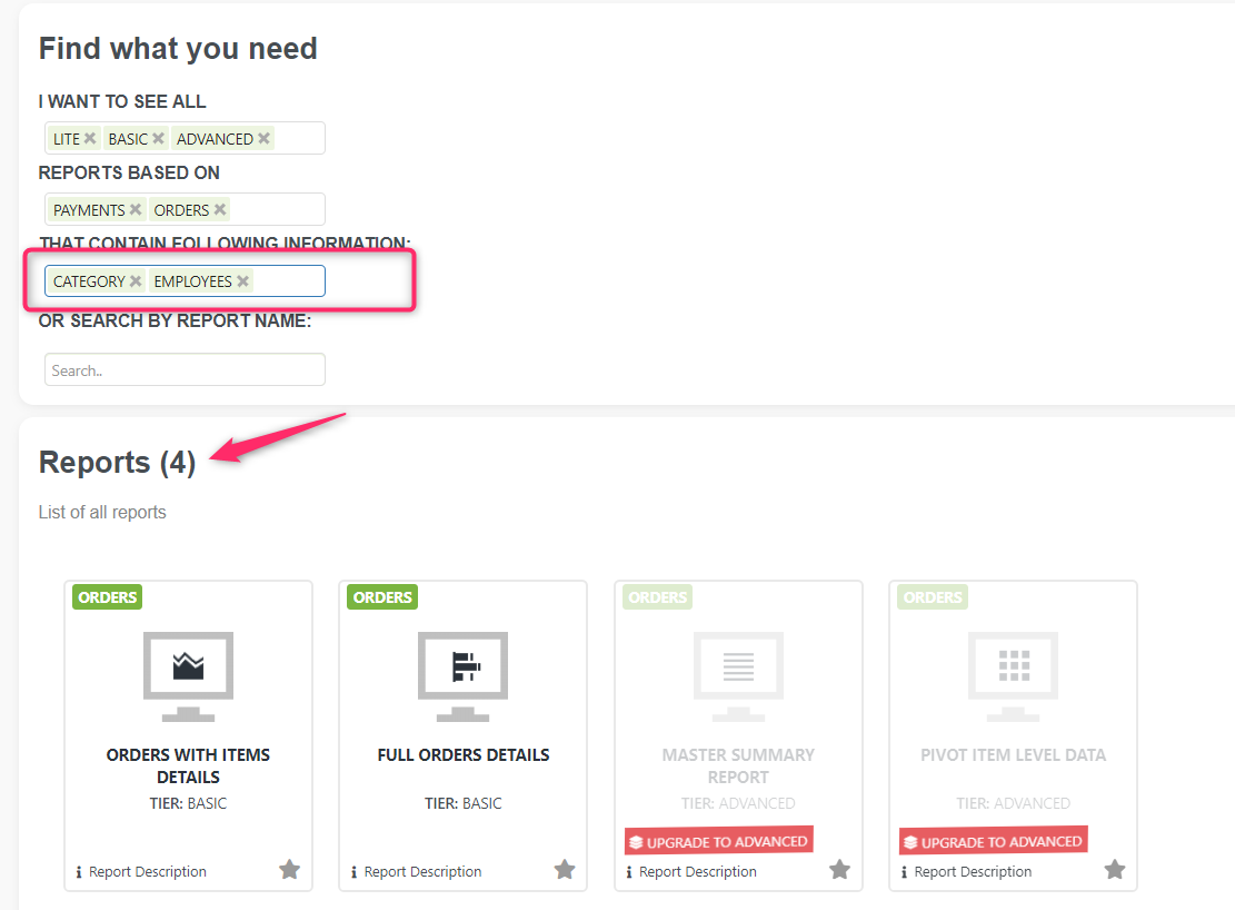
Similarly, you can find the report you need by adjusting your search criteria. When you open a report, if you like it, mark it as a favorite, and you will always be able to get to it quickly.
Search by report name
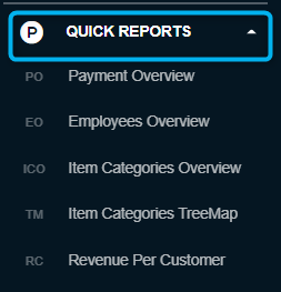
QUICK REPORTS
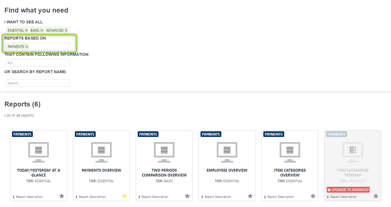
In the Quick reports section, you will find Payment based reports (or Overview reports as we say sometimes). All reports that belong to a payment-based report can be found in the Reports vault. To get a list of these reports, define “payments” as report’s baseline.
Another way to get to all those reports is by clicking “Reports list” in the top menu like shown on the picture below:
Payment based reports facts:
- Reports are based on payments
- Very Fast Reports
- Period selection up to 1 year
- Fewer details in reports
If you are a Professional tier user, there is no time limit (almost no limit) on the period in the reports. The actual limit is ten years, which is more than enough for most companies.
In the next sections, you can read more about our Fast Overview Reports.
Or check our quick video concerning these reports :
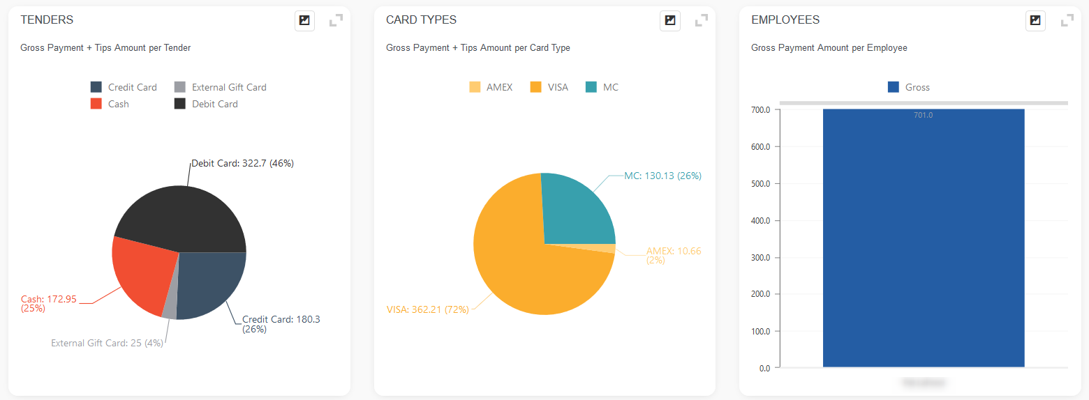
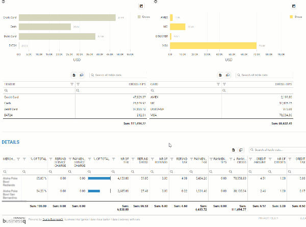
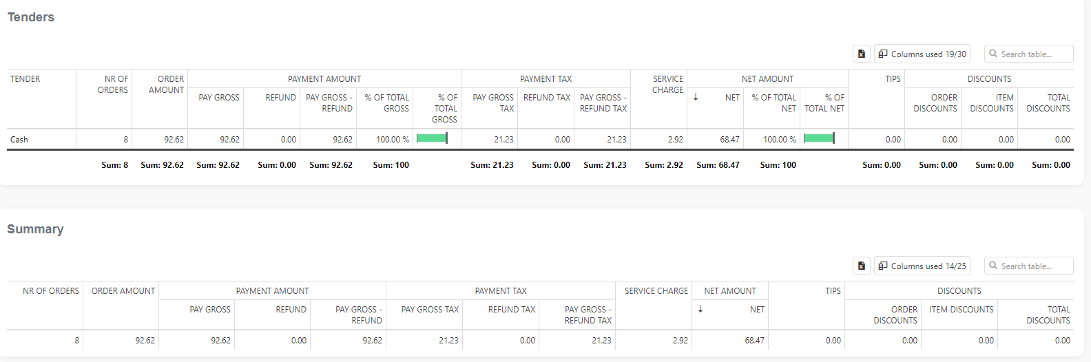
Payments Overview
Payment Overview is a payment-based report in the Quick Report section. Since it’s one of the most used reports, you can find it in the Editor’s Choice selection.
Report facts:
- The report is based on payments
- Very Fast Report
- Period selection up to 1 year
- Less details
Payments Overview is a fast report with time period selection up to one year, that will quickly give you details of your sales.
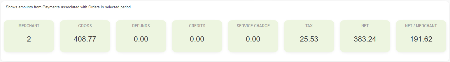
You can see the Gross amount, Net amount, and Tax amount for the selected period, as well as other information like which payment types are usually occurring, the percentage of payments per location, the number of payments, the number of refunds, a sum of refunds, and others. You can also export data to Excel.
You can quickly select the period you are interested in using the quick period time buttons. The period you selected will be highlighted in dark blue.
After you fetched data for the desired period, you will be able to see the following:
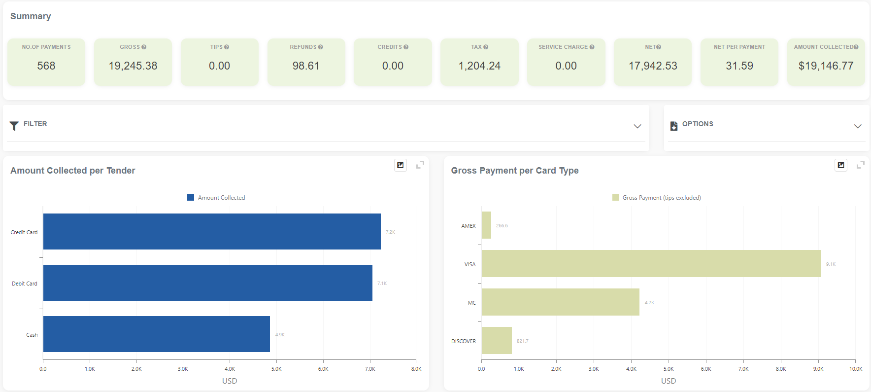
A SUMMARY shows you the number of payments for a selected period, including gross, tax, and net amounts.
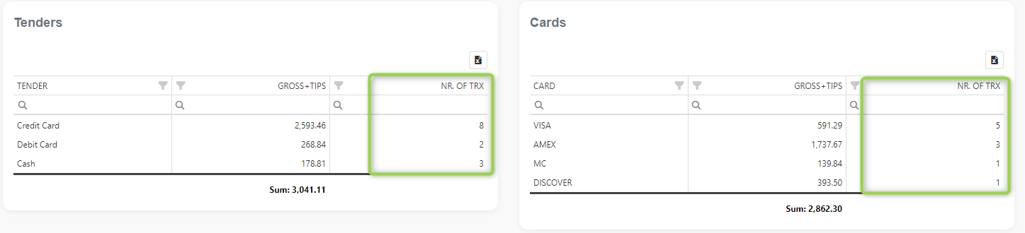
Two charts show you the Gross Payment Amount per Tender, and the other shows the Gross Payment Amount per Tender Type.
Looking into the same reports, you can notice new columns (marked green) showing details about credit cards used and how many times they were used.
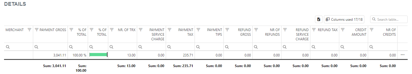
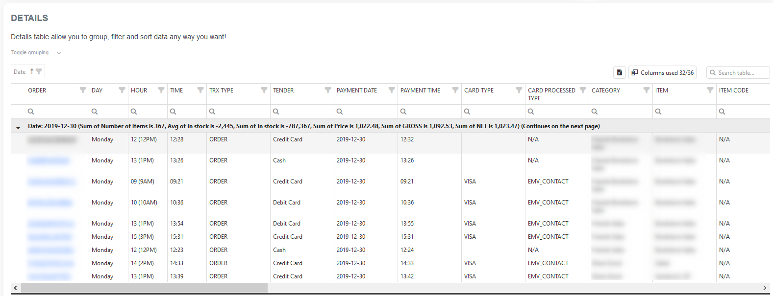
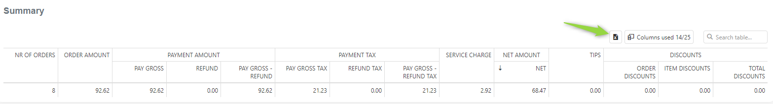
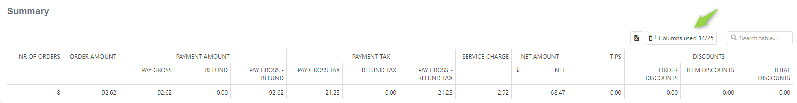
At the bottom of the page, you can find the DETAILS table, where you can see more detailed information for the selected period. You can remove/add columns from the table to specify which information you want to extract.
Quick video showing how to remove/add columns with Column Chooser:
https://businessq-software.com/wp-content/uploads/2017/06/cchoo.gif
Pivot Payment Level Data
The Custom Payment Pivot Data section allows you to create reports in the Analytics App. These reports are based on payment data, and in the pivot table, you can select columns from orders made in the specified period.Each merchant can create up to 20 reports (tabs).
This report is part of the Advanced & Professional tier.
Report facts:
- The report is based on payments
- Fast load of a Report (provides fewer details)
- Less detailed report
- Period selection: up to 365 days for the Advanced tier, and up to 3650 days (10 years) for the Professional tier
When you first open this report, it will look like this:
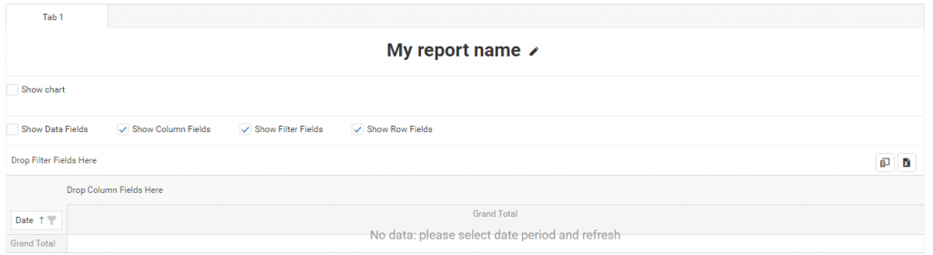
To display data in this pivot table, click one of the ‘Time buttons’ or select date periods and press the Refresh button.
TABS
The Pivot Payment Level Data report can have up to 20 tabs, each with its own pivot table, allowing you to create up to 20 custom reports.
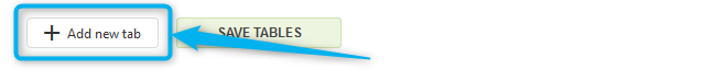
To add a new tab, press the ‘+Add new tab’ button:
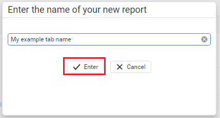
Once you press the ‘+Add new tab’ button, you can enter the tab’s name and press the ‘Enter’ button:
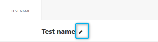
If you at any time wish to change the tab’s name, you can do it easily by pressing on the ‘pencil’ icon next to the tab’s name:
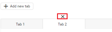
To remove a tab, hover over the tab you wish to remove, and the ‘X’ button will appear:
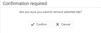
A confirmation window will appear when you click the ‘X’ button. Press ‘Confirm’ to delete the tab.
CHOOSING COLUMNS FOR PIVOT TABLE
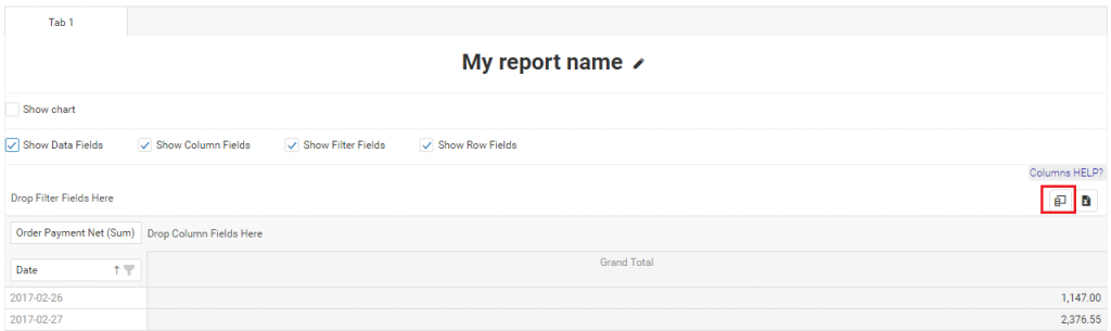
To be able to choose columns, you need to click on one of the ‘Time buttons’ or select date periods and press the Refresh button. When you have the data, you should click on the Column Chooser icon:
When Column Chooser is opened, you will find the list of all available fields in the ‘All Fields’ area:
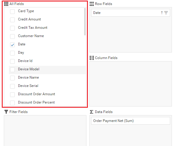
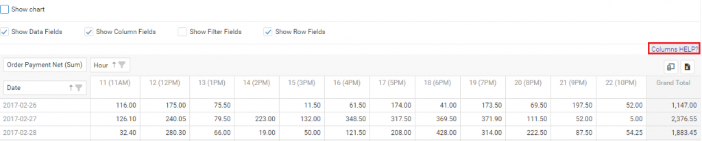
From there, you can easily drag and drop fields into the pivot table. You can drop fields as pivot columns, rows, data fields or filter fields. For example, I will drag Hour field to Columns:
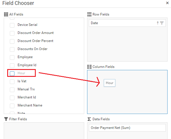
Almost instantly, you will see changes in the Pivot table:
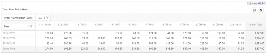
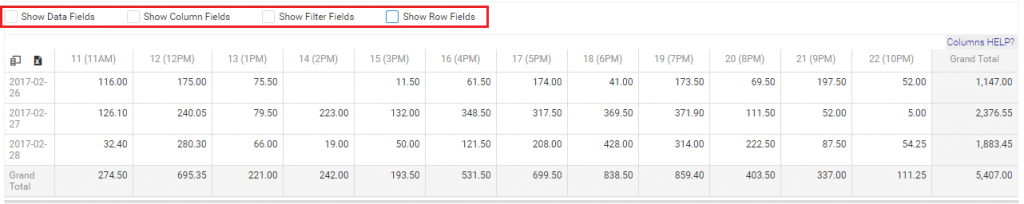
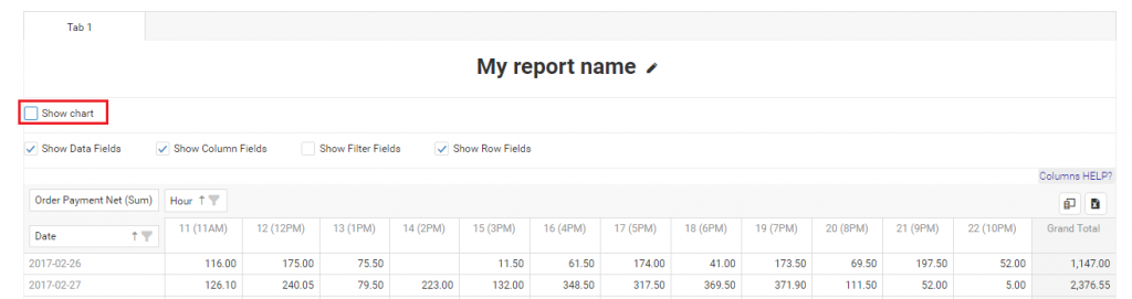
If you don’t want to see names of columns, rows, filters,s, or data fields, you can unselect them in the Field Panel area. This is how the same table as above looks like after removing names:
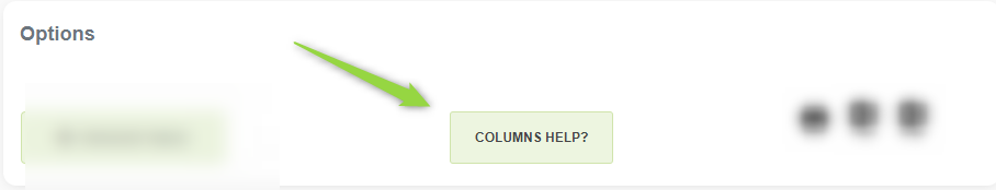
If you don’t know what each field in Column Chooser represents, you can click on the ‘Columns HELP?’ button:
INTEGRATION WITH CHART
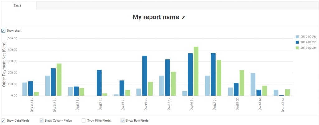
All pivot data can be visualized. You can enable chart integration by clicking on the ‘Show Chart’ checkbox:
This is how my example chart looks when I integrate it with my pivot table from above:
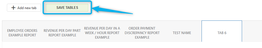
SAVING PIVOT TABLES
Above the tabs/custom reports section, you can find the ‘Save tables’ button. This button allows you to preserve all 10 of your tables/reports for future use.
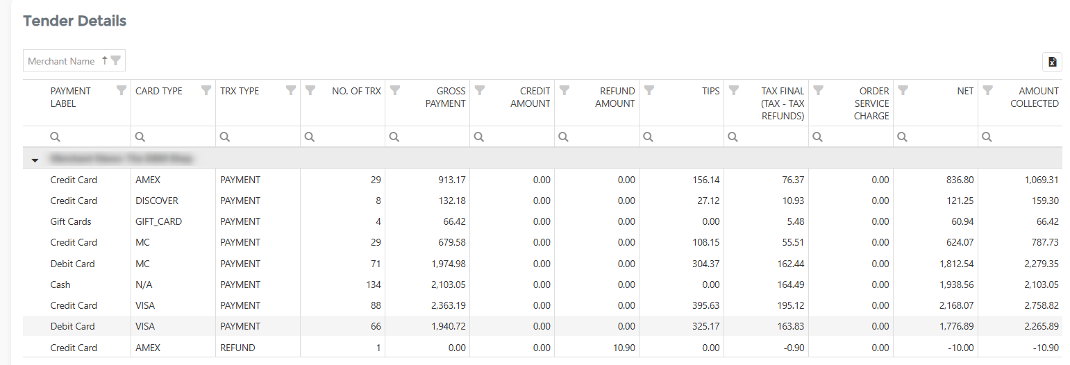
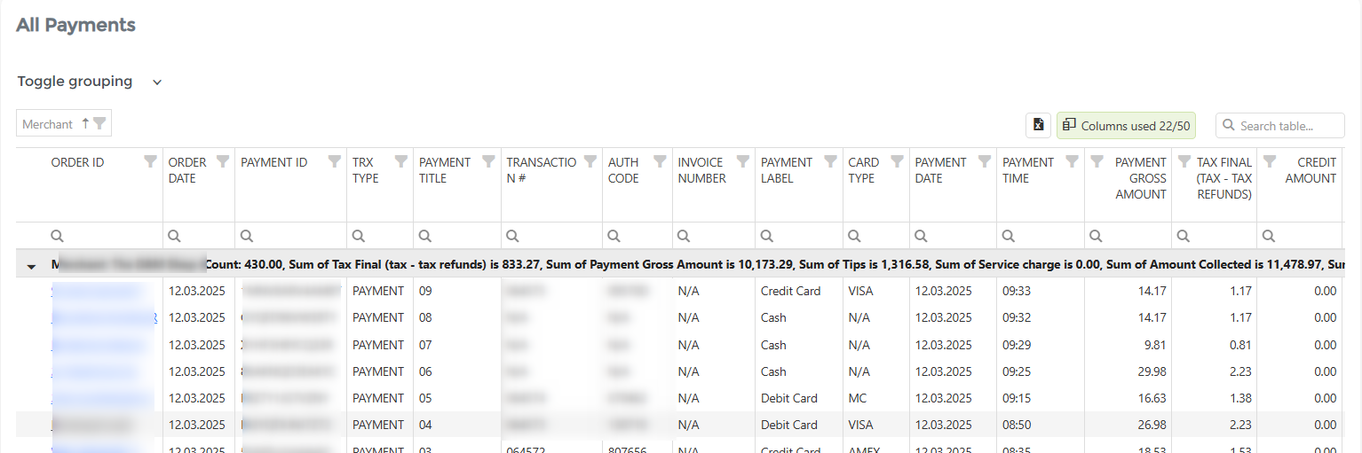
In addition to all the information provided, you will find two predefined tables in this section. You will get all payments per payment label information in the Tender details table. You do not need to create your unique custom report if you need this. The All payments table will give you a list of each payment (order) and its data. If you click on the link, the order will open.
We hope you like our new report and all the possibilities that can be achieved by using it.
Update:
We added a quick tutorial concerning this report and you can check it here:
Cash Log
The Cash Log report provides information on all cash transactions. Like most Analytics reports, you should start with the period you want to check; you can choose between predefined period buttons or select the custom period you wish by opening the calendar. To activate the action, click on the “Load data” icon.
The Cash Log report will give you information linked to the cash transactions. Some of the values you can find in the report are:
- Event Type: The type of event (reason for opening the cash drawer); events could be Open, Load, Transaction, or Adjustment.
- Change Amount: Cash value of the transaction
- Note: What was the reason for opening the cash drawer
If you group data by any table value, you will get totals for it. By default, the table is grouped by merchant name. Suppose you want to group data per Employee; drag and drop the employee name above the table. In the same way, you can use any other value from the table.
Employees Overview
Employee Overview is a payment-based report in the Quick Report section. To the Employees Overview report for the first time, you can search either in “Report vault” or access it directly by opening the Quick report section. If you like to use this report often, mark it as a Favorite and you will have fast access to it. Afterward, marked reports can be found in the Favorites report selection or on the Welcome page, Favorite group.
Report facts:
- Report based on payments
- Very Fast Report
- Period selection up to 1 year
- Fewer details
Like the “Payments overview report,” which is all about payments, this one is about your employees, allowing you to find everything in the selected period.
You can find out how much each employee contributes to your company by examining the number of gross payments they earned or the number of payments they made.
Two charts are followed by a detailed table in which you can find more details about your employees and the possibility of exporting that data to Excel.
Item Categories Overview
Item Categories Overview is a payment-based report and part of the Quick report section. You can access it for the first time by searching in “Report vault,” or by opening the Quick report section. If you like to use this report often, mark it as a Favorite, and you will have fast access to it. Afterward, you can find marked reports in the Favorites report selection or on the Welcome page, Favorite group.
Report facts:
- The report is based on payments
- Very Fast Report
- Period selection up to 1 year
- Fewer details
Like the last two reports, this is all about your Items from different categories.
This report lets you quickly see which items and categories are being sold the most over a selected period.
It has two charts showing the Payment amount per category and the number of units sold per category, followed by two other charts showing the Total Items that contribute to (percentage of) Revenue and the Total Items that contribute to (percentage of) Total Number Sold.
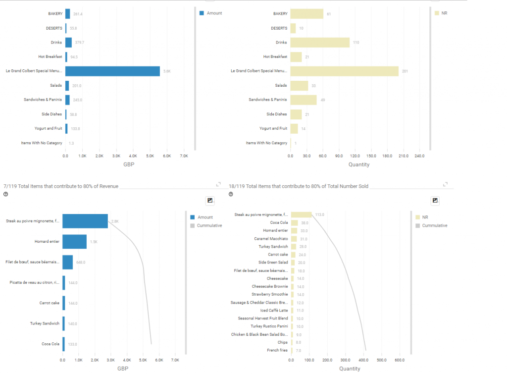
After those charts, there are two detailed tables where you can see more information from items like the number of items in stock, the number of times the item has been sold, discounts, refunds, and others, with the possibility to export data to Excel.
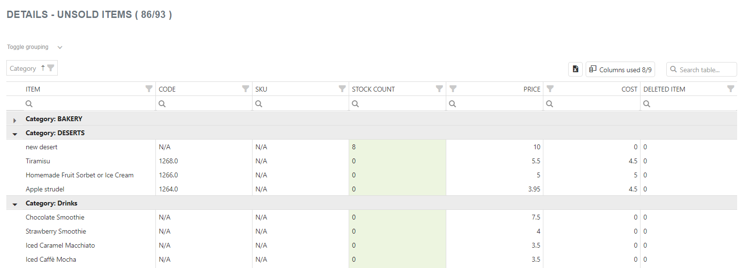
And a detailed table of unsold items in the selected period:
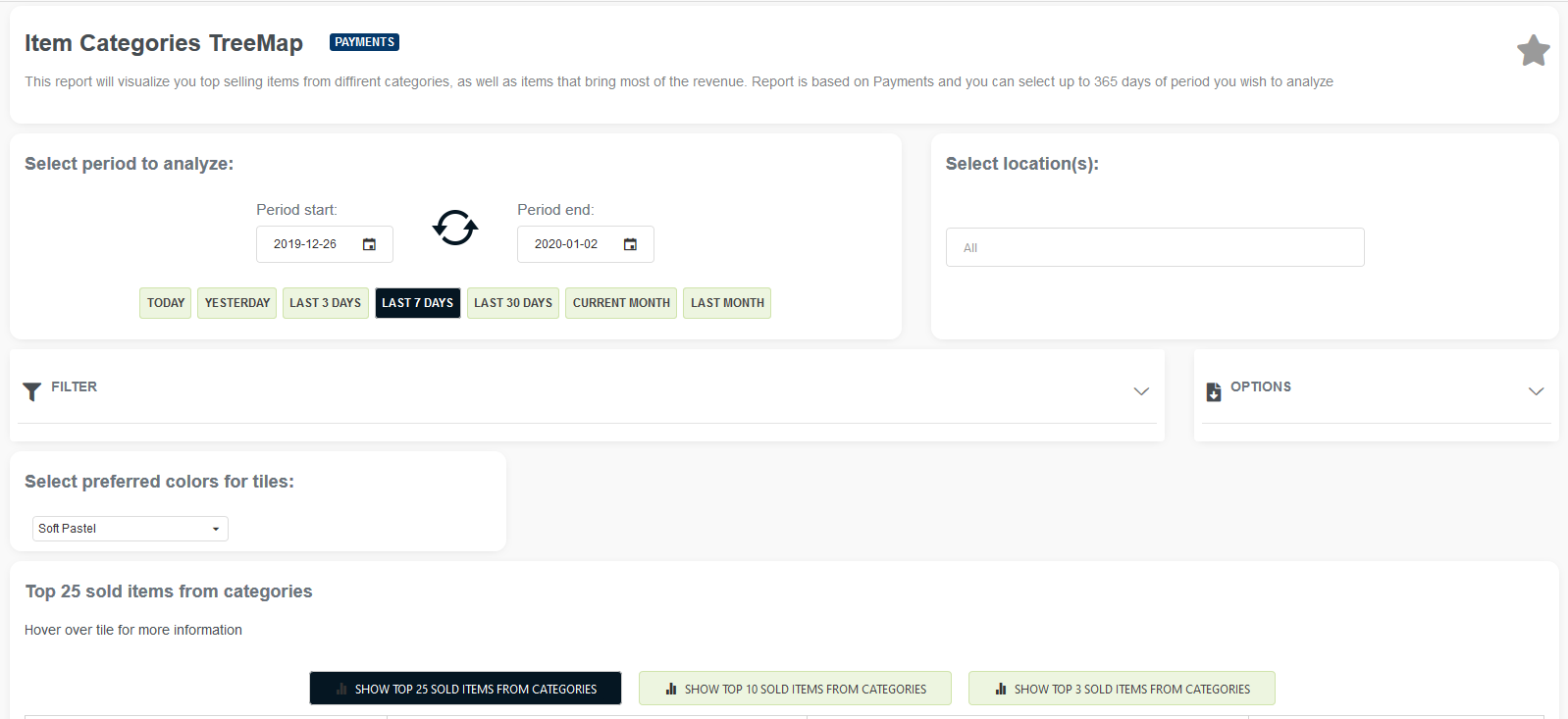
Item Categories TreeMap
Report Facts:
- The report is based on payments
- Very Fast Report
- Period selection up to 365 days (3650 days in the Professional tier)
- Fewer details
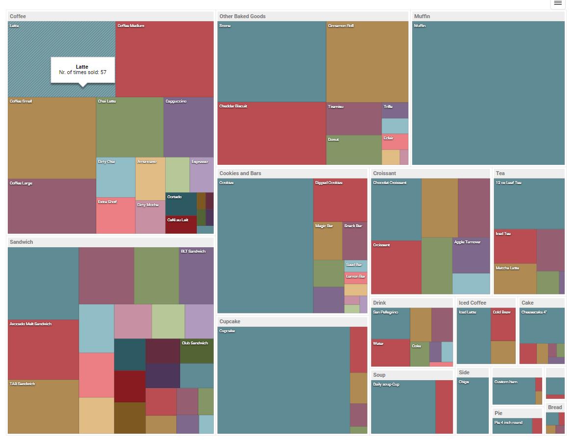
TreeMaps are economical because they can be used in a limited space and yet display a large number of items simultaneously.
When there is a correlation between color and size in the tree structure, you can see patterns that would be difficult to spot in other ways, for example, when a specific color is particularly relevant.
So, once you open the report, you will see a familiar calendar that can be found on almost all of our reports, predefined time buttons to choose from, and the option to choose all or some of the locations if you are using our multilocation feature.
Below, you can choose preferred colors for the tiles of the treeMap. Choose colors that are most suitable for your eyes, and remember that colors are going to be represented in rectangles, with the ‘best’ colored items being in the upper left corner, going to the other ‘weaker’ colored items to the bottom right corner.
Once you load data by pressing refresh, you will see two TreeMap tables.
The first one shows the Top 25 items sold in the categories. You will see the best category (with the most sales) in the upper left corner. Its items are represented as rectangles with different colors depending on your chosen color palette. Hovering over item ‘rectangles,’ you can see information about the item, such as the item’s name and the number of times it was sold. Above the treeMap Table, you can select to show the top 25/10 or top 3 items from categories.
In the right corner of the table, you can easily export the treeMap with one click in the picture format of your choice (PNG, JPEG, GIF, PDF, PNG).
The second TreeMap table shows you the Top 25 items by revenue from categories. You will see the best-earning category (with the most revenue) in the upper left corner. Its items are represented as rectangles with different colors depending on your chosen color palette. Hovering over item ‘rectangles,’ you can see information about the item, such as item names and total revenue. Above the treeMap Table, you can select to show the top 25/10 or top 3 items from categories.
In the right corner of the table, you can easily export the treeMap with one click in the picture format of your choice (PNG, JPEG, GIF, PDF, PNG).
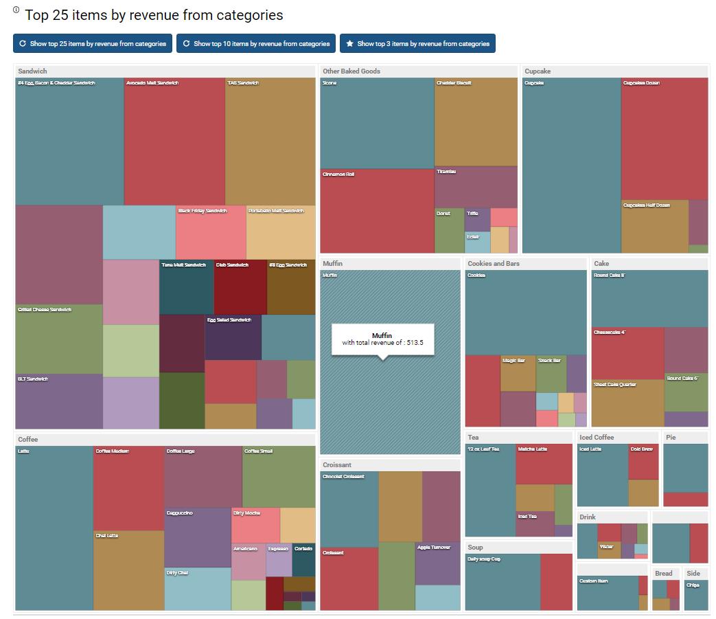
The TreeMap report works well with the multilocation feature, which means that if you have more than one location and the multilocation feature is on, you can select them from additional filters as shown in the picture below:

If you select all locations, the treeMap table will gather all categories from all locations. If the location category names and item names in those categories match, it will add them up and show them as one rectangle for a category and one rectangle for the item.
Revenue per Customers
Revenue per Customer is a payment-based report in the Quick Report section. You can access it for the first time by searching “Report vault” or opening the Quick report section. If you like to use this report often, mark it as a Favorite, and you will have fast access to it. Afterward, you can find marked reports in the Favorites report selection or the Favorite group’s welcome page.
Report facts:
- Reports are based on payments
- Slower load of a Report (provides more details)
- Very detailed reports
The Summary section provides the most relevant information, separately for orders with and without customer data.
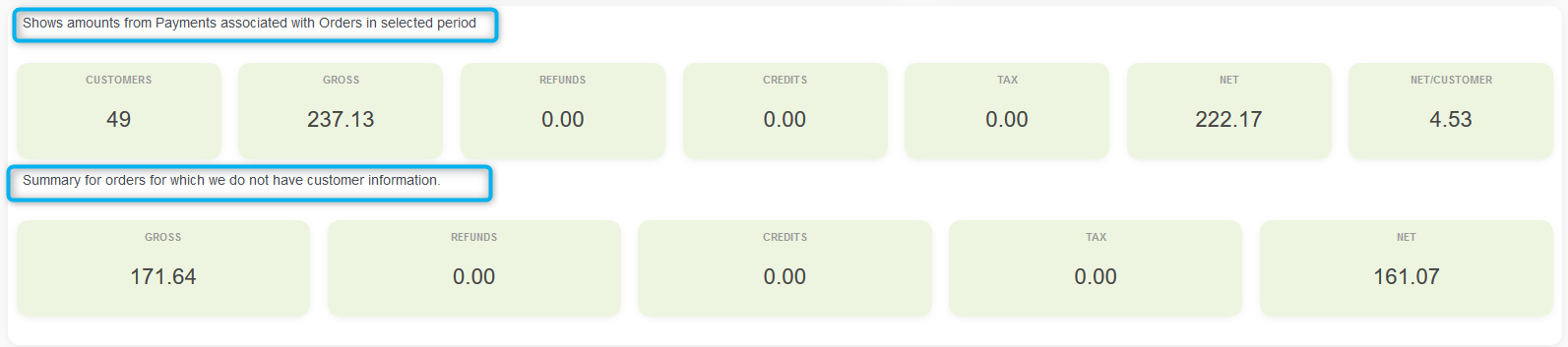
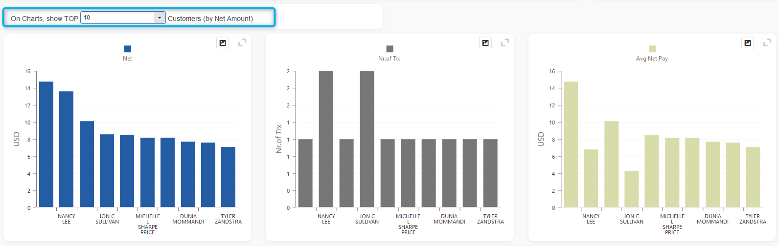
In three graphs, you can easily see which customers buy the most often (Number of Trx), which customers spend the most ( Net ), and even the average Net amount per transaction for each customer.
At the bottom of the report, there is a detailed table—you can search for data and export it to Excel.
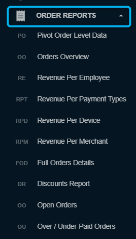
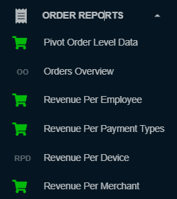
ORDERS REPOTS
In the next sections, we will explain Order based reports.
Report facts:
- Reports are based on Orders
- Slower load of a Report (provides more details)
- Very detailed reports
- Period selection: up to 62 days for Lite & Basic tier; up to 90 days for Advanced tier; up to 3650 days (10 years) for the Professional tier
Access to reports in this section is in two main ways:
1. Direct access via listed reports in the section:
If you are an Advanced & Professional tier user, all the reports will be available to you. If you are a Lite or Basic user, you will see the report, but you will not be able to access it unless you upgrade your subscription.
2. Report search in “Reports vault”
To find order-based reports, select “Orders” in the reports vault search. All reports from this group will be listed.
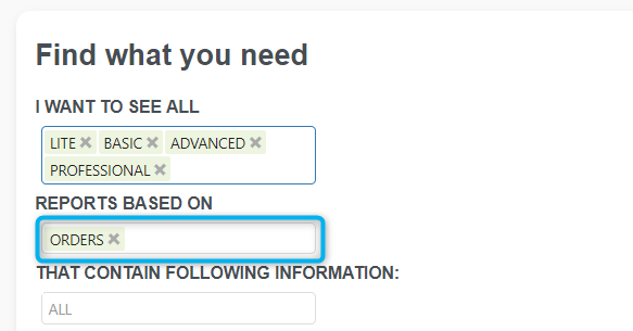
From the list of available reports, choose the one you need. If you don’t see the report you need, you can use additional filtering by selecting the required information.
Pivot Order level data reports
Pivot Order Level Data report is a report that allows you to create your own reports in Analytics App. This report is based on order level data, and in the pivot table, you can select columns that can be found on orders created in the selected time period.
This report is part of the Advanced & Professional tier.
Report facts:
- The report is based on orders
- Slower load of a Report (provides more details)
- Very detailed report
- Period selection: up to 90 days for the Advanced tier, and up to 3650 days (10 years) for the Professional tier
Each merchant can create up to 20 different tabs in Pivot Order Level data.
When you first open this report, it will look like this:
To display data in this pivot table, click on one of the ‘Time buttons’ or select date periods and press the Refresh button.
TABS
The Pivot Order Level Data report can have up to 20 tabs, each with its pivot table. To add a new tab, press the ‘+Add new tab’ button:
Once you press the ‘+Add new tab’ button, you can enter the tab’s name and press the ‘Enter’ button:
If you at any time wish to change the tab’s name, you can do it easily by pressing the ‘pencil’ icon next to the tab’s name:
To remove a tab, hover over the tab you wish to remove, and the ‘X’ button will appear:
A confirmation window will appear when you click on the ‘X’ button. Press ‘Confirm’ to delete the tab.
CHOOSING COLUMNS FOR PIVOT TABLE
To be able to choose columns, you need to click on one of the ‘Time buttons’ or select date periods and press the Refresh button. When you have the data, you should click on the Column Chooser icon:
When Column Chooser is opened, you will find the list of all available fields in the ‘All Fields’ area:
From there, you can easily drag and drop fields into the pivot table. You can drop fields as pivot columns, rows, data fields, or filter fields. For example, I will drag the Hour field to Columns:
Almost instantly, you will see changes in the Pivot table:
If you don’t want to see names of columns, rows, filters,s, or data fields, you can unselect them in the Field Panel area. This is how the same table as above looks after removing names:
If you don’t know what each field in Column Chooser represents, you can click on the ‘Columns HELP?’ button:
INTEGRATION WITH CHART
All pivot data can be visualized. You can enable chart integration by clicking on the ‘Show Chart’ checkbox:
This is how my example chart looks when I integrate it with my pivot table from above:
SAVING PIVOT TABLES
Above the tabs/custom reports section, you can find the ‘Save tables’ button. This way, you can preserve all 20 of your tabs (reports) for future use.
We hope you like our new report and all the possibilities it offers for achieving your goals.
Here is a quick tutorial concerning this report, and you can check it here:
Orders Overview and Order Types
The orders Overview and Order Types report is an order-based report with more details about orders.
Report facts:
- Reports are based on Orders
- Slower load of a Report (provides more details)
- Very detailed reports
- Data period: up to 62 days for the Lite & Basic tier; up to 90 days for the Advanced tier, and up to 3650 days (10 years) for the Professional tier
This report provides a quick overview of your orders for a specified period.
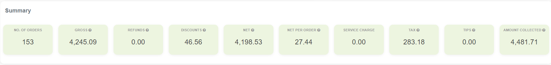
You can easily see the Number of Orders and the Gross, Net, and Tax amounts these orders produced in a selected period.
This is followed by a chart that visualizes gross and net payments per order, and another chart that visualizes gross and net payments per order type.
All charts have a mouse-over option for more details.
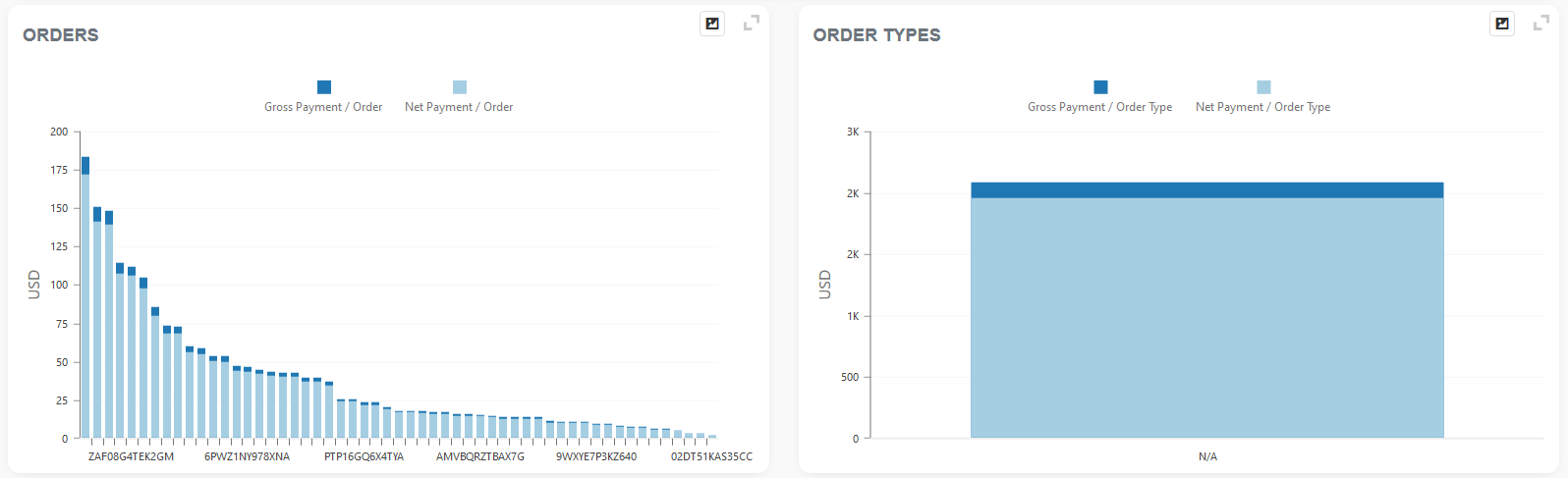
After charts, you have two easily customizable tables where you can drag and drop table column names to rearrange or remove columns you do not need.
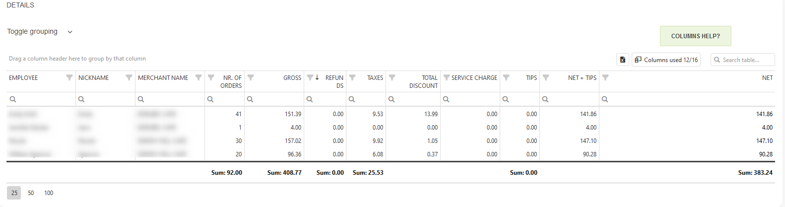
Revenue per Employee
Revenue per Employee report is part of the Orders reports section. For the first time, you can access it either by searching in “Report vault”; or you can access it by opening the Orders report section. If you like to use this report often, mark it as a Favorite, and you will have fast access to it. Afterward, marked reports are marked in the Favorites report selection or the Favorites group’s welcome page. This report is part of the Basic, Advanced & Professional tier.
Report facts:
- Reports are based on Orders
- Slower load of a Report (provides more details)
- Very detailed reports
- Data period: up to 62 days for the Lite & Basic tier; up to 90 days for the Advanced tier, and up to 3650 days (10 years) for the Professional tier
This report is similar to the Payment type report ‘Employee Overview.’ The difference is in processing data; in the first-mentioned report, we associate employees with payments, and in this report, we associate them with orders.
The report shows Employee info from Orders created during a selected period.
Suppose one employee is under multiple names in a multi-location setup (for example, Mike P., P. Mike, Peterson M., Mike Peterson). In that case, it messes with the report and is hard to track. For this purpose, we added Nickname and CustomID columns to give you better control over this situation.
This report has three charts. The first shows you the Top 10 (or 25, 50, 100) Employees by Net amount. The second chart shows you the number of Orders made by Employees. The lat chart visualizes the average Net payment per employee followed by the detailed table where you can arrange different information you need as you like with the possibility to export it to Excel.
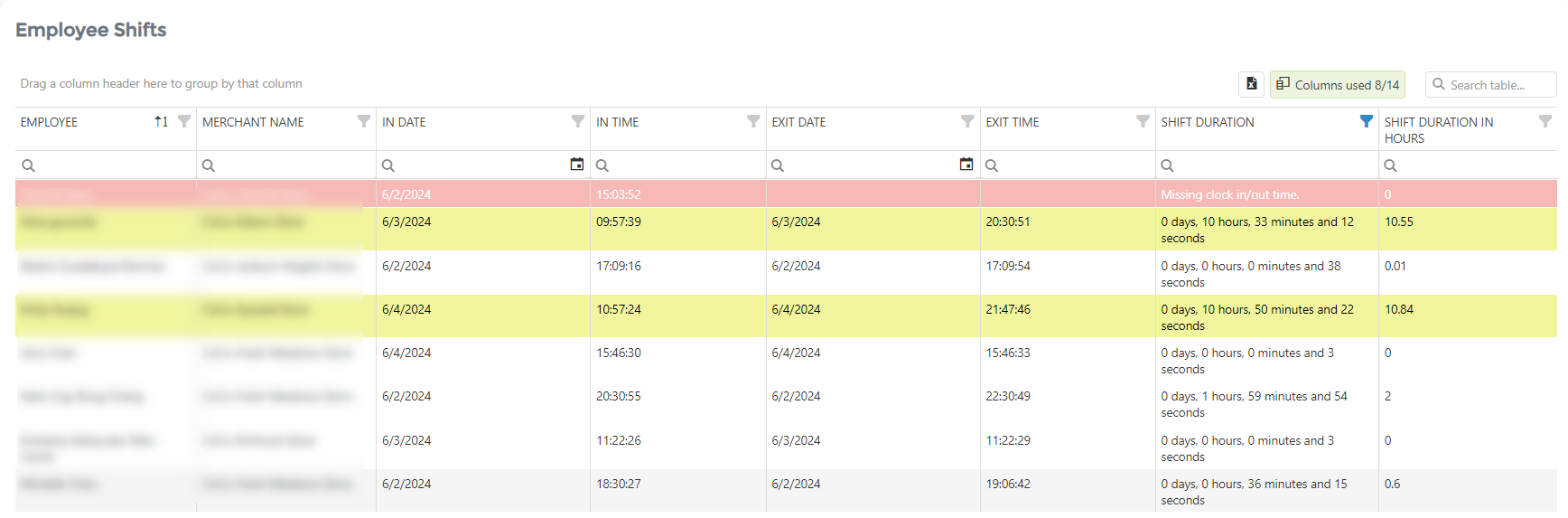
Employee Shifts
The employee Shifts table, which is the primary data source for this report, displays employee shift data from selected periods. This data is sourced from the Shifts app, which is seamlessly integrated with our Analytics platform, ensuring its accuracy and reliability.
The table shows data for each employee, such as the clock-in date and time and the clock-out date and time. Most importantly, it calculates the hours for each working day. The table uses colors to help you see the discrepancies easily.
Table rows marked in red are those with incomplete data (no clock-in/out data) or work duration in days. Also, rows marked in yellow have shift durations longer than 9 hours.
Revenue per Payment Types
The Revenue per Payment Types report is part of the Orders reports section. For the first time, you can access it by searching in the “Report Vault” or by opening the Orders report section. If you’d like to use this report often, mark it as a Favorite and you’ll have fast access to it. Afterward, marked reports can be found in the Favorites report selection or on the Welcome page, under the Favorites group. This report is part of the Basic, Advanced & Professional tiers.
Report facts:
- Reports are based on Orders
- Slower load of a Report (provides more details)
- Very detailed reports
- Period selection is up to 62 days for the Basic tier, up to 90 days for the Advanced tier, and up to 3650 days (10 years) for the Professional tier
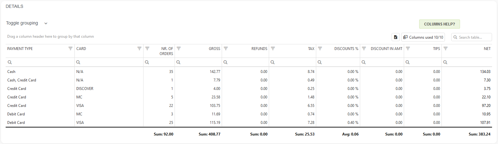
Similar to the faster Payments overview report, which is associated with payments, this report is linked to orders and displays Payment Types information from Orders created within the selected period, providing more detailed information.
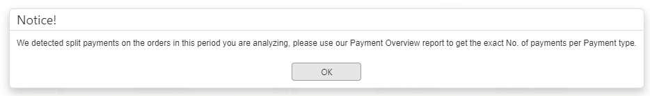
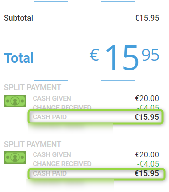
If the system detects split payments on orders within the period you are analyzing, before you access the report, you will see a notice. Split payments on orders refer to all orders that are paid with more than one payment type. There could be many combinations, such as cash and card, multiple cards, etc.
Like most reports, this one includes a Summary, three charts, and a detailed table at the end, with the option to extract information to Excel. If needed, you can use additional filters, such as Merchant, Device, and Order types.
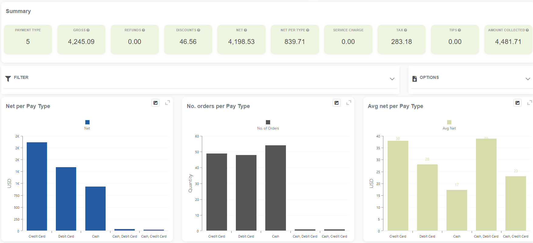
Followed by the detailed table, you can customize it with ease simply by rearranging column headers using drag-and-drop.
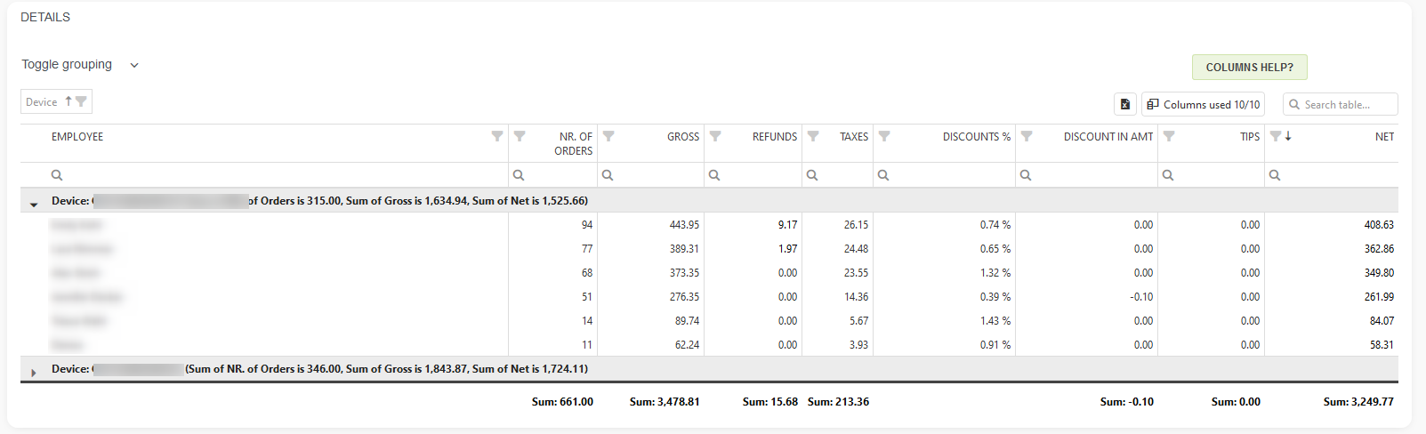
Revenue per Device
The Revenue per Device report is part of the Orders reports section. For the first time, you can access it by searching in the “Report vault” or opening the Orders report section. If you’d like to use this report often, mark it as a Favorite and you’ll have fast access to it. Afterward, you can find marked reports in the Favorites report selection or on the Welcome page, in the Favorites group. This report is available across all tiers: Lite, Basic, Advanced, and Professional.
Report facts:
- Reports are based on Orders
- Slower load of a Report (provides more details)
- Very detailed reports
- Period selection is up to 62 days for Lite & Basic tier, up to 90 days for Advanced tier, and up to 3650 days (10 years) for the Professional tier
Like other reports, this one includes a Summary, which displays the number of devices and their combined Net, Gross, Tax, and Profit values.
Alternatively, you can select only one device or different combinations if you have multiple devices installed.
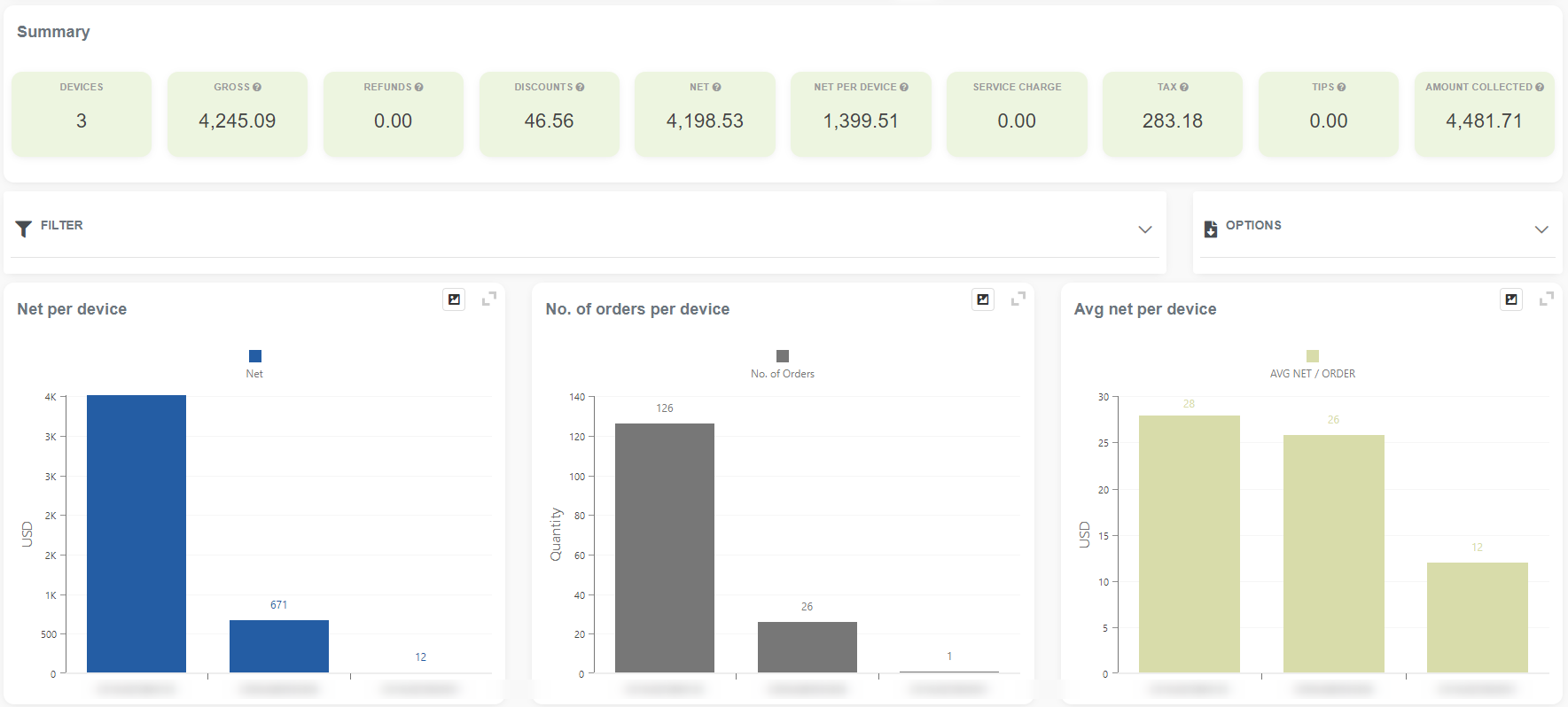
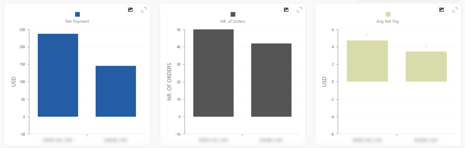
The report includes three charts that visualize your Net per Device, the number of orders per Device, and the average Net per Device. It is followed by a detailed table that offers the possibility to export information to Excel and rearrange the table as you like with a simple markup of values.
Revenue per Merchant location
Revenue per Merchant Location report is part of the Orders reports section. For the first time, you can access it by searching in the “Report vault” or opening the Orders report section. If you like to use this report often, mark it as Favorite and you will have fast access to it. Afterward, you can find marked reports in the Favorites report selection or on the Welcome page, the Favorites group. This report is part of the Basic, Advanced & Professional tier.
Report facts:
- Reports are based on Orders
- Slower load of a Report (provides more details)
- Very detailed reports
- Period selection is up to 62 days for Basic tier, up to 90 days for Advanced tier and up to 3650 days (10 years) for the Professional tier
This report is valuable to Merchants with multiple locations; they can easily compare their locations.
It has three charts showing net payments per location, the number of orders per location, and the Average Net Payment per location.
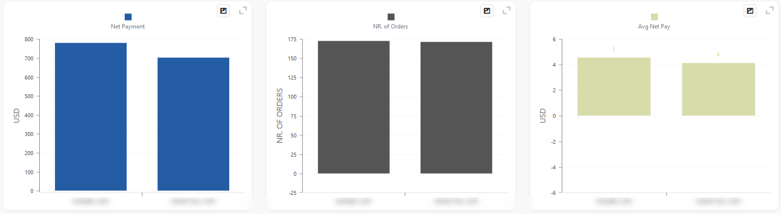
After visualization, you will have a detailed table showing information for a selected period concerning selected locations.
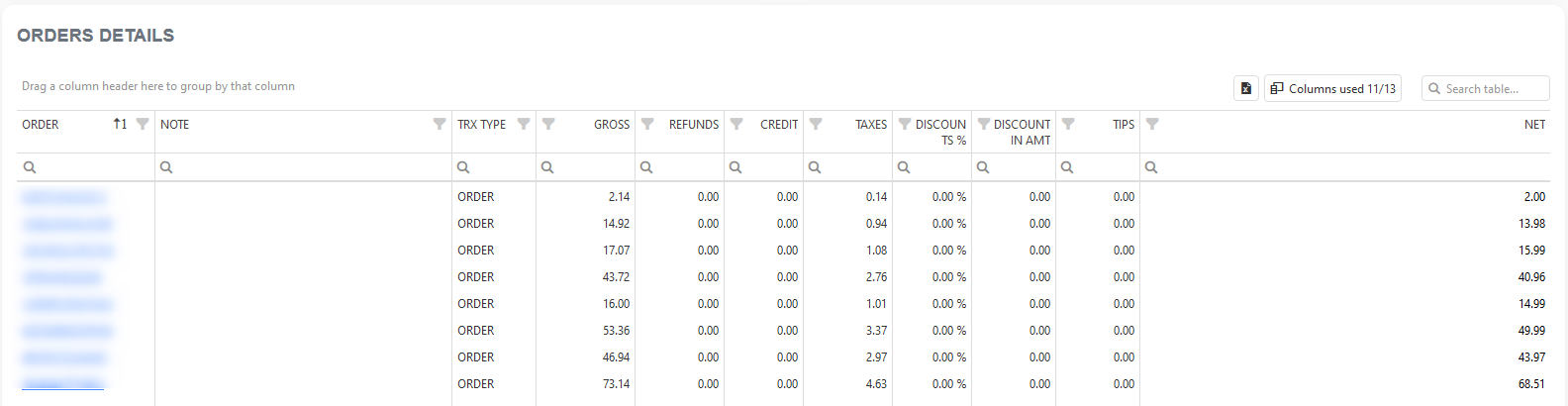
Full Orders Details
The Full Orders Details report is a significantly enhanced and improved version of the Orders with Items Details report, featuring a total of 77 columns. You can choose which columns you wish to see and which you don’t need to see. You can do that by clicking on the column chooser icon, and then you can drag columns in or out of the table.
This report is part of the Orders reports section. For the first time, you can access it by searching in the “Report vault” or opening the Orders report section. If you’d like to use this report often, mark it as a Favorite and you’ll have fast access to it. Afterward, you can find marked reports in the Favorites report selection or on the Welcome page, in the Favorites group. This report is part of the Basic, Advanced & Professional tiers.
Report facts:
- Reports are based on Orders
- Slower load of a Report (provides more details)
- Very detailed reports
- Period selection is up to 62 days for the Basic tier, up to 90 days for the Advanced tier, and up to 3650 days (10 years) for the Professional tier
After you have customized tables to suit your needs, you can save this custom table look. Every time you open this report, it will be set up in the way you want it to be. If you change your mind about the table appearance, you can save it again. You can save the table configuration by clicking on the save button, positioned left of the main title ( as shown in the picture below ):
You can customize the table any way you want, and possibilities are limitless.
Discounts Report
Discounts help your business, whether you aim to attract new customers, boost sales, or make room for new products. For this reason, we decided to make a report that will help you track your discounts in great detail—the Discounts Report. The report is part of the Orders reports section.
For the first time, you can access it by searching in the “Report vault” or opening the Orders report section. If you like to use this report often, mark it as a Favorite and you will have fast access to it. Afterward, you can find marked reports in the Favorites report selection or on the Welcome page, in the Favorites group. This report is part of the Basic, Advanced & Professional tiers.
Report facts:
- Reports are based on Items
- Slower load of a Report (provides more details)
- Very detailed reports
- Period selection is up to 62 days for the Basic tier, up to 90 days for the Advanced tier, and up to 3650 days (10 years) for the Professional tier
DISCOUNTS REPORT
- per Hour,
- per Location,
- per Category,
- per Items,
- per Customers,
- per Employees,
- per Item Discount Names and
- per Order Discount Names
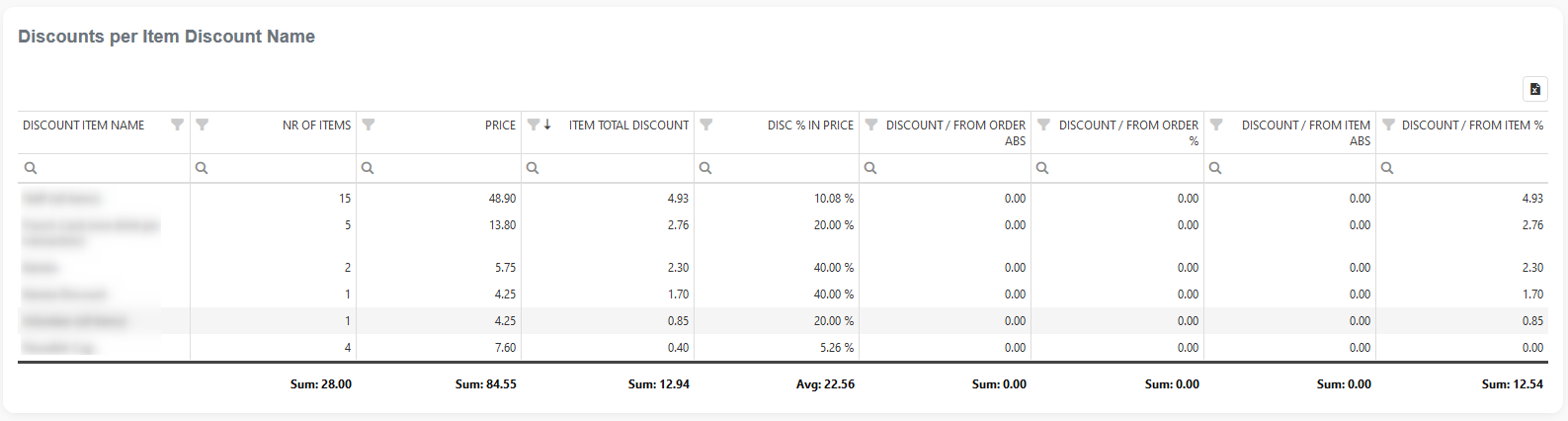
Sometimes, you can offer seasonal sales, or, for example, you can give 10% off a specific group of products each Monday. With our Discounts Report, you will know how much you earned by putting those items on sale and whether the wholesale was successful.
The Discounts Report will show you the names of the discounts you applied either to the whole Order
(example: every Tuesday from 9 AM-11 AM, you give 5% off for the entire order)
or on the specific Items
For example, today all apples are 15% off.
This way, you will always know how much you accomplished with each Discount you applied in a specific period.
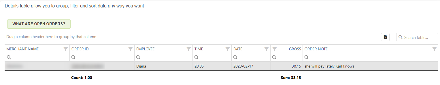
Open Orders
The Open Orders report is part of the Orders reports section. For the first time, you can access it by searching in the “Report vault” or opening the Orders report section. If you’d like to use this report often, mark it as a Favorite and you’ll have fast access to it. Afterward, you can find marked reports in the Favorites report selection or on the Welcome page, in the Favorites group. This report is part of the Basic, Advanced & Professional tiers.
The Open Orders report is an excellent diagnostic tool, capable of telling you which orders are still open, or more accurately, not paid. An order can be listed as open for the following reasons:
- Any order that has not been paid out will be listed as OPEN.
- Any order created from the Clover Tables app that has not yet been paid will appear as OPEN.
Report facts:
- Reports are based on Orders
- Slower load of a Report (provides more details)
- Very detailed reports
- Period selection is up to 62 days for the Basic tier, up to 90 days for the Advanced tier, and up to 3650 days (10 years) for the Professional tier
After defining the period you want to analyze, click the “Data Load” button. Upon fetching data, if there is any open order, it will be listed in the details table. Here is one example:
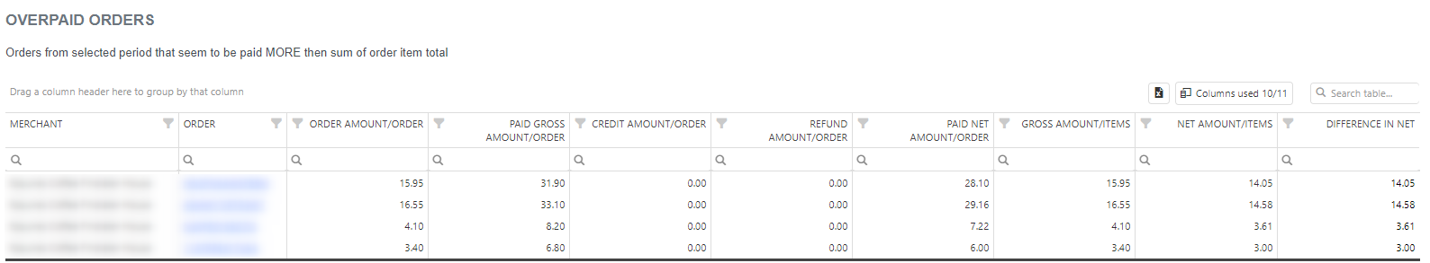
Over/Under-paid Orders
The Over / Under—Paid Orders report is a great diagnostic tool. It can tell you which orders have discrepancies. This report is divided into two parts: one for Overpaid orders and another for Underpaid orders.
This report is part of the Orders reports section. For the first time, you can access it by searching in the “Report vault” or opening the Orders report section. If you like to use this report often, mark it as Favorite and you will have fast access to it. Afterward, you can find marked reports in the Favorites report selection or on the Welcome page, the Favorites group. This report is part of the Basic, Advanced & Professional tier.
Report facts:
- Reports are based on Orders
- Slower load of a Report (provides more details)
- Very detailed reports
- Period selection is up to 62 days for the Basic tier, up to 90 days for the Advanced tier, and up to 3650 days (10 years) for the Professional tier
OVERPAID ORDERS TABLE
This table shows all the orders from the selected period that seem to have been paid MORE than the sum of the total order items.
UNDERPAID ORDERS TABLE
This table shows all the Orders from the selected period that seem to be paid LESS than the sum of the order item total.
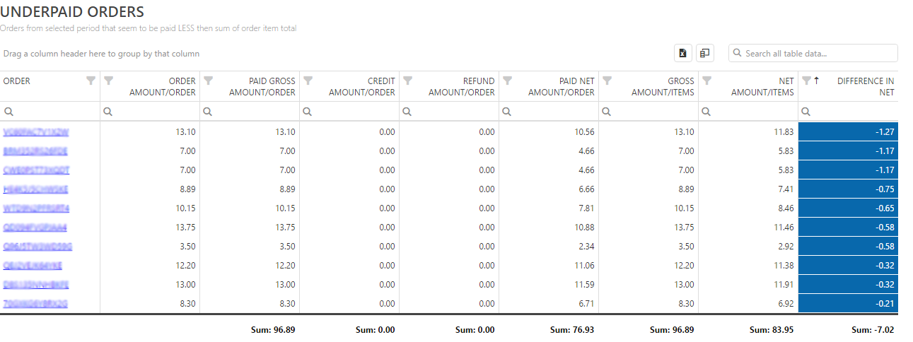
In both tables, in column ORDER you can directly see desired order and payments for that exact order. You can see that order by clicking on the underlined order ID as shown on the picture below:
By pressing the order’s ID you will get complete order and payments information for that order:
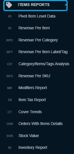
ITEMS REPORTS
In the Items reports sections, you will find all reports that give you detailed information about Items, Categories, Labels/Tags, etc. Besides predefined reports, here you will find Pivot Item level data report which you can see for creating custom reports.
Pivot Item level data reports
Just as we have Pivot Order Level data, which we explained in the previous section, this Pivot Item Level Data report offers the same options as the previous one, with the difference being that the report is based on items from orders.
You will be able to create up to 20 custom reports, name them, and save them for later use. For more information, check the previous section to learn what you can achieve with tables and how to manipulate them.
Revenue per Item
The Revenue per Item report is part of the Items reports section. You can access it by searching “Report Vault” or opening the Items report section. If you’d like to use this report often, mark it as a Favorite, and you’ll have fast access to it. Afterward, marked reports can be found in the Favorites report selection or on the Welcome page, in the Favorites group. This report is part of the Basic, Advanced & Professional tiers.
Report facts:
- Reports are based on the Item
- Slower load of a Report (provides more details)
- Very detailed reports
- Period selection is up to 62 days for the Basic tier, up to 90 days for the Advanced tier, and up to 3650 days (10 years) for the Professional tier
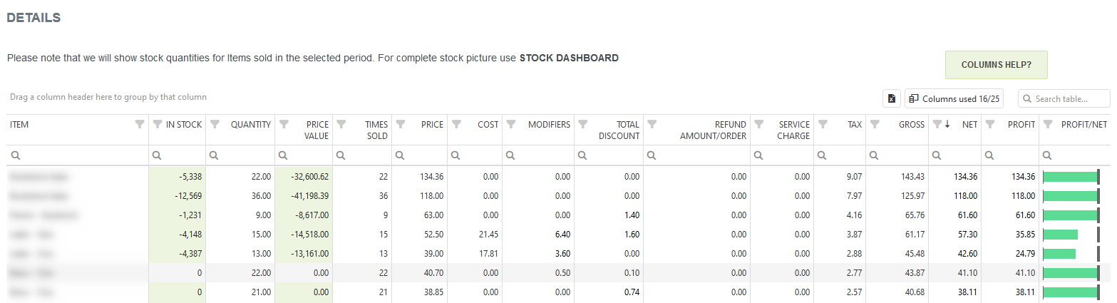
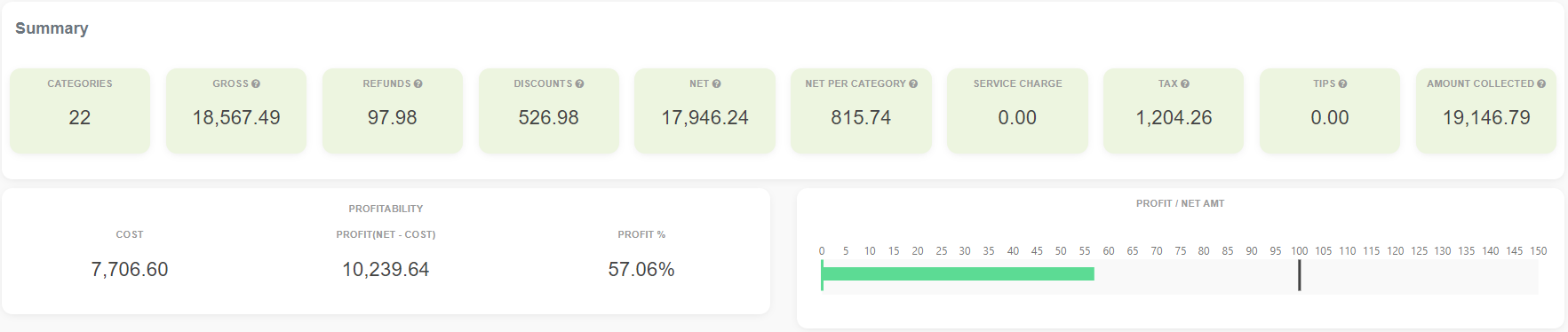
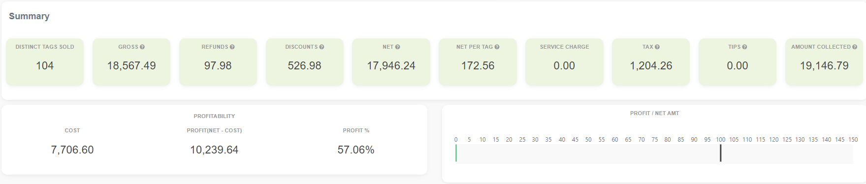
Revenue per Item is a very valuable report that gives insight into the number of times Items have been sold and shows profitability.
In the Summary section, in addition to the usual data, you can find information about profitability. Profitability calculation depends on cost data per item.
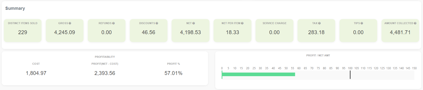
It has three charts that visualize the Net payment per Item, the Number of items sold, and the average net per item for the selected period. For a better view, you can choose how many top items by net amount should be shown in the chart. In this example, we have 25.
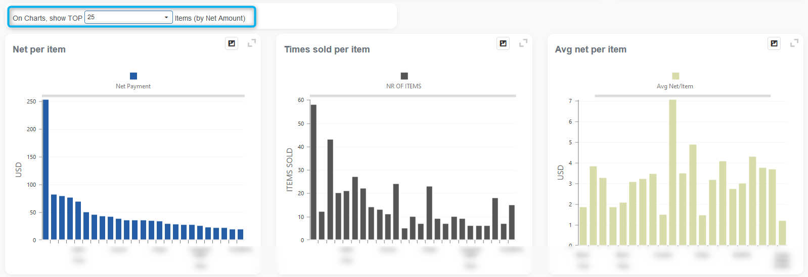
After charts, a detailed table is available with the possibility to rearrange and sort it as you wish by simply dragging and dropping table columns where you want.
Revenue per Category
Revenue per Category report is part of an Items reports section. You can access it by searching “Report Vault” or opening the Items report section. If you’d like to use this report often, mark it as a Favorite, and you’ll have fast access to it. Afterward, marked reports can be found in the Favorites report selection or on the Welcome page, in the Favorites group.
This report is part of the Basic, Advanced & Professional tiers. Report facts:
- Reports are based on Items
- Slower load of a Report (provides more details)
- Very detailed reports
- Period selection is up to 62 days for the Basic tier, up to 90 days for the Advanced tier, and up to 3650 days (10 years) for the Professional tier
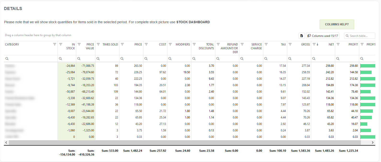
Revenue per Category is a report that shows profits per category.
In summary, you can see the number of categories being examined and the data processed for the selected period. You can also view Gross, Net, Tax, Refunds, and Profitability for each category. The report features three charts that visualize the net Payment per Category, the Number of Items in Each Category, and the average net payment per item in specific categories for the selected period.
After visualization, a detailed table is available, allowing you to export your data to Excel or rearrange it as needed with simple drag-and-drop functionality for table columns.
Revenue per Item Label/Tag
- Reports are based on items
- Slower load of a Report (provides more details)
- Very detailed reports
- Period selection is up to 62 days for the Basic tier, up to 90 days for the Advanced tier, and up to 3650 days (10 years) for the Professional tier
Revenue per Item Label / Tag is a report that shows you Profitability, Net, Gross, average net, and other information for your items with Labels/Tags.
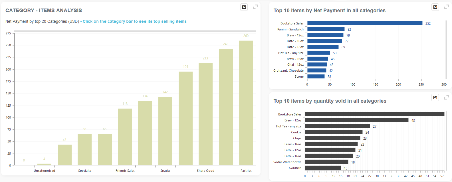
Category/Items/Tags Analysis
Category / Items / Tags Analysis is part of the Items reports section. You can access it either by searching in the “Report Vault” or by opening the Items report section. If you’d like to use this report often, mark it as a Favorite and you’ll have fast access to it. Afterward, marked reports can be found in the Favorites report selection or on the Welcome page, under the Favorites group.
Using quick period time buttons, you can quickly select the period you are interested in. The period you selected will be highlighted in dark blue. If those quick period time buttons are not enough, you can select a period manually by clicking the calendar icon, choosing a start date and end date, and then clicking the Refresh button.
There are two options you can use in this report:
- with information on unsold items,
- without information on unsold items.
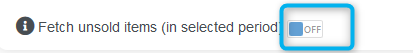
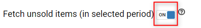
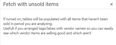
Additional information will provide details on the types of payments made. When you start with a report, the default setting for the “Fetch unsold items” button is OFF. If you also want to view unsold items, you need to change the setting to ON. After making this change, click the Refresh button again.
The Top 10 Items charts will inform you about the most popular items (by quantity) and items that bring the most of your revenue.
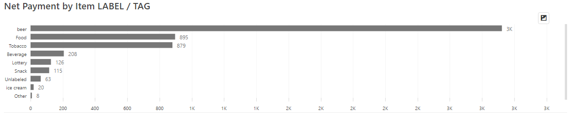
When defining Items in Clover, you can put a LABEL / TAG on each one of them. You will want to do that to achieve some additional categorization, super-categories, or similar.
If you do that, you can use the following dashboard chart to read the revenues per item, LABEL/TAG:
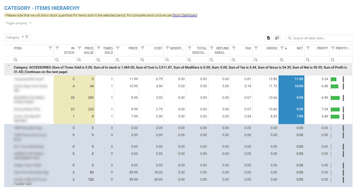
Following these graphs are two detailed tables that provide information for a selected period regarding the CATEGORY – ITEMS HIERARCHY and TAG/LABEL – ITEMS HIERARCHY.
Should you need more detailed information in this report (information about card payments), please mark the button “Fetch with extra information” with the ON option (as marked on the picture)
Clicking on? Icon, you will get more details on the type of information you can expect with this option.
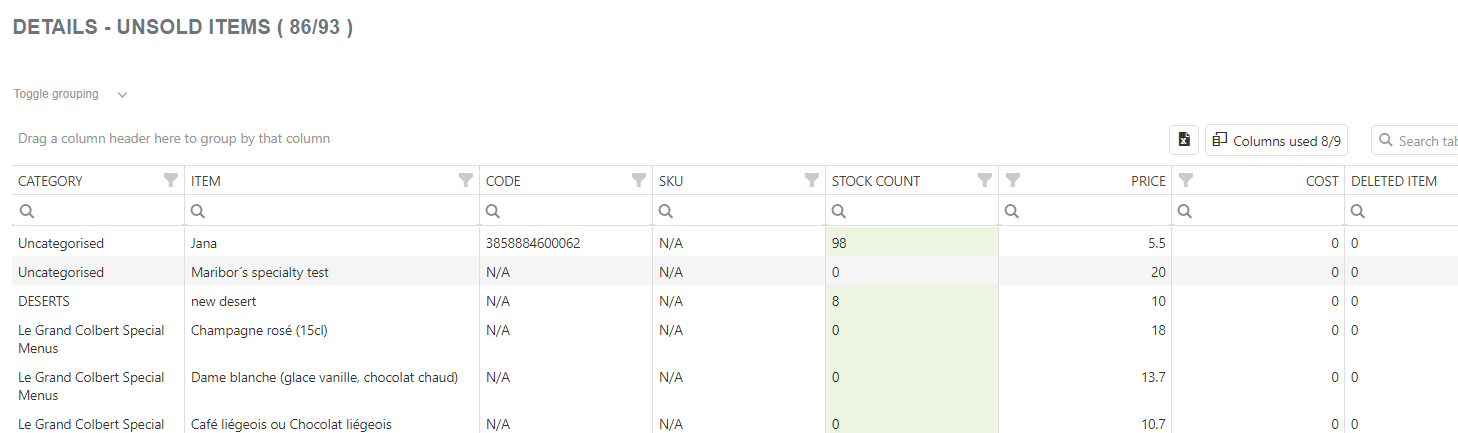
Upon reviewing the same reports as before, you can notice items marked in blue. Those items are all items that have not been sold in the period that you have been looking into.
Revenue per SKU
You will love this report if you’ve defined SKU codes on your Clover Items. It allows you to check business performance, including Profitability per SKU!
The Revenue per SKU report is part of the Items reports section. You can access it by searching in the “Report vault” or opening the Items report section. If you like to use this report often, mark it as a Favorite and you will have fast access to it. Afterward, marked reports can be found in Favorites report selection or on the Welcome page, Favorite group.
- Reports are based on items
- Slower load of a Report (provides more details)
- Very detailed reports
- Period selection:
- Up to 62 days for the Basic tier; up to 90 days for the Advanced tier, and up to 3650 days (10 years) for the Professional tier
The report shows Item SKU info from Orders created on a selected period.
In summary, you can see how many Items have an SKU defined and their overall Net, Gross, Tax, Profitability, and other information, considering the selected period.
It has 3 charts showing you Net Payments per SKU, Number of Items with SKU#, and Avg Net per Sku followed with a detailed table in which you can rearrange table columns as you wish and export information to Excel.
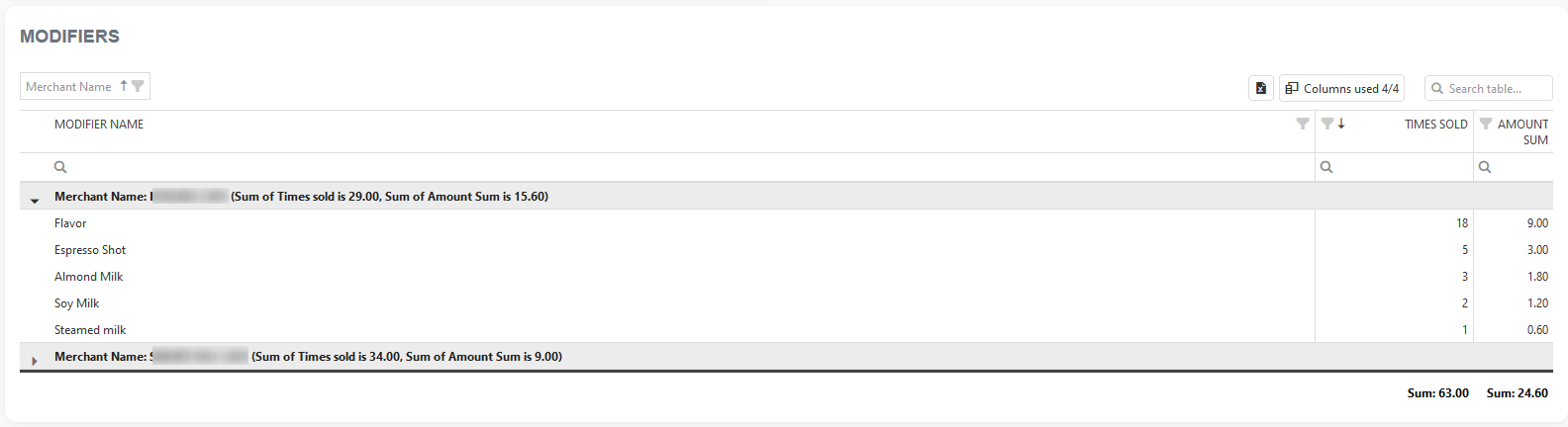
Modifiers report
The Modifiers Report is part of the Items Reports section. You can access it by searching in the “Report vault” or opening the Items report section. If you like to use this report often, mark it as a Favorite and you will have fast access to it. Afterward, marked reports can be found in Favorites report selection or on the Welcome page, Favorite group.
- Reports are based on Items
- Slower load of a Report (provides more details)
- Very detailed reports
- Period selection:
- Up to 62 days for the Basic tier; up to 124 days for the Advanced tier, and up to 3650 days (10 years) for the Professional tier
Like for other reports, select the period you wish to check. If the Merchant has more than one location, he can choose one or more locations to get data for. To get data, press the Refresh button. The maximum allowed period range for the BASIC Tier is 62 days, while for the FREE Tier, it is 7 days.
In Clover, you can define Modifiers that modify the price of Items. If you want to track the number of Modifiers sold, this report is right for you.
Modifiers
The first two charts are for the Modifiers table. That table shows all modifiers used in the selected period of time, with key information such as how many times each modifier was sold and the overall Amount earned from it.
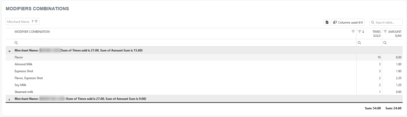
Modifier combination
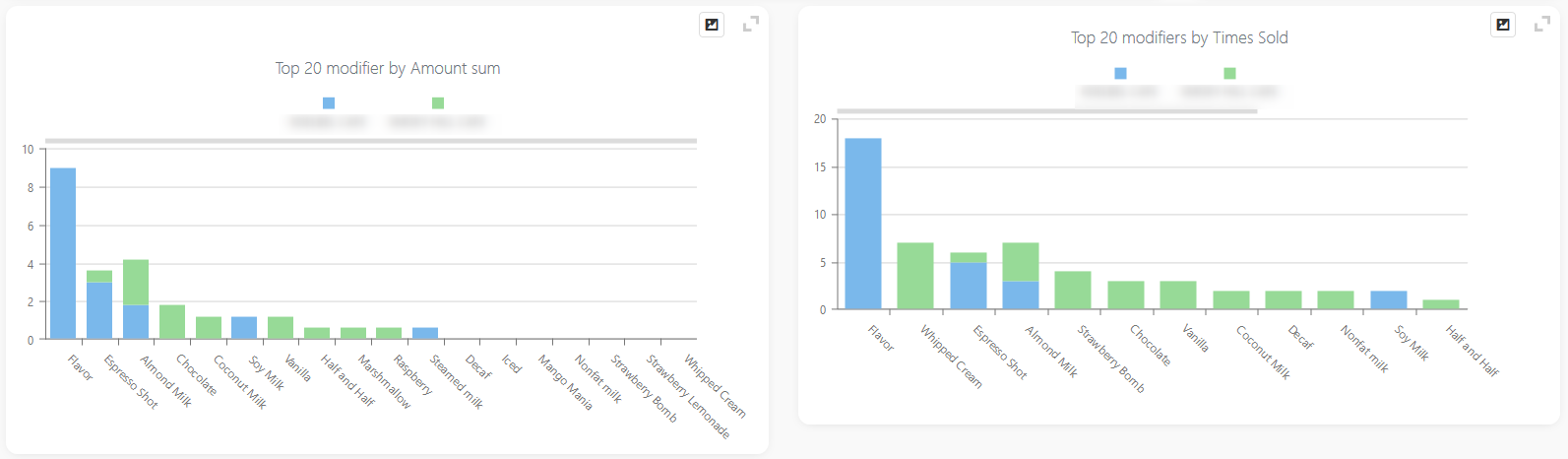
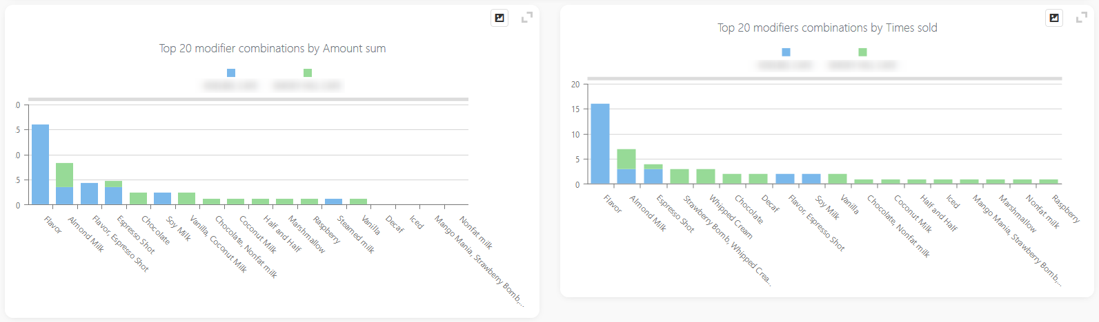
Moreover, if you want to see what Modifier combination is used the most (or the least), or simply how much you use modifiers in different combinations, use the second report charts and table.
Both charts will show the TOP 20 modifiers by AMOUNT SUM (left chart) and TIMES SOLD (right chart). Mouse over the bar will show you additional information like which location it is, depending on which chart you are looking at, how many times the modifier was sold, or the overall amount earned.
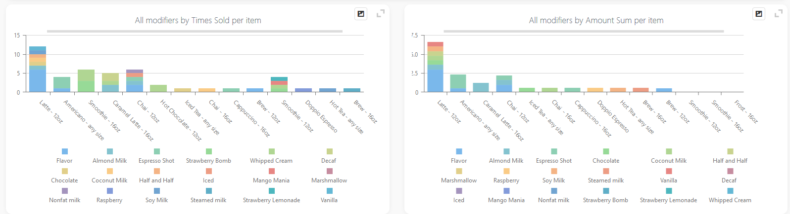
Items – Modifiers hierarchy
And the last fifth and sixth charts show visualization for the ITEMS- MODIFIERS HIERARCHY table.
That table is grouped to show you the ITEM and all of the modifiers that were ‘used’ on it in the period you are analyzing. So, the left chart will show you all modifiers amount sums that were used on a particular item(s) whilst the right chart will show you all modifiers on items but with information on how many times that modifier was sold.
Item Tax Report
This report is part of the Advanced & Professional tier. In this report, we are extracting all items from orders created in your analysis period. After the report is loaded, you will see a bar chart showing your Tax rate names and their overall tax sum in the selected period you were analyzing. Followed by a data grid (table) showing you the same information in a different format, with the possibility to export it to Excel.
Report facts:
- The report is based on orders
- Slower load of a Report (provides more details)
- Very detailed report
- Period selection:
- Up to 62 days for the Basic tier; up to 124 days for the Advanced tier, and up to 3650 days (10 years) for the Professional tier
In Clover, you can customize Taxes. You can add them, remove them, change their names, rates, etc. For this example, we created a list of Tax Names with their rates.
Tax name ‘NO_TAX_APPLIED’ has a tax rate of 0%.
Tax name ‘ZERO’ has a tax rate of 0%.
Tax name ‘Standard VAT’ has a tax rate of 2%.
Tax name ‘STANDARD’ has a tax rate of 2%.
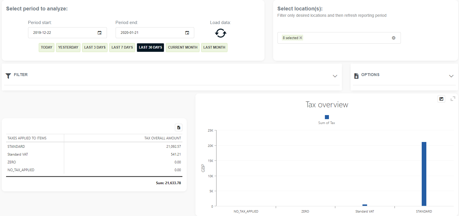
The picture shows that most items sold in this selected period had the standard tax applied to them.
You can inspect more by looking at the detailed table below chart:
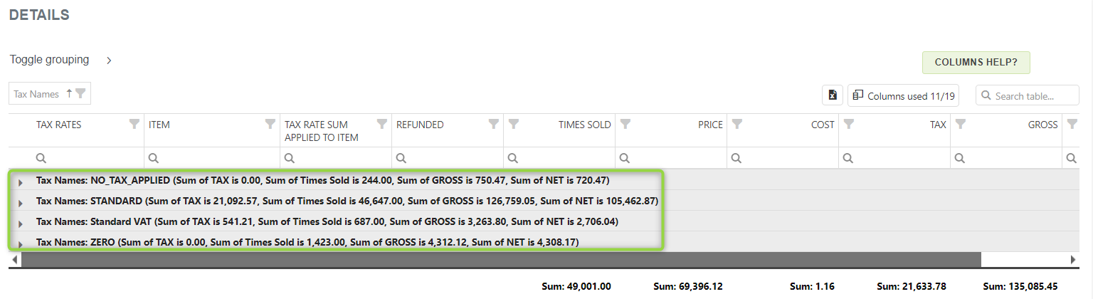
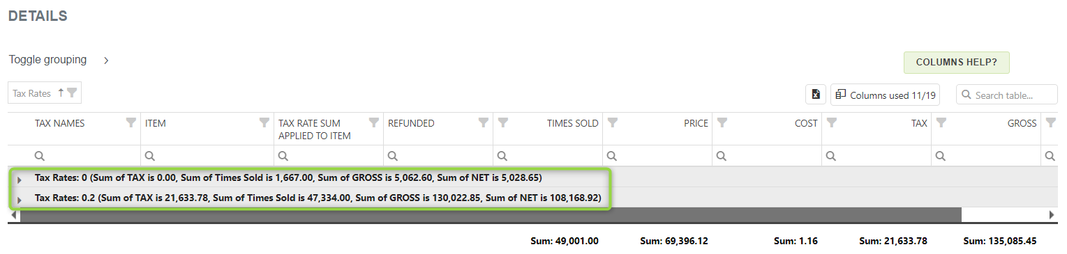
In the above pictures, the table in the first picture is grouped by column ‘Tax Names’, while in the second picture, we see grouping by “Tax Rates”. You can expand the ‘Tax Names’ column by pressing the little arrow. You can see a short summary of this tax rate in parentheses telling you what the sum of this tax rate is, how many items were sold that had that tax rate applied to them, and the sum of those items, Gross and NET.
In the above example, the No_tax_applied tax has a sum of TAX 0. This is normal, as items that have this tax applied to them are not taxable.
If you decide to expand tax name you would see additional information such as Item Names(all items sold with this tax rate applied, Tax rates applied to the item, Tax rate sum applied to the item, how many times this item was sold in this period you are analyzing, items price, cost, TAX.gross, and NET. There are also additional columns in the column chooser for you to use.
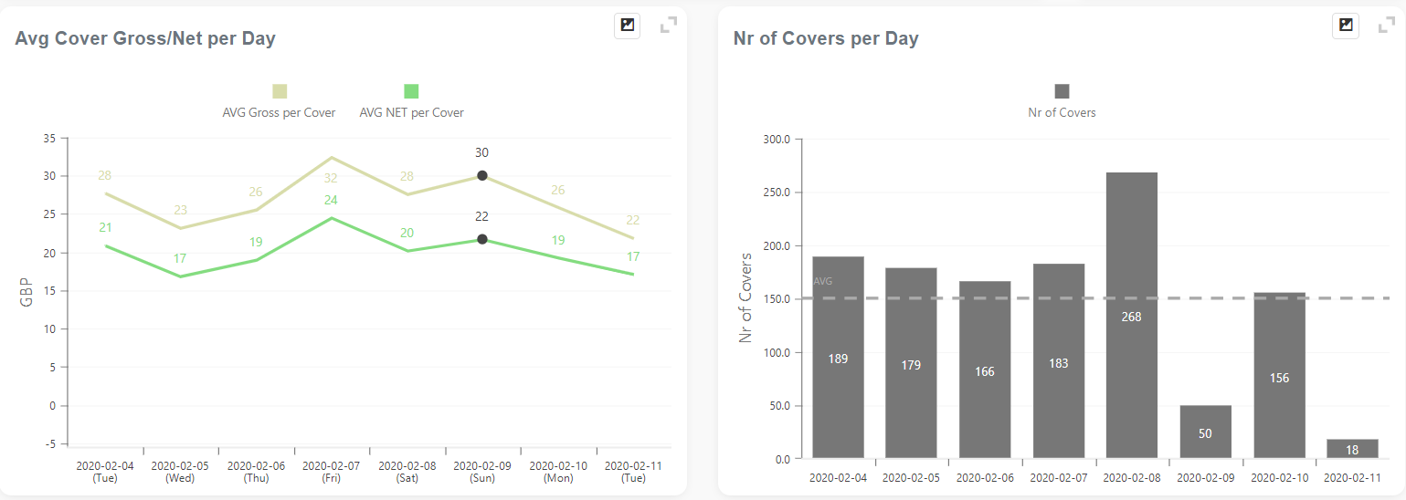
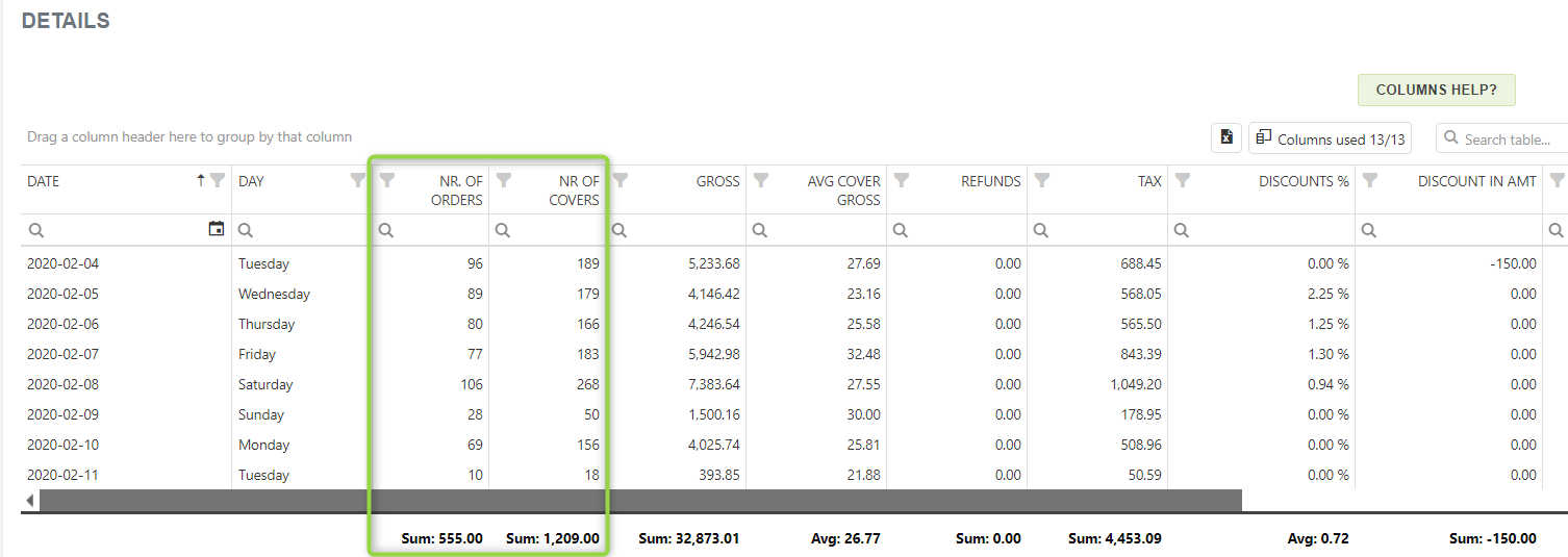
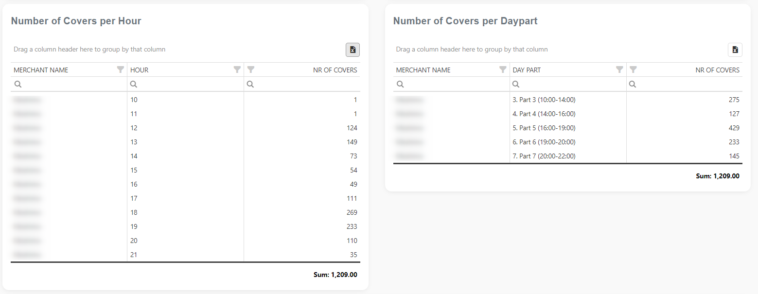
Cover Trends report
The Cover Trend report is a unique report developed with and mainly for restaurants. This report was created based on our customers’ needs and in cooperation with customers.
The report is part of the Items reports section. You can access it by searching in the “Report vault” or opening the Items report section. If you like to use this report often, mark it as a Favorite and you will have fast access to it. Afterward, marked reports can be found in the Favorites report selection or on the Welcome page, Favorite group.
- The report is based on orders
- Slower load of a Report (provides more details)
- Very detailed report
- Period selection:
- up to 90 days for the Advanced tier
- up to 3650 days (10 years) for the Professional tier
To track the number of customers per order, you should create an item in the Clover dashboard called ‘Number of Covers’.
So, for this report to function, there are some prerequisites:
- An item with the name ‘Number of Covers‘.
- Set that item price value to be 0 (zero) (or create it as a non-revenue item)
- Every time you create an order, add the “Number of Covers” item (that equals your customer/meal number)
You can read more about Cover as a term in the restaurant industry, as well as how to use that information in projection,s on the following link:
https://yourbusiness.azcentral.com/cover-restaurant-6923.html
Orders with Items Details
The Orders with Item Details Report is part of the Items reports section. You can access it either by searching in the “Report vault” or by opening the Items report section. If you like to use this report often, mark it as a Favorite and you will have fast access to it. Afterward, marked reports can be found in the Favorites report selection or on the Welcome page, Favorite group.
- Reports are based on Items
- Slower load of a Report (provides more details)
- Very detailed reports
- Period selection:
- Up to 62 days for the Basic tier; up to 124 days for the Advanced tier, and up to 3650 days (10 years) for the Professional tier
Stock Value
Have you ever wondered how much all your stock inventory is worth? Or how much different categories on the stock are worth? Or how much your stock is worth after you deduct your item’s cost value? In our simple, yet powerful dashboard, we present you all that. With our quick summary, two charts, and a detailed table, you will have complete reporting control over your inventory for all your locations (Merchants).
The report is part of a Items reports section. You can access it either by searching in “Report vault” or you can access it by opening the Items report section. If you like to use this report often, mark it as Favorite and you will have fast access to it. Afterward, marked reports, you can find in Favorites report selection or on the Welcome page, Favorite group.
CHART – Top 20 items by stock quantity in all categories
This chart shows which items you have in the largest amounts, no matter the category they are in.
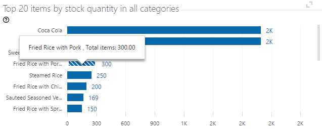
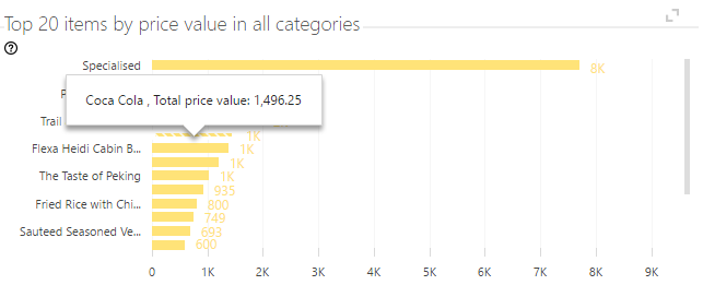
CHART – Top 20 items by price value in all categories
In this chart, we present items that hold the biggest value in your inventory.
The main table shows all your inventory, their price, cost, stock count, price and cost value, and your gain after deducting the cost from the price. Inventory can be grouped by the merchant, category, stock count, and any other column of your choosing. This way, it is easy to see, for example, which item category will bring you the most profit, or which merchant has the lowest amounts of certain items on stock.
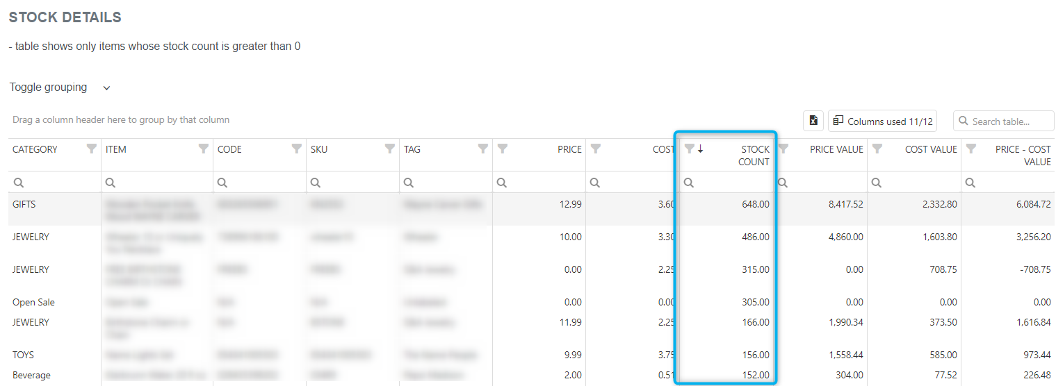
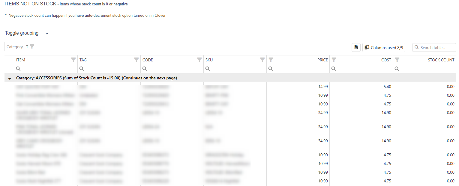
Besides the table with a list of items in the stock, there is a table with all items with 0 or the negative stock count.
Inventory Report
The Inventory report is part of a Items reports section. You can access it either by searching in “Report vault” or you can access it by opening the Items report section. If you like to use this report often, mark it as Favorite and you will have fast access to it. Afterward, marked reports, you can find in Favorites report selection or on the Welcome page, Favorite group.
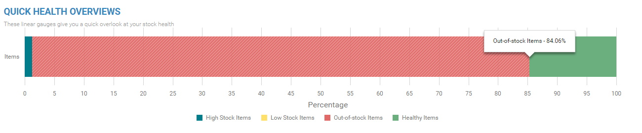
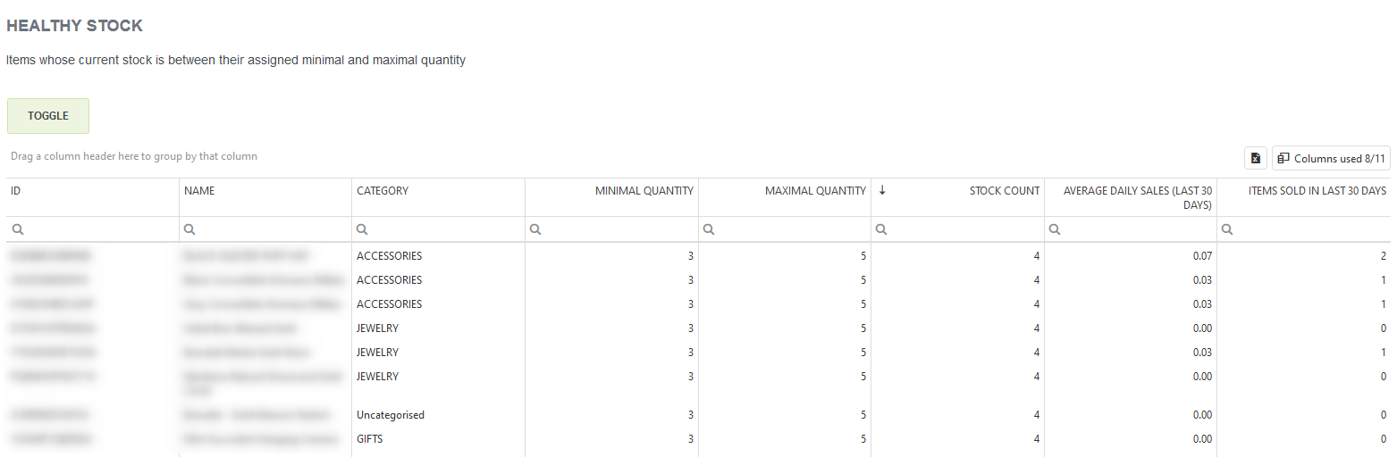
In the details section there are 4 tables where you can see:
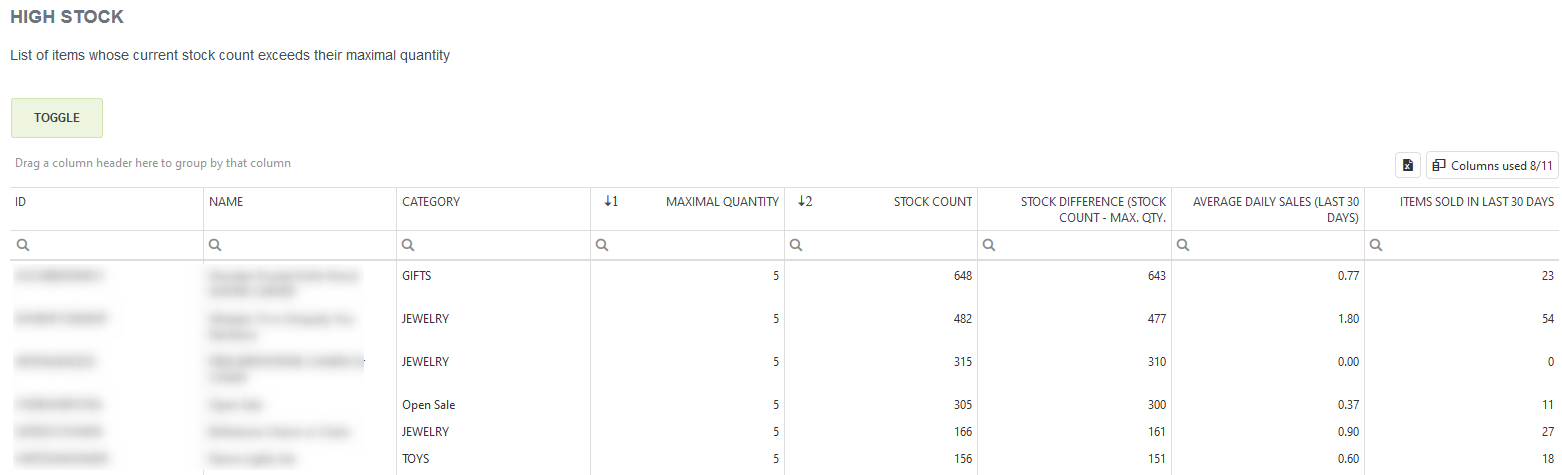
- High stock
- Heathy stock
- Low stock
- Out-of-stock items
High Stock Inventory
The high stock table is showing you all items on the stock which have a higher amount than the maximal quantity you had set up. In this example, you can see that we have set up a maximal desired quantity for these items to 10. But currently, we have more than that.
Healthy Stock Inventory
Low Stock Inventory
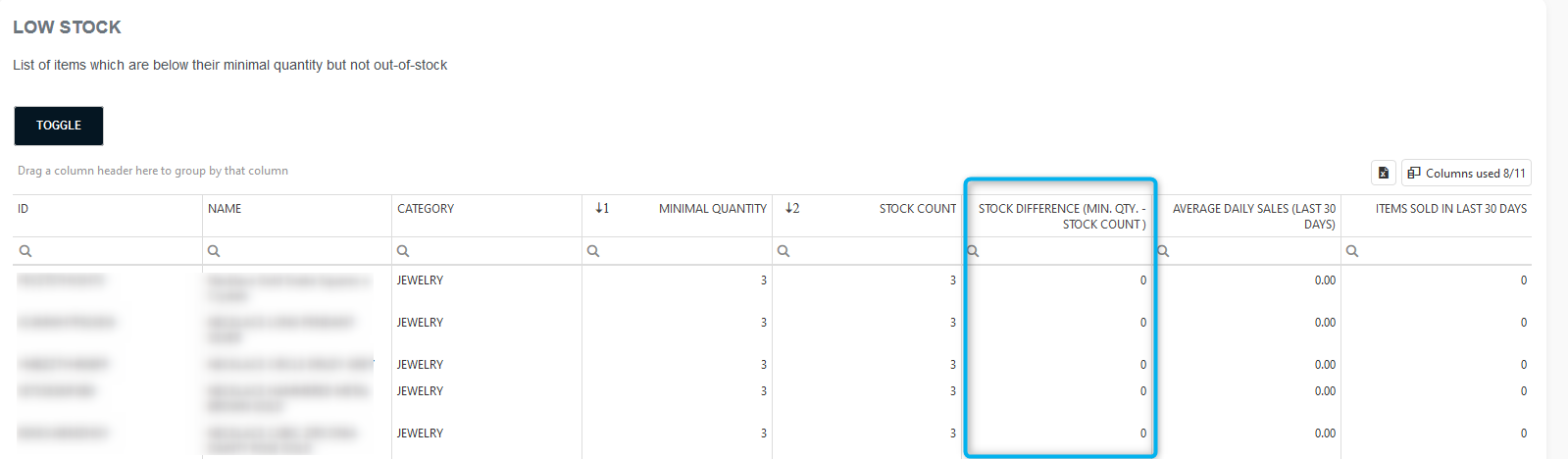
The next table you will see is the Low Stock table. That table will show you all items whose current stock is below the minimal quantity you have set up but are not out of stock. This table is a warning for merchants to see which items are running low on stock so they can re-order promptly.
Out-of-Stock Inventory
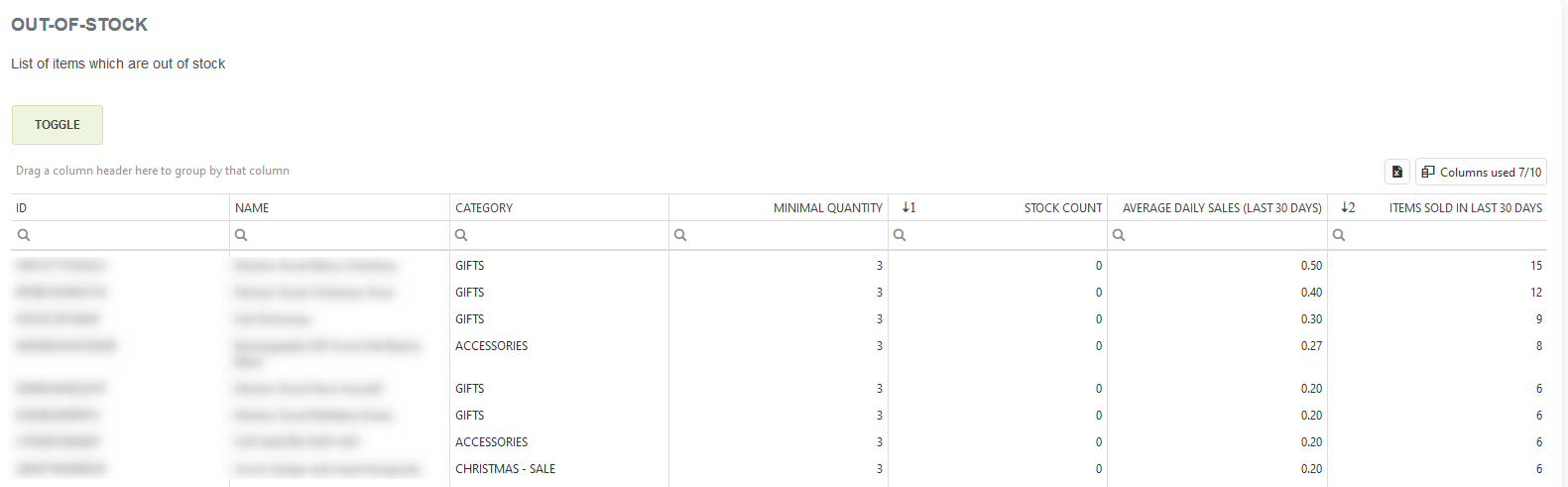
After the low stock table, you will see the Out of Stock table, we think there is no explanation needed for this table, the title says it all. In this example, we can see that there are items with no stock, but since those items were sold in the last 3o days, it is probably important to order some.
Inventory Report – Generate restock quantities/Purchase orders
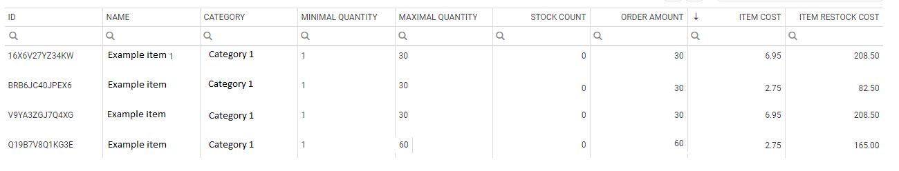
And at the bottom of the page is a new table/option called ‘PURCHASE ORDERS‘ which is a very cool feature. By pressing on the ‘Generate restock quantities’ button, a pop up will show:
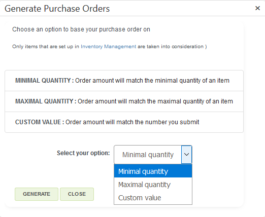
After clicking on ‘generate purchase order’. Selecting the minimal quantity as the option, we’ll show you that item on the table with the order quantity of 6.
An example of a generated order table set to match maximal quantity:
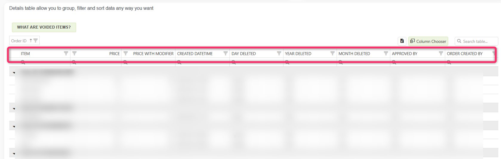
Voided Items Report
The Voided Items or Deleted Items from Orders report provides detailed information about items removed or voided from orders within a specified period. This report helps track the reasons for item removal, pricing modifiers and quantities, and the individuals involved.
In the detailed table, you will find each order plus items that have been voided.
PERFORMANCE REPORTS
In the Performance reports sections, you will find all reports that give you detailed information about performances. Here you will find reports like Master Summary report, Revenue by Hour, Dwell time, or Profit overview report.
Depending on your tier, you will have access to all or only some reports.
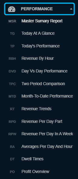
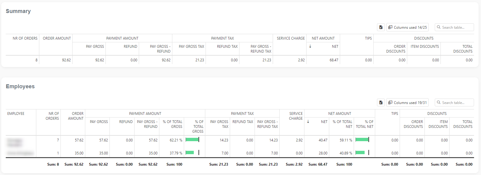
Master Summary Report
The Master Summary report summarizes all the essential aspects of your business in one place. Since each business has different aspects that are crucial for decision-making, you can choose which aspects to monitor in this report. Just select what you need from our predefined tables, and your master report is ready!
This report is part of the Advanced & Professional tier. Report facts:
- The report is based on orders
- Slower load of a Report (provides more details)
- Very detailed report
- Period selection:
- up to 90 days for the Advanced tier
- up to 3650 days (10 years) for the Professional tier
All relevant information is in one place, so you can print this report on paper or save the whole report in PDF form. All of this is now available with just a few clicks.
This report is part of the Performance Reports section. You can access it by searching in the “Report vault” or opening the Items report section. If you like to use this report often, mark it as a Favorite and you will have fast access to it. Afterward, marked reports can be found in the Favorites report selection or on the Welcome page, Favorite group.
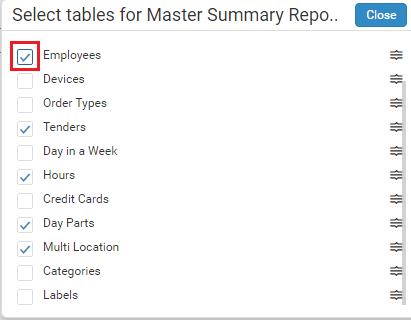
When you first open the Master Summary report, it will show you the following tables:
- Summary,
- Employees,
- Tenders,
- Hours,
- Day Parts
- and Multi-Location.
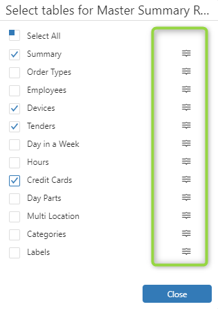
Many tables can be found in the Master Summary report but are not visible the first time you open this report, including:
- Devices,
- Order Types,
- Day in a Week,
- Credit Cards,
- Categories and Labels.
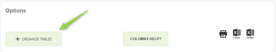
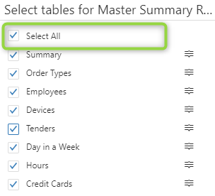
SELECTION OF TABLES FOR MASTER SUMMARY REPORT
To see the full list of summary tables and to select/deselect them, press on the ‘Arrange tables in Master Summary Report’ button:
To select which tables you wish to see in the Master Summary Report, simply click on the checkbox next to the desired table or click on the table’s name:
In my example, I will choose only the Summary and Tenders tables. This is how my Master Summary report looks like after selecting these tables:
If you wish to select all tables (or deselect) you can press the ‘Select All’ button ( press again to deselect all):
REARRANGING THE ORDER OF TABLES
Except for the option to choose the desired tables, you can also select the order of tables that will appear on the Master Summary report. This option is available once you press the ‘Arrange tables in Master Summary Report’. To rearrange the order of tables, click and drag on the icon on the right of the table name:
Once you click on the Rearrange icon of the selected table, drag and drop this table anywhere in the list. In my example, I will drag Tenders to the first place in the list:
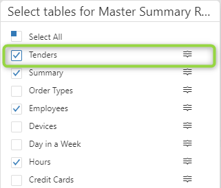
Immediately, I will see that the Tenders table got to the top of my Master Summary report:
SOME OTHER OPTIONS
- Each table can be exported to Excel by pressing on the ‘Export all data’ icon:
- Except for the columns that you currently see in tables, you can also choose other columns by pressing on the Column Chooser icon:
To see all the options tables in Analytics offer, check out our Tips & Tricks section for tables.
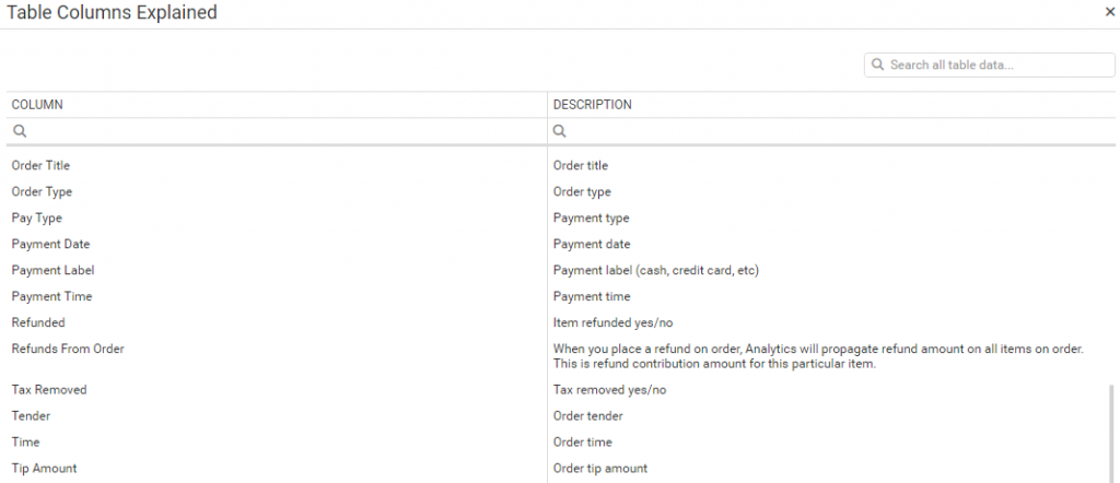
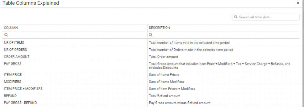
3. If you have trouble understanding what each column in the tables means, click the Column Help button. By pressing on that button, you will get the list of all columns in tables with descriptions.
PRINTING MASTER SUMMARY REPORT
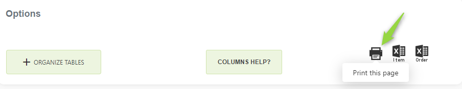
If you wish to print this report, you can do so by selecting the print icon that you will find under the Options box. From there, you can either print this report on paper or save it in PDF format.
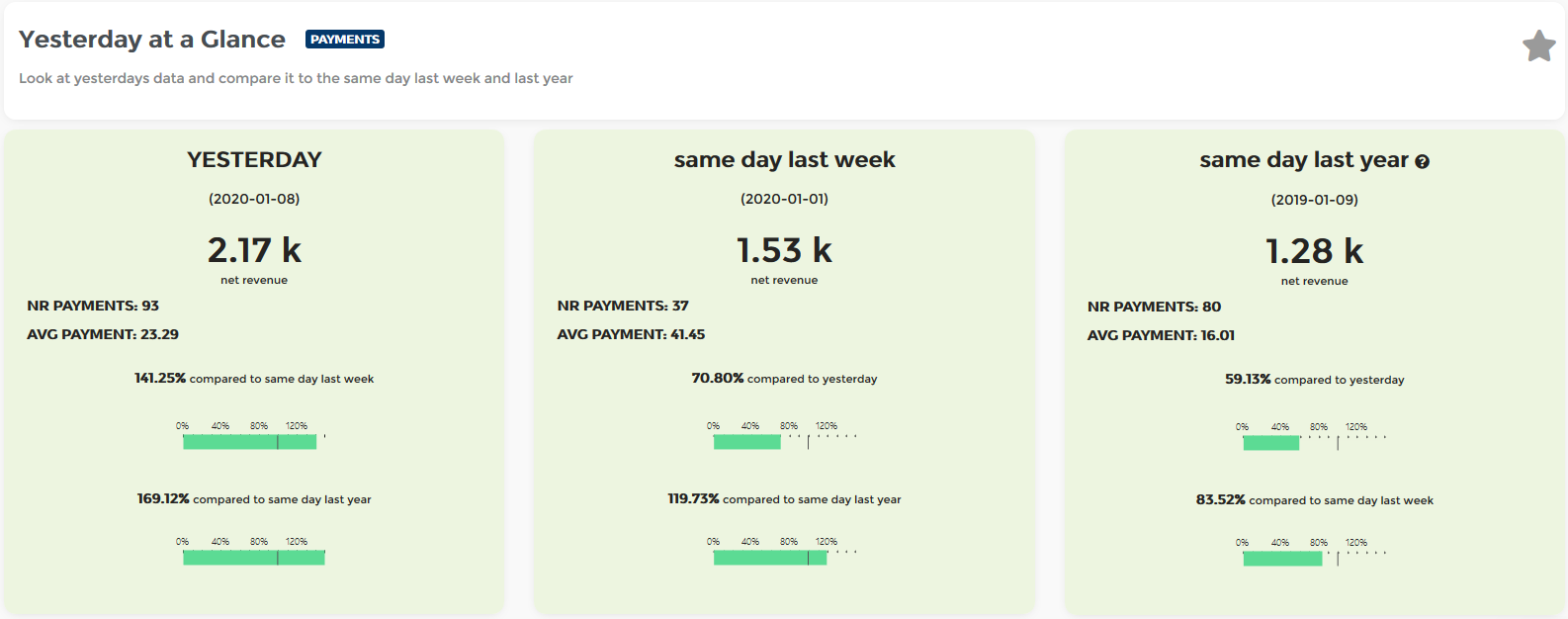
Today / Yesterday At a Glance
Today / Yesterday At a Glance report is part of a Performance reports section. You can access it either by searching in “Report vault” or you can access it by opening the Items report section. If you like to use this report often, mark it as Favorite and you will have fast access to it. Afterward, marked reports, you can find in Favorites report selection or on the Welcome page, Favorite group. This report is part of all Analytics reports, Lite, Basic, Advanced & Professional tier.
Report Facts:
- Reports are based on payments
- Very Fast Reports
- Period selection not available – It is always comparing today’s / yesterday’s day vs last week vs the same day last year
- Fewer details
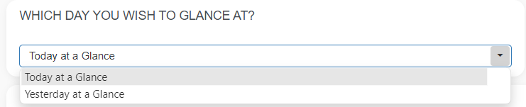
Report Today / Yesterday At a Glance shows revenue for a selected day with several different and important information. Now you have the possibility to choose today’s or yesterday’s data. For getting data, on the top of the page, please select which day you wish to glance at:
Once you load the report you will see a column that shows today’s / yesterday’s revenue from the start of the business day hour until the time of running the report. Additional information shows you the Number of Payments and Average payment amount followed by a percentage/bar chart showing you how much of NET revenue you have earned compared to the same day last week as well as compared to the same day last year.
The second column is showing you data from the same day last week, which means that we are taking the same day 7 days ago and we are comparing it with today’s / yesterday’s revenue and with the revenue from the same day last year.
And the last column will compare the same day from the last year with today’s / yesterday’s revenue and with the revenue from the same day last week.
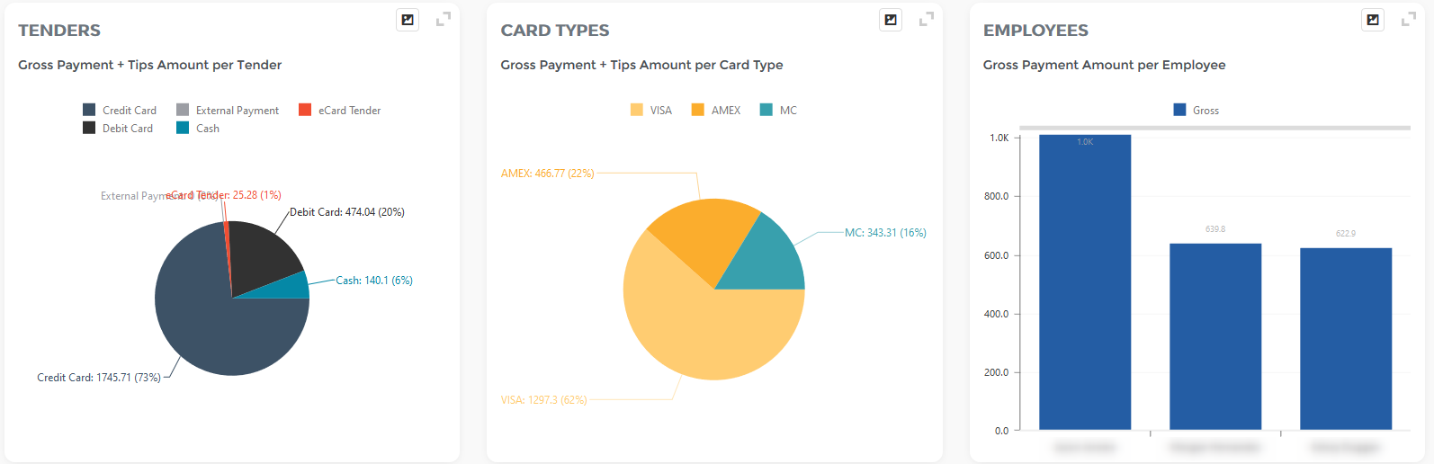
As you can see in the picture below, you will have 3 pie charts showing you Tender types, Card types usage, and top Employees for today.
And that’s not all!
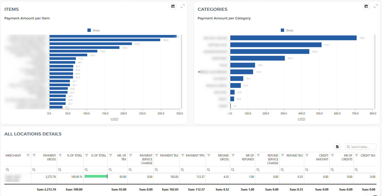
You can see the Payment amount per item for today’s day as well as which category is making most of the revenue followed by a table which can be rearranged the way you like by simply dragging and dropping columns either to column chooser to remove columns that are not relevant to you or adding columns from column chooser and arranging the table for quick one-click export to excel.
If you are using our multilocation feature you will see all of your locations in this table with today’s payments/numbers of transactions, payment taxes, refunds, and more.
We hope you will find this report useful.
Happy Analyzing!
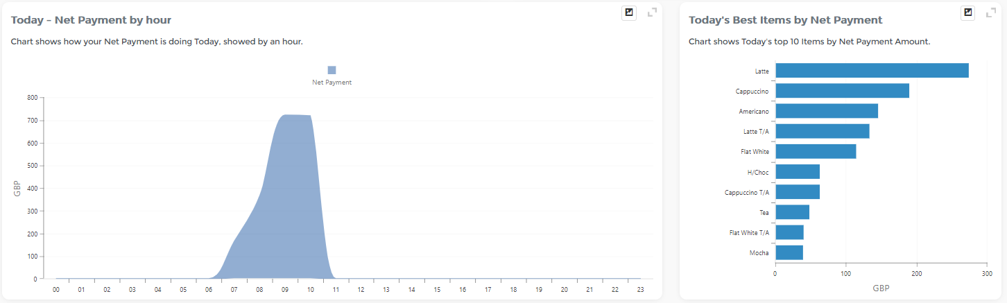
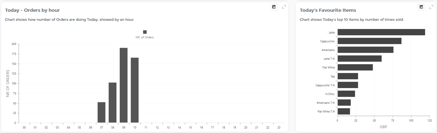
Today’s Performance
Today’s Performance analysis is part of a Performance section. You can access it either by searching in “Report vault” or you can access it by opening the Items report section. If you like to use this report often, mark it as Favorite and you will have fast access to it. Afterward, marked reports, you can find in Favorites report selection or on the Welcome page, Favorite group.
The dashboard shows a complete view of business performance Today vs the same day last week.
The second graph is there to visualize Today’s Orders by the hour, followed by today’s favorite items.
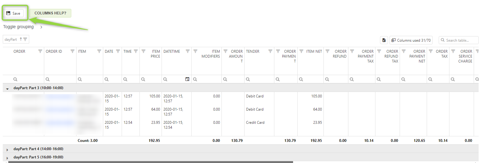
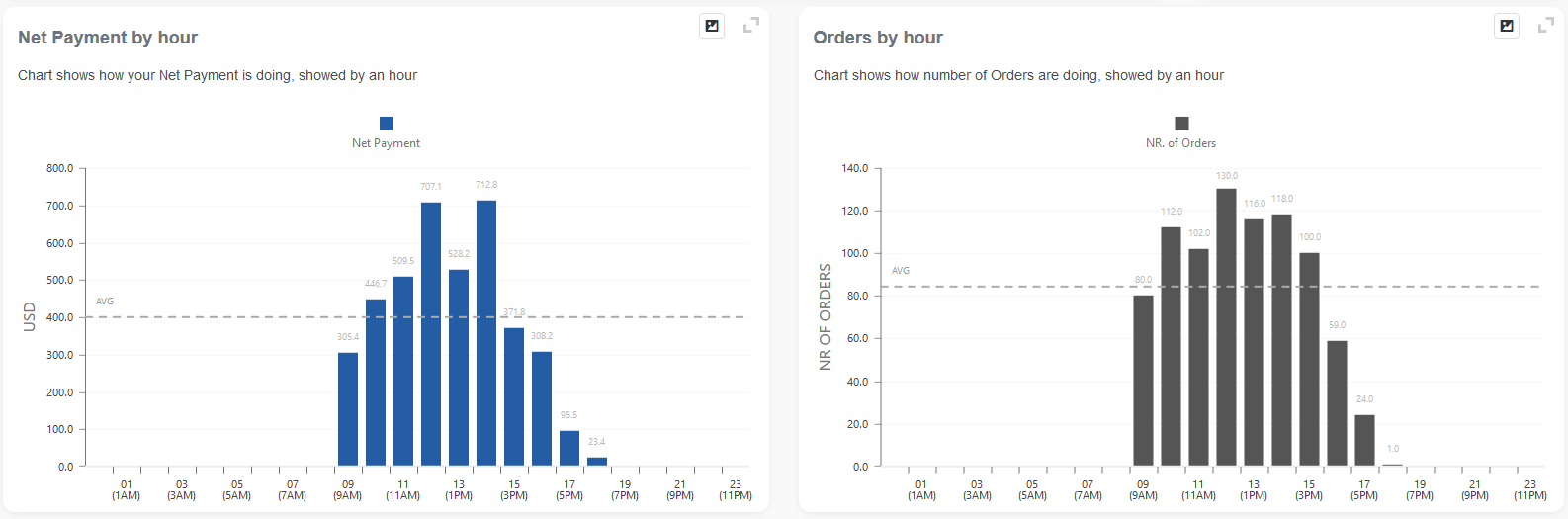
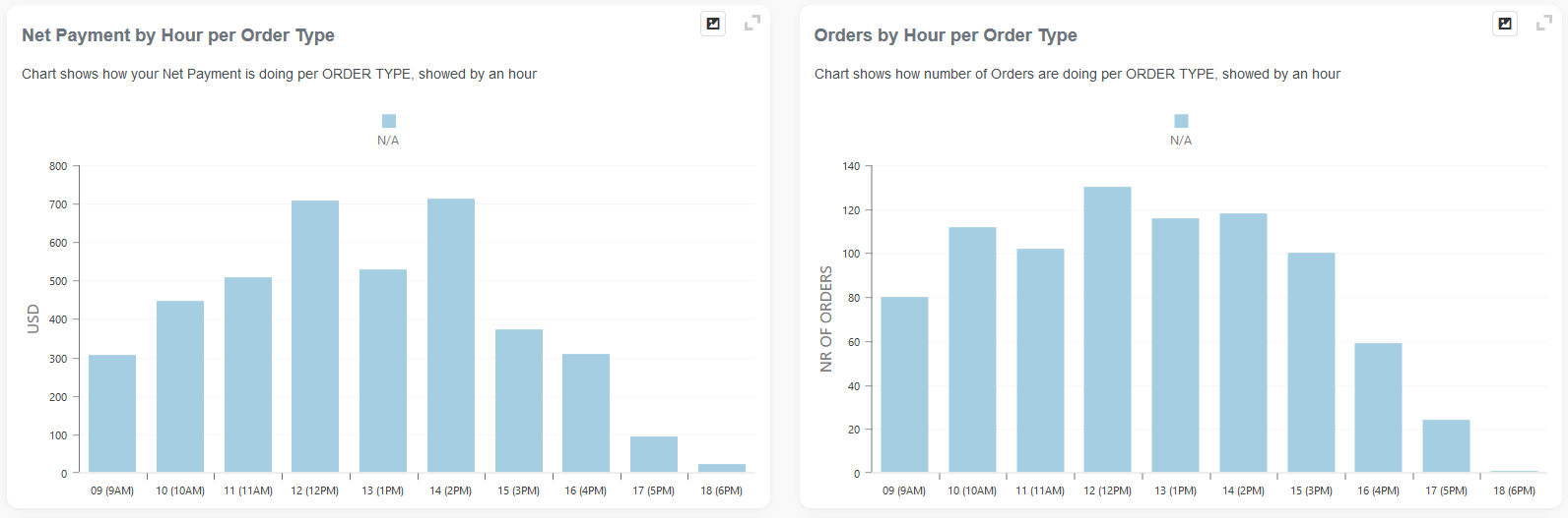
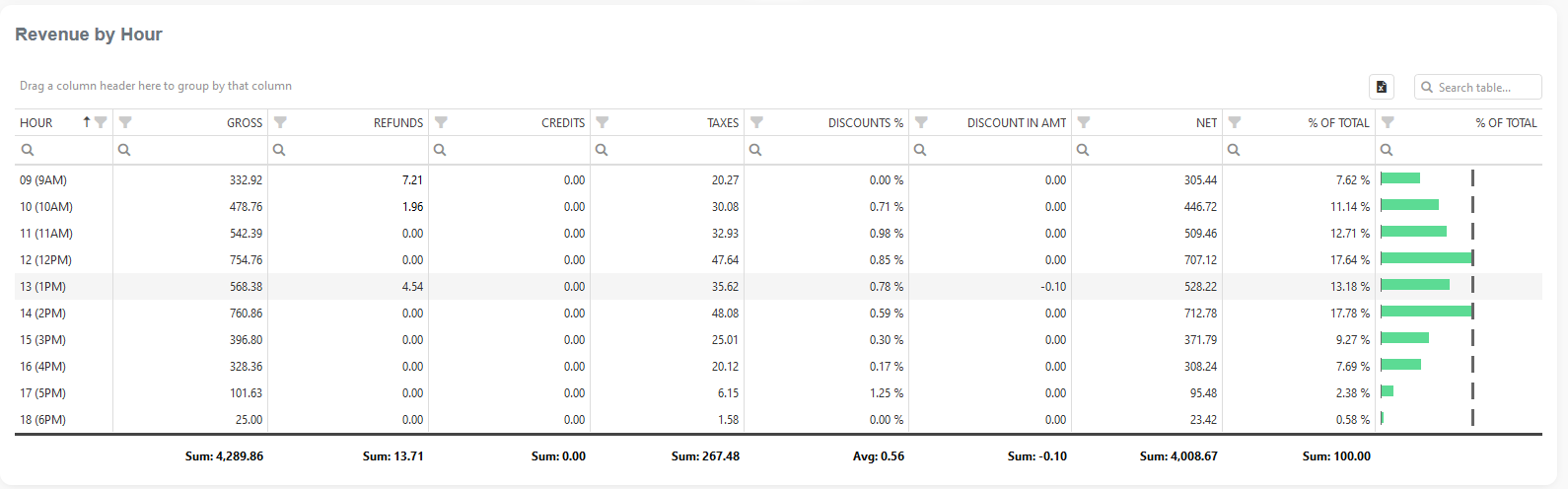
Revenue by Hour
Revenue by Hour analysis is part of the Performance section. You can access it by searching in the “Report vault” or opening the Items report section. If you like to use this report often, mark it as a Favorite and you will have fast access to it. Afterward, marked reports can be found in the Favorites report selection or on the Welcome page, Favorite group.
Report facts:
- The report is based on time and/or date periods
- Slower load of a Report (provides more details)
- Very detailed report
- Period selection:
- Up to 62 days for the Basic tier; 90 days for the Advanced tier, and up to 3650 days (10 years) for the Professional tier
Revenue by Hour Dashboard is excellent when you need answers to questions like
- What is my Revenue and the number of orders per Hour in a day for the custom date range?
- What do I sell and in what part of the day?
- Can I close my shop earlier (because I don’t do any significant revenue later in the day)?
- When can I expect the most orders in a Day, when is the peak?
- For every Hour, I want to see Revenue by Item Tag.
- For every hour, I want to see Revenue by Order Type
- What order type do people buy in, and what part of the day?
- …
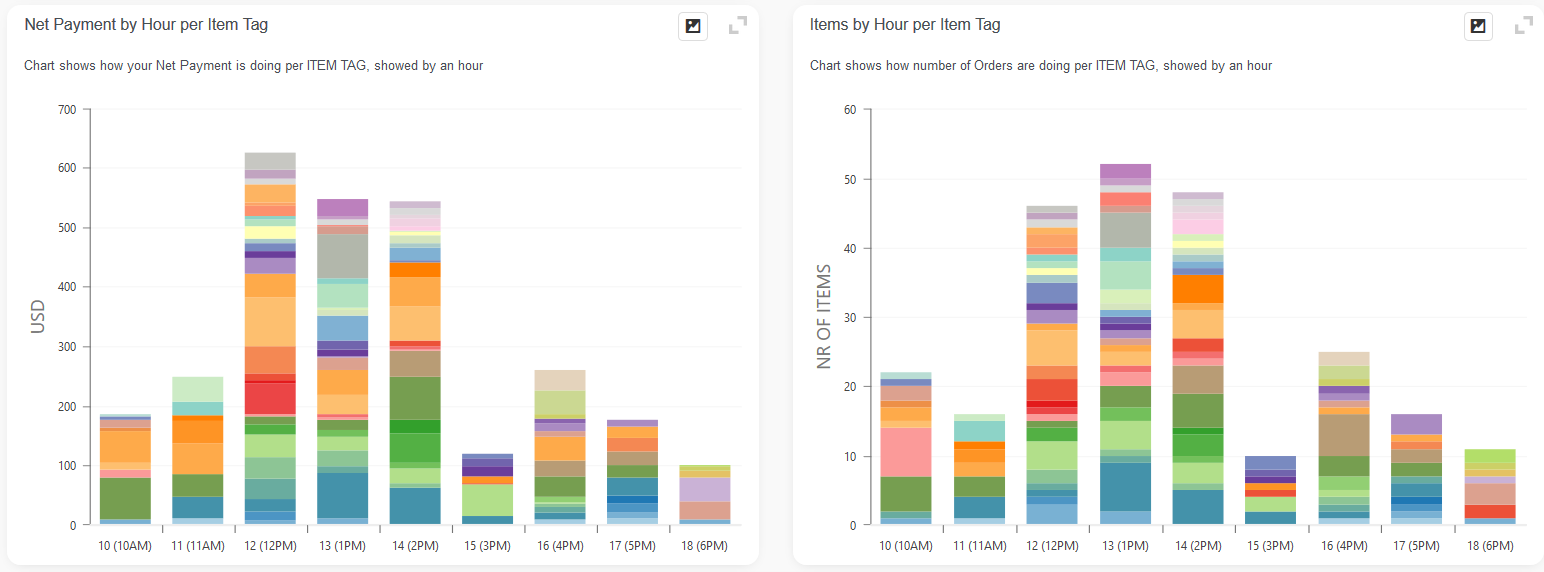
In the first part of the Dashboard, you can find a Summary for the selected period, with the graphical distribution of Net Payment and Number of orders by the hour, for the selected date period:
Following is Net payment and Nr of Orders by Hour, but sliced for every Order Type:
Below you will find Net payment and Nr of Orders by Hour, but sliced for every Item Tag:
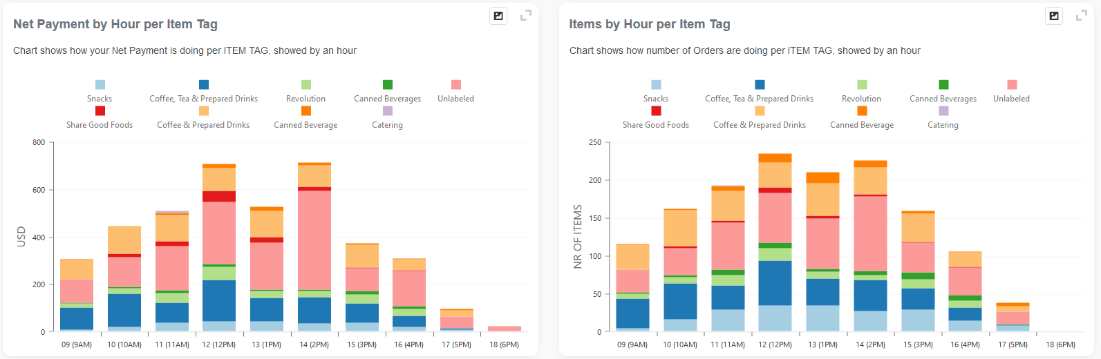
Finally, all the details by Hour are presented in the table:
As well, there is a table which shows you the Items sold in specific hours.
Day vs Day Performance
The Day vs Day Performance report is part of the Performance section. You can access it by searching in the “Report vault” or opening the Items report section. If you like to use this report often, mark it as a Favorite and you will have fast access to it. Afterward, marked reports can be found in the Favorites report selection or on the Welcome page, Favorite group.
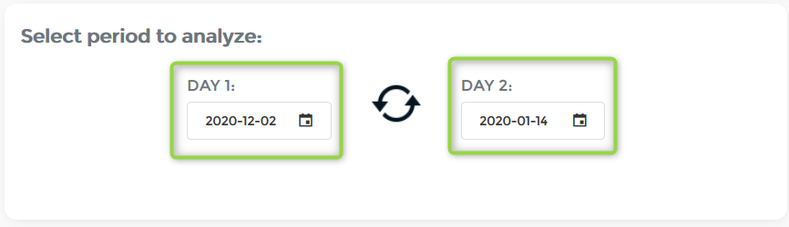
In Day vs. Day Performance, you can choose which two days you want to compare, while Today’s Performance automatically selects the current day and compares it to yesterday’s.
It has the same two graphs that were introduced in the previous section.
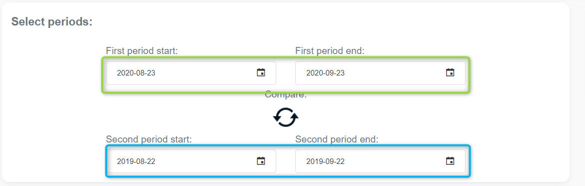
Two Periods Comparison Overview
Reports facts:
- Report is based on payments
- Very Fast Report
- Period selection up to 1 year
- Less details
Have you ever thought about comparing two different periods, for example, last week with the current week? Or last year’s month with the current month? Well, this is now available in our Two Period Comparison Overview report!
Our new Overview gives you two short summaries for selected periods, a table for period comparison per merchant, two charts and a table with period comparison per tender, and two charts with period comparison per employee. This combined gives you a complete overview of every basic segment of your business for selected periods.
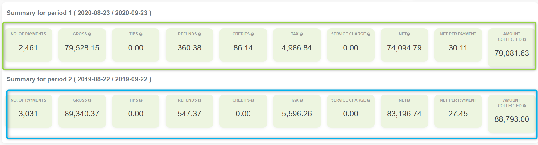
Short summary for periods
Gives a quick overview of both selected periods by showing a total number of payments, gross, tax, net, and more…
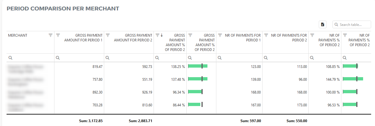
PERIOD COMPARISON PER MERCHANT
This table shows your gross payment and the number of transactions for all your merchant locations for the selected periods. It also shows the percentage of gross payments and the number of transactions of the first selected period in comparison with the second period.
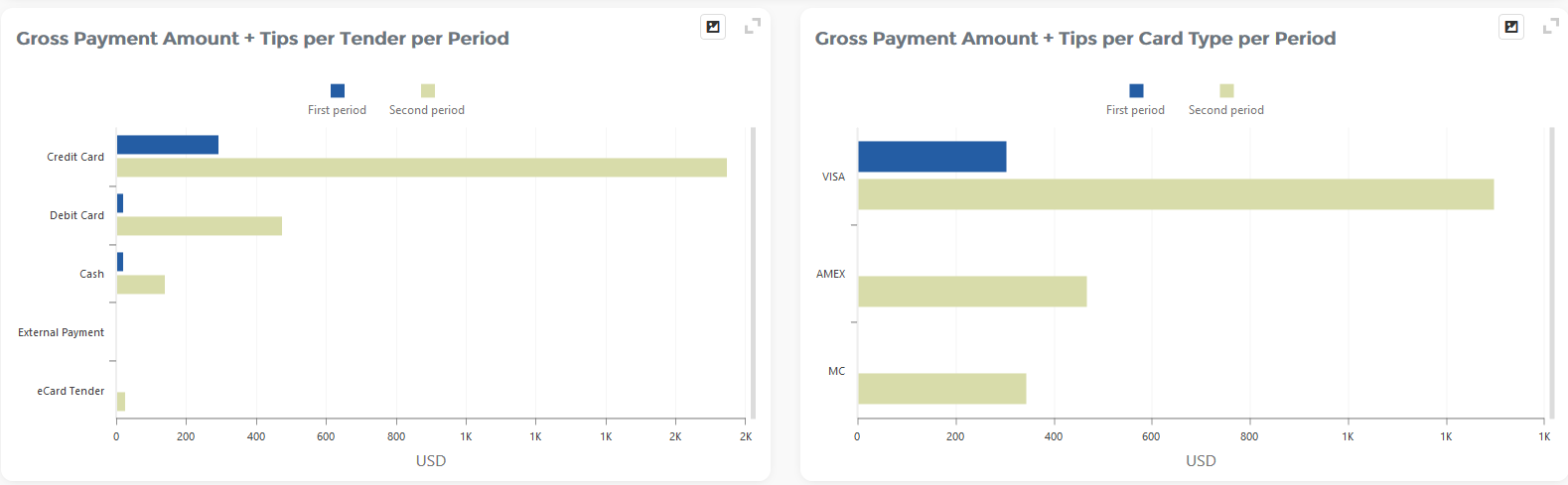
PERIOD COMPARISON PER TENDER
This comparison visually shows your gross payment amount per tender per period and per card type. Among the two mentioned charts, we have put two tables which list all your tenders and also give you a clear percentage of gross payments for the first period compared with the second period.
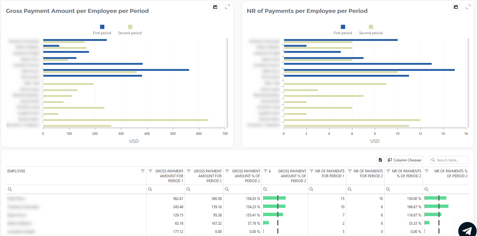
PERIOD COMPARISON PER EMPLOYEE
With our two charts, you will easily see how your employees were performing in different periods taking into account both the gross payment amount and the number of payments per period. Below the charts, we also put a table which lists all your employees and shows the gross payment amount they made in both periods, as well as the number of payments they had.
Month-to-Date Performance
First of all, what is Month-to-date (MTD)? If you are looking at the dashboard on 19-Sep, then Month-to-date means a period of 19 days from the beginning of September until the 19th of September. This dashboard will compare Revenue and Number of orders from the MTD period with the Last Month’s Period.
What is it good for? If you are looking at performance at the end of the month and you see that you already achieved values from the last month, you can consider this month as a successful one.
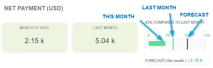
In the above picture, we can see that so far this month (2.15k) is on 43% of Net payment from the last Month (5.04k). Moreover, we can see that if we keep up at the same pace, we will earn 3.18k in Net payment by the end of this month (FORECAST, presented with the black dot ).
The same metrics you can see about the Number of orders, too.
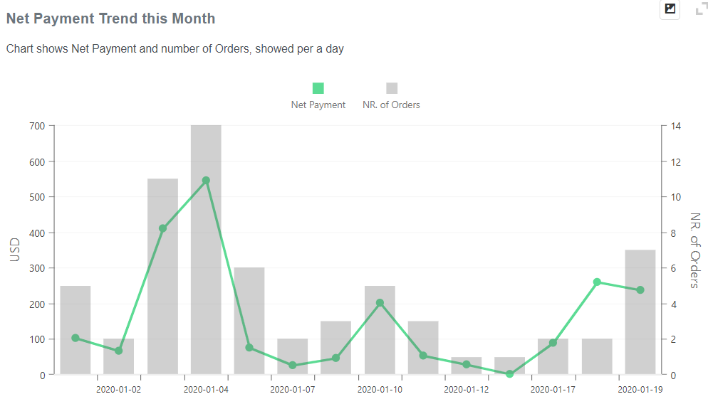
In the Revenue Trend section, you can track the trend of your income per day. See if you earn more on weekends if your revenue is constantly rising or maybe declining?
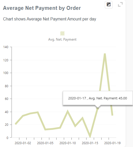
Number of Orders by hour distribution is great to see when is the peak of your selling activity for one day. You can see, for this month, how many orders do you have every hour. Maybe from this chart, you can decide to transfer an employee to help here for some hours, or you will decide that you can close earlier because revenue is not so big after 10 pm, for example.
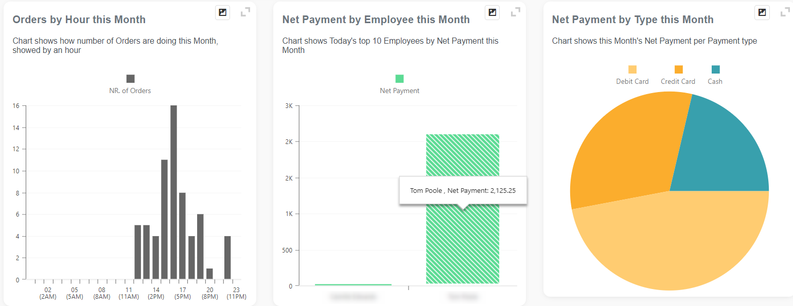
… or how much you earn per payment method. By Cash, Credit Card, or something else?
Revenue Trends
- The report is based on time and/or date periods
- Slower load of a Report (provides more details)
- Very detailed report
- Period selection:
- Up to 62 days for the Basic tier; 90 days for the Advanced tier, and up to 3650 days (10 years) for the Professional tier
Revenue Trends is a report showing trends and dates from orders created during selected periods.
We offer you three charts to visualize Net payments of orders by date, Number of orders per Date, as well as Avg Net pay per Date:
Summary:
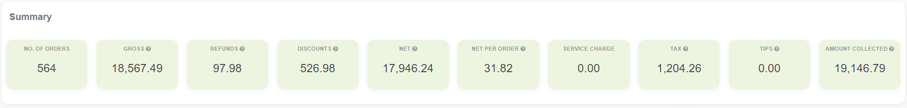
Charts and detailed table :
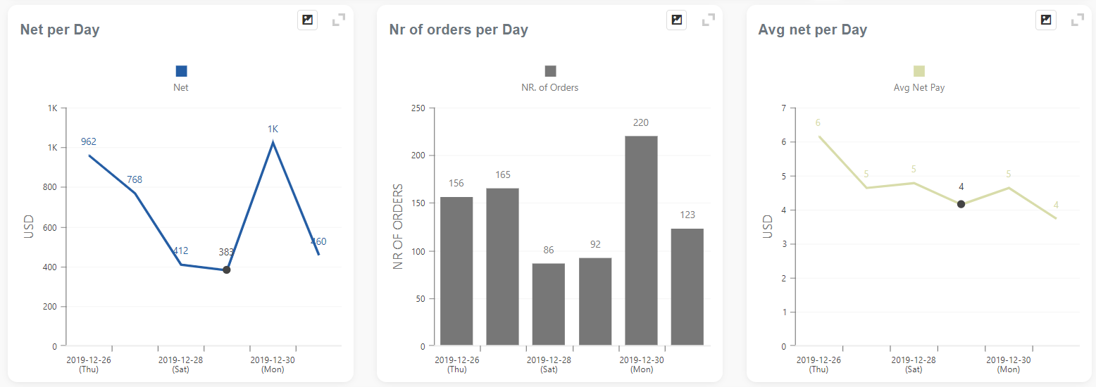
A detailed table with the possibility to export to Excel and easy rearranging to suit your needs by simply dragging and dropping column headers where you want:
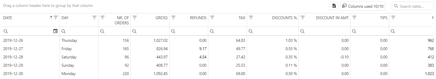
Revenue per Day Part
The Revenue per Day Part report is part of the Performance section. You can access it by searching in the “Report vault” or opening the Items report section. If you like to use this report often, mark it as a Favorite and you will have fast access to it. Afterward, marked reports can be found in Favorites report selection or on the Welcome page, Favorite group.
- The report is based on time and/or date periods
- Slower load of a Report (provides more details)
- Very detailed report
- Period selection:
- Up to 62 days for the Basic tier; 90 days for the Advanced tier, and up to 3650 days (10 years) for the Professional tier
The segmentation of the day into different “dayparts” is a must-have in the restaurant industry and service-oriented businesses. Day-part analysis is essential because it shows operators when the busiest time of the day is. This knowledge helps you determine which daypart you need more staff and which you need less, when to prepare things in advance, when to have all the necessary ingredients, when to organize promotions, or when to start a happy hour. This report aims to explore whether or not there are opportunities to optimize your business.
The daypart report will show data on how you have defined your dayparts. You can find more about how to define them here.
The report shows you the net number of orders and average net pay distributed on the days of your choosing.
There, you can find three charts: a chart showing the net per daypart, a chart showing the number of orders per daypart, and an average net pay per daypart. In addition to the charts, there is also a detailed table showing dayparts.
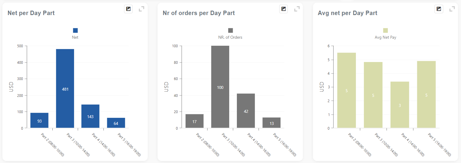
A table can be easily rearranged by dragging and dropping column headers. After you finish arranging the table to suit your needs, you can export it to Excel.
Example of table view with custom day part names:
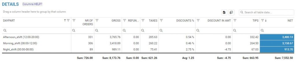
Revenue per Day in a Week
The Revenue per Day in a Week report is part of the Performance section. You can access it by searching in the “Report vault” or opening the Items report section. If you like to use this report often, mark it as a Favorite and you will have fast access to it. Afterward, marked reports can be found in Favorites report selection or on the Welcome page, Favorite group.
- The report is based on time and/or date periods
- Slower load of a Report (provides more details)
- Very detailed report
- Period selection:
- Up to 62 days for the Basic tier; 90 days for the Advanced tier, and up to 3650 days (10 years) for the Professional tier
The report shows business information for Orders created during the selected time period, with a focus on a single day in a week.
Just like the Revenue Trends Report, which is showing Profits per date, this report concentrates on days of the week so you can see the following information:
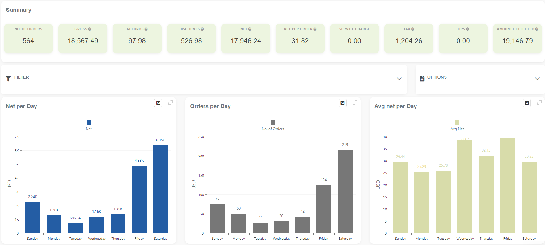
A detailed table with the possibility of export to Excel.
Average Sales per Day and Hour
This report is available in the Advanced & Professional tier.
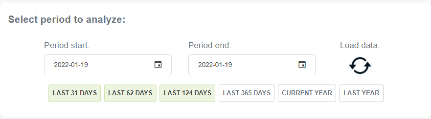
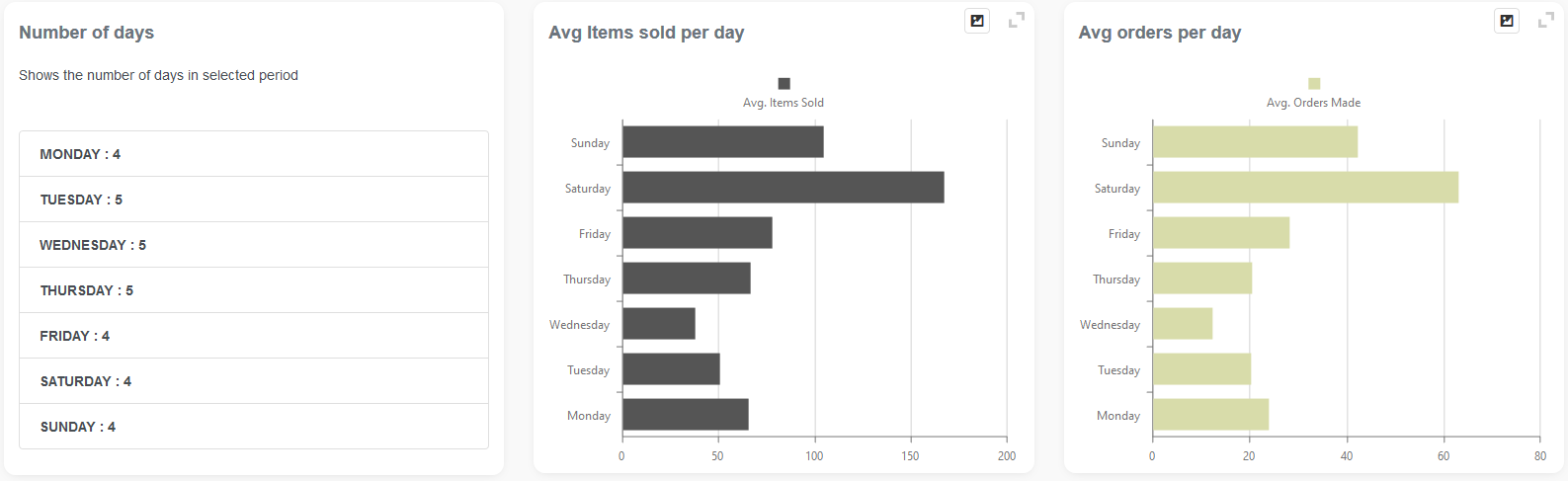
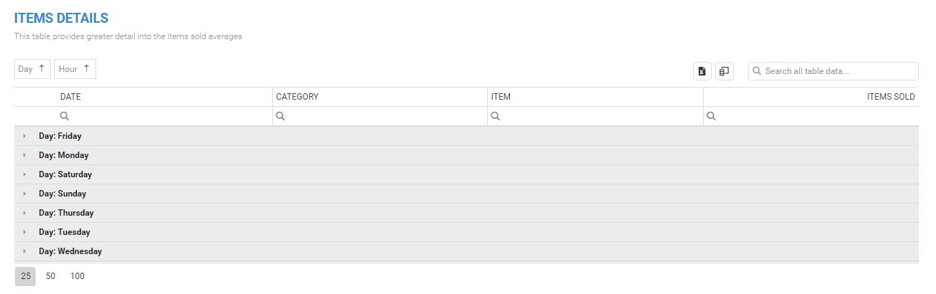
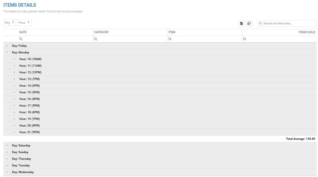
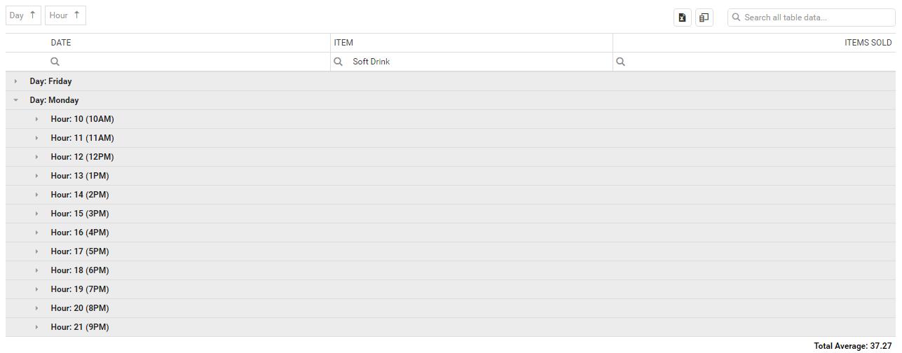
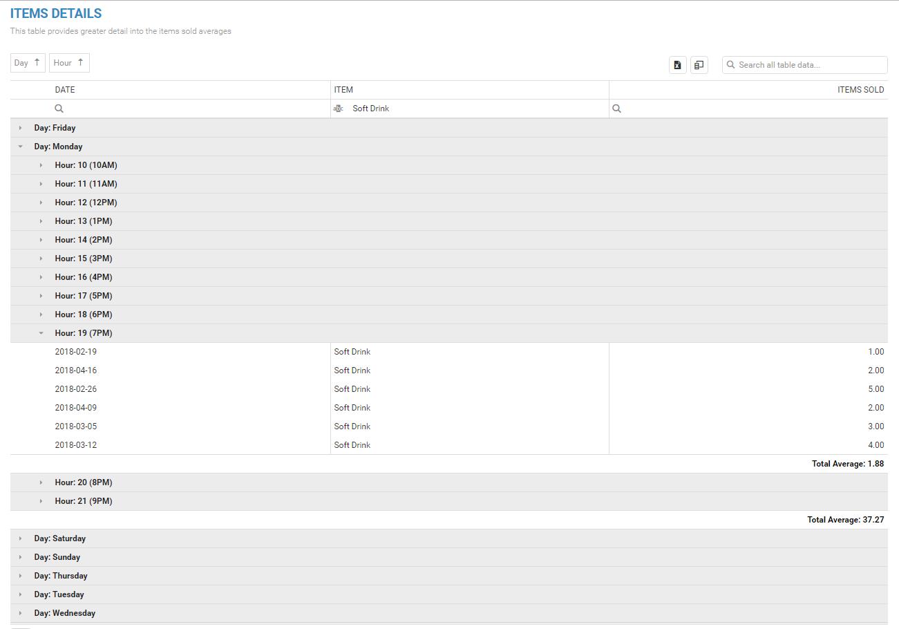
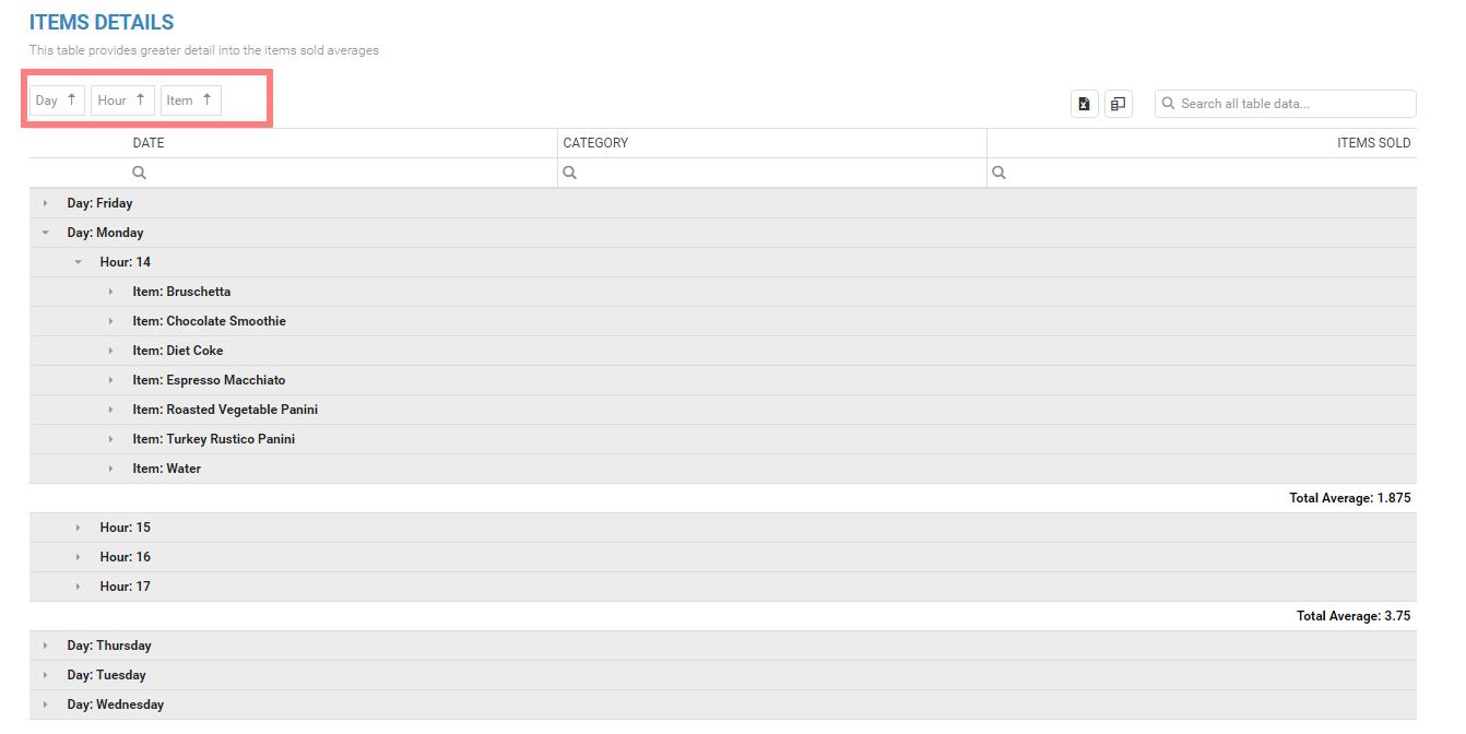
Dwell Times report
Many merchants, especially restaurants, wish to know how long customers spend in their restaurants. That’s why we developed the Dwell time report. Again, it is a special report prepared for restaurants and bats that want to know how much time their customers spend.
Report facts:
- The report is based on orders
- Slower load of a Report (provides more details)
- Very detailed report
- Period selection:
- up to 90 days for the Advanced tier
- up to 3650 days (10 years) for the Professional tier
The time customers spend in a store is called ‘dwell time,’ and it’s a key performance indicator (KPI) for any brick-and-mortar business. Dwell time is related to several essential metrics like customer satisfaction, shopping experience, and even sales. Measuring dwell time can give important insight into your restaurant’s performance and reveal potential areas for improvement and growth. However, the most significant measurement restaurant owners should be aware of is the impact of dwell time on sales volume.
Longer dwell time at your store reflects higher customer satisfaction. There are dozens of factors that may contribute to satisfaction at a restaurant, but it’s easiest to identify areas that might drive customers away faster. The more extended customers spend in a location, the greater the chance of impulse purchases. But beware of measuring dwell time blindly. The longer time spent in your restaurant due to slow service will harm sales and customer satisfaction.
Much more information on dwell time, you can find in tutorials right under the report name.
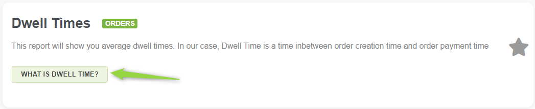
Dwell Times report shows the time between order creation and payment. You can analyze any period in the past, with a maximum of 124 days selected (or unlimited if you are a Pro tier user). Choose the period you want to analyze and click on the “load data” icon.
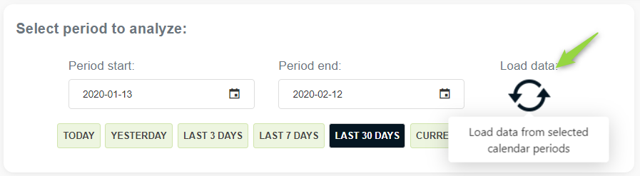
Like in most Analytics reports, here you will see the Summary section. Besides the usual order information in the summary section, here you will find the average dwell time. Average dwell time is taken only from orders created and paid on the same day.
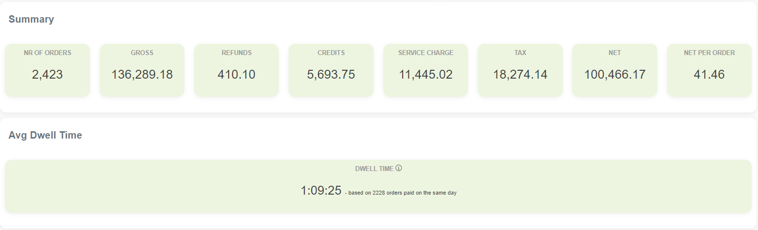
After a summary for the analyzed period, you will be able to see a table that shows a daily number of orders with each day’s average dwell time and other order information:
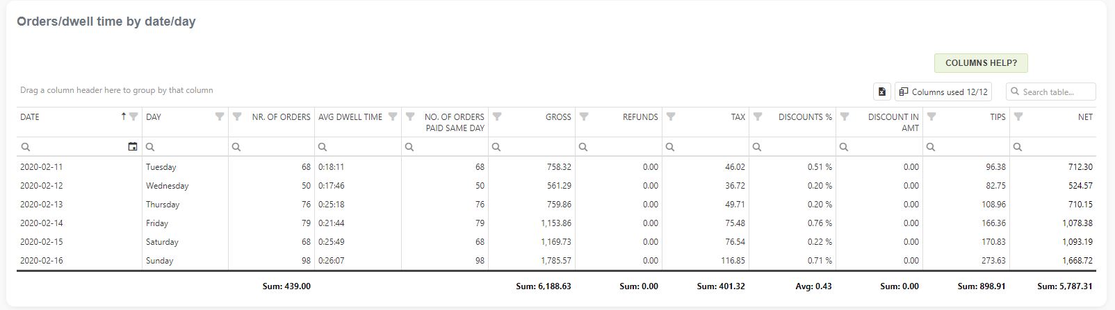
Besides the summary, this report offers a section with charts for visualization and a table with detailed information. The charts show the average dwell time per day, hour, and daypart. The Dwell timetable lists all orders with information like order creation date and time, plus payment date and time.
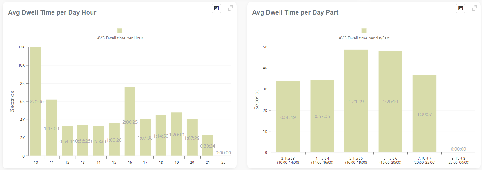
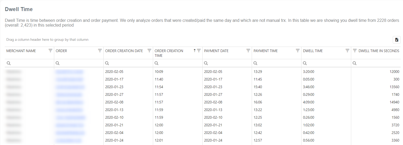
We hope you will find this report useful, especially if you want to know how much time your customers spend at your store. If you have any questions about it, please post them. We will gladly support you.
Happy analyzing
Profit Overview
- Reports are based on Orders
- Slower load of a Report (provides more details)
- Very detailed reports
- Period selection:
- Up to 62 days for the Basic tier; up to 90 days for the Advanced tier, and up to 3650 days (10 years) for the Professional tier
Select the custom date filter range on the period start/end fields, press Refresh to get the data, or click on one of our predefined date range filters.
Your profit is calculated as PROFIT = TOTAL PAYMENT – TAXES – COSTS.
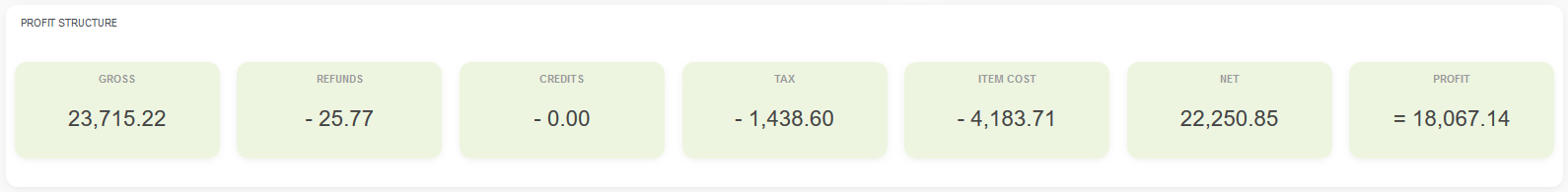
We will extract the Cost part from your Clover Items data. If you do not have costs for your Clover Items, the profit will be the net payment minus taxes.
The Profit Trends chart is a great way to see the most profitable days. The green area represents Profit; the more significant the green area, the bigger the profit.
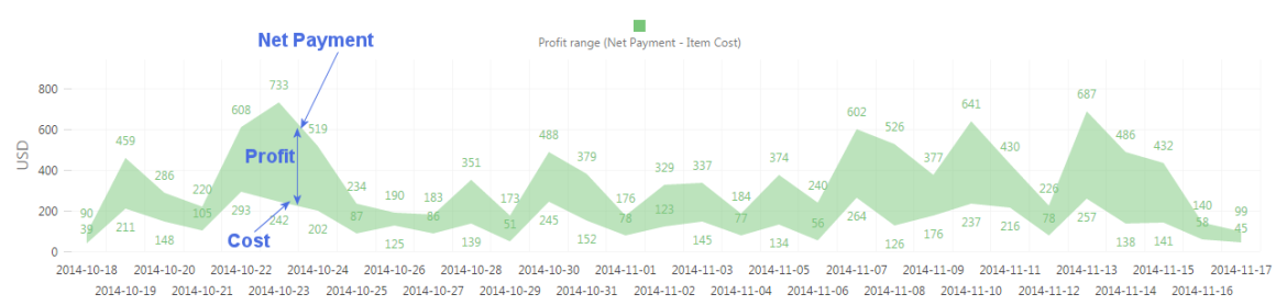
On the last chart, you can read what the Profit was in absolute amount, by Date:
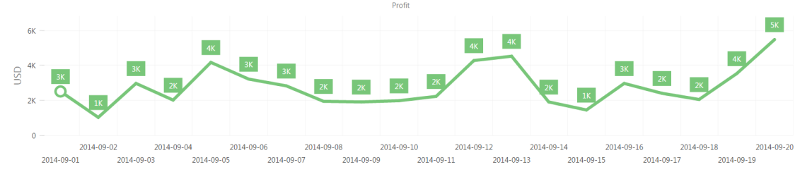
AI POWERED REPORTS
Reports based on the Artificial intelligence (AI) and Machine Learning (ML) models are part of the Profession tier.
What is Machine Learning? What is it all about? We can say that Machine learning (ML) uses computer algorithms that can improve data analysis and experience. It is seen as a part of artificial intelligence. To make predictions or decisions without being programmed, Machine learning algorithms build a model based on sample data. Shorty, Machine Learning systems have the ability to learn and improve from experience without being explicitly programmed automatically.
Today, machine learning algorithms are used in a wide variety of applications, such as medicine, speech recognition, or computer vision.
Let’s explore reports that you can find in the Professional tier and how they could be used.
RFM Customer Segmentation
Wouldn’t it be great to identify groups of customers? That way, you can tailor your marketing strategy to target each group with personalized offers, increase profit, improve unit economics, etc. In that case, the RFM Segments report is what you need
RFM analysis quantifies customers based on three key factors:
- Recency – how long it’s been since a customer bought something from you or visited your website
- Frequency – how often a customer buys from you or how often he visits your website
- Monetary – the average spend of a customer per visit or the overall transaction value in a given period of time
RFM Customer Segmentation analysis is part of AI-Powered reports that is available for Professional tier users.
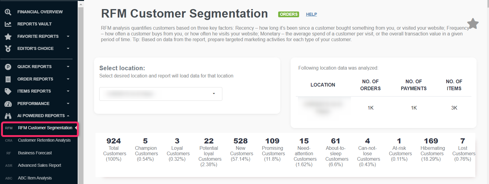
What Are the Benefits of an RFM Analysis?
Firstly and most importantly, RFM Analysis done by machine learning algorithms saves you enormous time. Besides that, it calculates something manually you wouldn’t be able to. When you have this data, you can use it for many purposes, like:
- Identify specific groups of customers
- Target them for marketing activities
- Promote repeat purchases and loyalty
- Acquire new customers
Even more than that, an RFM score:
- Helps you focus on and improve customer retention and customer lifetime value.
- Helps you lower customer acquisition costs
- Teaches you which of your customers are the most worth retaining and which you shouldn’t spend too much time and budget on keeping.
- Helps you understand which of your customers you can’t afford to lose and which are most likely to churn.
This is just a part of the things you can do with RFM analysis. Once you figure out how to best use an RFM score, you’ll know exactly what each segment of your customers needs and what message to send them. Let’s see how you can target each group…
Let’s see one example and what this merchant can find out using this data. His total count is more than 68K, from which only 29 are at risk.
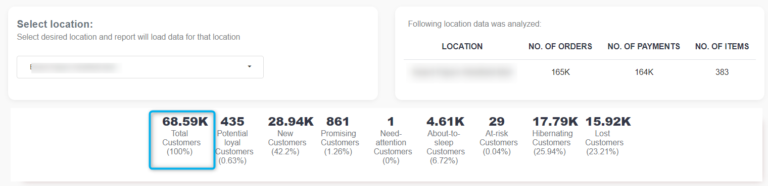
RFM analysis scores every customer on each of these three factors on a scale of 0 (worst) to 4 (best). After that, we assign an RFM score to each customer by concatenating his numbers for Recency, Frequency, and Monetary value (for example, RFM = 444 are the best customers in all regards, and RFM = 000 is the worst).
| RFM segment name | Description | RFM SCORE |
| Lost customer | Made their last purchase a long time ago and haven’t engaged at all recently. | 000, 001, 010, 020, 030, 040 |
| Hibernating customer | Made their last purchase a long time ago and neither visited the site nor opened an email recently. | 221, 211, 122, 121, 112, 111, 021, 012, 011, 101, 100 |
| Can-not-lose customer | Made the largest orders, and often. But haven’t returned for a long time. | 044, 043, 033, 103, 104, 004, 003, 002 |
| At-risk customer | Similar to ‘Can-not-lose them customers’ but with smaller monetary and frequency value. | 144, 143, 134, 133, 142, 141, 132, 131, 124, 123, 114, 113, 042, 041, 034, 032, 031, 024, 023, 022, 014, 013 |
| About-to-sleep customer | Standard customers with not too long-ago purchases. | 220, 210, 201, 110, 102, 120, 130, 140 |
| Need-attention customer | Core customers whose last purchase happened a while ago. | 424, 423, 332, 323, 232, 223, 214, 213 |
| Promising customer | Potential loyal customer. Spends frequently and a good amount. But the last purchase was a while ago. | 414, 413, 412, 411, 410, 404, 403, 402, 314, 313, 302, 303 ,304, 204, 203, 202 |
| New customer | Bought most recently. | 401, 400, 311, 310, 301, 300, 200 |
| Potential loyal customer | Recent customers, and spent a good amount. | 442, 440, 441, 430, 431, 422, 421, 420, 341, 340, 331, 330, 320, 342, 322, 321, 312, 242, 241, 240, 231, 230, 222, 212 |
| Loyal customer | Loyal customers are ones that order regularly from your store. | 432, 333, 324, 244, 243, 234, 233, 224 |
| Champion customer | Bought recently, order often, and spend the most. | 444, 443, 433, 434, 343, 344, 334 |
Here is one example where we can see all customers divided into segments.
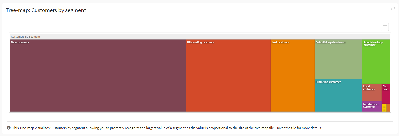
Depending upon their RFM analysis scores, customers can be segregated into the following categories:
- Lost customer
- Hibernating customer
- Can-not-lose customer
- At-risk customer
- About-to-sleep customer
- Need-attention customer
- Promising customer
- New customer
- Potential loyal customer
- Loyal customer
- Champion customer
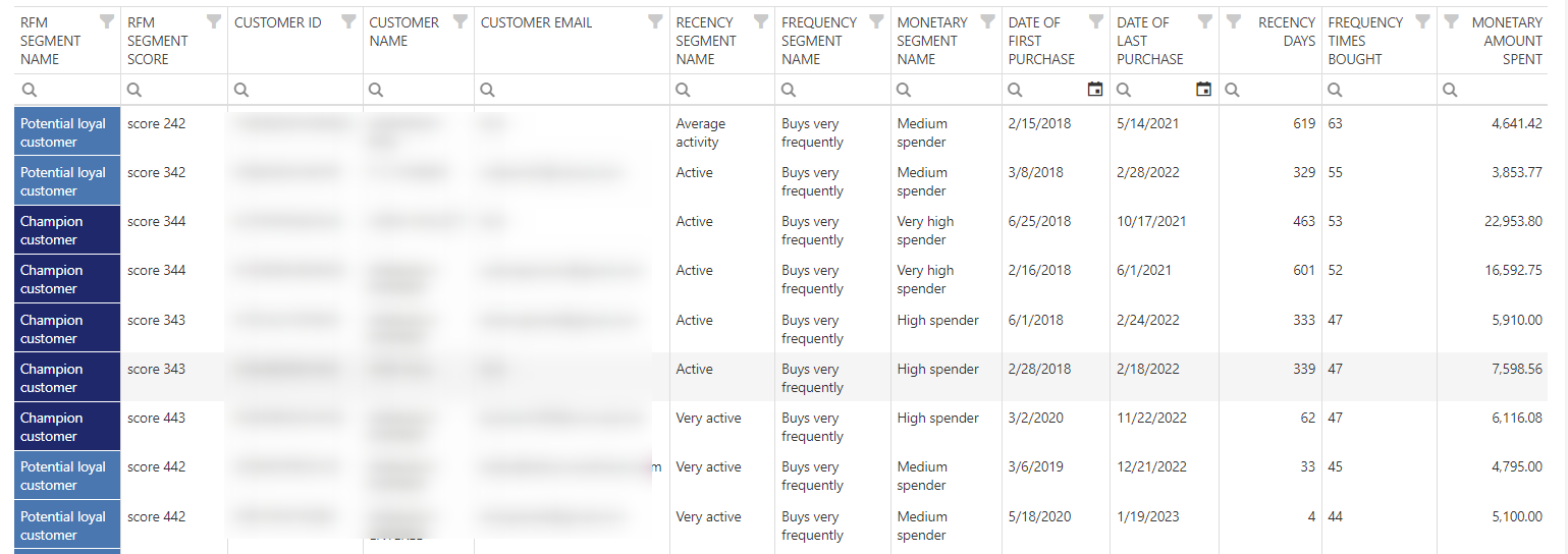
How to use RFM analysis in marketing?
Now that you have all the data at your disposal, it’s time to move on to the marketing part. By grouping customers by RFM values, you can immediately get a complete picture of what’s happening with your customer base.
Champion customer
These customers are your most loyal base. They often purchase, spend more than average, and have purchased recently. You want to keep these customers happy, and you should cherish them.
Loyal customer
They may not always spend the most and may not have shopped with you recently, but they always come back. These are customers who love your brand and products. Cherish them, offer your loyalty programs, reward them, and ask them to make some reviews.. in short, keep a good and steady relationship.
Potential loyal customer
They are your recent customers with average frequency and spent a good amount. Keep them close by offering membership or loyalty programs.
At-risk customer; Need-attention customer
Those customers may not purchase often, but these are your biggest spenders. These customers should be nurtured because they already love your products. Be sure to offer product recommendations based on their purchase or other most-bought products.
New customer; Promising customer
New customers are very important for any business. You’ve done the hard work to buy something for the first time, and now it’s time to nurture that relationship. Retaining these customers can be the best way to find new loyal customers and champions. Start building relationships with these customers by providing support and special offers.
At-risk customer, Hibernating customer
At-Risk Customers are your customers who purchase often and spend big amounts but haven’t purchased recently. Reactive those customers by sending them personalized reactivation campaigns, offering renewals and helpful products to encourage another purchase.
About-to-sleep customer
You know you have a lot of About-to-sleep customers. They are disengaging from you. Think about a re-engagement campaign that would bring them back to your website. Send them a personalized email, or run a survey asking what happened that made them stop visiting you.
Can-not-lose customer
Can-not-lose customers are customers who used to visit and purchase quite often but haven’t done any activity recently. Bring them back with relevant promotions, and run surveys to find out what went wrong and avoid losing them.
Customer Retention Analysis
Firstly, let’s check what Retention Rate is and why it is so important.
What does Retention Rate mean?
Retention rate refers to the percentage of customers who continue buying a product or service over some given timeframe. This is a critical success metric for subscription-based businesses, such as SaaS software providers, and companies whose customers repeatedly buy the same products, such as milk and coffee brands.
For businesses that sell products to customers only once over a long period—car or refrigerator manufacturers, for example—retention rate is a less relevant success metric. But suppose these companies also sell an ongoing service to support their products, such as a warranty or maintenance agreement. In that case, the retention rate can be essential for success in selling these add-on sales.
Why is a high Customer Retention Rate so important?
Many entrepreneurs and business analysts believe customer retention is the most crucial metric to determine a company’s success. High customer retention means customers of the product or business tend to return to, continue to buy or, in some other way, not defect to another product, company, or non-use entirely.
Before we move to specific reports in this section, here are definitions for values in this report:
- New customers: Customers who placed their first order within the defined period (only the first order counts)
- Returning customers: A returning customer is simply someone who has bought your product or service once before and has returned to make another purchase
Customer Retention Analysis s part of our AI Powered reports section and is available only in the Professional tier. If you don’t have access to it, upgrade via the Clover dashboard. As soon as you upgrade, we will collect all of your historical data, and you will be able to use further analysis and reports to help you get even more profound knowledge of your business’s current and future state.
In this section, you can find several charts.
New Customers vs. Returning Customers report
This chart shows the number of distinct New Customers vs. Returning Customers detected in an analyzing period. You can notice many new vs. returning customers who bought something by simply looking into color.
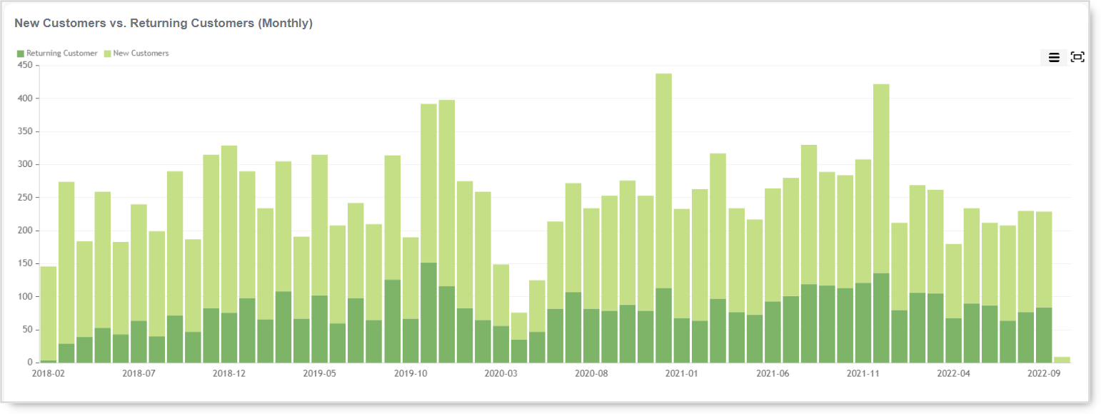
Retention – % of Returning Customers report
In this chart, you can see % of returning customers each month.
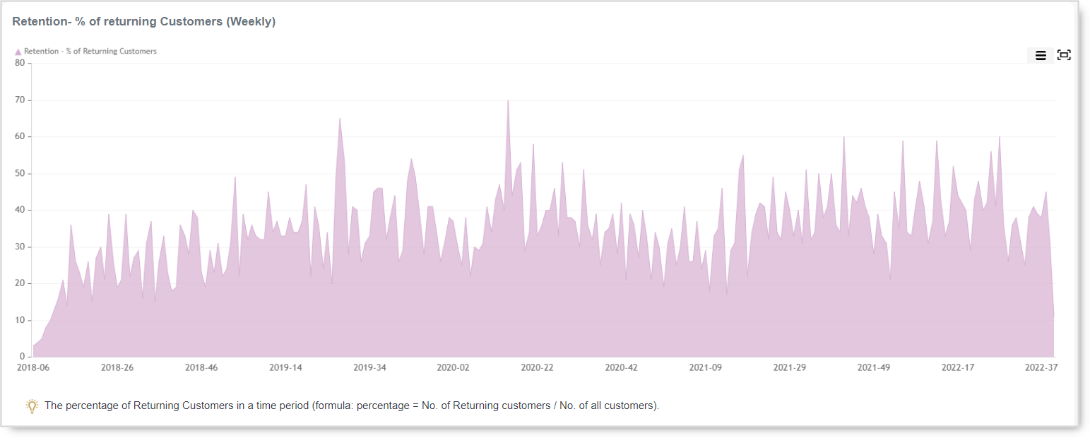
Gross Sales New Customers vs. Returning Customers (Monthly)
This chart presents the gross sales made by new vs. the revenue earned by returning customers.
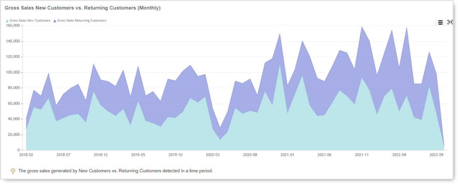
No. of Payments New Customers vs. Returning Customers (Monthly)
Similar to other charts, this one lets you see the number of payments per type of customer, new vs. returning.
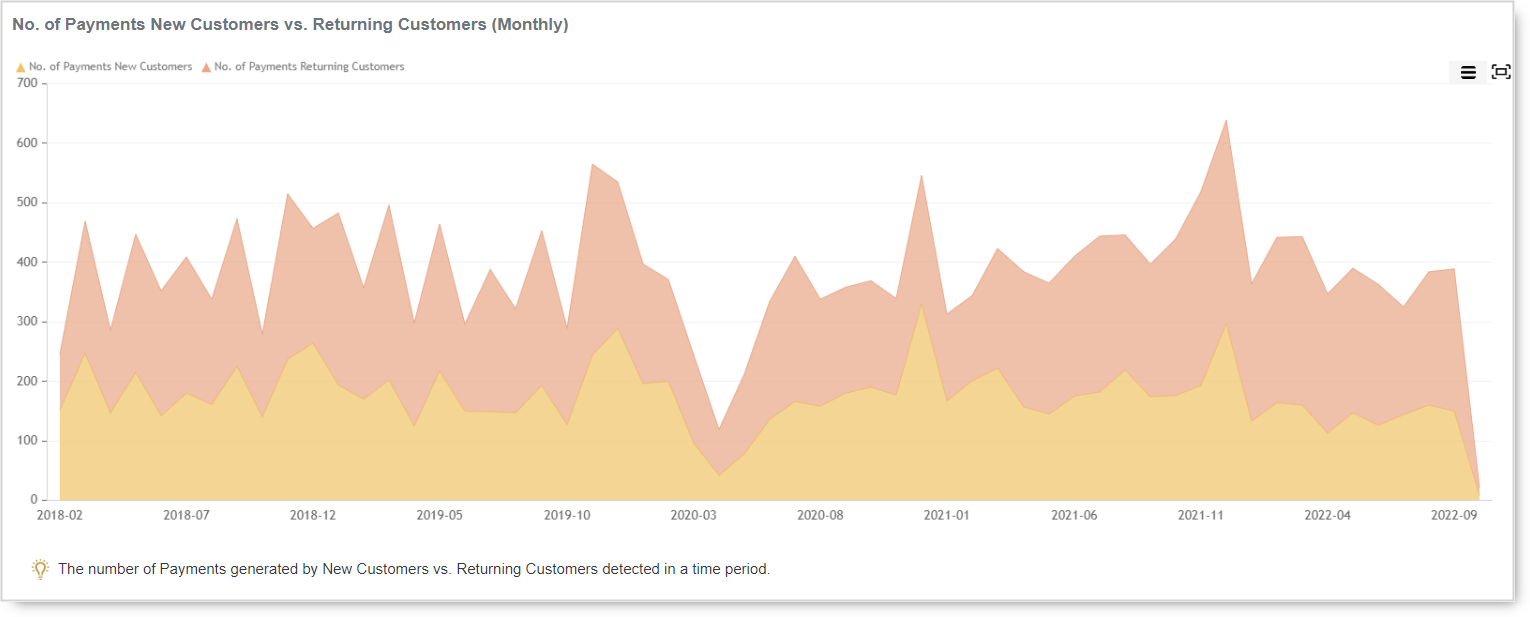
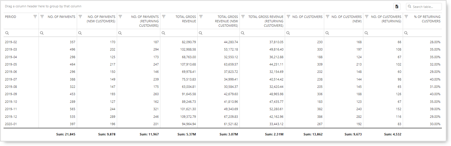
Business Forecast
What is a Business Forecast?
A business forecast is an analysis where you will find a prediction of your future sales revenue. Sales forecasts are based on different historical data taking into account various effects. Businesses use the sales forecast to estimate weekly, monthly, quarterly, and annual sales totals. Just like a weather forecast, your team should view your sales forecast as a plan to work from, not a firm prediction.
Machine learning algorithms are using your historical data, taking into account weekly and yearly seasonality, holiday effects, and anomalies detection. Based on that information, the report will give you a forecast for periods like today, tomorrow, the next 7, and the next 30 days. Not only that you can get predictions on your revenue, but you can make the same analysis for the Number of orders and Number of customers.
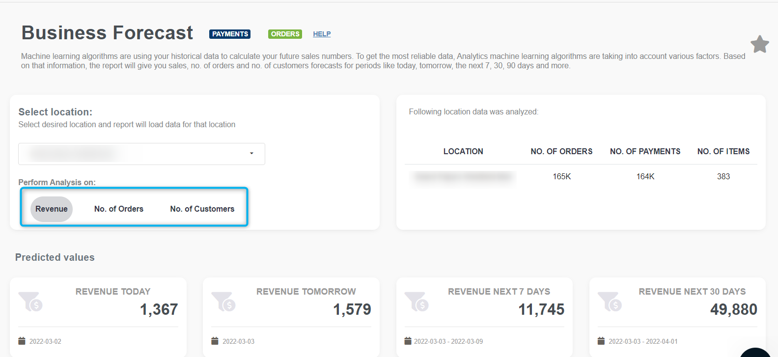
Besides the gross sales forecast for defined periods (today, tomorrow, next 7 days, next 30 days), in this report, you can several charts and one detailed table. Depending on Analisiy you choose, you will see charts and detailed tables. If you are using Revenue analysis, all the values will be for revenue. If you choose to do Orders analysis, all charts and tables will show Orders data.
Forecast – REVENUE
In charts you can see actual sales data, predicted sales plus the trend. In the charts, you will see historical actuals and forecast for the next 365 days that is aggregated per day, week, month, or year. With the help of this chart, merchants can see what they can expect in the next 12 months and they can be prepared for what is coming. If you know, there is no surprise! You can prepare yourself and even make something to change the trend.
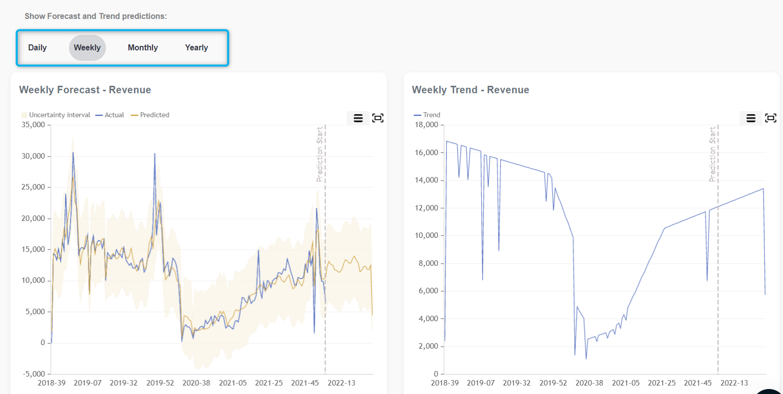
The chart can be maximized for a better view in a shorter period. Mouseover on each graph will show you data on a day you wish to check.
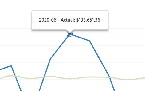
Besides maximization, the chart can be exported and printed.
Forecast the next 90 days – REVENUE
In the Forecast, for the next 90 days detailed table you will get much useful information on prediction for the next 90 days. The detailed table offers information like the actual date, predicted data, last year’s data, and the difference between last year (LY) and prediction for this year. Besides this data, in this table, you will find lower and upper prediction uncertainty. Each column can be sorted and exported to excel for future usage.
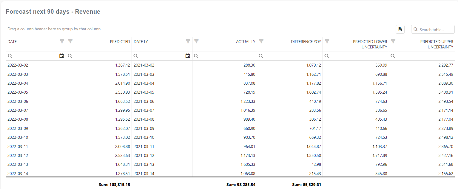
Advanced Sales Trend Report
Advanced Sales Trends report is part of our AI Powered reports section and is available only in the Professional tier. If you don’t have access to it, upgrade via the Clover dashboard. As soon as you upgrade, we will collect all of your historical data, and you will be able to use further analysis and reports to help you get even more profound knowledge of your business’s current and future state.
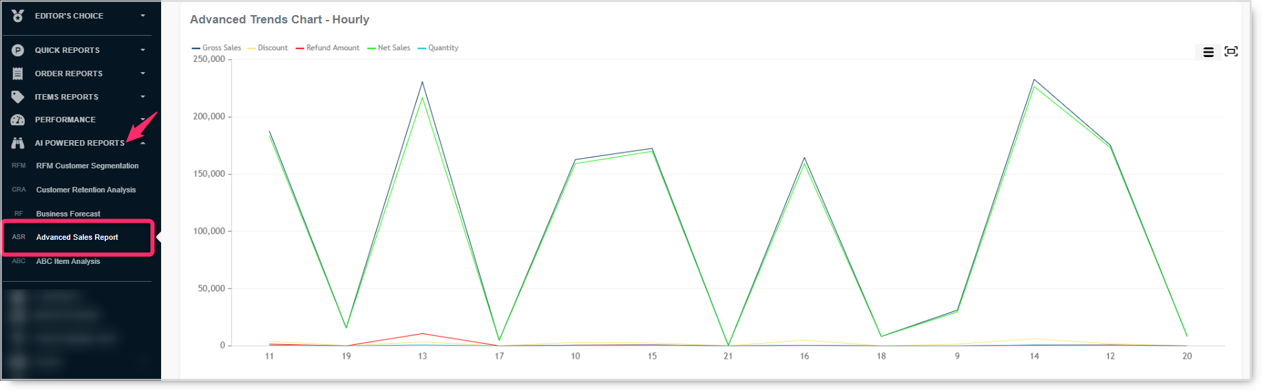
Like all Analytics reports, here you can find several sections that include charts and tables. The quick selection represents the period in this report; the default value is Yesterday with “Day in a Week” as a scale. That means once you open the report, in the graph and detailed table, you will get data covering sales from all your customers and items for yesterday. If you want to change the period, open the quick selection and choose the period you wish to or select a particular period by choosing a date on the calendar. For example, if you change the period to the Last 30 days, it makes sense to see the scale for Day in a week, Date, or Week.
This report has attributes such as Employees, Devices, Order Type, etc. All the values are automatically selected as the default values. You can easily remove specific values by unselecting them and clicking the Refresh button: the data in the graph and the detailed table will change accordingly.
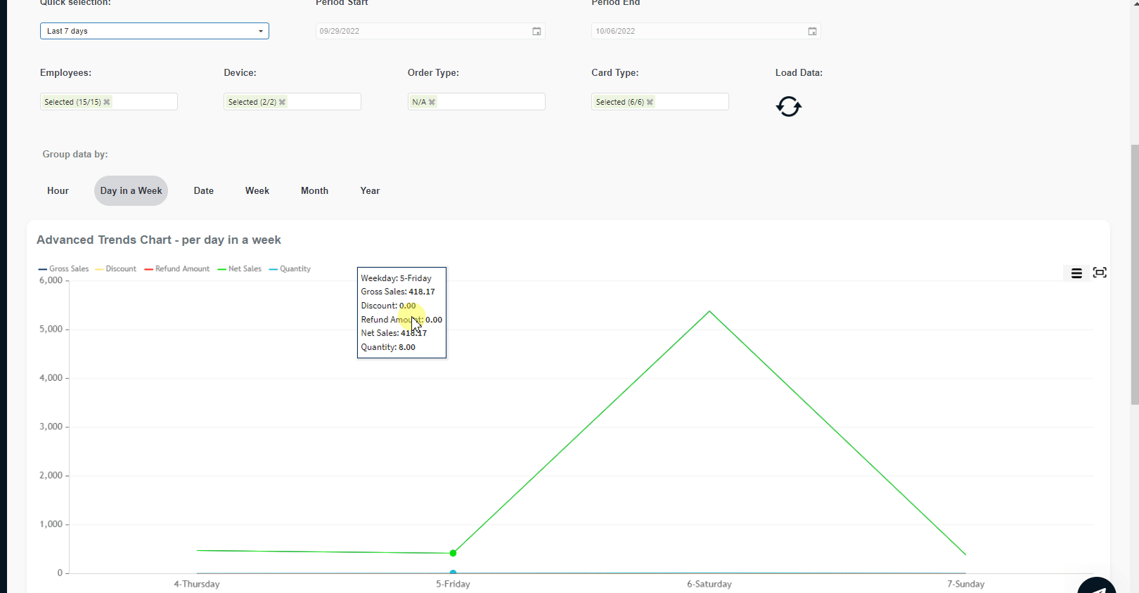
Definitions
In case you are not familiar with our metrics, we will briefly define each (US Market):
- Gross Sales: Total amount of item sales, including extras such as modifiers; this is the gross subtotal before discounts and refunds. Does not include tips, taxes, service charges, or non-revenue items.
- Discount: Total calculated discounts. Discounts in percentage/absolute amount from orders and items
- Refund Amount: Total amount of refunds, including manual refunds
- Net Sales: Amount of item sales remaining after all discounts and refunds have been deducted. Does not include tips, taxes, service charges, or non-revenue item sales.
- Quantity: the total quantity of all items ordered within the selected period (net Quantity + returned Quantity
Automatically, the graph will show you Gross Sales, Discount, Refund, Net Sales, and Quantity metrics. If you want, you can unselect metrics you don’t need.
Additionally, you can group data by:
- Hour
- Day in a week
- Date
- Week
- Month
- Year
As you change the scale, the graph changes as well, accordingly. Here are a few examples of how the same data changes based on the different scales.
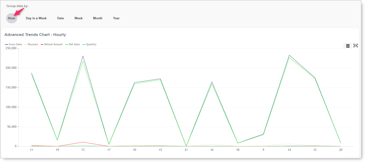
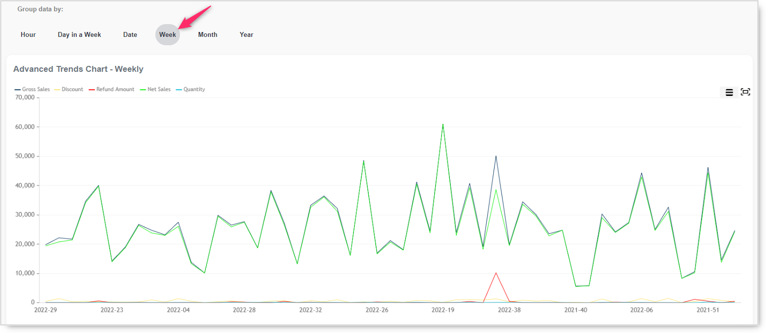
A detailed table with all metric values for the selected period and scale is also here. As you change the scale, so does the table.
ABC Item Analysis
There are tons of reports where you can find out what is your best-selling item in a period… but what if you would know a group of items that contributes to the sales the most, not only one or two items, but a group.
ABC analysis is a classification method in which items/entities are divided into three categories, A, B, and C. This analysis is actually an inventory management technique that determines the value of inventory items based on their importance to your business. This helps analysts to understand which products are most critical to financial success. The most important items, based on profitability, are “Class A” items, the next-most important are Class B and the least important are Class C.
Bear in mind, that this report calculates data from the beginning of your work on Clover. If you sold something you will see it here, whenever it happened.
Here is one topical example of ABC Analysis. From this chart, we can see, that 18% of items that are grouped into category A make 87% of the revenue. To get the details on this, the best is to check the detailed table under the charts. In the detailed table, in category A there are only 22 items. So, those 22 items are your gold mine.
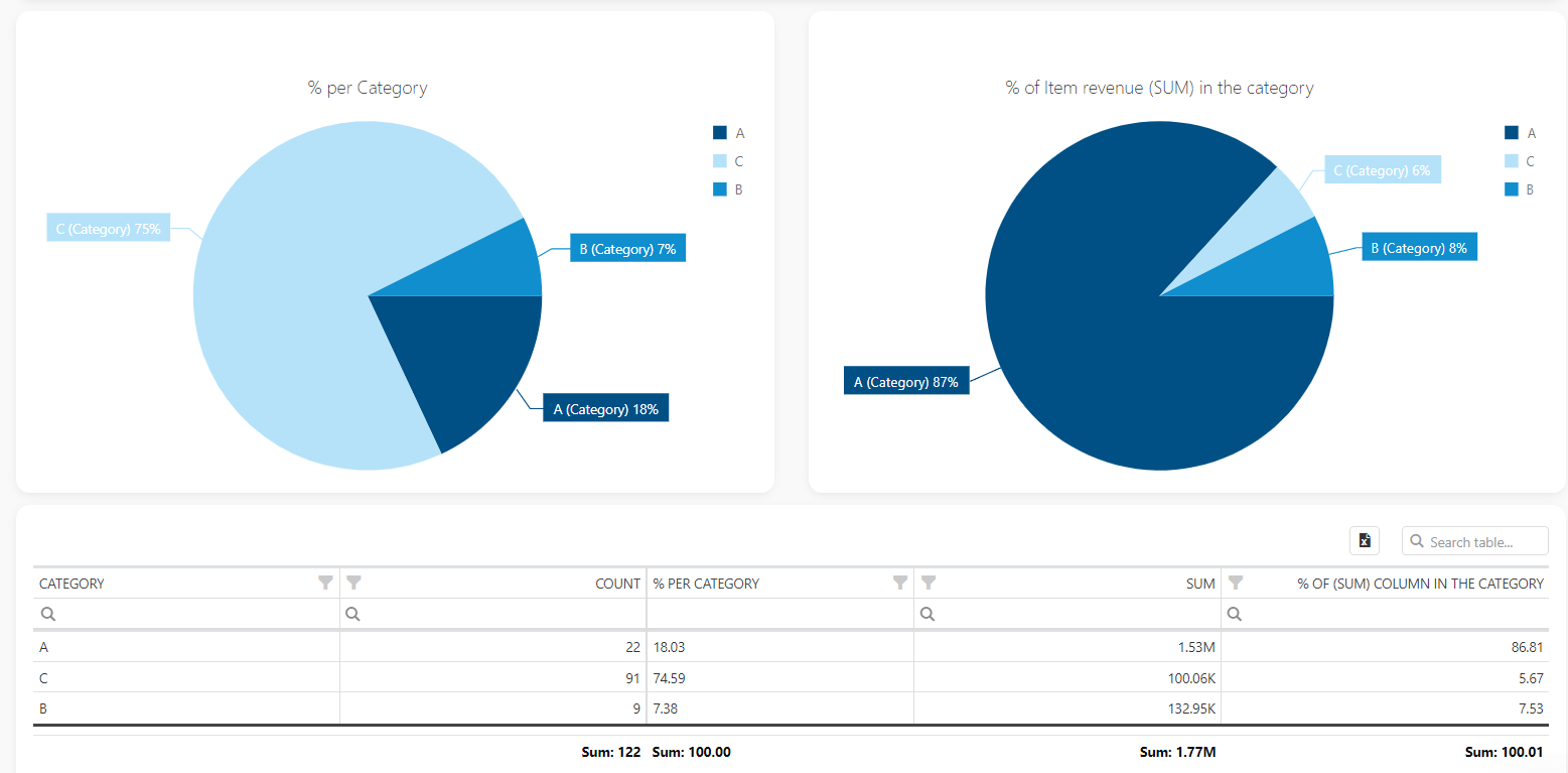
The ABC analysis, also called Pareto analysis, is based on the Pareto principle, which says that 80% of the results (output) come from 20% of the efforts (input). The Pareto Chart is a combination of a bar and a line graph – it contains both bars and lines, where each bar represents an item/entity in descending order, while the height of the bar represents the value of the item/entity. The curved orange line represents the cumulative percentage of the item/entity.
When looking at the same data in the Pareto chart, data are more visible. Now you will see that items from category C have very little contribution to total revenue. Contribution is so little that you can barely see those items in the chart. But, on the other hand, items in category A, are so important that each one is visible in the chart.
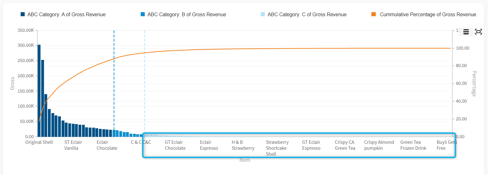
OK, this is all great, but how can I use this information in real life? How can I find out the best selling items, items that are in category A.? Super easily! Scroll down the report until you get the detailed table with all the items listed. If you are interested in category A, for example, select it and check it out more. As we can see in this example, item in line one contributed alone with 17.17% in total sales. Yes, yes, only one item contributed 17.17% to total revenue.
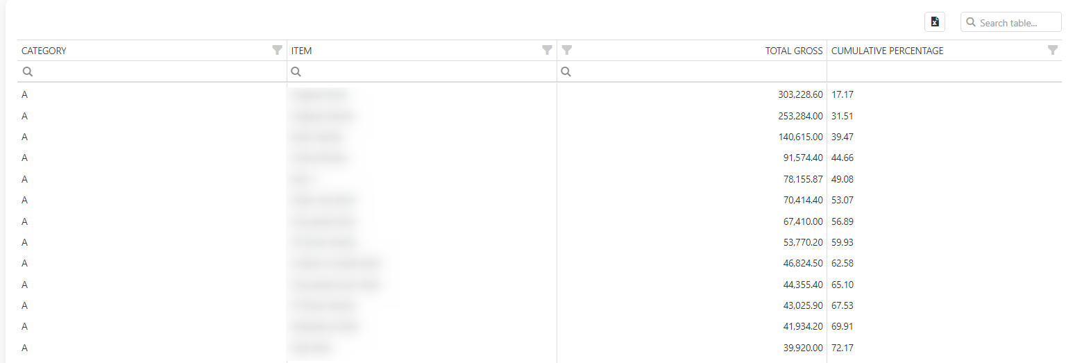
Advanced Options
Automatic Emailing
The e-Reports option is available only for Advanced tier users.
With e-Reports Merchants have the possibility to receive reports directly to their email inbox at a specific day/time. There are 35 default reports available with the possibility to create and receive custom-made reports based on a pivot table. Merchants will get emails with a report based on their settings (fetch with customer information, date format, the start of business day hour..). The multilocation feature is supported as well.
You can access this feature from the main menu as shown in the picture below. This option is available in the Basic, Advanced and Professional tier:
Creating a new report
There are several steps that you need to go through in defining a new email report. A setup wizard will guide you until you finish it.
Click on icon “+ CREATE NEW“. This icon you can find on the main page of a Scheduler section. This icon will always be available, regardless of how many email reports you already defined.
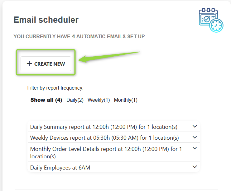
Step 1. – Choosing a report you wish to receive
In step one, you need to choose a report that you wish to receive your email. Besides predefined report names, there is also an option to give your own name to each email report. If you do not define a specific name, a default one will be used.
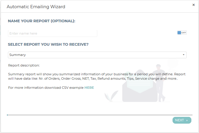
Clicking on the arrow in the box under “Select report you wish to receive”, a list of all available reports will appear. From the whole list of reports, you will be able to choose reports depending on the tier you are using. Reports that are not available in your tier will be grayed out. The whole list of available reports per each tier you can see here
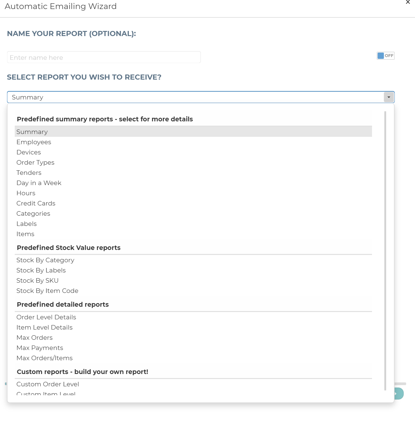
Step 2 – Location(s) for your report
In this section, you need to choose for which location you wish to get a report for. Your location will always default and you will see it in the box. In case you have only one location, in this step, you don’t need to do anything, just click on “Next” button.
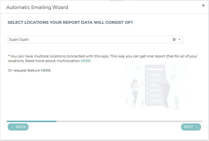
In case you have more locations that are using Analytics App and they are already linked with the Multilocation feature, when setting up reports, you can choose for which location you want a particular report. When you open a location name box (click on the arrow on the right side), all connected locations will be listed. Please choose all the locations you want to get data for in a particular report. It could be only one, some or all of your locations.
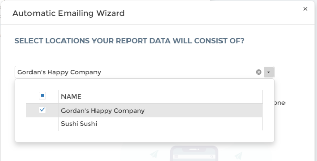
If you have more locations, and you wish to connect all your locations with the multilocation feature, please follow the steps described in the article about multilocation that is available here.
Step 3 – Time, Frequency, and Data period set up
In step three, you need to define several things like time, frequency, and data period.
Time: time of the day when you will receive a report to your email. When opening the time box, you will see a list of all available times. Time to receive stars at midnight (0:00 am) followed by every 30 minutes choice. Chose one that suits your needs.
Frequency: in the frequency, you define how often you will receive reports. Predefined frequencies are Daily, Weekly and Monthly.
Data period: In the data period you define the period for data retrieving. This is a very important step because even the time of receiving a report can make a difference in the data that you will get. The data period is connected to the time you are receiving reports, as well as how you defined your business day. Available data periods are:
- Today
- Yesterday
- Last 3 days
- Last 7 days
- Last 30 days
- Month-to-date
- Last month
- Date-to-end-of-Month
- Custom data period (how to set up find here)
If you are already using our app Analytics, you will notice data periods are the same. From the name of the data period, you can conclude what data you will receive.
Example – You define to receive reports daily for the data period today. Your business day starts at 8 am. Depending on the time you will receive a report, your report will contain data for a period of none, one or maybe several hours.
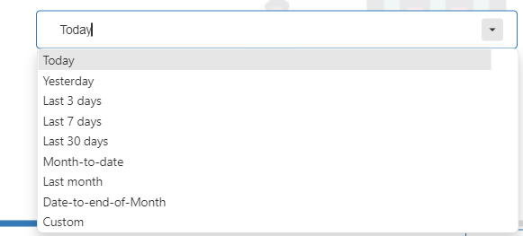
Step 4 – Recipients of reports
In step four, you need to define who shall be receiving the report that you have prepared. There is no limit on email addresses for receiving reposts. When you are in this step if the mail you wish to receive. When you added all email(s), just click on the icon “Next“.
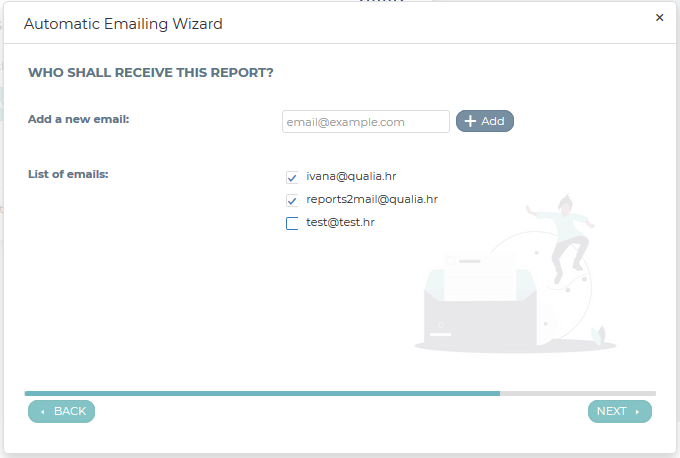
Step 5 – Report overview
In the last step of the report setup, there are several options. Before you save this report wizard, you can check what you choose in the Wizard overview or send a test mail. If you are satisfied with the setup, you can save it.
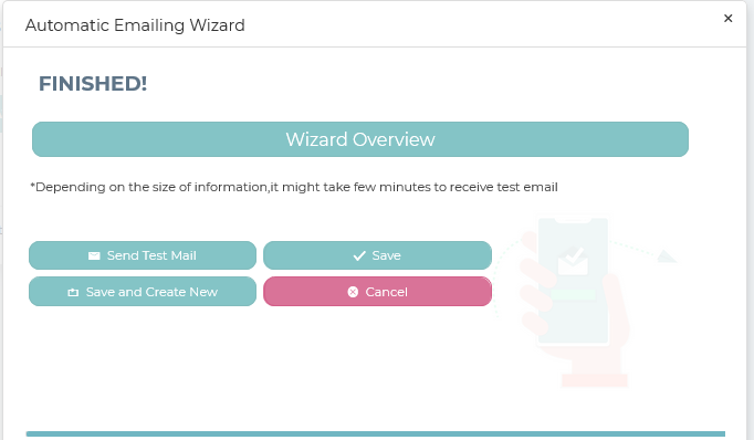
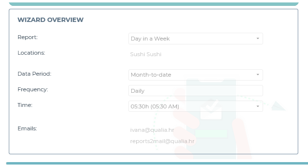
THAT’S IT, if you followed these instructions, you have successfully created a first automatic emailing report!
Editing already prepared e-reports
If you want to make changes to reports you already defined, this is very easy.
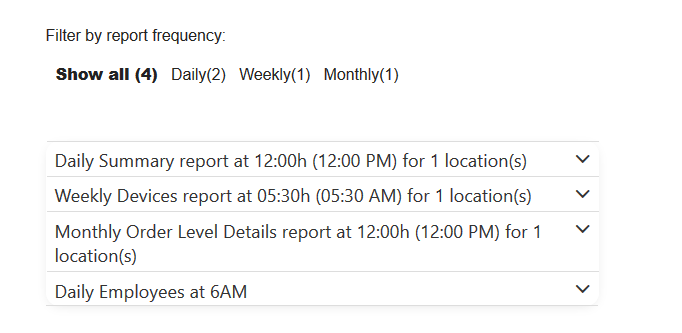
On the main e-Report page, click on the report that you want to edit, clone, or delete. For editing, click on the “edit” icon and basic information on the prepared report will open. If you want to change the name of the report you can do so by clicking on the icon “use custom name” and putting a value on “ON“. Enter the name you wish and save changes. Except for name change, here you can do all other changes as well like frequency, time of receiving, data period, or even add or remove email addresses. Besides those changes, you can change the decimal separator in the CSV files that you will receive. The decimal separator is predefined by the location you are coming from, US market (dot), EU market (Comma).
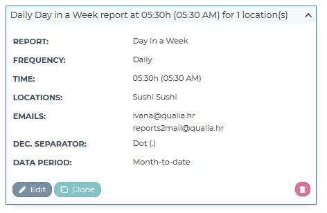
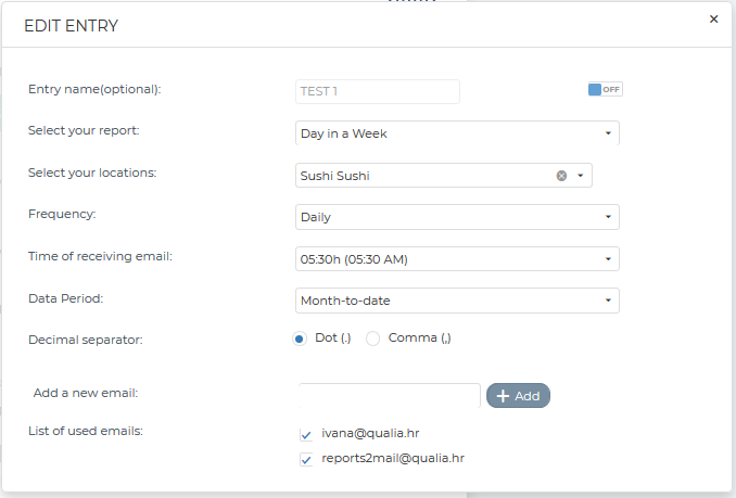
Except for editing, any earlier prepared email reports, you can clone or delete. To do so, just click on the icon for this action.
For an easier look into possible e-Reports, we prepared all reports in an excel file. Examples of those e-Reports you can find here.
Welcome Screen and its Settings
The Welcome Screen is the login landing page of Analytics, it can be accessed either by clicking on the Analytics logo or Welcome icon in the main mane.
On the welcome screen, you get several pieces of information like
- Favorite Reports
- Recent Report Activity
- Location Details
- Info carousel
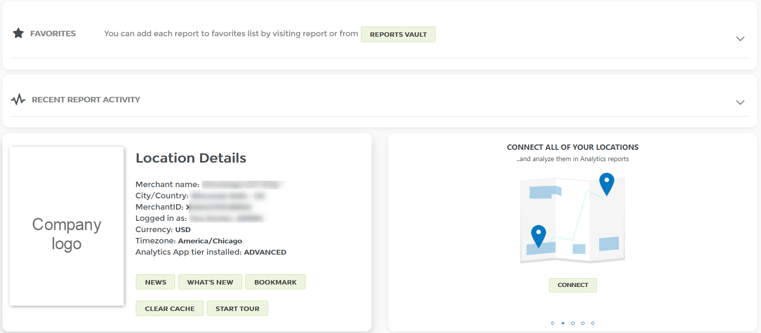
Favorites
In the Favourites section, you will see all the reports you have marked as favorite ones. To add a report to the favorites list, just mark it with a “Star”. Star mark you can find on the top right side on every report.
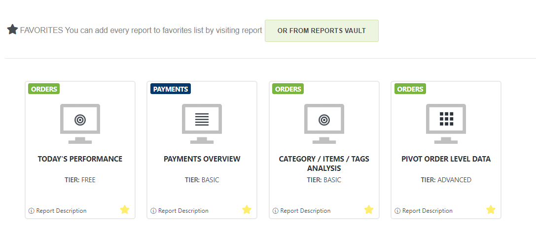
Recent Report Activity
In the Recent Report Activity section, you will see all the reports recently used. The last used report will be first from the left. In this way, you can always see what you are using the most.
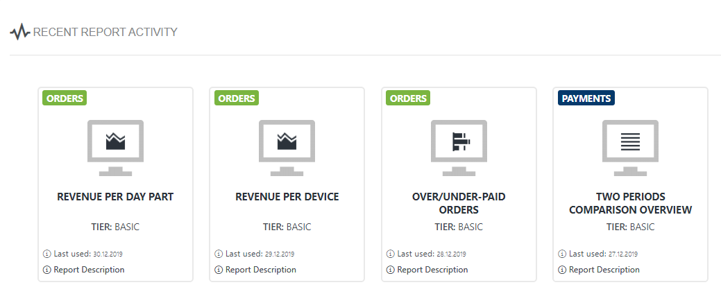
Location details
Here you can see the main data for your location plus there are possibilities for some action by clicking on icons on the bottom of this box.
- Start tour – the first time you log in, the tour will start automatically. If you want to start it again, just click on the icon.
- Cache clearing -The last icon in the Location details box is “Clear cache”. The clear cache button gives you the ability to delete all currently stored and cached data.
- Locations: number of linked location
- Current subscription tier: tier that you are currently using.
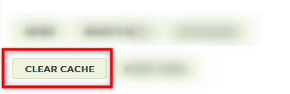
There is a description that says: If you updated some values in Clover such as Item SKU# or Item costs you will need to clear previously saved cache so new changes can be refreshed by the Analytics app. We do this automatically every 24 hours or after your session ends (when the browser is closed). But if you want to see these changes immediately press this button to clear the cache.
![]()
Note: A person logged in with a role that was unselected will not be able to access any of the reports, including settings pages.
General Settings
GENERAL SETTINGS
You can find the General Settings within the Setup Screen. Here you can define several basic data that are connected to your business like:
- general data (start of a business day, date format etc.)
- dayparts
- access to application
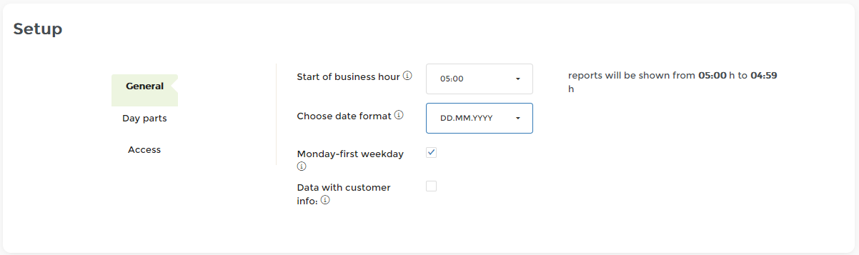
I) GENERAL
In the first card, you can find the General data.
In “General” some information regarding your business should be defined.
- Business hour – here you can set an hour when your Business day starts. If you want that Analytics analyzes your data differently than calendar day hours, define the start of a day as you need it. It can be any hour in a day. Please note that in that case, your business day will finish in 24h. All changes are saved automatically.

- Date format – There is a possibility to choose the preferred date format. From the drop-down menu, choose one you wish to use.
- Monday as the first day of a week: Check or uncheck box depending on your preferred settings. If the box is not checked, Sunday will be the first day of a week. Analytics comes with default values for each market: Monday (EU), Sunday (US).

- Data with customer info – If checked, you would be able to see customer name, email and customer phone number in several analytics reports. This data you could see in Analytics reports in case they exist in your clover/could be taken from Credit Card.
![]()
If you do not need customer information, we suggest leaving it unchecked as it can, depending on the number of customers, greatly increase the time of initial caching of data from Clover. Customer data you will see in the following reports:
- full orders details report,
- orders with items details,
- pivot item/order level data reports.
II) DAY PARTS
The second card in “General Settings” is Day parts.
Day Parts – here you can split dayparts as per your needs. By default, Analytics divide a day into 8 dayparts. The minimum that you could have is 2. To reset your day parts into default values, just click on the icon “Set default values”. Regardless of what you had at that time, after this action, a day will be divided into 8 dayparts. Day parts are calculated from a time you defined in Business day
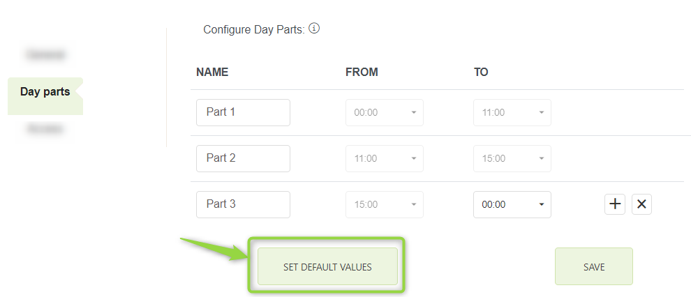
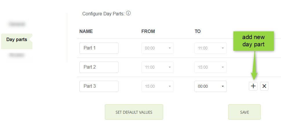
In case you don’t want 8 days, but rather 3 or 4, just delete extras and correct time per daypart. To add a new daypart, just click on the button “Add new“. Each day part you can rename as you like (instead of default name put your own).
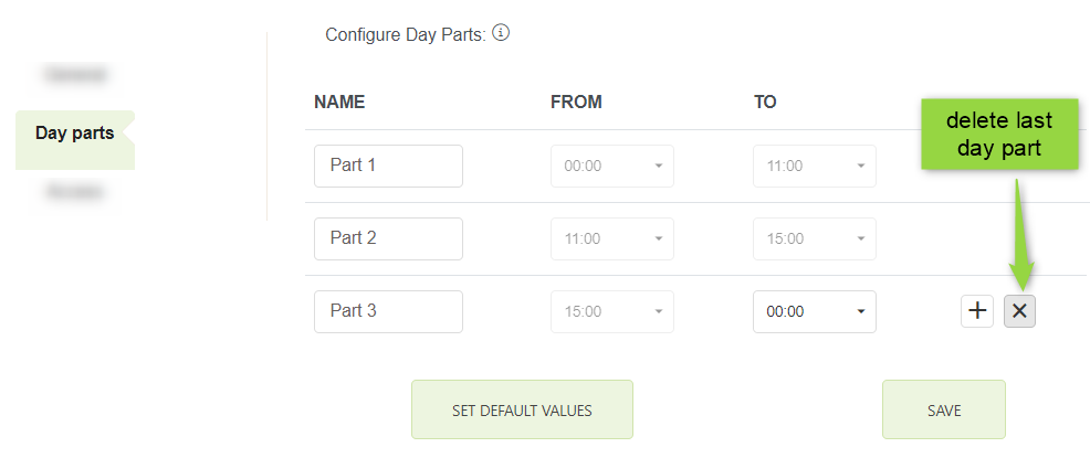
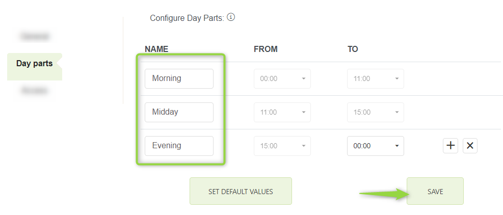
Day parts are used in reports like Revenue Per Day Parts report, Master summary report and some other as well.
After adjusting Day Parts, click on “save changes” card and save changes you made.
III) ACCESS
The third card in “General Settings” is Access. Here we will show the list of all roles that we have found defined in the Clover for your particular merchant ID:
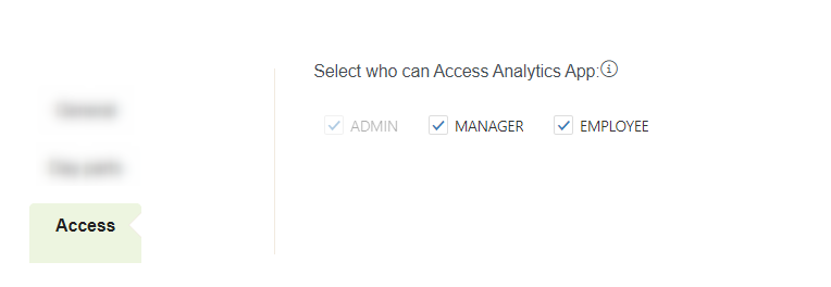
Every time you click on one of the offered checkboxes, you will get a small notification that is telling you that the changes are now active:
For security reasons, you will not be able to exclude your own role. Also, each person will be able to exclude only those roles that are less restrictive from the current employee’s role. For example, a person logged in with role EMPLOYEE, will not be able to deselect role ADMIN. On the other hand, a person with role ADMIN will be able to deselect role EMPLOYEE.
When a person logs in into Analytics app with the role that was unselected, a message will be shown:
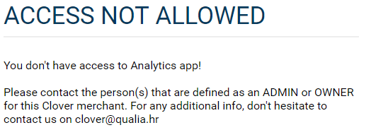
Multilocation Feature
To get more information on the multilocation features, go to the “Multilocation” page. Here you will find all the necessary information’s about the Mulitlocatoin feature. Above that, you can send an automatic request to the support team.
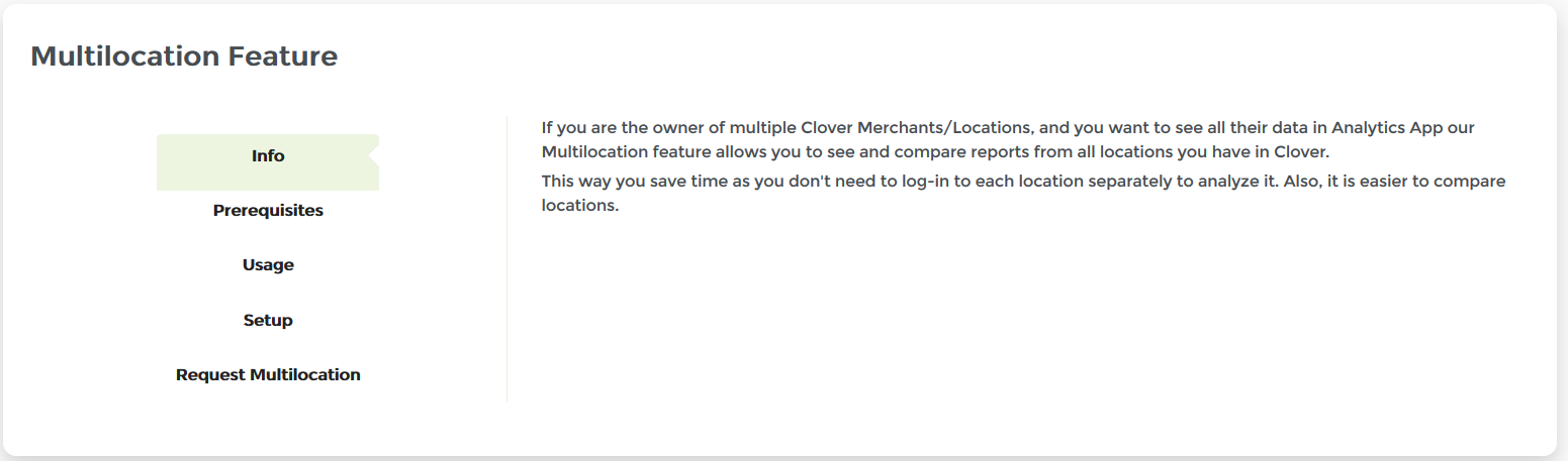
To see all locations linked, check listed locations in “Your linked locations”. Here you will find the list of all Merchant IDs (all Merchant Locations) available to you at that moment.
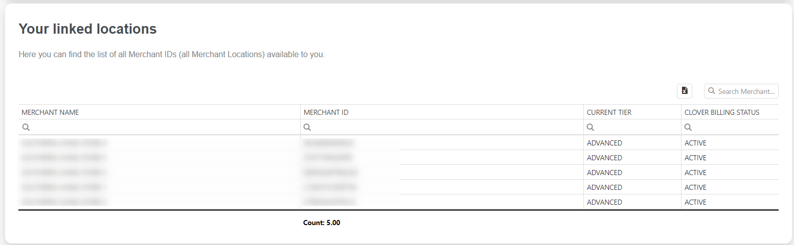
If you are the owner of more Clover Merchants/Locations, and you want to see all their data in Analytics App, please:
- Install BASIC or ADVANCED Tier on all your Merchants
- Make initial login to Analytics App
- Please send your request to ‘clover@qualia.hr’ with all Merchant IDs you want to link
We will set up a Multi-Location environment for you in one business day. After the multilocation feature is active, you will receive our confirmation email.
What will you get with it?
On every Analytics Report you will see a Merchant filter:
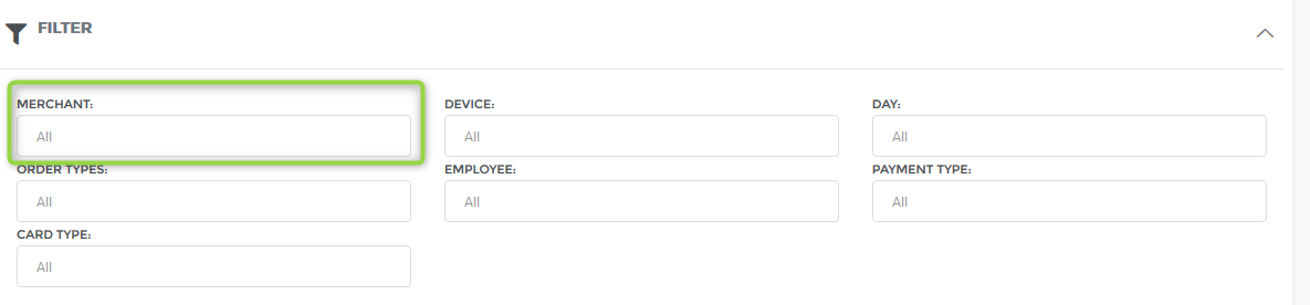
That means – you can filter all your reports (Customers, Items, Trends, Categories, Profit ….. ) for one or more your Merchants/Locations!
Multi-Location Report
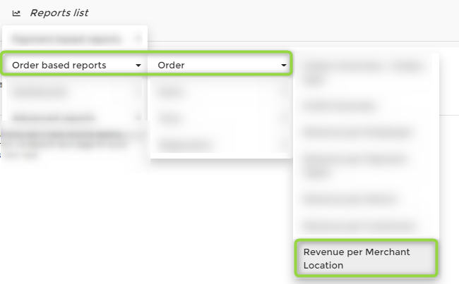
On our Multi-Location Report you will be able to see and compare (visually and in a table) revenues, the number of orders, averages and more from all your locations.
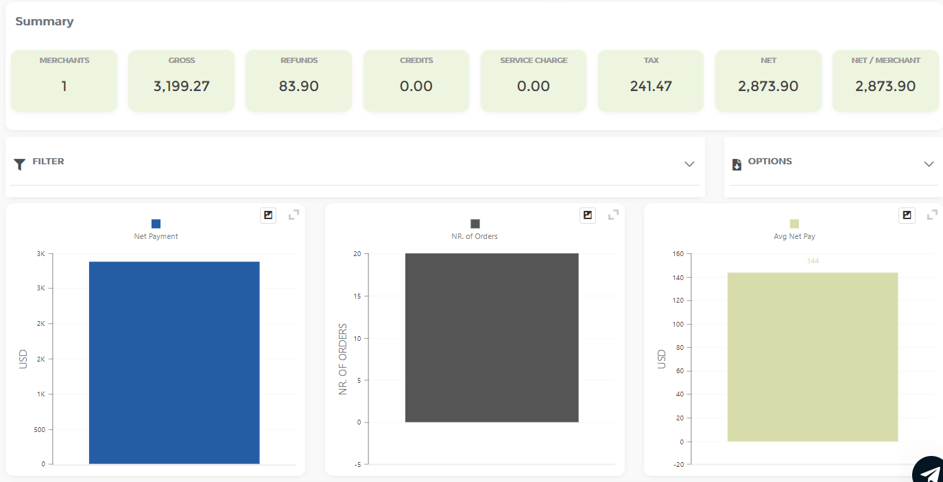
We hope you will find this new feature very useful. It should give you a great overview of your growing business.
Ways to set up multi-location in Analytics app
There are several ways to set up a multi-location feature in Analytics App. Here you can find more information on all of them.
For the multi-location feature to work, all locations that need to be linked, have to be at least Basic Tier Analytics.
1. One/More Merchant(s) as Supervisor(s)
One of the options to choose from is one (or more) Merchants as a supervisor. By choosing a supervising merchant, only that merchant can see data from all other locations. Other locations/merchants can only see their data.
2. One/More Employee(s) as Supervisor(s)
One of the options to choose from is one (or more) Employees as a supervisor(s). By choosing a supervising employee, only that employee can see data from all locations. Other employees can only see data from their locations.
But that is not all! We have gone a step further, and we can set up a multi-location feature in a way that best suits your need, with increased flexibility. Whether you wish to give all merchants/locations data to a single employee, or you wish that four out of seven of your locations can see all locations and the remaining three can see themselves. We can now make it happen.
3. Custom Location Grouping
In short, multi-location access rights can be attached to both employees and locations, and we can group locations as you like.
Let’s take a look at some examples. Let’s say I have seven merchant locations with ID’s: L1, L2, L3, L4, L5, L6, and L7. I have 30 employees, but most important are CEO, admin, and manager of both location L1 and location L2; so let’s give them ID’s ceo1, adm1, and man12. We can support a lot of different setups for this example, so I will list just some of the possibilities at our hands.
Possibility one:
- ceo1 and adm1 will be able to see all locations data
- man12 can see data only for locations L1 and L2
- all locations can see just themselves
- all other employees (27 of them) can only see locations at which they are logged in
Possibility two:
- only adm1 can see all locations data
- ceo1 and man12 can both see data about locations L1 and L2
- 15 of the remaining employees can see locations L3 and L4
- remaining employees can see locations L5 and L6
- all locations can see only themselves
Possibility three:
- only ceo1 can see all locations data
- all other employees can just see data about locations at which they are logged in
- location L1 can see all locations data (this means that whoever is logged in L1 can see all locations data )
- locations L2 and L3 can see data about L1, L2 and L3 locations (whichever employee is logged in L2 or L3 can see this data )
- locations L4 and L5 can see data about L1, L2, L3, L4, and L5 locations
- location L6 can only see data about itself
As you can see, possibilities are countless, and we support them all!
To set up a multi-location feature of your choosing, just sent us an email at clover@qualia.hr with a detailed description of how you would like it to be set up, altogether with all relevant ID’s (employees ID’s or merchant ID’s).
Commissions
If you pay to at least some of your employees via commission, you can now use Analytics for Clover to adjust commission types and percentages. You can find the commissions menu under page Setup.
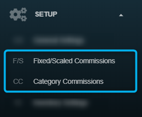
Commission Type can be
- Fixed percentage or Scaling,
- Commissions by Category
Employees commissions can be seen in several reports, like:
- “Revenue per Employee” report,
- “Revenue per Item Category” report and on
- “Revenue per Item Tag” report.
Commissions percentages are calculated from the Gross Amount.
Fixed/scaled commissions
Fixed/scaled commissions you can find the main menu, page Setup.
How to use this form
If you check „APPLY COMMISSIONS“ checkbox
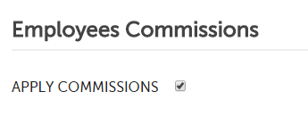
You will be able to see the commissions Table in Revenue Per Employee report.
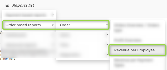
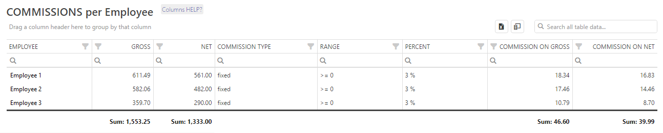
When you check the „APPLY COMMISSIONS“ checkbox you will get a list of all your employees, with commission type for every employee. There are two types of commissions, fixed and scaling. By default, all commission type is set to „fixed“.
By clicking on each employee name you will be able to manage commissions settings for the selected employees.
First, you select commission type:
1. Fixed is selected
By selecting „Fixed “, the commission will always be calculated with the same percentage. If you wish to define the same percentage for all employees, just click on the icon “Apply to all”. In case you want to have different percentages, go through the employee list and define each commission separately.
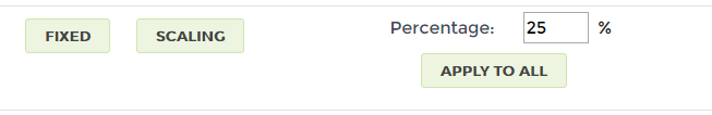
2. Scaling is selected
Now you can set ranges. By default, there are two ranges but you can add more ranges by clicking on the „New Range“ button. The Commission will be calculated based on a range. There are two values in every range, “from” and “to”.
If you set
Range 1 : 0 – 1000 10% ,
this means that if an employee sold gross sales from $0 – $999, a 10% commission percentage will be used.
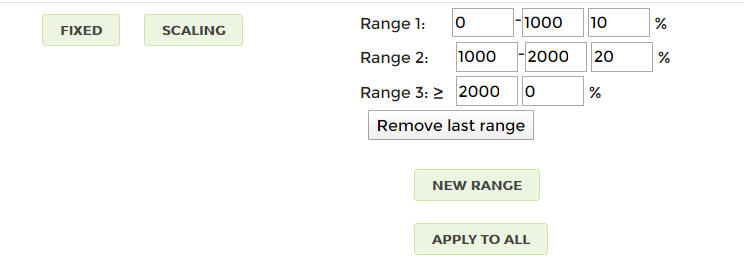
The changes that you made have no effect until you save changes by clicking on the „Save“ button on the top/bottom of the page.
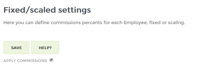
Where can I see commissions?
If you check „APPLY COMMISSIONS“ checkbox, you will see some new commission tables on
- “Revenue per Employee” report,
- “Revenue per Item Tag” report.

Category Commissions
If you pay to at least some of your employees via commissions, and you want to apply commissions for different Item Categories (like ‘products’, ‘services, ”… ), you can now use Analytics for Clover to adjust commission percentages. You can find the category commissions configuration in main menu, page Setup.
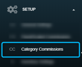
Commissions by category set up
First, you will see an editable table of your Employees and Item Categories. For each employee listed are all categories you have.
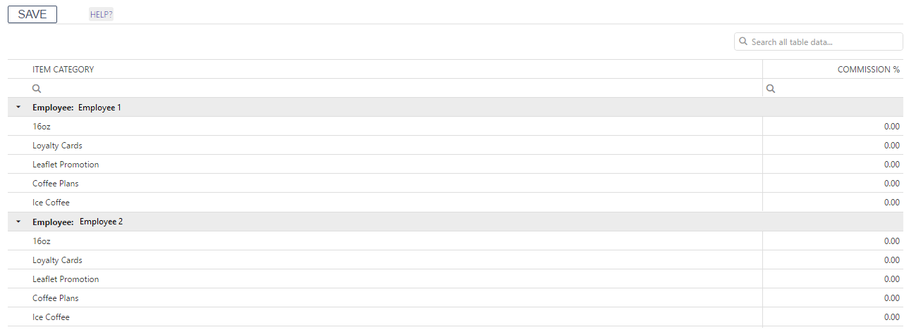
To add commission, please enter percentage (number from 0 – 100) for each Employee (like in the picture)
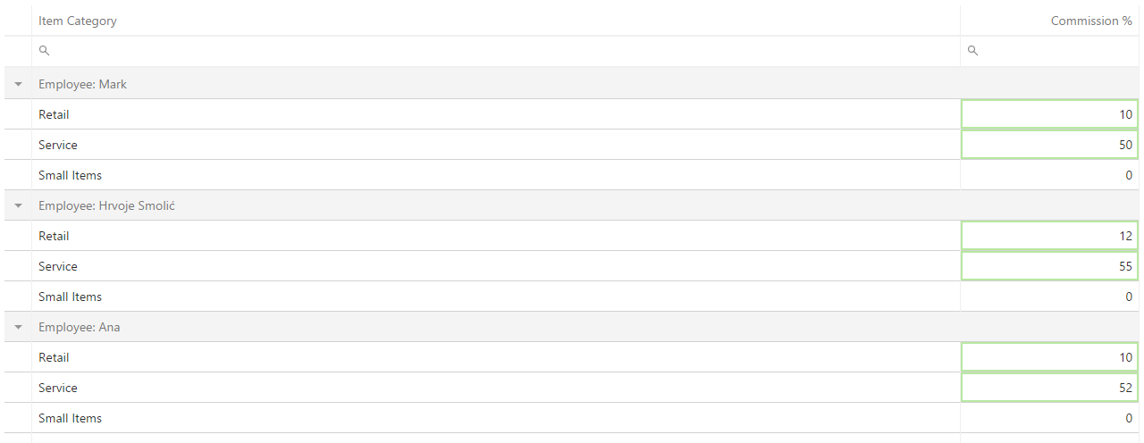
and finally, press SAVE on „Save“ button.

Commissions percentages are calculated from the Gross Amount.
Where can I see commissions?
You will see a commission table on Revenue per Category report – in the table:
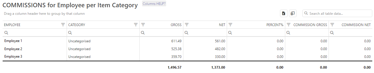
Inventory Settings
1. Manual set up of Quantity value
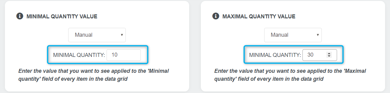

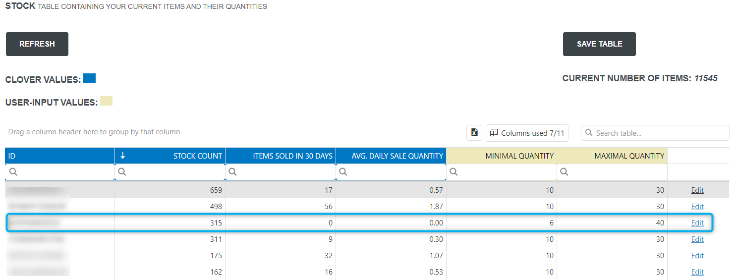
2. Formula based set up of Quantity value
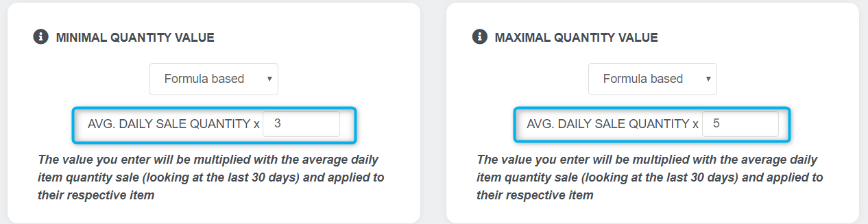
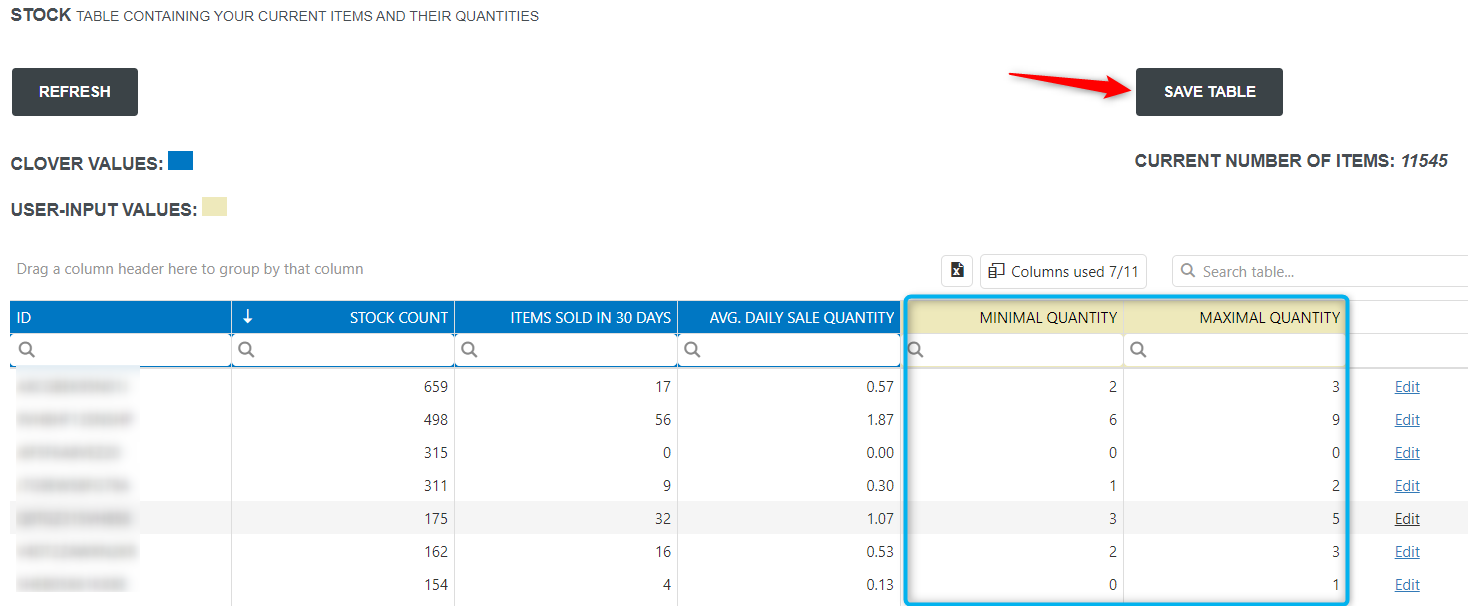
Frequently Asked Questions / Troubleshooting
In the next sections, we will gather frequently asked questions we receive at our support email address.
If those questions/answers didn’t have solution to your problem, please send us an email with your question to clover@qualia.hr
Item / Order CSV Export
Every order-based report has the ability to export a report on an entire order-level into a CSV file. You can find the respective export buttons next to the refresh button at the top of a report.
Order-based reports can be accessed either directly via the Report List /Order-based report link in the top menu or by search in “Reports vault”. In each of the reports, there is the Options section. Here there are several options like:
- to print report
- download order based row data (CSV)
- download item based row data (CSV)
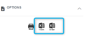
The downloaded file will contain data from the period that was selected in the Analyzing period.
The following information is available to order based export:
Merchant Name, Transaction Type, Device Name, Order, Order Type, Date, Original Date, Day, Hour, Day Part, Time, Employee, Payment Type, Payment Date, Payment Time, Card Type, Order Amount, Order Pay Gross Amount, Order Refund Amount, Credit Amount, Order Gross Minus Refund, Order Tax Amount Gross, Order Tax Refund Amount, Credit Tax Amount, Order Net Tax Amount, Order Net Minus Tax Amount, Order Discount Names, Order Discount Percent, Order Discount Amount, Order Tip Amount, Order Service Charge, Tax Removed, isVat, Pay Type, Manual Transaction
The following information is available to order with item details export:
Merchant Name, Transaction Type, Device Name, Order, Order Type, Date, Original Date, Day, Hour, Day Part, Time, Employee, Payment Type, Payment Date, Payment Time, Card Type, Order Amount, Order Pay Gross Amount, Order Refund Amount, Credit Amount, Order Gross Minus Refund, Order Tax Amount Gross, Order Tax Refund Amount, Credit Tax Amount, Order Net Tax Amount, Order Net Minus Tax Amount, Order Discount Names, Order Discount Percent, Order Discount Amount, Order Tip Amount, Order Service Charge, Tax Removed, isVat, Pay Type, Manual Transaction, Item ID, SKU, Item Name, Item Code, Note, Refunded, isRevenue, Exchanged, Tag, Tag1, Tag2, Tag3, Category, Category1, Category2, Category3, Modifiers, Item Price, Item Cost, Item Modifications Amount, Item Discount Names, Item Discount in Percent, Item Disc. Amount from Perc., Item Discount in Amount, Item Disc. Amount from Perc. on Order, Item NET Discount Amount, Item Tax Amount, Item Gross Amount, Item NET Amount
When to use Payment and when to use Order based reports?
Payment based reports are very fast reports that will give you a quick look (overview) of important aspects of your business like Payments, Employees and Item Categories. In other words, Payment based reports are fast business overviews of revenues. If you quickly want to see all the payments made in some period, you should choose Payments Overview.
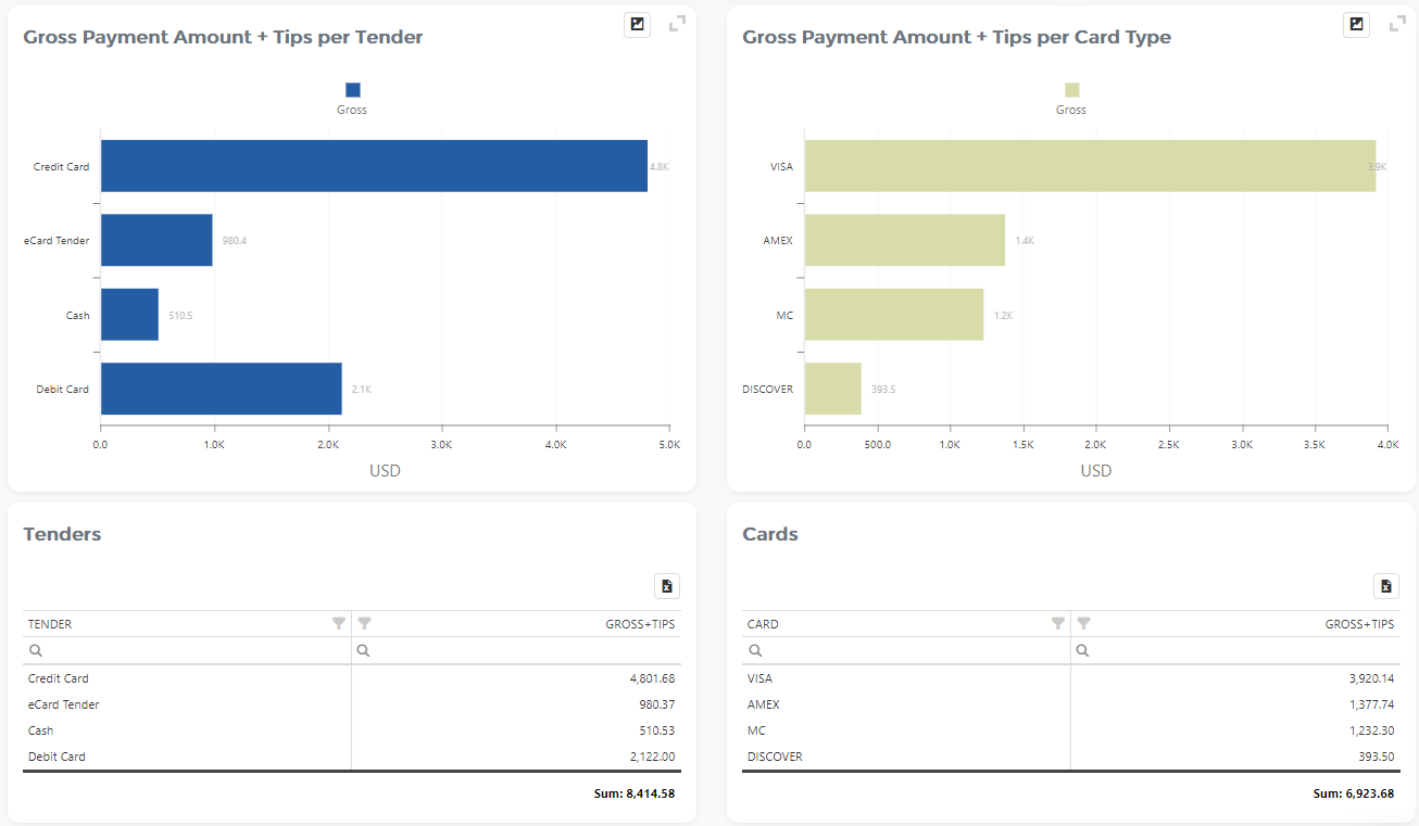
As you can see from the picture above, Overviews don’t give many details.
For this reason, we have Order based reports, that gives you a detailed analysis of Clover data. Each report shows you a small segment of your business in great detail. Due to a larger amount of details, Reports are slower than Overviews. Order based Reports are a better choice if you need to get a lot of information.
Payment based reports can show you an overview of the larger period than Reports (366 days range)
Multi location support
I have more than one Merchant ID (location) in Clover. Does Analytics App support that?
Yes. If you have more merchant locations, they all can be integrated into our multi-location environment.
How to setup a Multi-location feature?
- Each location you want to integrate into a multi-location environment must be BASIC or ADVANCED tier
- Log in at least once with each of your locations (initial login) to Analytics App
- Send us an e-mail at clover@qualia.hr with your merchant IDs for each location
- We will send you an e-mail confirmation (usually within 1-2 business days)
Day parts in details
Day parts are defined in the “General settings” section. That information you can find here.
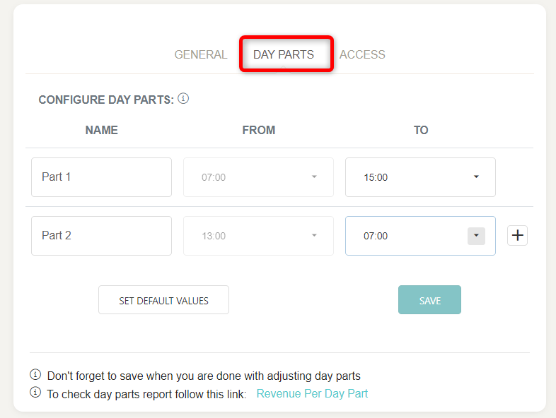
Here we will show more situations and how they can be set up.
There you will find Day parts option. By default, in Analytics there are 8 day parts, and depending on Business day start, it could look like this:
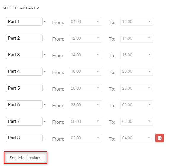
Example 1:
- your business day starts at 5 am
- you want to divide the day into 6 equal time dayparts
You can choose to have either three or up to eight parts. If you wish to get just three-day parts, set ‘To’ time in Part 3 to 24:00, and Part 4 will be removed and so on. If you change your mind, just select any other time in Part 3 ‘To’ time and you will once again have four-day parts.
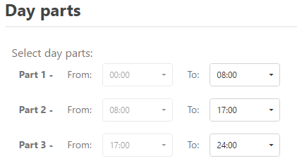
After selecting dayparts, it is necessary to press the SAVE button. 
For our example, I will choose dayparts like this:
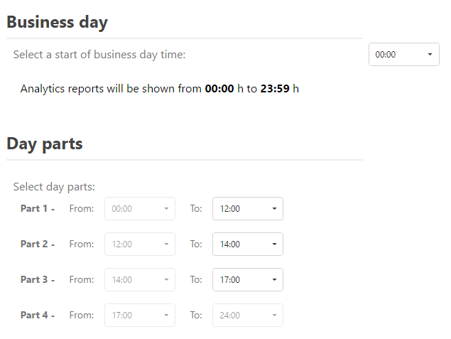
Note that you can have custom day part names set by clicking on the name of daypart and changing it to whatever you want. How correct you define your dayparts, that better information you would see in Revenue per Day Part report. Information on that report you can find here.
I have the FREE Tier. Why don’t I see some report filters?
In STARTER (free) tier, there are no reports available. The free tier offers the Dashboard with some basic daily sales information.
Buy Essential, Basic or Advanced Tier to avoid any limitations and to get additional reports and dashboards.
With Basic or Advanced Tier you will have the opportunity to have 30+ reports at your disposal.
From how long ago can I see data in Analytics?
You can track data from the first day you started using Clover, regardless of when you installed Analytics App. For example, if you started using Clover a year ago, and you installed Analytics app last week, you will be able to analyze data from a year ago.
Are there any time limitations on Payment and Order based reports?
Most of our reports give you the possibility to select periods of your choosing, either choosing your custom dates or by using predefined periods.
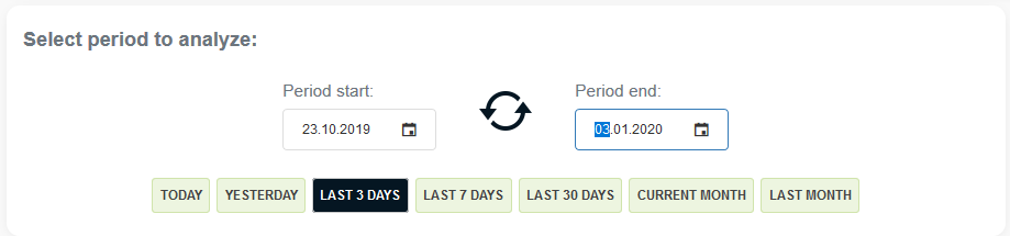
The selected period can contain a maximum of 366 days (one year) on Payment based reports, and on other reports maximum of 62 Days for Basic tier, and 90 days for Advanced tier users. In FREE tier there are no reports, only daily Dashboard.
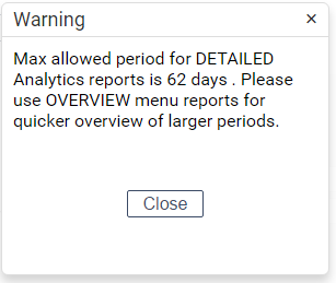
My browser doesn’t show new Analytics App version?
Sometimes web browser caches “old” data and this disables you from seeing newest features or improvements.
Steps that should force the browser to get the latest update:
- Try refreshing Analytics page few times or close your browser.
- Clear browser cache
- Open Analytics in a different browser
How to easily set up Employees Commissions or Employees-Categories Commissions?
You can find the Commission settings within the Setup page in the main menu.

Details about what types of commissions we support, on which reports can you see Commissions and how to properly adjust them are explained on this link.
How to track Modifiers in analytics?
In Clover, you can define Modifiers that modify the price of Items. If you want to track the number of Modifiers being sold, Modifiers Report is the perfect report for you. It can be accessed via direct link in top menu Report List / Order based reports / Items / Modifiers Report or by search in Reports Vault.
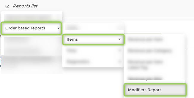
All details about Modifiers Report can be found at this link here
Additional Filters on reports
Analytics reports can be multi-dimensionally filtered, and for every filter, you can select one or more values.
For example, on Revenue Trends reports you can see Additional Filters panel:
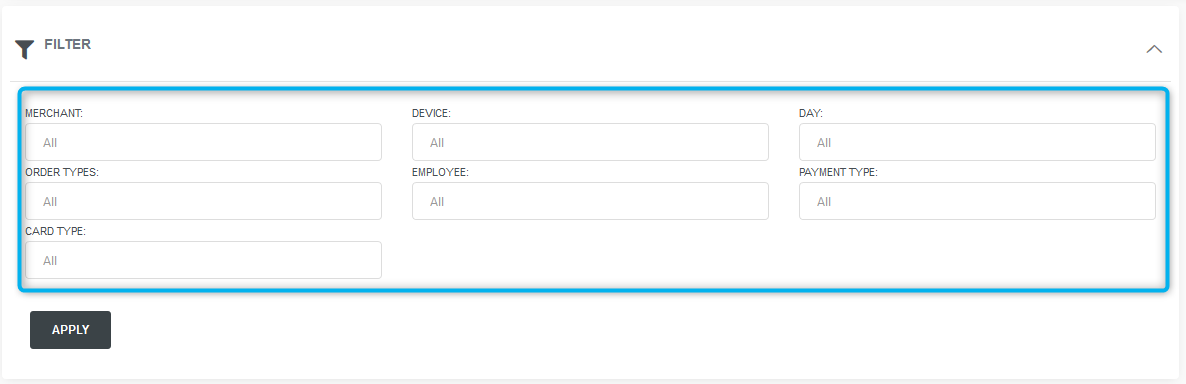
Additional filters are
- MERCHANT
- DEVICE
- DAY
- ORDER TYPE
- EMPLOYEE
- PAYMENT TYPE
- CARD TYPE
For every filter, you can select one or more values.
Advanced Analysis
So, where is the beauty in this feature?
Consider Revenue Trends report. So far, it gave you all kinds of information connected to revenue per date. You can clearly see a net revenue trend chart, for example.
But what if you wish to see all those charts and all that info, but only for one of your devices? You just have to select that device in the additional filter:
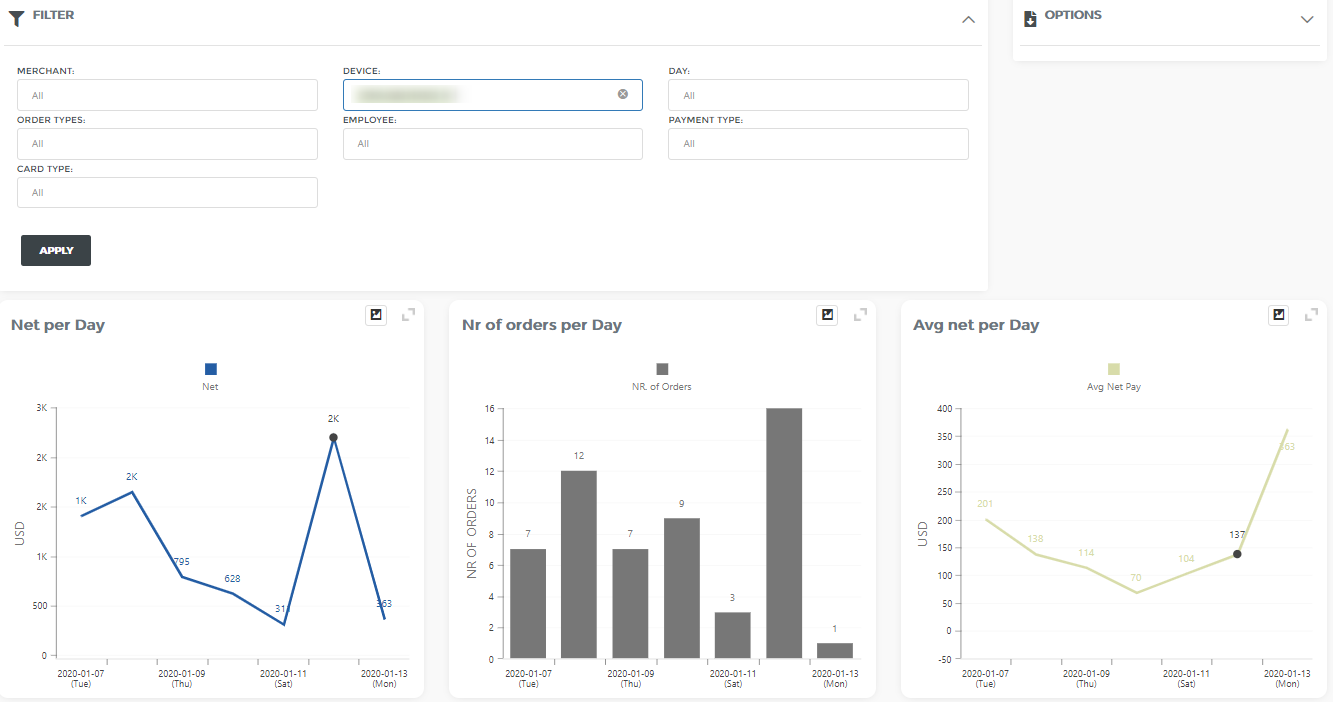
All charts and tables will smoothly filter to new values!
Further, if you want to analyze all that info, for Till 2 device, for Credit Cards, and for Visa and MC card types, just select:
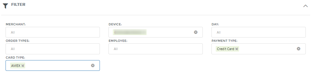
As you can see, only your imagination and business need is a limit on what you want to filter and analyze (just one of the ideas – try to select 1 month of data, select only Monday and Friday in DAY filter and you will see an immediate comparison between those two days.)
Which customers buys the most?
If you want to know which customers are buying most often or which customer spent the most, then Revenue per Customer report is all that you need. One of the ways to access to Revenue per Customer report is directly via Report list in the top menu bar Report list / Order based reports / Order / Revenue per Customers.
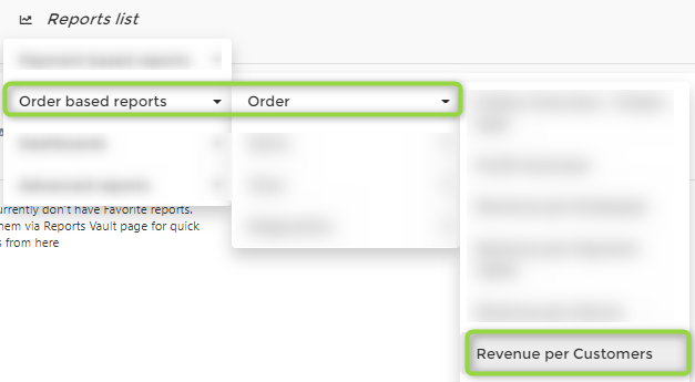
You can check detailed explanations on this link here
How to see your stock value?
Stock Value Dashboard will show you all Items currently in stock and what is their total value. For more information check this link here
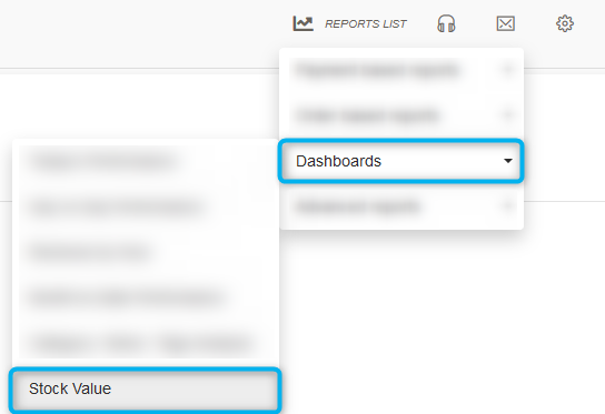
You can also see stock quantities on reports: revenue per Item, per Category, per Tag/Label and per SKU. Note that in this report you will only see stock for those items that were sold in a selected period. For the full picture, you should use the Stock Value Dashboard.
How to compare two time periods?
Two Periods Comparison Overview allows you to select periods that will be compared in more levels like per merchant, per tender and per employee. Report where you can get this data is called “Two period Comparison”. It could be accessed directly via link Report list /Payment based reports /Two period Comparison or via search in “Reports vault”
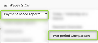
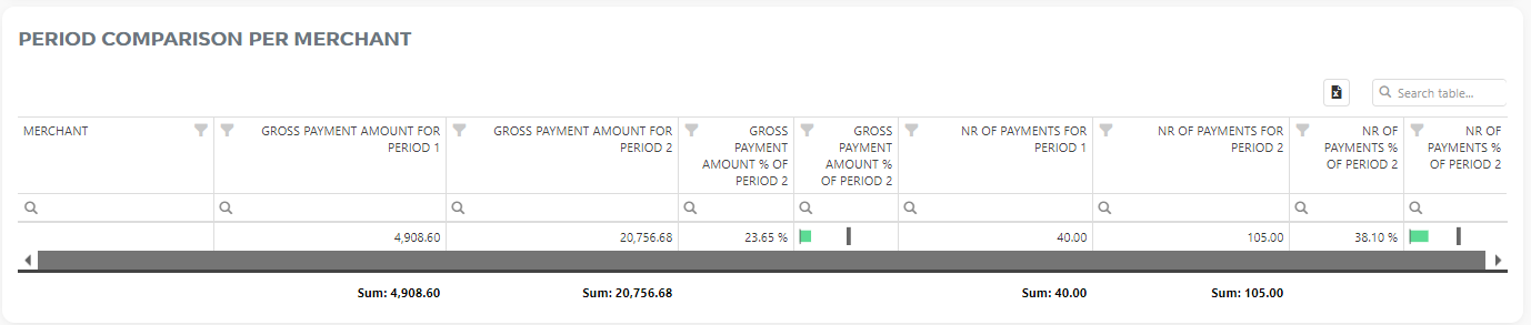
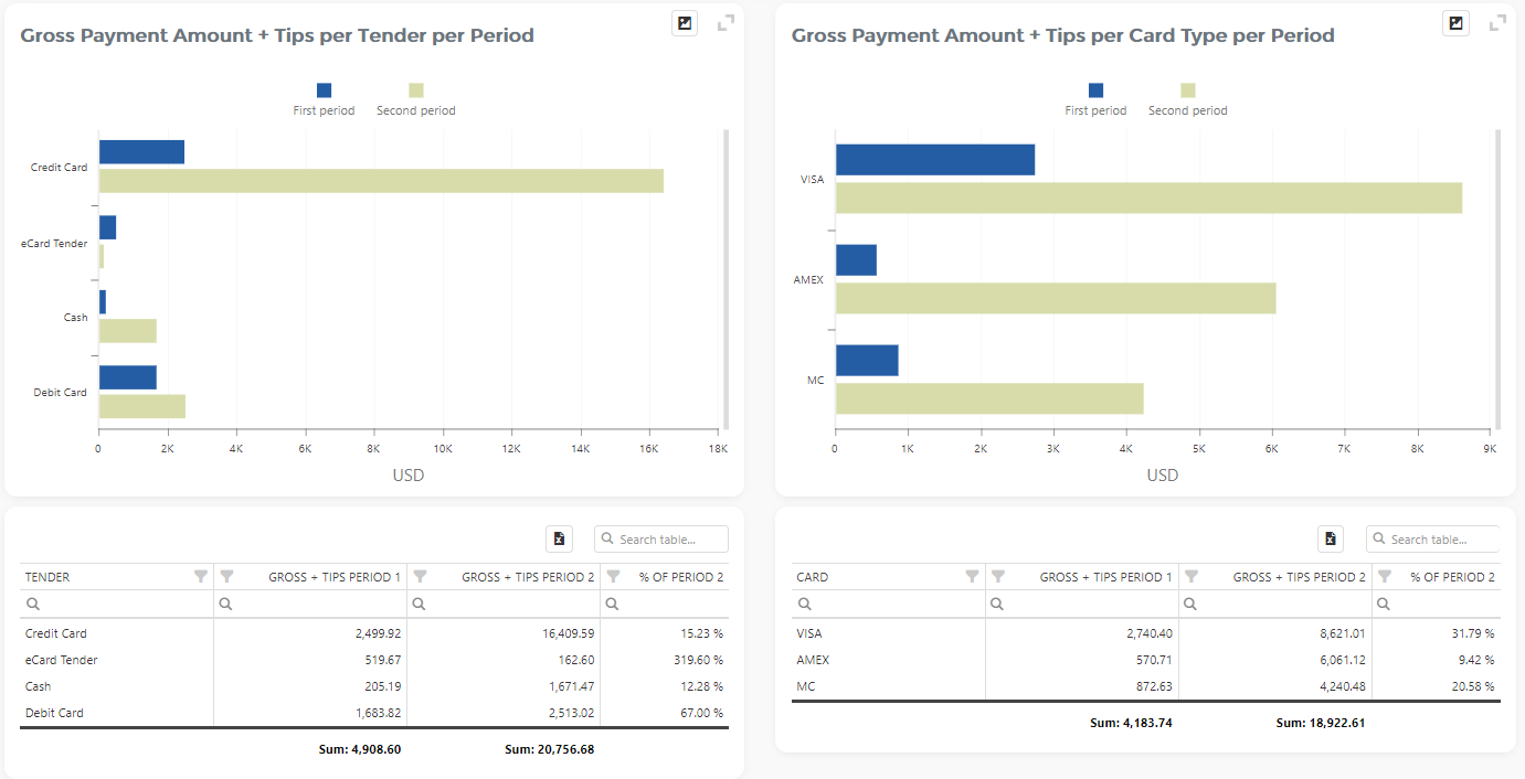
Details about Period Comparison Overview are available here
How to make the best use of Analytics tables?
To answer this question we created a short video of tips&tricks you can check out here.
Can I make a custom table and export it to the Excel?
Yes, all our tables are fully customizable, and by exporting them to Excel they are preserved. Each table in Analytics can be exported into Excel. How table is viewed in the app, that how it will be when exported.
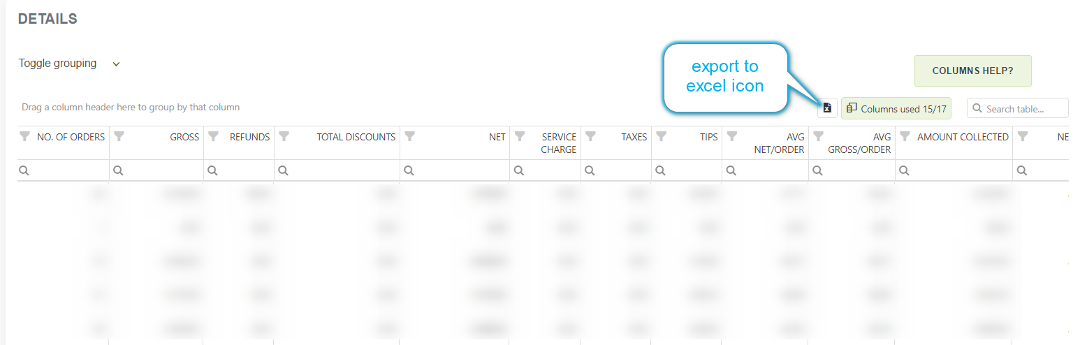
To answer this question we created a short video of tips&tricks you can check out here
Exporting the table to Excel is shown at the end of the video but we are encouraging you to check the whole video as you might learn some features you did not know about.
Which items contribute to 80% of my revenue?
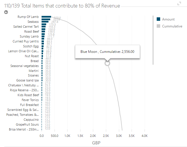
Which Items I didn’t sell in selected period?
In Item Categories Overview report we have a table called ‘Unsold Items’. This table is meant to help you identify which items weren’t so popular in the selected period, so you can take actions based on that intelligence – especially if you have many unsold, “unpopular” items on stock.
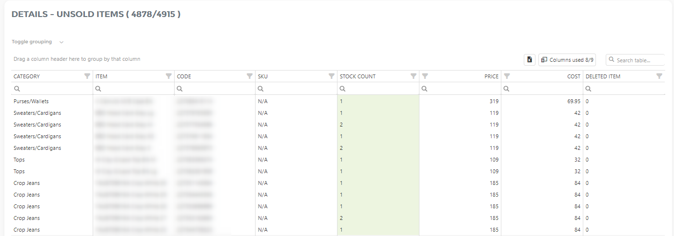
Where can i get Analytics App for my cellphone?
Analytics for Clover is web application developed in the most modern web application framework. It is designed to work well on any device, including desktops, tablets, and mobile devices. For that reason, we don’t see the need for developing native mobile Analytics apps.
Supported web browsers are:
Can i hide Analytcs app from my employees?
Yes, it is possible to hide Analytics from your Employees.
Who can access Analytics is managed through General Settings – Security Settings.
You can read how to manage access to Analytics here
Is it possible to export graph?
Yes, you can print or export any chart in Analytics to one of the following formats: PNG, PDF, JPEG, SVG or GIF.
Export icon ( ) can be found in the upper right corner of any chart. By clicking on it, it will show you all the formats you can export the chart to:
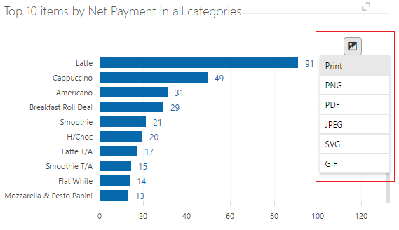
Just one click, and you will get the desired chart in any format you chose. A simple, elegant and fast solution for getting charts saved as pictures in high quality, and in the same form as you see it on our Analytics App. That means that if you zoom on a chart, scroll up or down, in the export, the picture will be the exactly the same ( with zooms and scrolling included ).
Possible difference between Clover reports and Analytics reports
Sometimes you can notice that amounts on Clover Payment reports are somewhat different than those in Analytics reports. This difference most likely comes from the fact that Clover reports are based on payments, and Analytics reports are based on orders.
Orders are usually placed on the same day, but payments don’t always have to be on the same day as order. Example: I placed an order yesterday, and I pay for that order today. Result: If I look at yesterday’s report in Clover reports, I will not see that amount. In Analytics reports for yesterday, that amount will be shown.
- Today / Yesterday at a glance
- Payments overview
- Two periods comparison overview
- Employees overview
- Item categories overview
- Item categories treemap
Order based reports
Possible difference between Clover reports and Analytics reports 2
One customer came to us with a problem in which he stated that he is having a difference in Clovers Payments Tax Report and Analytics App Report.
He wanted to look at the whole month so he could give details to his accountant. But he couldn’t figure out why is there a TAX difference in our Analytics Report and Clover’s report.
After a brief analyzing we figured out the following:
This was what he saw on Clover Payment Tax report:
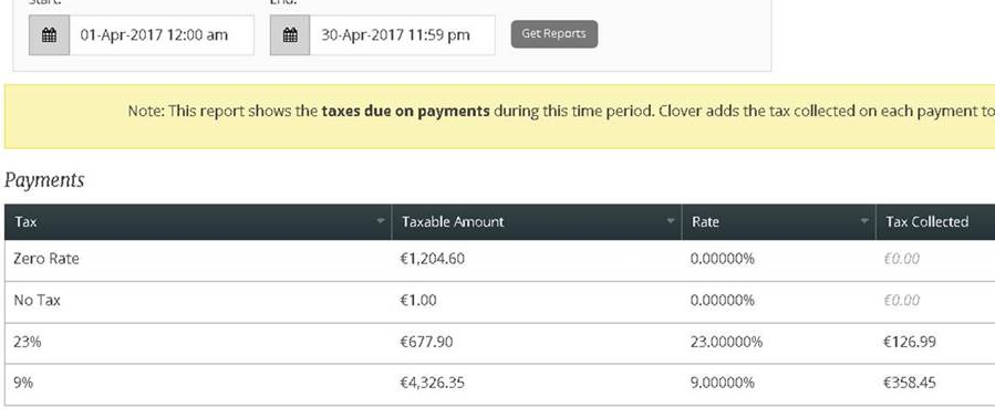
You can see that Tax Collected overall equals to 126.99 + 385.45 = 485.44.
After he checked Taxes on Clovers report, he went and opened our fast Payments Overview report for the same period and he got these results:
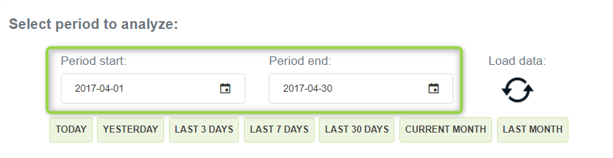
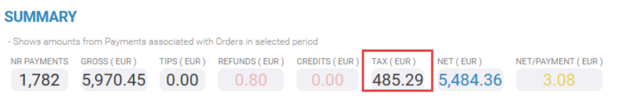
So you can see that the highlighted TAX is 485.29, which is different than 485.44 he was getting from Clover Report.
The reason for that is due to the fact that there was one refund in April ( 0,80 EUR). The tax amount for this refund was 0,15 EUR.
Since Analytics takes into account the refund, and the Clover report doesn’t, we have a difference of 0,15 EUR.
Possible difference in Clover reports and Analytics reports 3 - Diagnose
Sometimes, numbers that you get in SUMMARY doesn’t match the ones you can see at the bottom of your tables as totals.
Example:
In Summary, I get these numbers:
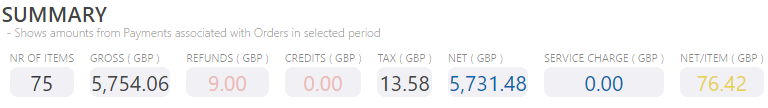
But in report Revenue per Item, I get this numbers at the bottom totals:
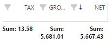
I can see that my net number is different by almost $64. Next step I take is to open my Diagnostic Tools and find Over/Under Paid Orders for the same time period. There I can see that the difference in NET is also $64. This means that these three orders are responsible for the discrepancy.
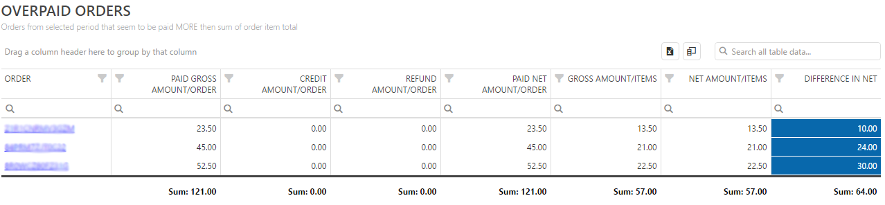
I will open last order by clicking on the underlined ORDER ID. And there I can see the following:
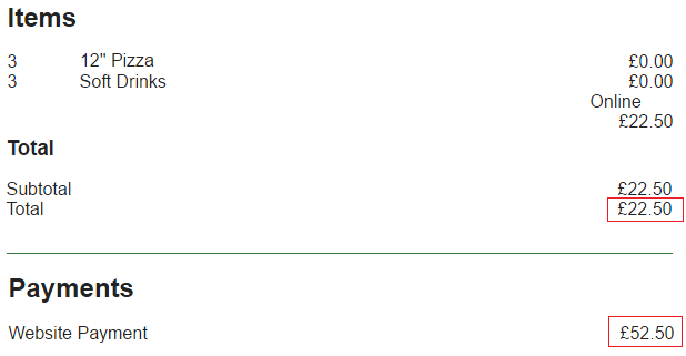
I can see that there really is a difference between order amount and the payment amount, and the difference is exactly $30. What is the reason for this difference, we can’t tell for sure at this point. If you find similar examples and know the reason for discrepancies, please send us an email.
This is just an indication that there are possible issues with the order, and you should take a closer look at orders listed in Over/Under – Paid Orders.
Automatic Emails Reports
The automatic emailing has several types of reports it can send each day. The complete list of reports and its example contents can be found in the list below:
Here you can find a list of all predefined e-Reports and examples in excel.
Payment Summary reports
Payment Summary
Payment Tenders
Payments by Hour
Orders Summary reports
Orders summary
Employees report
Employees Shifts
Devices report
Order Types report
Tenders report-orders
Day in a Week report
Hours report-orders
Hours report-payments
Credit Cards report
Day Parts report
Categories report
Labels report
Items
Modifier Summary
Modifier Combinations
Modifier Item Hierarchy
Comparison reports
Payment Comparison Day vs Day
Payment Comparison Year-To-Date
Payment Comparison Month-To-Date
Payment Comparison Week-To-Date
Order Comparison Day vs Day
Order Comparison Month-To-Date
Order Comparison Week-To-Date
Stock Value reports
Stock by Category report
Stock by Labels report
Stock by SKU report
Stock by Item Code report
Detailed reports
Order Level Details report
Item Level Details report
Max Orders report
Max Payments report
Max Orders/Items report
Other reports
Cash Log
Custom data period in e-Reports scheduler explained
CUSTOM DATA PERIOD explained
If predefined data periods are not enough you can always select CUSTOM data period where you will need to define a data period start and period end:
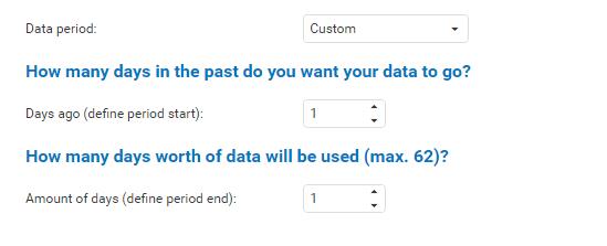
In the above picture, you can see that the custom period is selected.
Data period start is 1 day ago (starting position/period start) and the amount of days is 1 day, which would be equal to Yesterday’s data.
As we fetch data starting from 1 day ago and going 1 day ‘forward’
Example 2: if we select period start to be 4, and the number of days 4. You would receive the last 4 days of data in your report
Additional help:
Creation of CUSTOM ITEM or ORDER report
Custom reports are a new feature we developed as per the request of our app users.
For simplicity, we will show you two examples via animation of how you can create your custom reports.
Custom orders based report EXAMPLE 1
In the following example, we set up a report to receive it weekly on Monday for the last 7 days of data. The report will show us the customer name, their phone number and the number of orders they made in the last 7 days.
Custom items based report EXAMPLE 2
In the following example, we wish to receive a daily report consisted of yesterday’s data which will show us all categories and items that were sold from those categories with their overall Item NET value.
Also, we will select the Merchant name, just so we can distinguish categories/items from each location. If we don’t select the merchant name and you have selected multiple locations, data will be summarized from both locations.