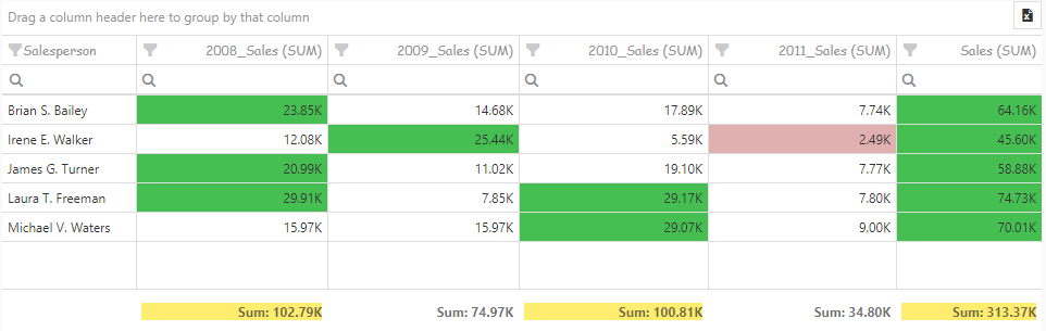
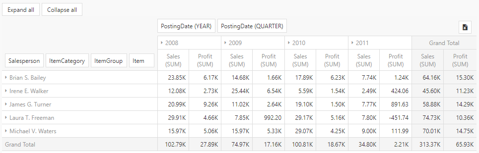
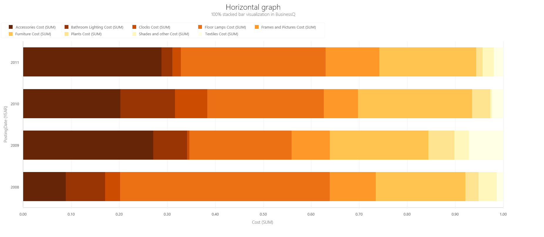
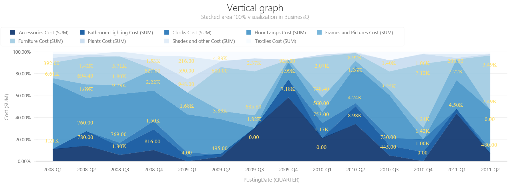
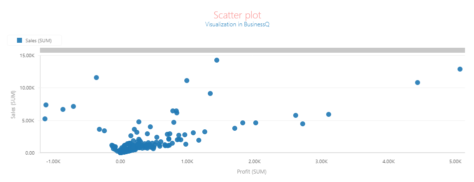
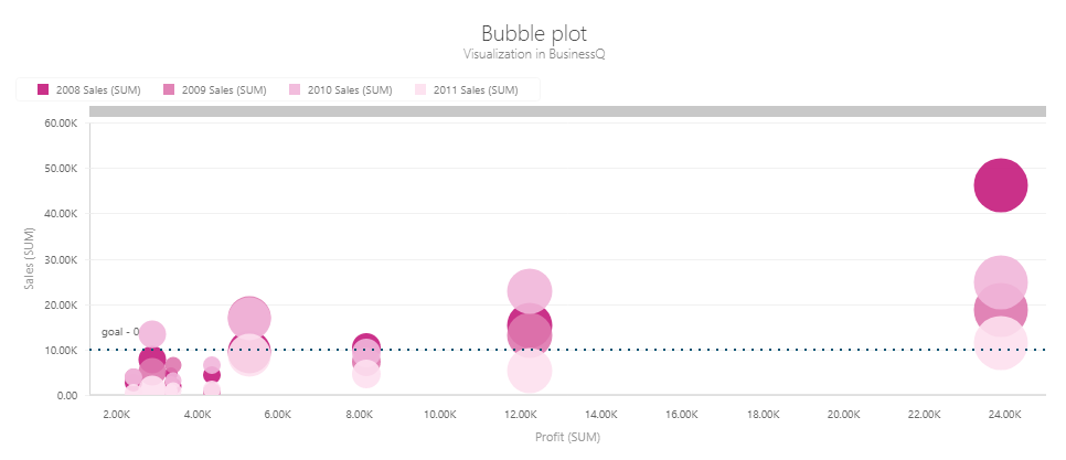
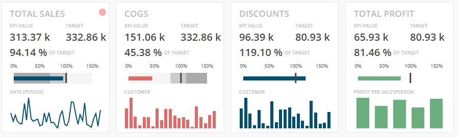
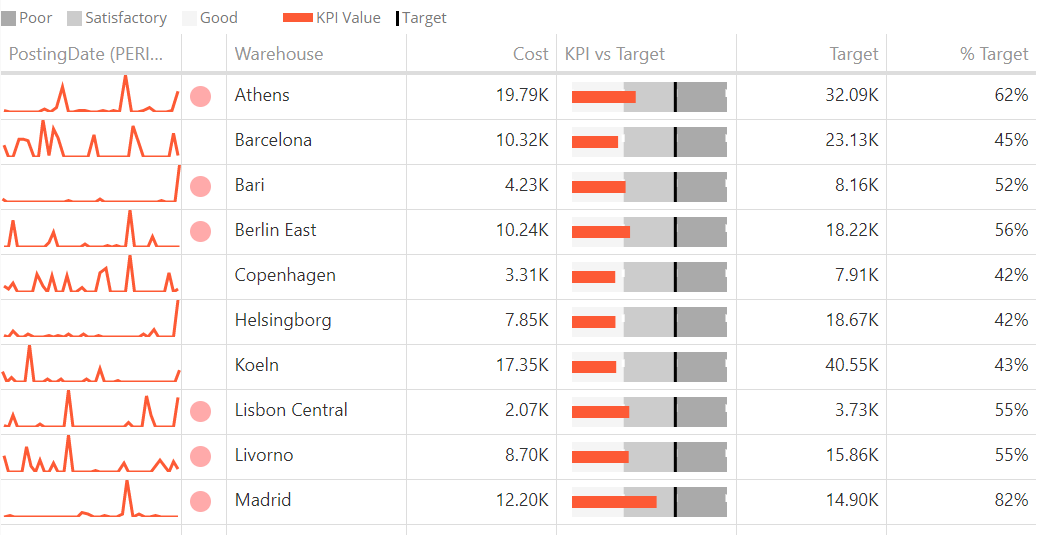
Data visualization from our carefully selected VISUALIZE tabs. Data visualization from our carefully selected VISUALIZE tabs. Data visualization from our carefully selected VISUALIZE tabs. Data visualization from our carefully selected VISUALIZE tabs. VISUALIZE In BusinessQ software, select appropriate data visualization from our carefully selected VISUALIZE tabs. TABLE Usage: Detailed Reports, Regular Tables, Cross-Tables, Ranking, Nominal Comparisons… Read more… PIVOT TABLE Usage: Data Summarization, Ad Hoc data pivoting… Read more… HORIZONTAL GRAPH Usage: Ranking, Nominal Comparisons, Part to whole, Deviation, Distribution… Read more… VERTICAL GRAPH Usage: Time Series, Ranking, Nominal Comparisons, Part-to-whole, Deviation, Distribution… Read more… SCATTER PLOT Usage: Correlation Show data as: Plot (Triangle, Cross, Circle, Polygon, Square) Read more… BUBBLE PLOT Usage: Correlation Description: Similar to Scatter Plot, Bubble Plot is defined by 3 value series and the third one controls the size of the data point. Read more… KPI CARD Usage: One Key Performance Indicator Read more… KPI MATRIX Usage: Key Performance Indicators Read more… PIE CHART Usage: Part to whole (for small number of items) Actions: TOP/BOTTOM Ranking Read more… TreeMap Usage: Display hierarchical data as a set of nested rectangles… Read more… You don’t see the visualization type you need for your next project? We would love to hear from you!