

Basic info
This introduction is important to understand further explanations and steps needed to create dashboards and reports in BusinessQ software. First step in creating any visualization is a connection to reporting database. Then you define a business model, meta-layer that maps to data in your reporting database using understandable business terms. After that, you define and make one or more reports. Finally, from one or more reports you can design information Dashboard:
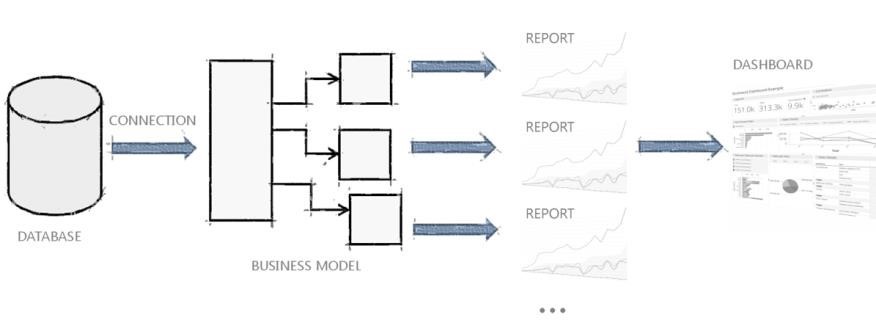
To provide flexibility, there are exceptions to the steps above. Instead of using business model, you can create reports through freehand SQL queries. For more details about distinction between Business Model and Freehand based reports, you can check Create Report section. And if your data is in Excel or CSV format, you can bypass connection and business model, and go directly to creating reports.
Welcome screen
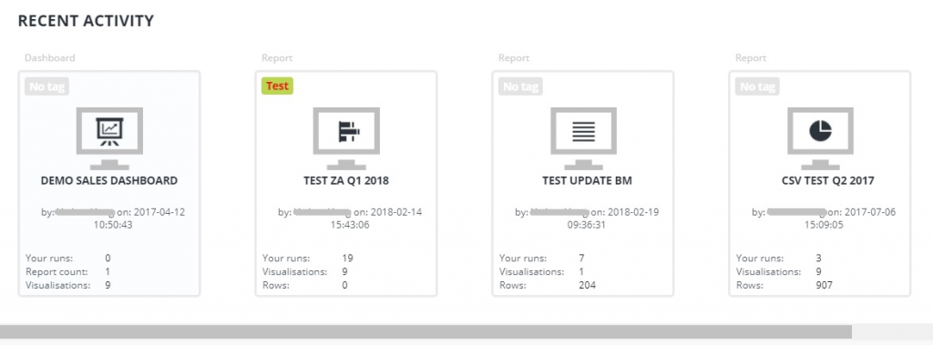
If you don’t use report or dashboard instead of welcome screen, you will be able to see all your basic business data in one place. Also, you are able to see your recent activity (reports and dashboards that you’ve recently used)
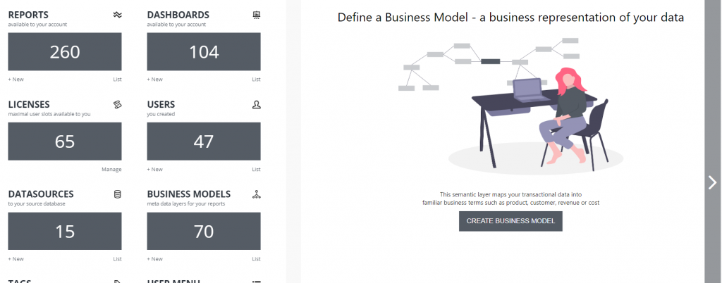
BusinessQ Administrator
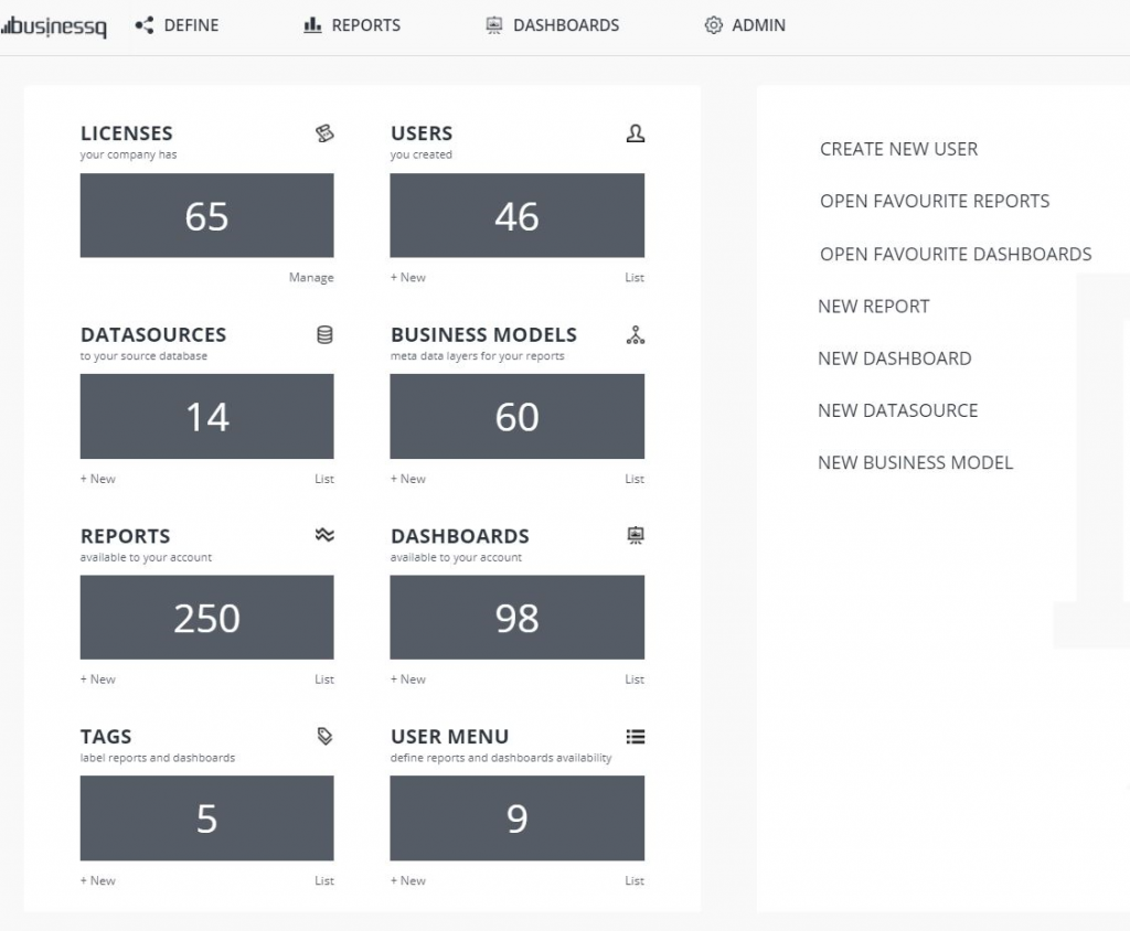
If you are BusinessQ Administrator, on welcome screen you can see data about licenses, users, data sources, business models, reports, dashboards, tags and user menus. Also, you are able from there go to lists or create new items, without clicking on the menu.
Recent activity is shown under this data.
BusinessQ Viewer
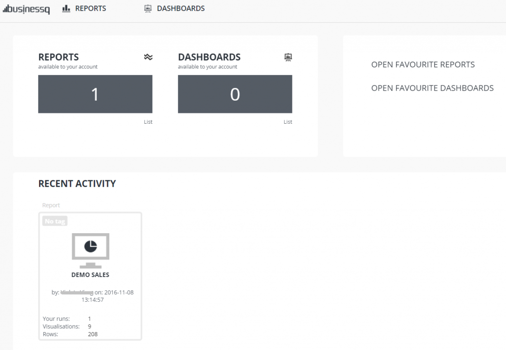
If you are BusinessQ Viewer, on welcome screen you can see available reports and dashboards. Also, you can go to lists of all and favorite reports and dashboards, without clicking on the menu.
Under this data you can see your recent activity
Data source
Every report definition starts with a data source connection to database where reporting tables reside. A Data Source entity in BusinessQ contains the connection parameters for database middleware. All Business Models created within BusinessQ need appropriate data sources.
Business model
Business Model is the very reason why BusinessQ is easy-to-use for non-technical users. With Business Model, you can access information from database without any SQL or coding knowledge. Accessing information is easy because BusinessQ uses a meta-data layer that resides between actual data and data visualization in reports and dashboards.
Your BusinessQ Administrator creates a Business Model which maps data from reporting database to every-day, understandable business terms. For end-users, this makes it easy to select the data they want for report through user-friendly drag-and-drop interface. End users do not have to think about what is under business model layer, they will just operate with business terms like Sales Amount, Quantity, Customer, Month etc.
Business model consist of database tables, table joins and business model definition. Definition consists of columns from database tables. There are two types of model definition columns:
- – dimensions (e.g. item name, state, store)
- – measures (e.g. number of units sold, profit, sales target)
When end user builds a report, she selects items from a business model, and then “runs” a report. What is happening when end user runs or refreshes a report? First, BusinessQ connects to appropriate Business Model. Business Model then translates user request for data into appropriate SQL query and through Data Source sends it to the database. Then Business Model retrieves the requested data and returns it to report. Finally, report turns data into visualizations.
Report
In BusinessQ a report is a collection of data representations/visualizations, based upon a subset of data chosen from a business model. In a report, you define
- – the subset of model fields to use for report (SELECT clause in SQL statement),
- – which model fields will be included as SQL filters to be chosen before report’s run (WHERE clause in SQL statement).
On this subset, you can then create one or more data visualizations (that is pivot table, bar chart, KPI chart, pie chart etc.).
One feature of BusinessQ reports is that you can give access to so called “public” reports to anyone – e.g. you can embed them to your public webpages or blogs. You can find more on public reports in “Create Report” section.
Dashboard
Each dashboard is a collection of report visualizations on a single page. Dashboard consist of zero or more of each:
- – visualization elements (any visualization from any report)
- – text elements (for titles, subtitles etc.)
- – images (must be accessible from web)
- – web pages (must be accessible from web)
- – local filters (any dimension field from reports present on dashboard)
Just like with reports, you can have “public” dashboards for whom you can give access to anyone.
Menu
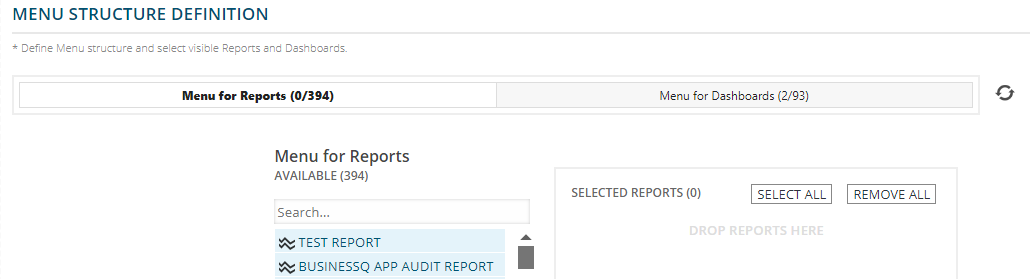
Menu determines which reports and/or dashboards users can view and access, e.g. one set of reports for sales department, another for HR department, etc. It can be viewed as a security feature. In order to define/limit which reports or dashboards a user can view, you use “User Menu” entity. For each Menu, you can define which reports and/or dashboards will be part of it. Each menu can have zero or more reports and dashboards. And each report and dashboard can be in zero or more menus.
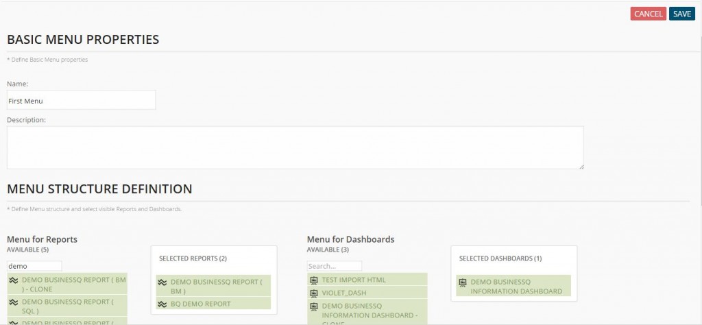
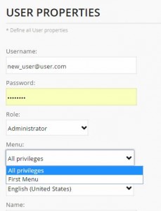
Then, when you create or edit a user, you select a single menu for them. There is a special hidden menu called “All privileges” that you can give users – user with that menu will be able to access all reports and dashboards.
Each user will have access to reports and dashboards included in the menu to which it is linked, and also to every report and dashboard that user has created.
There is an option to select all or remove all existing reports or dashboards from the menu. Also, you can see an additional refresh button added so you can always fetch the newest version of your report and dashboard list without refreshing the whole page.
Integration
BusinessQ can easily be integrated into your web pages or blogs, or even into your ERP application as a special reporting and analytical module. BusinessQ offers two levels of integration, both levels are based on HTML inline frame element <iframe>:
- – Public reports and dashboards. As mentioned in “Reports” section above, you can set a report or a dashboard as Public. This will allow anyone, even non-BusinessQ users, to view it. This type of integration is suitable if you want to add visualizations to your public web pages or blogs for everyone to see. You can easily embed BusinessQ report or dashboard by adding a single line into your web page, e.g.:
<iframe src="https://your.server/businessq/#/report/1/view" width="100%" height="700"></iframe>
More on public integration can be found under “Create Report” section.
- – Single sign-on (SSO) integration. In case you want more control over who can access specific reports and dashboards, public approach is not suitable. With SSO, BusinessQ will know exactly who is opening reports and dashboards and will check if the user has necessary rights to view them. Although you can also embed SSO integrated reports and dashboards with a single line of code, it is more complicated than with public integration because it involves generating temporary token (with which BusinessQ will authenticate the user) and adding it to URL in
<iframe>srcattribute. You can find more detailed technical overview under “SSO” section.
How to get started
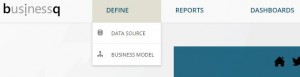
On BusinessQ “Home” page you can find a few simple ways that will help you to create your reports and dashboards.
At the top of the “Home” page you can see these steps:
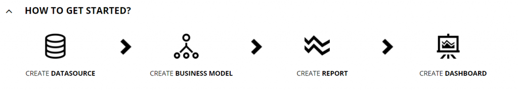
This is the basic steps for your reporting.
First, you need to create a data source, then you create a business model and after that, you are ready for reports. When you have at least one report you can create a dashboard from it.
By clicking on image or text below it you will be redirected to a part of BusinessQ that you selected.
Also, on the “Home” screen you can find the slide show with these steps and description of each step.
Data Sources
The first thing to do in order to create reports and dashboards is to define a data source, that is a database where the data to be analyzed resides. If you use CSV or Excel data you can go directly to “Reports” (for more info check “Reports” section).
Simply go on “Data source” item on “Define” menu.
In data source home you will find the list of currently defined data sources. Under the “Data Source” title you can find “New” button to create new data sources. To edit existing data sources, you can double click it from the list or you can click an edit button that appears when you select one data source from the list. You can clone existing data source; clone button also appears when you select one data source from the list.
Create Data Source
First you need to enter a name for this data source and select the database type. Currently, BusinessQ can connect to the following relational databases:
- – Oracle
- – Microsoft SQL Server (MSSQL)
- – PostgreSQL
- – MySQL
After you choose the database type, you will see other fields needed to configure the connection, like database server hostname (or IP address) and port (or instance for MSSQL), database name, and user credentials.
IMPORTANT: If the Oracle instance uses service name, it can be entered in the same field as server name/IP. But in this case, port field must be empty – to distinguish between symbolic hostname and service name.
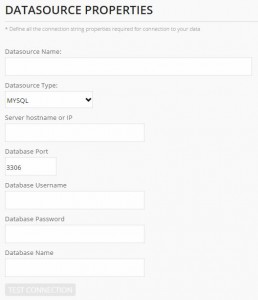
NOTE: Database user password is stored in BusinessQ repository with industry standard AES encryption algorithm in counter (CTR) mode with key length of 256 bits.
Press “Test connection” to check if inserted parameters are correct and that BusinessQ can connect to the desired database.
When done press “Create” button on the top-right end of the page.
Business Model
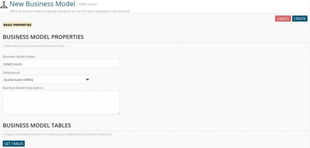
To create a business model, in the menu “Define” press “Business models” item. You will be presented with the list of existing business models.
To create a new one press “New” button under “Business Models” title. To edit existing one, choose it from the list and then click the “Edit” button or double click the item from the list. To clone existing one, choose it from the list and then click the “Clone” button.
Business Model is defined in three steps.
Create Business Model (from Data Source)
First step in creating a business model is setting a name and choosing a data source from the list upon which the data model will be defined.
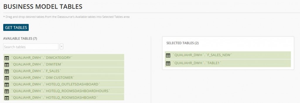
Once data source has been selected, press “GET TABLES” button to update “Available Tables” list.
Then, drag and drop tables you want to include in your business model from “Available Tables” list to “Selected Tables” list – a table or a list of tables whose columns will be used in the model definition, and possibly auxiliary tables needed for joining the primary data model tables.
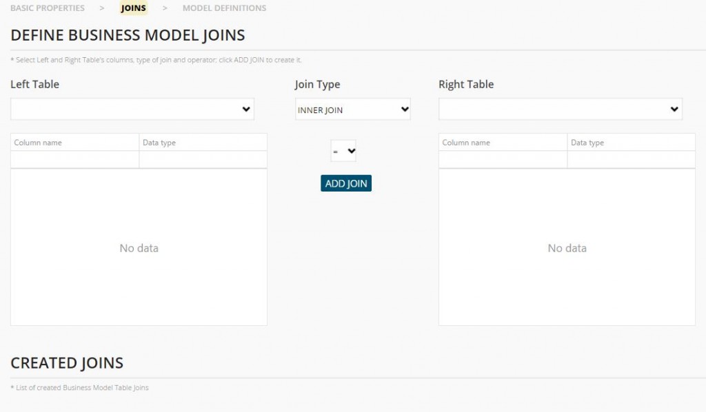
If you choose more than one table, you will need to define a way in which the tables are joined. Press “Joins” on the breadcrumbs on the bar under the page title “Edit Business Model”.
To define a new join, choose left table and left table column from the input fields to the left of the page, do the same for the right table and column, and select a join type and column operator. In case your tables have composite joins (two or more pairs of joining columns), you can repeatedly select the same left and right table with new column pair and operator and press Add Join – column pair will be appended (with AND operator) to the first defined join for those tables.
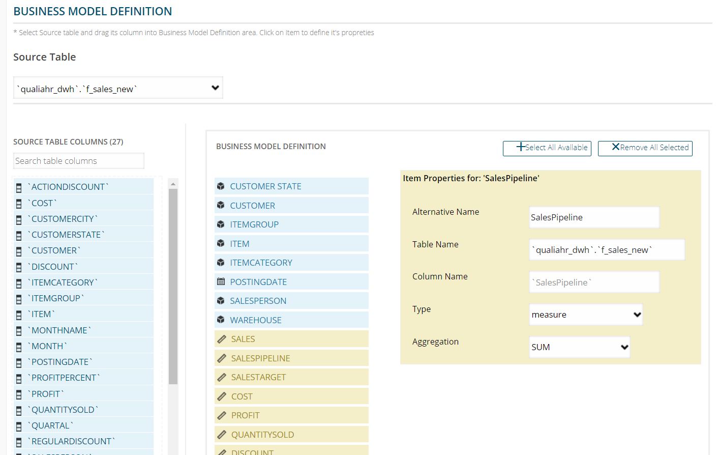
After defining joins, or directly from the first step if you have selected only one table, go to “Model Definitions” on the breadcrumbs.
In this step, you can choose table columns that will be a part of the business model definition by using a drag-and-drop interface or, if you wish to use all columns from one table simply add them by clicking on “Select All Available”. You can mark each model definition column as a measure (e.g. number of units sold, profit, sales target) or a dimension (e.g. item name, state, store), and can change its alternate name – the more descriptive name or business term for the model column that will appear to end user when creating or opening reports. For measures, you can specify the aggregation function (sum, average, min, max, count) to be used for grouping data in SQL query. For dimensions, you can choose its sub type:
- – plain text – column value will be displayed as-is,
- – date – column value will be formatted as date and will be localized, and BusinessQ will create additional helper model fields like YEAR, MONTH, PERIOD, etc.
NOTE: ‘Table name’ and ‘Column Name’ property will be used when generating SQL query from report; do not change ‘Table name’ and ‘Column Name’ property unless it was changed in the database.
Create Business Model (from another Business Model)
Multi Business Model can only be created from regular non-multi BMs, in other words from BMs based
on Data Source. You cannot create multi BM from other multi BMs.
This feature allows you to have data from different data sources in a single report.
There are two types of multi BMs that you can create and that are similar in concept to the classic
SQL constructs:
- JOIN – Join two or more Business Models just like they are tables in a relational database. Then create a new Business Model based on selected Business Models. For example, you can have your planning data from Excel together with actual sales data from the relational database in a single visualization.
- UNION – Combine data from two or more Business Models just like with UNION operator in SQL. Match columns from each Business Model with their equivalent. Finally, create a new Business Model based on matched columns. For example, you can combine data from different stores that have local databases as a single dataset.
Creating reports based on multi BMs is identical to creating them from regular datasource-based BMs. And they will follow rules defined on underlying BMs like BM filtering.
JOIN multi BM
JOIN multi BM is similar in concept to JOIN in SQL. And is very similar to how you define a classic datasource-based BM.
- Select BMs to join. They will serve like tables in a relational database.
- Define how their fields are joined with LEFT, RIGHT, INNER joins.
- Define business model definition with fields from selected BMs.
There are two subtypes of JOIN multi BM:
- Group/aggregate data before joining.
- Group/aggregate data after the join.
Group before join
First, perform grouping based on aggregation on each selected Business Model separately. Then, join selected Business Models to get the final dataset.
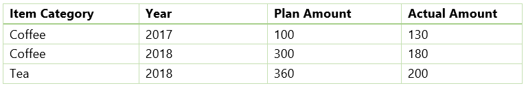
For example, if you have this planning data:
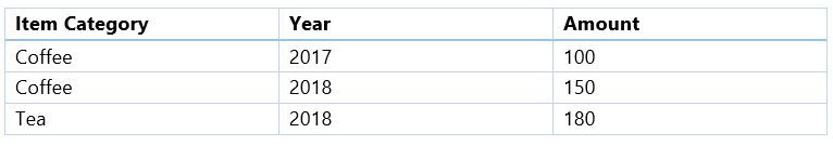
And let this be actual sales:
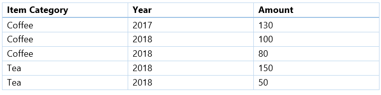
In this case, it would be preferred to first group planning and actual data separately and then join them. By grouping (SUM) actual sales before, we will get:
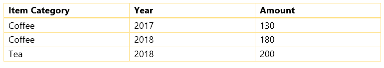
And after joining we get:
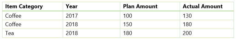
This is what we expect to get.
Group after join
First, perform join on selected Business Models. Then, perform grouping based on aggregation to get the final dataset.
For data from the previous example, we would first perform join and get this dataset:
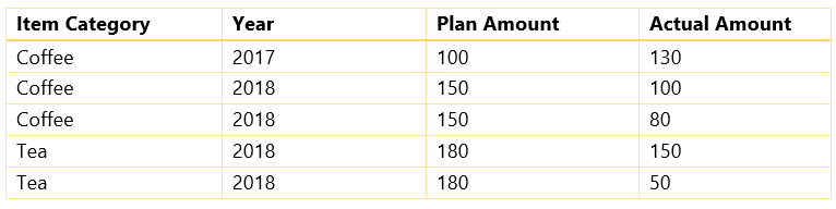
And after grouping by using SUM we get:
Plan amount is multiplied by the number of corresponding rows in actual data. For this particular example data, this is not what we want.
But this flow of group-after-join is more closely matched to traditional SQL concept of joining and grouping. And in this case, we can get the plan amount we expect by using a different aggregation function, like MIN or MAX or AVG. But it might not be intuitive and might not work in certain cases.
UNION multi BM
UNION multi BM is similar in concept to UNION in SQL. Defining them is similar to defining classic BM, but there are differences.
As an example, let say we want to get something similar to the following SQL:
SELECT a, b, c FROM bm1
UNION
SELECT m, n, o FROM bm2
UNION
SELECT x, y, z FROM bm3
Then we would:
- Select BMs to combine. They will serve like tables in a relational database.
- In our example, they will be bm1, bm2, bm3.
- Define ‘joins’, or more correctly, define matching columns from all BMs. This step is somewhat different compared to JOIN multi BM or regular BM.
- Left BM is always fixed and you cannot change it – it will be the topmost Business Model in selected list in the previous step.
- In our example, it will be bm1.
- Right BM can be changed among other BMs – all except the fixed left BM.
- In our example, they will be bm2 and bm3.
- Match fields from left and right BMs. Matching fields will appear in a list below, and will not be present anymore in available fields for that par of left and right BM.
- In our example, we will match fields a, b, c from bm1 with fields m, n, o from bm2, and fields x, y, z from bm3.
- Left BM is always fixed and you cannot change it – it will be the topmost Business Model in selected list in the previous step.
- Define business model definition with matched fields from left BM. It can be any BM since they are all equal but BusinessQ will choose the topmost selected BM.
- In our example, we define business model definition from fields a, b and c.
There are two subtypes of UNION multi BM:
- UNION – Removes duplicate data rows that come from different selected Business Models. Just like UNION operator in SQL.
- UNION ALL – Returns all data rows even if there are duplicates. Just like UNION ALL operator in SQL.
Report
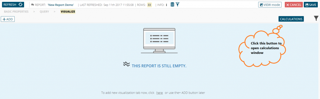
To create a report, go in “Reports” menu and chose “New Report”.
Alternatively, go to “Report List” item. From there you can see the list of existing reports. As in the other lists of the application, press “New” to create a new report, select an existing report to show “Open” and “Clone” buttons or double-click the menu item to open selected report. After you open an existing report, you will be in “view” mode where you will see visualization tabs, “pen” icon to enter “edit” mode and “Cancel” button on the right side.
![]()
Reports and dashboards have two modes of work:
- – Edit mode. Reserved for BusinessQ administrators who have access to all the steps in report and dashboard creation.
- – View mode. BusinessQ viewers can only access this mode in which they can only see visualization step. Here they can switch between various report visualization tabs previously created by administrators, and they can change SQL filters and local filters.
Find info about the report by clicking info icon. 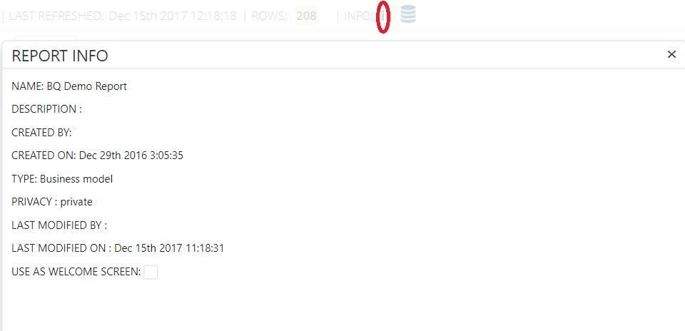
In info popup, you can set currently opened report as welcome screen. That means that it will be automatically shown when you log into BusinessQ.
More on different steps in the creation of reports, and differences between SQL and local filters can be found in the following paragraphs.
Create Report
Similarly to business model entity, creating reports is done in three steps. In the 1st step you define report’s name, the privacy level and optional description. Privacy level “Private” means that report will be accessible only to BusinessQ users who have it in their menus. While “Public” means that report can be accessed by anyone – BusinessQ users who do not have it in their menus and even non-BusinessQ users. That means for example that you can embed public reports and dashboards into your company’s webpage or blog, and anyone who visits those pages will see interactive report and dashboard visualizations. To give access to public reports, just open the report and copy-paste report URL (e.g. https://your.server/businessq/#/report/1/view) which you can give to non-BusinessQ users.
For 2nd step press “Query” item on breadcrumbs in bar under the menu. Here you will have to choose between report query types.
Business model query type will use the business model to specify the data and the filters to use for the report, without the need to use manual SQL queries.
With Freehand query type, it is possible to define arbitrary SQL queries to extract data to use in the report.
With CSV query type, you can directly paste your CSV/Excel data or upload a CSV file.
In the table below you can see the necessary user expertise for each step in creating and using reports and dashboards.
| Report type | Data source | Business model | Report “Query” step | Report “Visualization” step | Dashboard |
| Business model | IT specialist | IT specialist | End user | End user | End user |
| Freehand | IT specialist | x | IT specialist | End user | End user |
| CSV | x | x | IT specialist End user |
End user | End user |
Freehand and CSV reports do not have business model and therefore may seem simpler. But for them business model step – definition of dimensions and measures, and defining entire SQL statement in the case of freehand – is moved to report creation process into “Query” step. Although for CSV report, experienced end users can do it themselves since it does not involve relational databases and knowledge of SQL. Also, ‘business model’ for freehand and CSV reports is tied to specific report – if you need similar set of data for new report, you will have to repeat the process of defining dimensions and measures.
Besides the ability to have a single business model that can be used by multiple reports, the added benefit of using business model is the ability for even relatively inexperienced users to use reports and dashboards creating workflow on their own. There is a need for a specialist to create necessary data source(s) and business model(s), but after that end users can create their own reports and dashboards without additional help.
NOTE: See “Menu” section on how to assign reports to users.
Report from Business model
By choosing “Business model” a new select field appears in which you must choose the business model to use.
In “Available fields” list all the fields included in the selected business model appears. You can drag and drop those fields into “Selected fields” list to use them in the report.
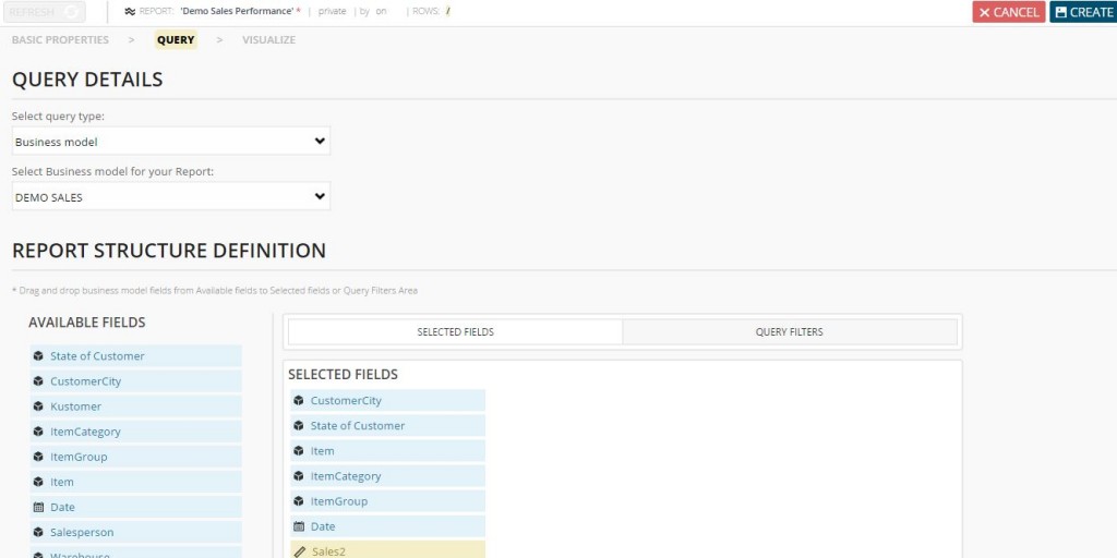
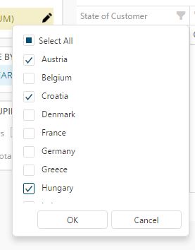
Click on the “Query filters” tab to be able to choose filter fields. Fields dropped on the “Query filters” represent the SQL filters whose values the user will choose before opening a report. This way user is able to filter the data pulled from the database.
By selecting each field in the list “Query filters”, you can define the type of SQL filter.
- “Single list” means that the user will see a select box and will be able to choose only one value for that filter at a time.
- “Multiple list” enables the user to choose one or more values. You can put limit and define how many items user can choose.
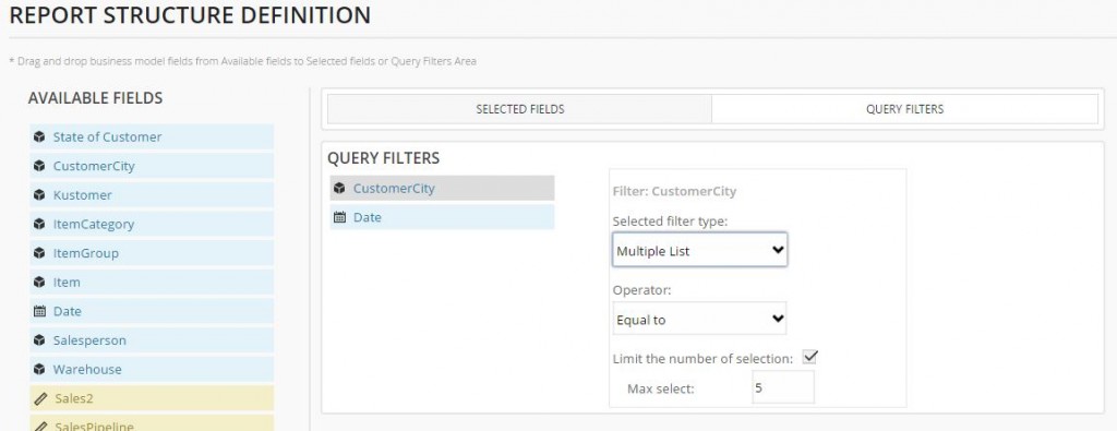
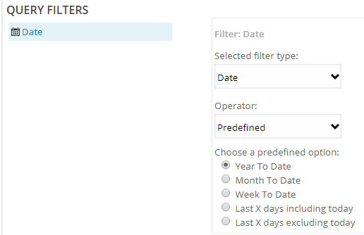
- “Date” presents the user with a calendar for date pick. If you choose “Interval” as operator, you can limit number of days that user can choose (e.g. limit users so they can choose intervals no longer than five days).
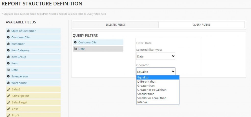 Also, you can use predefined date ranges:YTD – Year-To-Date
MTD – Month-To-Date
WTD– Week-To-Date
Last X days including/excluding today
If you choose this option, when you open your visualizations, you will get a predefined date range you can’t change. This option is meant for users who have fixed and specific date intervals they often use and that they rarely change.
- “Date & time” like “Date” filter, but the user can select and date and time. It is useful when you have a large amount of data through the day and you wish to analyze only part of it.
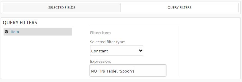
- “Constant” gives you an ability to assign a constant value to a field. Since users who open report can’t choose a value for constant filters, they are not shown to users – they are ‘hidden’.
NOTE: Every measure added as a filter can only be of Constant type.
You can also pass a variable name to a field. Variable can be one of the following:<@username>,<@userid>. Example:
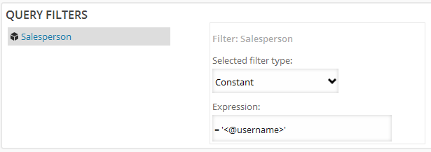
BusinessQ will replace expression with appropriate values in SQL generation – BusinessQ username or ID of the user who opens the report.
When you select Fields and Query Filters for the report, press “Visualize” on the breadcrumbs in the bar under the menu to proceed with the definition of report visualizations.
Freehand report
By choosing “Freehand”, a new select field appears in which you must choose the data source to use.
When you choose a data source, you will need to write your own SQL query with which you will retrieve data.
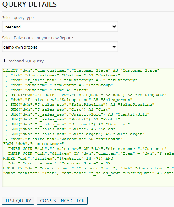
You can also add one or more SQL filters for freehand report. You need to write custom SQL for each filter – usually you will select distinct values for that column. After you are finished with adding filters, you can check if all the filters in SQL (filter names) are correctly defined under “SQL filters” with “Consistency Check” button.
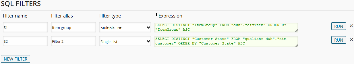
More about Filter Types (single list, multiple list, date, constant) can be found in “Report from Business model” section.
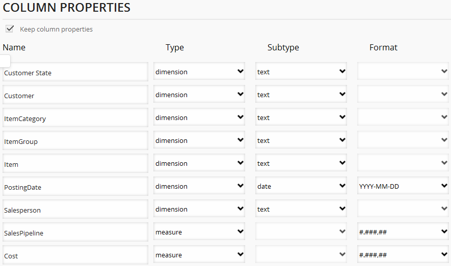
When you are finished with the SQL (and SQL filters), you need to check if the SQL query is valid by clicking “Test Query” button. After choosing SQL filter values, you will see the returned data. After that you need to choose ‘business model’ column properties – columns from query’s SELECT clause. BusinessQ will try to guess the type of model columns – dimensions or measures – but you can override the default selection.
When you are done with SQL query, filters and model, press “Visualize” on the breadcrumbs in the bar under the menu to proceed with the definition of report visualizations.
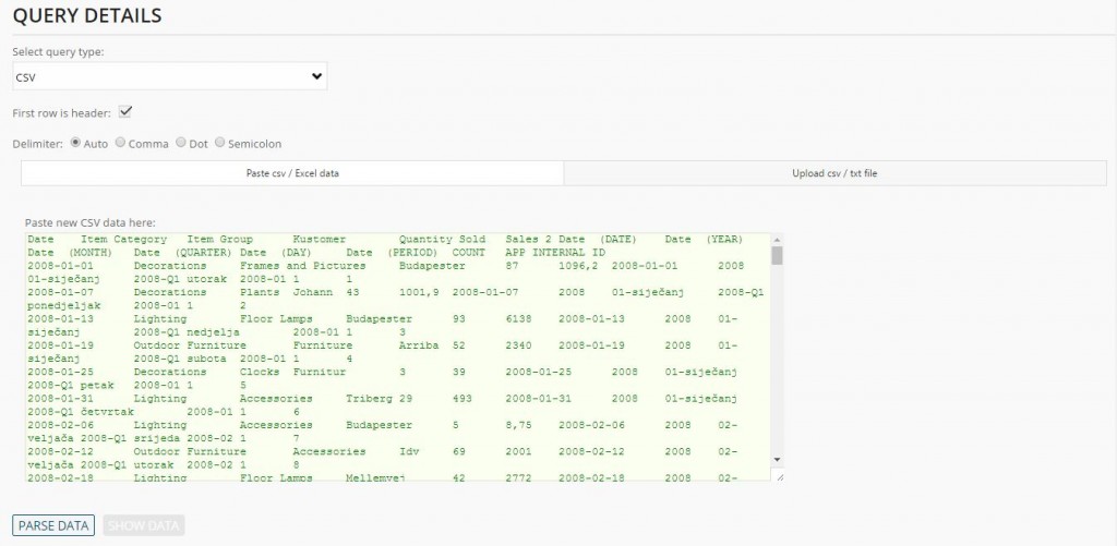
Report from csv/Excel File
To create report from CSV/Excel data, you need to copy/paste data from CSV/Excel file or upload/drag-and-drop your CSV file.
Example for copy/paste data from CSV/Excel:
Example for upload/drag-and-drop your CSV file:
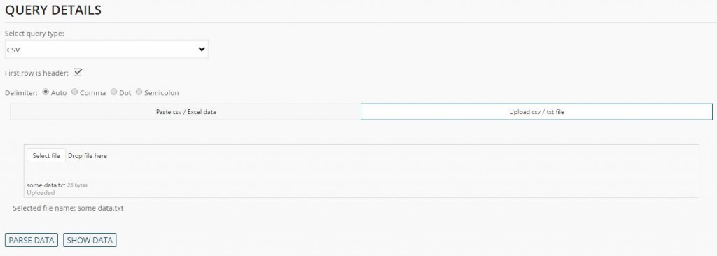
NOTE: If you upload your file, BusinessQ will not save your file, it will save only filename and data from it.
After you’re done, just click “Parse Data” button. Then you will be able to see data by clicking on “Show Data” button. Besides that, you will see “Column Properties”. There you will have to decide what type of data is in which column. You can see under “Freehand report” how this selection looks like.
After you’re done, you can create a report by clicking on “Visualize” item on breadcrumbs in dark grey bar under the menu.
Create Visualization
3rd and final step in creating reports is defining a single or multiple visualizations. Unlike “Query” step which is different for each of report’s query types (business model, freehand or Excel/CSV), “Visualize” step is the same for all query types.
When the user clicks on “Visualize”, if SQL filters have been defined, BusinessQ presents the filters window.
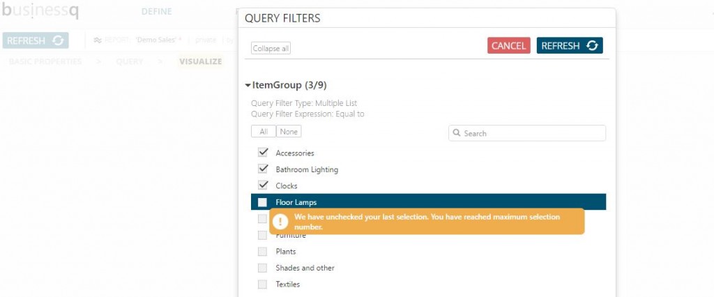
For “Multiple list” or “Single list” filters, as you can see in the previous image, there is a way to search filter values. This is very useful especially when there are filters with a large number of values. With “All”/“None” buttons it is possible to select/deselect all values in “Multiple list”. If you choose to put limit on multiple list, e.g. limit says that you can choose 5 items, when you click “All” button, BusinessQ will select only first five items from the list.
When you select filters, press “Refresh” button which will hide the filter panel and will generate SQL query and apply filters. Query is executed and data is returned from the database and you can proceed with creating report visualizations.
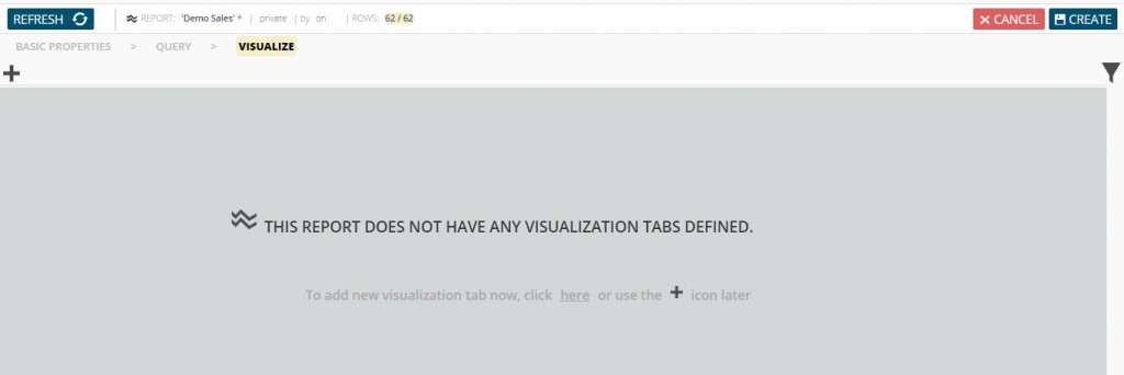
If there are no visualizations (new report), info on how to add your first visualization will be displayed on the screen.
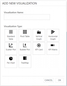
When you click the add button you are presented with the “Add new visualization” panel. Set an optional name for the visualization and required visualization type and press “OK” button.
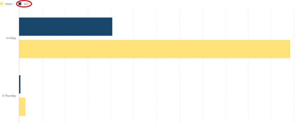
Show/hide measures on graph
You can easily show or hide measure on your vertical or horizontal graph and on scatter and bubble plot.
If you use two or more measures and you wish to see only one or few of them, but you don’t want to remove others just click on the legend to hide measures you don’t want to see.
Before
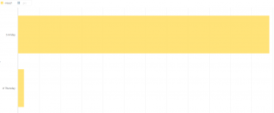
After
Crosshair option
You can use crosshair option on a vertical or horizontal graph and on scatter and bubble plot. All you have to do is go over the point.
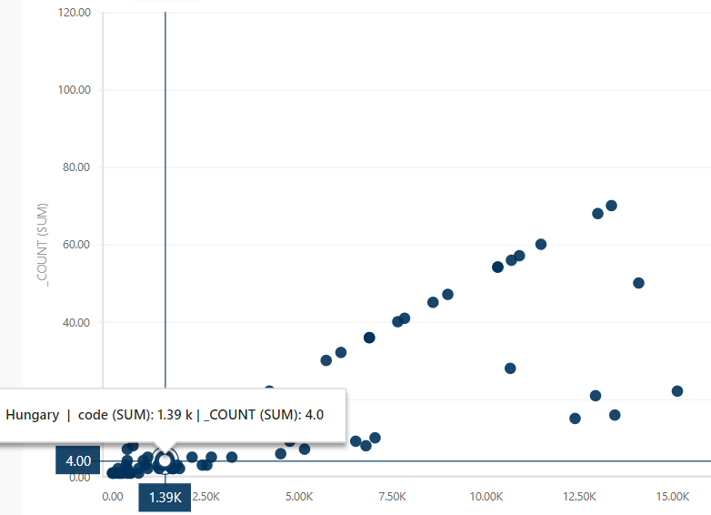
You can enable/disable crosshair by checking/unchecking that option.
Conditional coloring
You can use conditional coloring on a vertical or horizontal graph and on scatter and bubble plot.
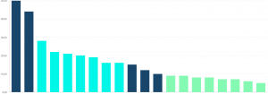
To use this, you have to go to the properties editor of measure to which you want to put condition.
Here are type descriptions:
- Table: table and cross table data representation. This component allows per column free text filtering and sorting.
- Pivot Table: This component automatically sums each row and each column in table.
- Vertical and Horizontal Graph types: bar charts, line charts, area charts, plot charts …
- Scatter Plot: a type of mathematical diagram using Cartesian coordinates to display values.
- Bubble Plot: type of chart that displays three dimensions of data. It can be considered a variation of the scatter plot, in which the data points are replaced with bubbles whose size depends on the 3rd dimension/measure.
- KPI Card and KPI Matrix: component ideal to present key performance indicators with spark lines, bullet charts and alerts.
- Pie Chart: pie charts.
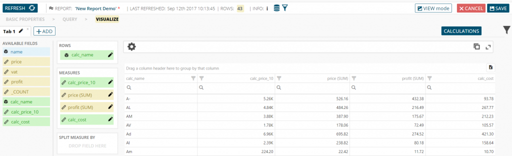
Table
After you choose “Table” visualization type and press “OK” button, you will be able to create a tabular representation of your data. From “Fields” list drag and drop dimensions and measures onto “Rows” and “Measures” lists respectively. To remove a field, you can drag and drop it back onto “Available fields” list. As you drag and drop fields, table will automatically reflect changes.
You can also split selected measures into more columns (create cross-tabulation) by drag and drop dimension field at “Split Measure By” area. By doing so, each measure will be split by distinct values of the selected dimension.
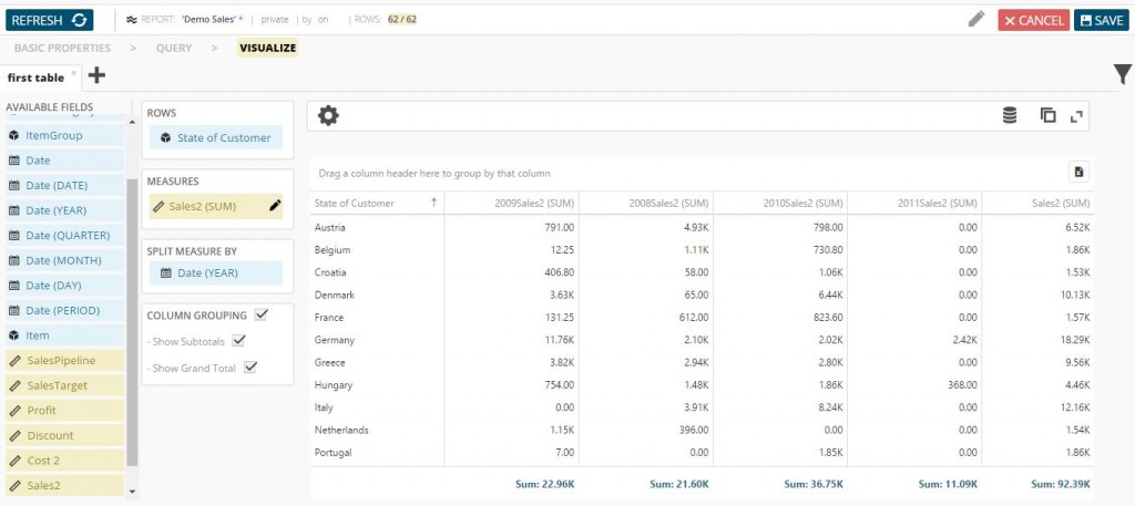
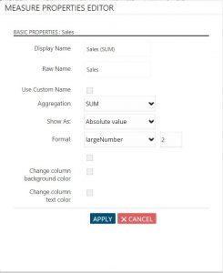
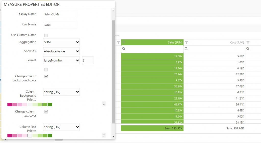
When you select measures you want to use, you will see “Pen” icon near each one. By clicking on it you can change the way the data will be represented in the table. Change Aggregation to show measures sum values, average, minimum, maximum values or its count, and you can also show values as absolute value or percent of total, ranking or running values. You can even choose its format, name that will be displayed instead of original name, change column background and/or text color.
Modify all table settings to suit your needs. Sort columns, both dimensions and measures, ascending or descending just by clicking on the column name.
Also, you can group columns in your table. You just need to pull table column into area above table. It is marked with “Drag your column header here to group by that column” text. You can put as many columns as you wish in that area.
If you wish to disable this option or not to show totals in table, you can uncheck that options under “Split Measure By” area.
You can export your table in Excel format. If you group, filter, sort or do anything else to your table, it will be exported identically. You can hide it in settings by unchecking “Show Export To Excel Button”.
Above table, you can see “Settings” icon. By clicking on it you will see more properties to include on your table.

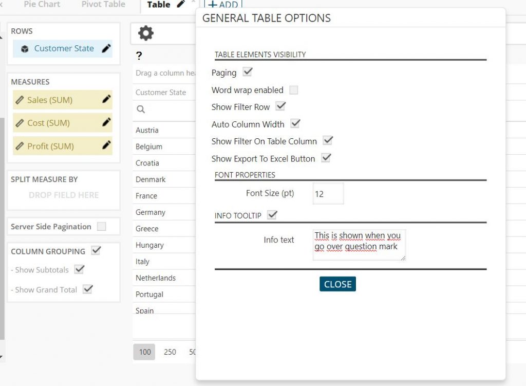
You can choose to see your data on more than one page by checking “Paging” option. This will speed up your table visualization when you have large amount of data.
“Word wrap enabled” option will wrap words in table.
“Show Filter row” option will include search area in every column. You can adjust your search criteria by clicking on search icon in every column.
NOTE: This settings will not be saved when you save your report.
“Show Filter On Table Column” option will include filter possibility for every column. You will be able to filter data by selecting/deselecting values on the filter list.
NOTE: This settings will not be saved when you save your report.
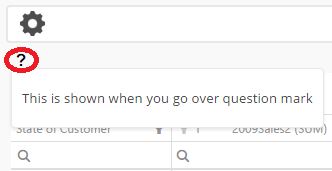
Enable “Info Tooltip” option to write a note. It will add question mark above the table. When user go over it she will be able to see creator’s note.
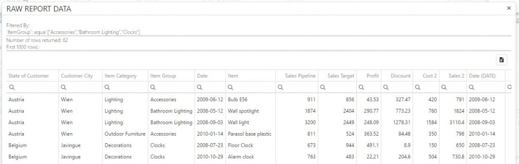
Above table, on right top of the page, you can see “Raw data” icon. It allows you to see the data upon which the visualization will be based on. If you have turned on filter query, it will show your filter values.
You can search each column and export table in Excel format.
If you click “Aggregated data” icon, you will be able to see all aggregation amounts of your measures that are shown in table. If you have split measure by, for example “Year”, you will see aggregation amounts of your measures for each year.
You can maximize your table by clicking on “Maximize” icon.
“Server-side pagination” – if you have millions of data in your report and you wish to see all of them in a table this is the perfect feature for you. If you choose server-side pagination that means that BusinessQ will be getting them part by part (when you are scrolling or switching pages in a table) so getting data will be much faster. This feature doesn’t allow you grouping of your data but only their overview. To enable this feature simply mark checkbox for server-side pagination in table visualization on your report.
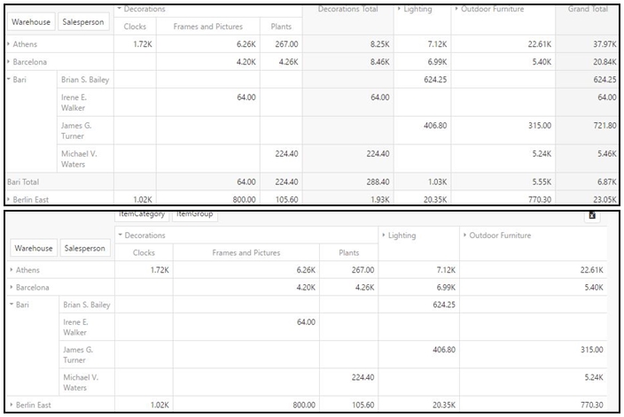
Pivot table
Pivot table is used for data summarization, Ad Hoc data pivoting etc.
In pivot table you can automatically see summary of count, minimum, maximum, total or average of the data stored in one table or spreadsheet.
Also, you can see total summary of each column and each row.
There are two buttons above pivot table – button for expanding all and button for collapsing all rows and columns.
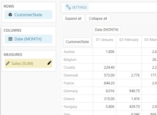
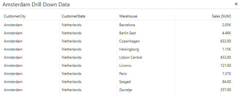
Drill down
If you have multiple fields in a row you can double click on that row to get a pop up with a complete hierarchy of that cell.
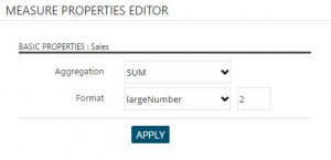
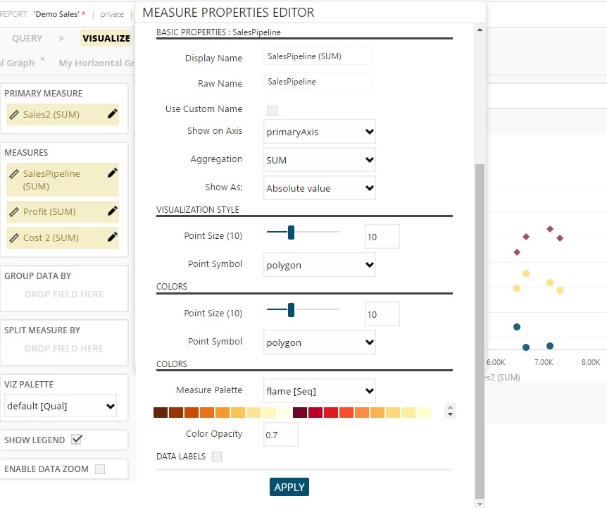
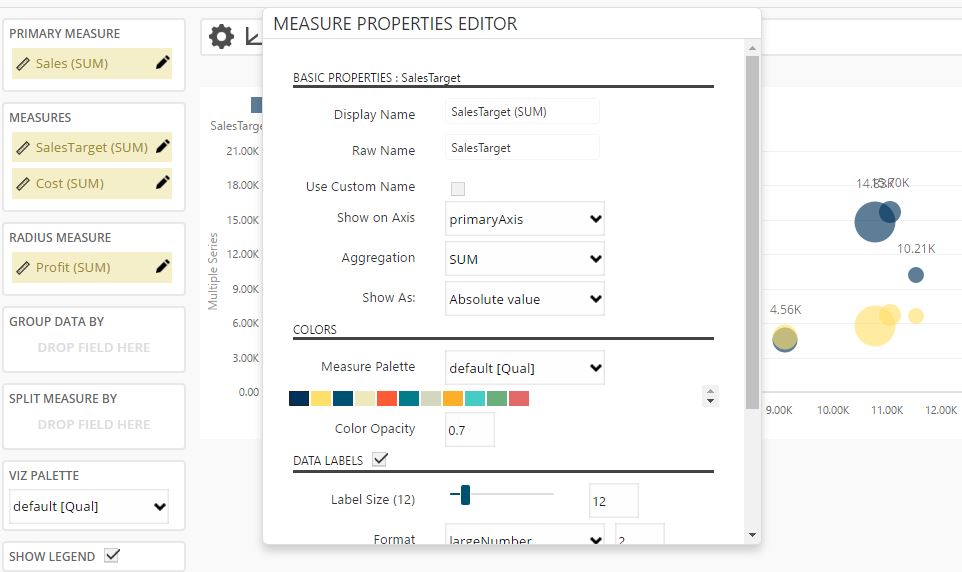
Measures Properties
Click the pen icon to the right of measure to define measure properties – like aggregation type and format.
Above table you can see “Settings” icon. By clicking on it you will see more properties to include on your pivot table.
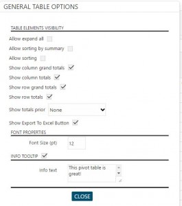
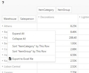 “Allow expand all” allows you to expand all data (when you have more than one dimension in rows or columns) by clicking right mouse button and selecting option “Expand all”. You can collapse all by selecting “Collapse all” option.
“Allow sorting by summary” allows you to sort selected dimension by clicking right mouse button and selecting option “Sort *row/column name* by This Row/Column”.
This two options appears only when you click right mouse button on rows or columns and they are available only for rows/columns – depending where you clicked.
“Allow sorting” allows you to sort every row and column by their values – you can sort ascending/descending by clicking on column name.
With options “Show column grand totals”/“Show row grand totals” you choose if “Grand total” row or column will be visible in table.
With options “Show column totals”/“Show row totals” you choose if “Total” row or column will be visible in table.
“Show totals prior” allows you to manage where totals will be shown – before or after columns or/and row or after them.
“Show Export To Excel Button” option will show or hide export button. You can find it in right corner above table.
“Font size” allows you to change the font size in a table.
“Info Tooltip” option will add question mark above table. When user go over it she will be able to see creator note.
Above table, on right top of the page, you can see “Raw data” icon. It allows you to see the data upon which the visualization will be based on. If you have turned on filter query, it will show your filter values.
You can search each column and export table in Excel format.
Vertical and Horizontal Graph
NOTE: Vertical and Horizontal Graph have the same settings and possibilities.
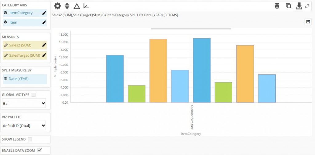
To create a bar / line / area / point chart, press the “Add” button, and in the “Add New Visualization” panel choose Vertical Graph or Horizontal Graph. Then press “OK” button.
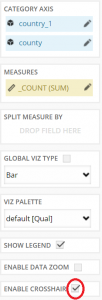
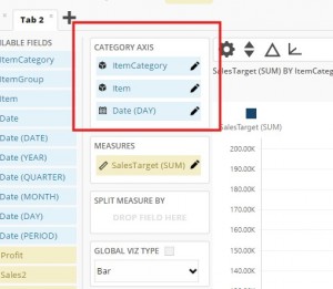
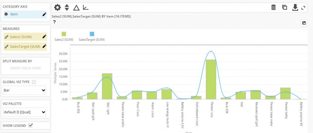
Drag and drop fields from “Fields” list to “Category Axis” list (dimension fields), “Measures” list (measures fields) and “Split measure by” field (dimension field) if you need that possibility.
Drill Down
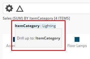
You can put more than one dimension in “Category Axis” list. This will enable you to drill down through your selected category dimensions.
After you have selected category dimensions, on the chart you can click on any 1st level dimension value (e.g. in our example on one of ItemCategory values):
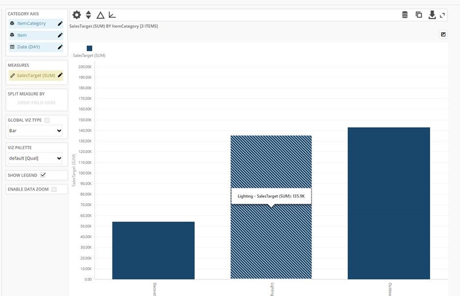
By clicking on it, you will drill down to 2nd level dimension values filtered by selected 1st level dimension value (e.g. in our example it would be all Items belonging to selected ItemCategory):
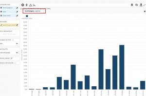
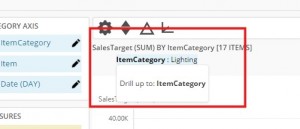
By clicking on 2nd level value, you will drill down to 3rd level, and then to 4th level and so on until you reach your final category level. Drill up by clicking on breadcrumbs:
Category Properties
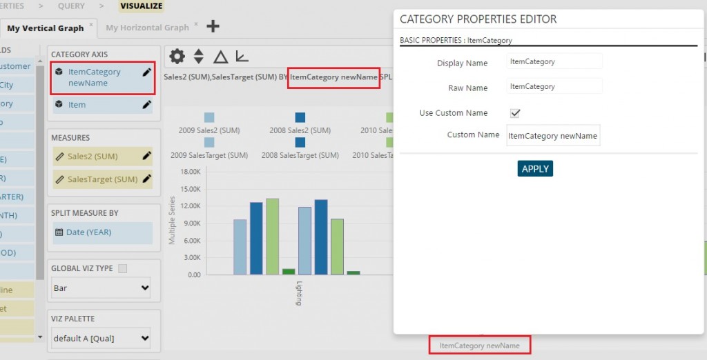
Click the pen icon to the right of each category to define measure’s display name. This name will be used only on this graph.
Measure Properties
Click the pen icon to the right of each measure to define measure’s properties – like display name, border color, labels etc.
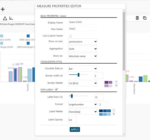
NOTE: If you want to change border or label color, it’s not enough just to choose palette – that will not do anything. After you choose palette you need to choose color.
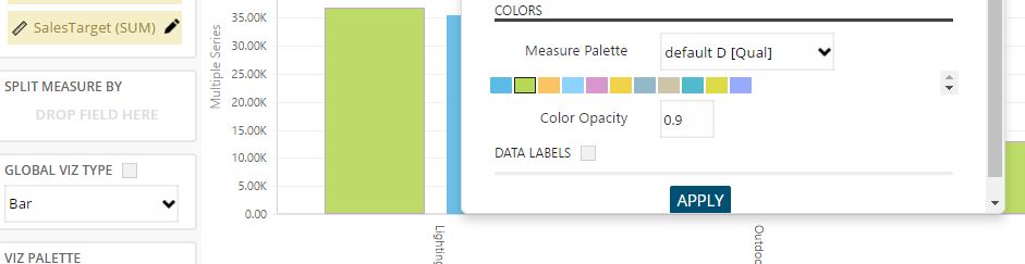
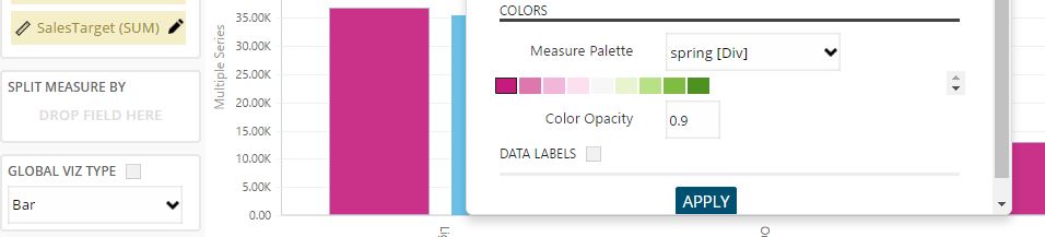
If you did not split your measures (if you do not have item in split-by area), you can change your measure color. E.g.:
For each measure with the option “Visualize Data as” you can choose horizontal or vertical graph’s specific visual representation (e.g. bar graph which is default, line, curved line, area, point, etc.):
You can set your measure on the second axis by changing the value of “Show On Axis” field.
You can also change global visual representation/type of the graph. This option is available under split-by area. It will affect/override graphs of all measures – if you already set a different kind of visualization for one of your measures before, this option will change it and you will need to set it again.
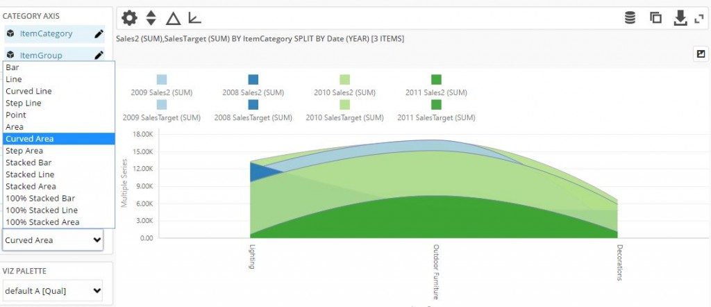
Besides that, you can choose different palette, hide legend and enable data zoom (also under split-by area).
In “Measure properties” editor you can also set and use regression feature.
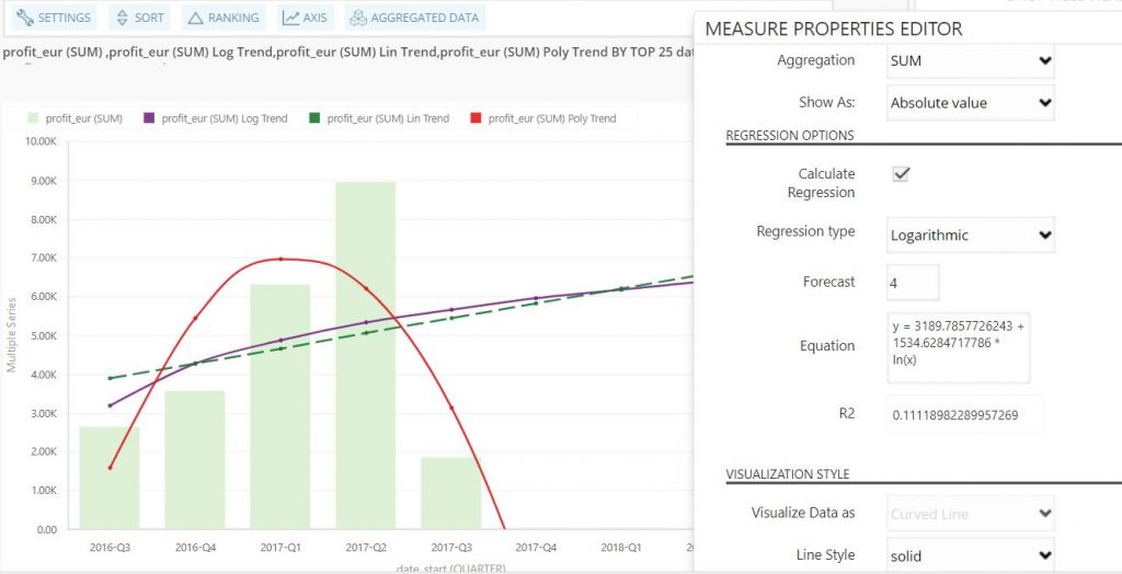
There are three available regression types – linear, logarithmic and polynomial.
Linear trendline usually shows whether something increases or decreases at a steady rate.
A logarithmic trendline is most useful when the rate of change in the data increases or decreases quickly.
A polynomial trendline is a curved line and it is useful e.g. when you have to analyze gains and losses over big data set. Order of polynomial is determined by the number of fluctuations in the data. Order 2 polynomial trendline has one hill or valley, order 3 has one or two hills or valleys and order 4 has 3 of them.It is useful, for example, for analyzing gains and losses over a large data set.
Also, you can use BusinessQ forecast feature. That means that you can select N periods to add to visualization and see e.g. how your future profit will look like. Important notice is that this feature is available only for the date, year, period and quarter type dimension.
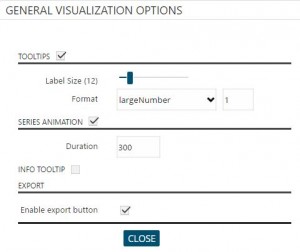
You can notice toolbar above graph.
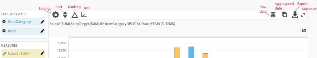
When you click on “Settings” you are able to set some general options.
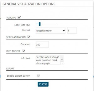
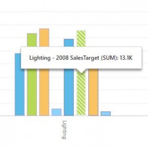
With “Tooltips” option you can set format size of your tooltip or turn off tooltips. Tooltip is shown when you go over item bar in graph.
In “Series animation” duration you can set graph loading time (in miliseconds).
“Info Tooltip” option will add question mark above graph. When user go over it she will be able to see creator’s note.
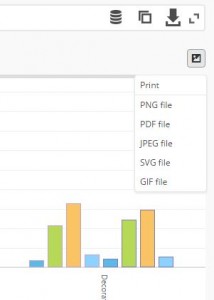
“Enable Export Button” option will show or hide export button. You can find it in right corner above graph.
You can print your graph right from your browser or export it in many formats.
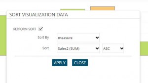
By clicking on “Sort” icon you are able to sort (reorder) measures and dimensions. After you set sort option click “Apply” button to get result.
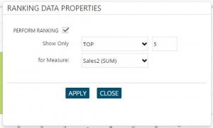
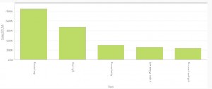
By clicking on “Ranking” icon, you can rank your items. It is used to show only the most significant data. With this function, for example, you can show only 5 categories with the maximum/minimum value in the selected measure (top/bottom 5).
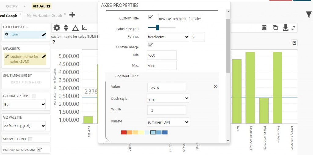
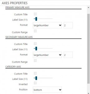
By clicking on “Axis” icon you can change primary, secondary and category axis options, change title, add custom range, constant lines, change label size and format.
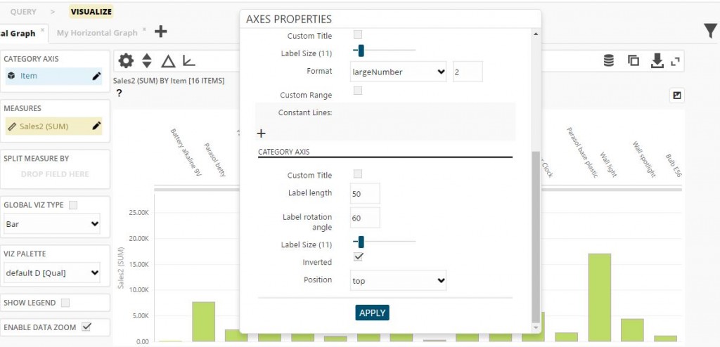
When you have more than one measure, on their axis will be shown “Multiple series” title. If you want to change it, you can do it here.
NOTE: If you set measure custom name (by clicking on pen icon beside its name) and you set “Custom title” in this option, on axis will be shown this name.
On right top of the page, you can see “Raw data” icon. It allows you to see the data upon which the visualization will be based on. If you have turned on filter query, it will show your filter values.
You can search each column and export table in Excel format.
If you click “Aggregated data” icon, you will be able to see all aggregation amounts of your measures that are shown in graph. If you have split measure by, for example “Year”, you will see aggregation amounts of your measures for each year.
If you click “Export” icon in the same toolbar, you will export data that you use for visualization in CSV format. Export button above the graph allows you to export it in more formats.
You can maximize your graph by clicking on “Maximize” icon.
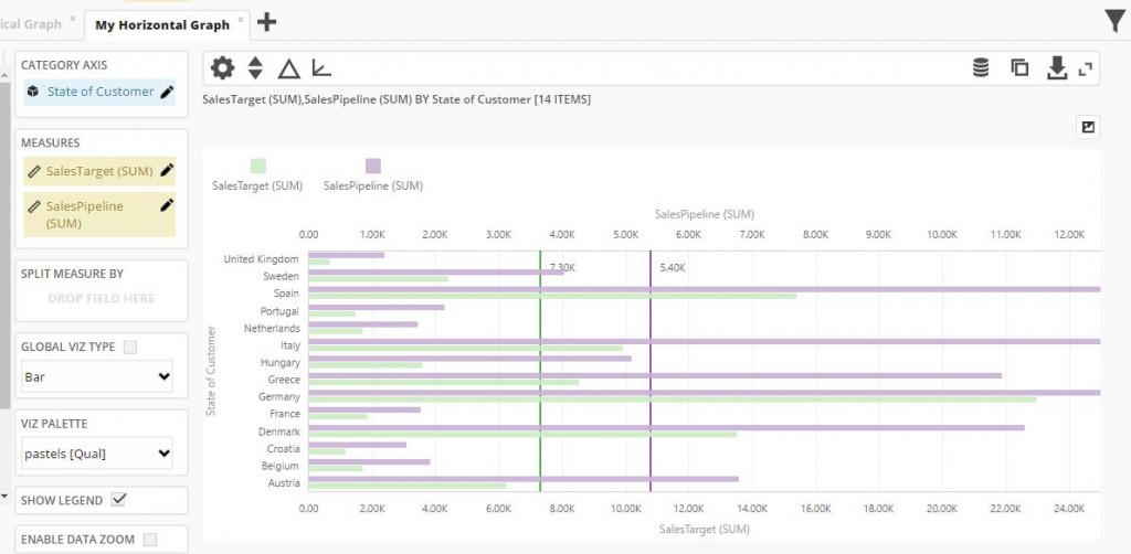
HORIZONTAL GRAPH
As already said, horizontal graph has the same settings and possibilities as vertical graph. Here is just one visual example:
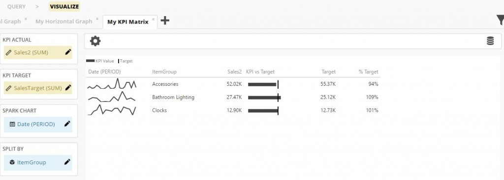
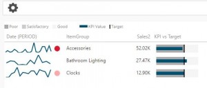
KPI Matrix
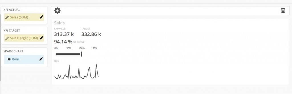
KPI matrix is a powerful data representation used to give insight on target fulfillment. To create a KPI Matrix visualization click the add icon and choose “KPI Matrix” in the “Add new visualization” panel, then press “OK” button. KPI matrix has a four set of options which can be filled with report fields:
- – Under KPI Actual you must drag and drop the measure representing the performance you want to analyze in the visualization.
- – Under KPI Target you must drag and drop the target value for the measure representing the performance.
- – Under Spark Chart you drag and drop category/dimension field for spark chart.
- – Under Split By, it is possible to put a dimension field used to divide KPI representation into multiple rows. For example, choosing “Product” as Split By field, for each product there will be a row presenting actual measure compared with the target.
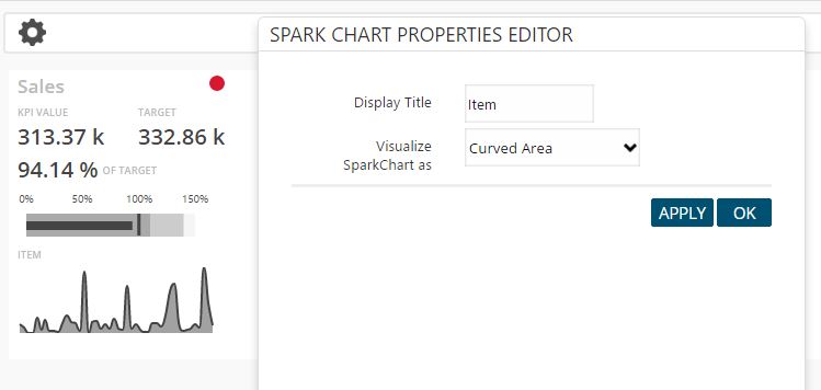
Spark Chart
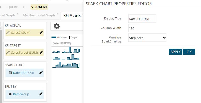
Spark Chart is a line, area or bar chart, presented without axis, useful to indicate the trend of a measure for example. Choose a dimension field to set as Spark Chart. For each row of KPI Matrix there will be a spark line presenting the actual performance measure varying for the dimension used in Spark Chart definition.
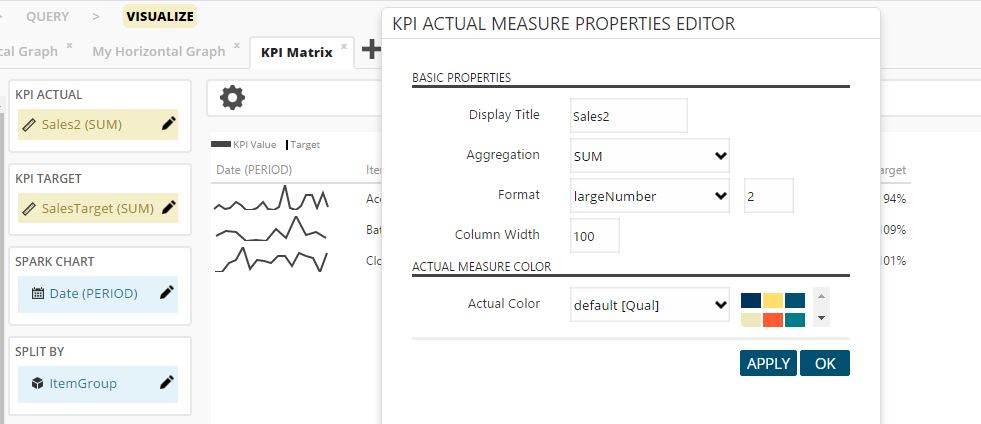
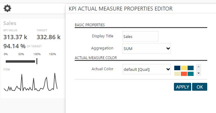
KPI Actual Measure Properties
Click the pen icon to the right of measure to define measure’s properties – like display name, actual color, aggregation type etc.
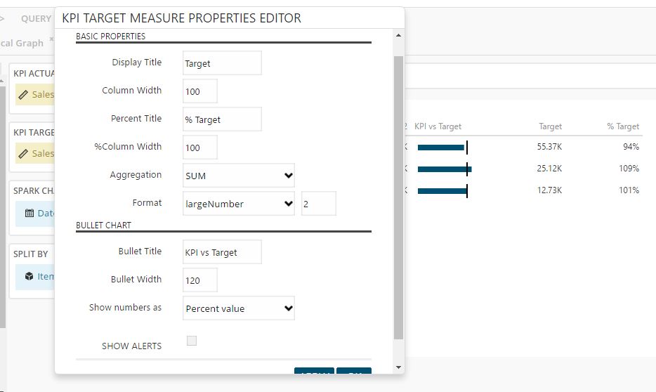
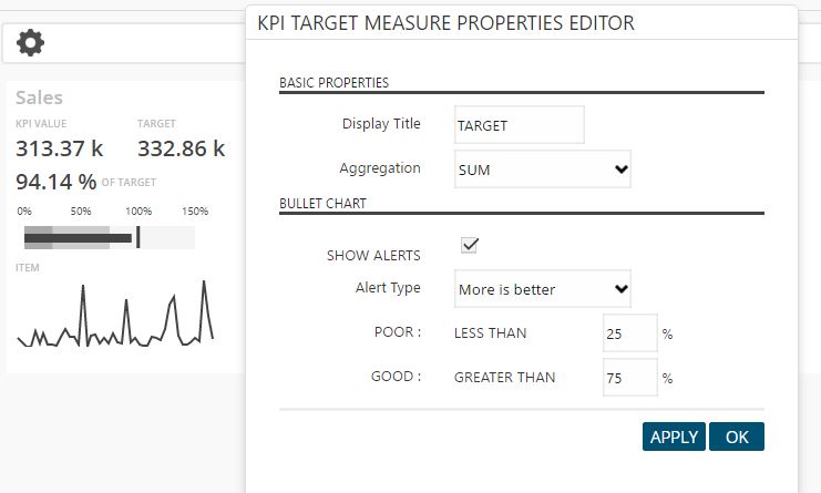
KPI Target Measure Properties
Click the pen icon to the right of measure to define measure’s properties – like display name, aggregation type, bullet chart title etc.
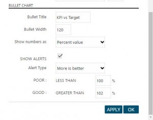
You can set alerts to see if your “KPI Actual” measure fulfill its target. If it doesn’t it will have red dot on the right side of spark chart. If actual measure is far away from target it will have stronger red color.
![]()
Spark Chart
Click the pen icon to the right of “Spark Chart” dimension to define dimension properties – display name, column width and visualization type.
Split By
Click the pen icon to the right of “Split By” dimension to define dimension properties – display name and column width.
Above KPI area you can see “Settings” icon with which you can set “Info Tooltip”. “Info Tooltip” option will add question mark above KPI area. When user go over it she will be able to see creator’s note.
Above KPI area, on right top of the page, you can see “Raw data” icon. It allows you to see the data upon which the visualization will be based on. If you have turned on filter query, it will show your filter values.
You can search each column and export table in Excel format.
KPI Card
KPI Card is similar to KPI Matrix, but it is more general. That means that with KPI Card you can have only one card, analogous to a single row in KPI matrix – it doesn’t have “Split By” option.
KPI Actual Measure Properties
Click the pen icon to the right of measure to define measure’s properties – like display name, actual color or aggregation type.
KPI Target Measure Properties
Click the pen icon to the right of measure to define measure’s properties – like display name, aggregation type and bullet chart alerts.
You can set alerts to see if your “KPI Actual” measure fulfill its target. If it doesn’t it will have red dot above target number. If actual measure is far away from target it will have stronger red color.
Spark Chart
Click the pen icon to the right of “Spark Chart” dimension to define dimension properties – display name and visualization type.
Above KPI area you can see “Settings” icon. By clicking on it you will can set “Info Tooltip”. “Info Tooltip” option will add question mark above KPI area. When user go over it she will be able to see creator’s note.
Above KPI area, on right top of the page, you can see “Raw data” icon. It allows you to see the data upon which the visualization will be based on. If you have turned on filter query, it will show your filter values.
You can search each column and export table in Excel format.
General Options
Above KPI Card , you can see “Settings” icon. By clicking on it you will see more properties to include on your KPI Card.
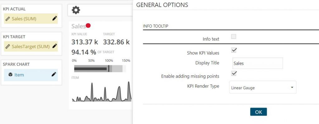
You can add info text, choose if KPI values are visible, set display title, enable/disable missing points and select KPI Render Type.
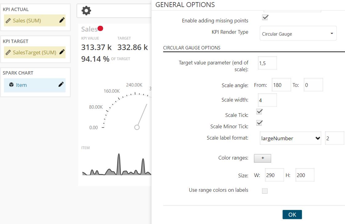
KPI Render Type can be “Linear Gauge” or “Circular Gauge”. For “Circular Gauge” you can set more options, like target parameter, scale angle, range colors etc.
Scatter Plot
Unlike more traditional horizontal and vertical graphs, scatter plot shows relationship between two measures. In scatter plot you can easily see whether they correlate with each other or not.
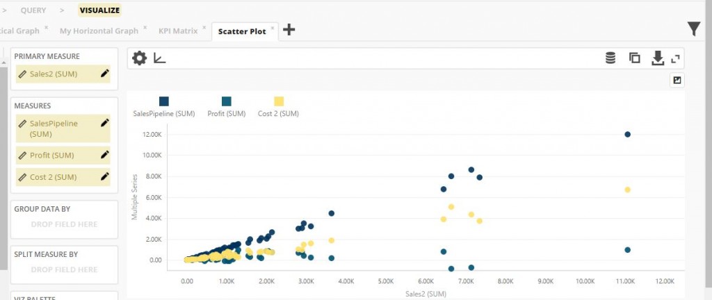
In the graph above you can see correlation of “Sales” and other measures (as you can see, you can put more measures into “Measures” box). If they both grow together (or if just measures from “Measures” area grow) correlation is good.
Primary Measure Properties
Click the pen icon to the right of primary measure to define measure properties – display name and aggregation type.
Measures Properties
Click the pen icon to the right of every measure to define measure properties – like display name, aggregation type, point symbol, color etc.
You can group measures in your graph. You just need to drag and drop one of dimensions field at “Group Data By” area. Then you can easily see for example what type of item or in what time of year is better correlation between sales and profit.
Also, you can split selected measures into more columns by drag and drop dimension field at “Split Measure By” area. By doing that, each measure will be split by distinct values of selected dimension.
You can also change various display options like choosing different palette, hide legend or enable data zoom (under “Split Measure By” area).
NOTE: If you change your palette in “viz palette” it will reset individual palette of each measure.
Above graph you can see “Settings” icon (![]() ). By clicking on it you can manage general visualization options, like hide/show tooltips, duration of animation, show/hide export button above graph (
). By clicking on it you can manage general visualization options, like hide/show tooltips, duration of animation, show/hide export button above graph (![]() ) and show/hide info tooltip icon.
) and show/hide info tooltip icon.
By clicking on “Axis” icon (![]() ) you can change primary, secondary and category axis options, change title, add custom range, constant lines, change label size and format.
) you can change primary, secondary and category axis options, change title, add custom range, constant lines, change label size and format.
Above graph, on right top of the page, you can see “Raw data” icon (![]() ). It allows you to see the data upon which the visualization will be base on. If you have turned on filter query, it will show your filter values. You can search each column and export table in Excel format.
). It allows you to see the data upon which the visualization will be base on. If you have turned on filter query, it will show your filter values. You can search each column and export table in Excel format.
If you click “Aggregated data” icon (![]() ), you will be able to see all aggregated amounts of your measures that are shown in the graph. If you have split measure by, for example, “Year”, you will see aggregated amounts of your measures for each year.
), you will be able to see all aggregated amounts of your measures that are shown in the graph. If you have split measure by, for example, “Year”, you will see aggregated amounts of your measures for each year.
If you click “Export” icon (![]() ) in the same toolbar, you will export data that you use in visualization in CSV format. Export button above the graph (
) in the same toolbar, you will export data that you use in visualization in CSV format. Export button above the graph (![]() ) allows you to export it in more formats, e.g. PDF or PNG, or print graph from your browser.
) allows you to export it in more formats, e.g. PDF or PNG, or print graph from your browser.
You can maximize your graph by clicking on “Maximize” icon (![]() ).
).
Bubble Plot
Bubble Plot is similar to Scatter Plot, but Bubble Plot is defined by three value series (three measures). Third one controls the size of the data point.
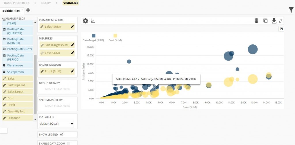
In the graph above you can see correlation of “Sales” and other measures (as you can see, you can put more measures into “Measures” box) and “Profit”. In this case bigger bubble means bigger profit.
Primary Measure Properties
Click the pen icon to the right of primary measure to define measure properties – display name and aggregation type.
Measures Properties
Click the pen icon to the right of every measure to define measure properties – like display name, aggregation type, color etc.
You can group measures in your graph. You just need to drag and drop one of dimensions field at “Group Data By” area.
Also, you can split selected measures into more columns by drag and drop dimension field at “Split Measure By” area. By doing that, each measure will be split by distinct values of selected dimension.
You can also change various display options like choosing different palette, hide legend or enable data zoom (under “Split Measure By” area).
NOTE: If you change your palette in “viz palette” it will reset individual palette of each measure.
Above graph you can see “Settings” icon (![]() ). By clicking on it you can manage general visualization options, like hide/show tooltips, duration of animation, show/hide export button above graph (
). By clicking on it you can manage general visualization options, like hide/show tooltips, duration of animation, show/hide export button above graph (![]() ) and show/hide info tooltip icon.
) and show/hide info tooltip icon.
By clicking on “Axis” icon (![]() ) you can change primary, secondary and category axis options, change title, add custom range, constant lines, change label size and format.
) you can change primary, secondary and category axis options, change title, add custom range, constant lines, change label size and format.
Above graph, on right top of the page, you can see “Raw data” icon (![]() ). It allows you to see the data upon which the visualization will be based on. If you have turned on filter query, it will show your filter values. You can search each column and export table in Excel format.
). It allows you to see the data upon which the visualization will be based on. If you have turned on filter query, it will show your filter values. You can search each column and export table in Excel format.
If you click “Aggregated data” icon (![]() ), you will be able to see all aggregated amounts of your measures that are shown in graph. If you have split measure by, for example “Year”, you will see aggregation amounts of your measures for every year.
), you will be able to see all aggregated amounts of your measures that are shown in graph. If you have split measure by, for example “Year”, you will see aggregation amounts of your measures for every year.
If you click “Export” icon (![]() ) in same toolbar, you will export data that you use in visualization in CSV format. Export button above the graph (
) in same toolbar, you will export data that you use in visualization in CSV format. Export button above the graph (![]() ) allows you to export it in more formats e.g. PDF or PNG, or print graph from your browser.
) allows you to export it in more formats e.g. PDF or PNG, or print graph from your browser.
You can maximize your graph by clicking on “Maximize” icon (![]() ).
).
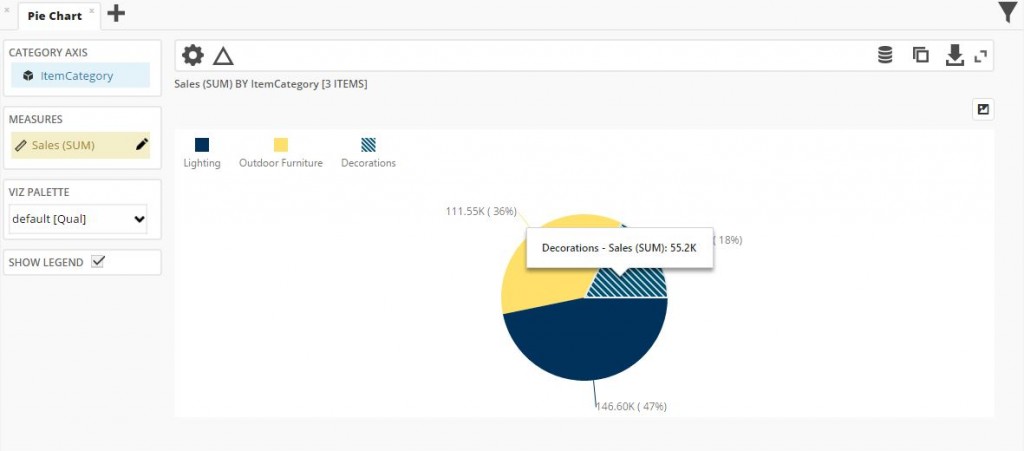
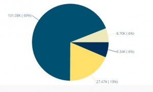
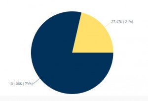
Pie Chart
Pie Chart is used to see contributions of data segments as a percentage of a whole. It is important that data contain small number of distinct values for category dimensions because it is hard to see contribution of each value if you have many values – large number of small slices.
Drill Down
You can put more than one dimension in “Category Axis” list. This will enable you to drill down through your selected category dimensions.
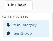
After you have selected category dimensions, on the chart you can click on any 1st level dimension value (e.g. in our example on one of ItemCategory values):
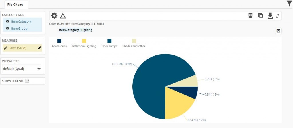
By clicking on 2nd level value, you will drill down to 3rd level, and then to 4th level and so on until you reach your final category level. Drill up by clicking on breadcrumbs:
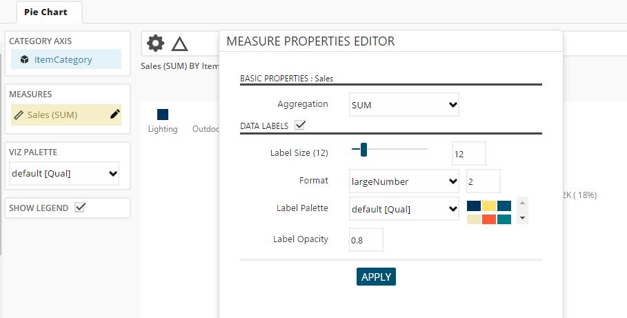
Measures Properties
Click the pen icon to the right of measure to define measure properties – like aggregation type and label size, format, color and opacity.
Above graph you can see “Settings” icon (![]() ). By clicking on it you can manage general visualization options, like hide/show tooltips, duration of animation, show/hide export button above graph (
). By clicking on it you can manage general visualization options, like hide/show tooltips, duration of animation, show/hide export button above graph (![]() ) and show/hide info tooltip icon.
) and show/hide info tooltip icon.
By clicking on “Ranking” icon you can rank your items. It is used to show only the most significant data. With this function, for example, you can show only 5 categories with the maximum / minimum value in the selected measure (top / bottom 5).
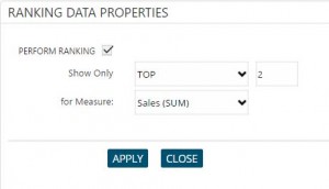
NOTE: If you have used drill down before ranking, ranking will drill up to first layer and you will need to drill down again.
Above graph, on right top of the page, you can see “Raw data” icon (![]() ). It allows you to see the data upon which the visualization will be based on. If you have turned on filter query, it will show your filter values. You can search each column and export table in Excel format.
). It allows you to see the data upon which the visualization will be based on. If you have turned on filter query, it will show your filter values. You can search each column and export table in Excel format.
If you click “Aggregated data” icon (![]() ), you will be able to see all aggregated amounts of your measures that are shown in graph. If you have split measure by, for example “Year”, you will see aggregated amounts of your measures for each year.
), you will be able to see all aggregated amounts of your measures that are shown in graph. If you have split measure by, for example “Year”, you will see aggregated amounts of your measures for each year.
If you click “Export” icon (![]() ) in same toolbar, you will export data that you use in visualization in CSV format. Export button above the graph (
) in same toolbar, you will export data that you use in visualization in CSV format. Export button above the graph (![]() ) allows you to export it in more formats e.g. PDF or PNG, or print graph from your browser.
) allows you to export it in more formats e.g. PDF or PNG, or print graph from your browser.
You can maximize your graph by clicking on “Maximize” icon (![]() ).
).
TreeMap
TreeMap is a visualization that displays hierarchical data by using nested rectangles whose sizes are proportional to their values.
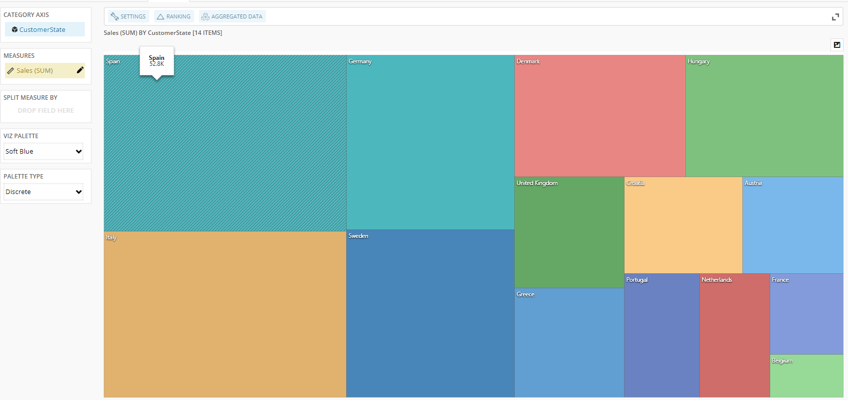
The visualization takes one measure and one dimension which can be split by another dimension.
Above graph, you can see “Settings” icon (![]() ). By clicking on it you can manage general visualization options, like hide/show tooltips, duration of the animation, show/hide export button above graph (
). By clicking on it you can manage general visualization options, like hide/show tooltips, duration of the animation, show/hide export button above graph (![]() ) and show/hide info tooltip icon.
) and show/hide info tooltip icon.
Many unique options were added to this visualization such as different palettes, options of displaying color in multiple ways and display direction of rectangles and you can set them in settings.
By clicking on “Ranking” icon, you can rank your items. It is used to show only the most significant data. With this function, for example, you can show only 5 categories with the maximum/minimum value in the selected measure (top/bottom 5).
If you click “Aggregated data” icon (![]() ), you will be able to see all aggregated amounts of your measures that are shown in the graph. If you have split measure by, for example, “Year”, you will see aggregated amounts of your measures for each year.
), you will be able to see all aggregated amounts of your measures that are shown in the graph. If you have split measure by, for example, “Year”, you will see aggregated amounts of your measures for each year.
If you click “Export” icon (![]() ) in the same toolbar, you will export data that you use in visualization in CSV format. Export button above the graph (
) in the same toolbar, you will export data that you use in visualization in CSV format. Export button above the graph (![]() ) allows you to export it in more formats, e.g. PDF or PNG, or print graph from your browser.
) allows you to export it in more formats, e.g. PDF or PNG, or print graph from your browser.
You can maximize your graph by clicking on “Maximize” icon (![]() ).
).
Calculation in Report
With calculations, you can create custom Measure or Dimension fields based on different functions which can then be used in reports like any other available measure or dimension field.
To add calculation click “CALCULATIONS” button on the right side of the report.
That will open window with available fields, existing calculations and examples of calculations.
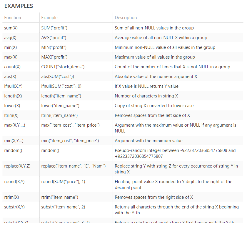
To create new calculation click “ADD NEW CALCULATION” button (above existing calculations area).
That will open window for a new calculation. You need to set the name of calculation, select calculation type (measure or dimension) and write a function for your calculation.
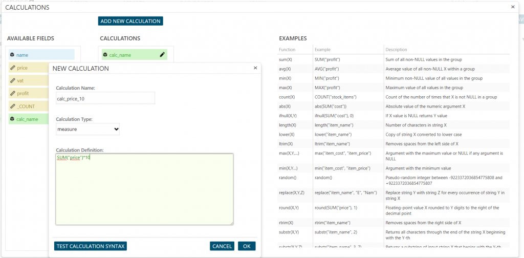
You can use more than one available field in one calculation. For example, if you don’t know how much did something cost, but you know price and profit, you can easily calculate the cost.
When you are done you can click “Test calculation syntax” to see if there is any error and then click “Ok” button to add it or “Cancel” button dismiss it. You can skip “Test calculation syntax” step, but you have to click “Ok” to add calculation into “Available fields” in the report.
After that, you can just use your calculation like any other field.
Dashboard
To create a dashboard, go in “Dashboards” menu and chose “New Dashboard”.
Alternatively, go to “Dashboard List” item. From there you can see the list of existing dashboards. As in other lists of the application, press “New” to create a new dashboard, select an existing dashboard to show “Open” and “Clone” buttons or double-click the menu item to open selected report. After you open existing dashboard, you will be in “view” mode where you will see various visualizations from different reports, “pen” icon to enter Edit mode and “Cancel” button on the right side.
Reports and dashboards have two modes of work:
- – Edit mode. Reserved for BusinessQ administrators who have access to all the steps in report and dashboard creation.
- – View mode. BusinessQ viewers can only access this mode in which they can only see visualization step. Here they can change SQL filters and local filters.
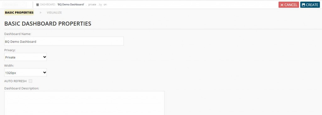
Create Dashboard
When creating a new dashboard, first define a dashboard name, dashboard size and the privacy. Privacy levels are explained in “Create Report” section. To give access to public dashboards, just open the dashboard and copy-paste dashboard URL (e.g. https://your.server/businessq/#/dashboard/1/view) which you can give to non-BusinessQ users.
NOTE: See “Menu” section on how to assign dashboards to users.
After you’re done, you can create dashboard by clicking on “Visualize” item on breadcrumbs in the bar under the menu. When clicked on “Visualize” if there are no elements added to the dashboard (new dashboard), info on how to add your first dashboard element will be displayed on the screen.
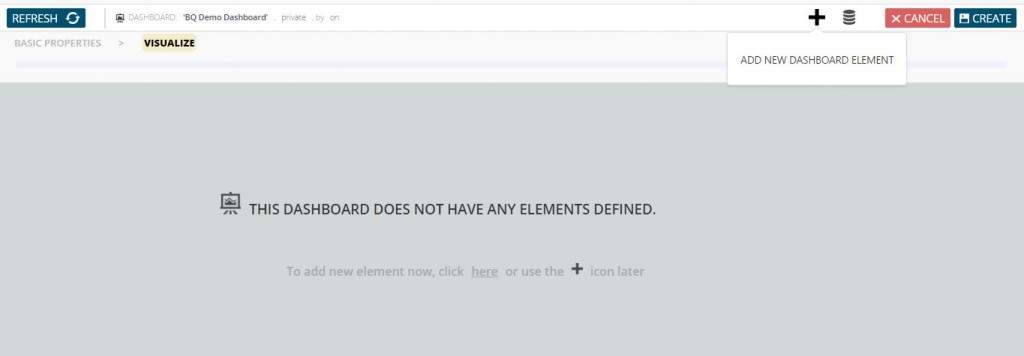
You can add new element on a dashboard by simply click on element icon you want to use.
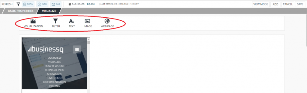
Dashboard Element Types
After clicking on “Add New Dashboard Element” button, you will be able to choose what type of element you wish to add to dashboard.
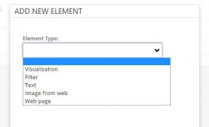
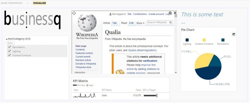
“Visualization” element type allows you to add BusinessQ reports’ visualizations.
“Filter” element type allows you to add BusinessQ reports’ filter.
“Text” element type allows you to add text/title/label to BusinessQ dashboard.
“Image from web” element type allows you to add image from web on BusinessQ dashboard.
“Web page” element type allows you to add web page on BusinessQ dashboard. For example, you can even add other public BusinessQ reports and dashboards.
You can have zero or more of each element type on your dashboard.
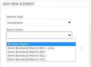
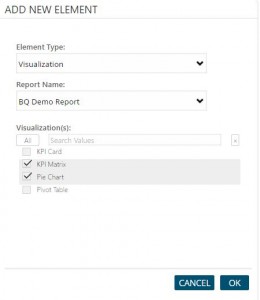
Visualization
“Visualization” element type allows you to add BusinessQ reports’ visualizations. After selecting a report, you will be able to select one or more of its visualizations. After you are done with selecting visualizations, press “OK” button.
Now you can see selected visualizations on dashboard. When you go over each visualization, you can see icons that allows you to move, resize, change settings, maximize (bring specific visualization into large focus) or remove visualization.
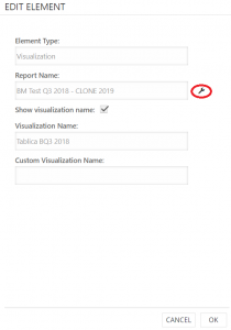
When you go to “Edit” element from the report, you have an option to open that report in a new tab.
Filter
You can change data on dashboard’s report only if you add “Filter” element from the same report.
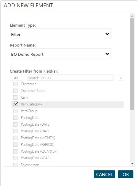
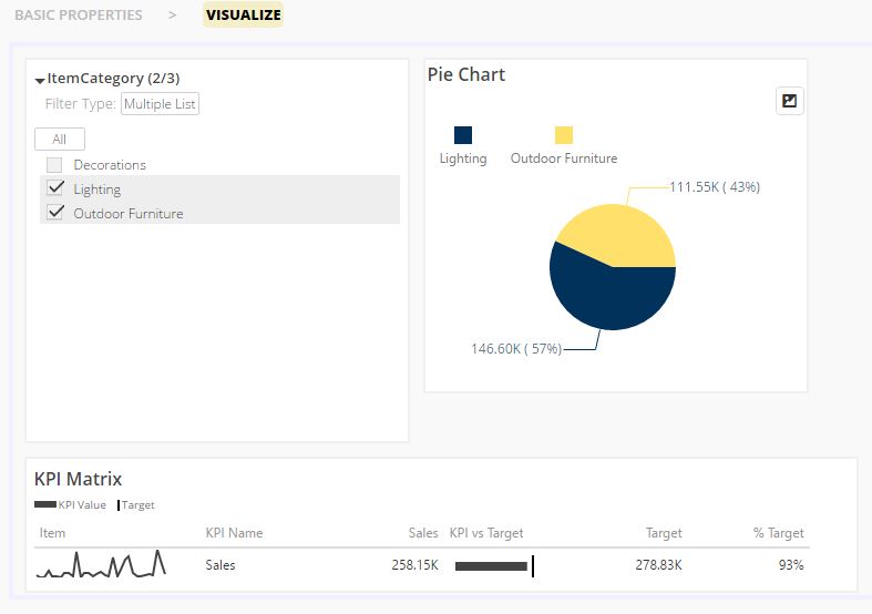
When you choose your filter fields, press “OK” button. You will now see filter window on your dashboard with which you can now filter your data. Filter fields will affect all visualizations that come from the same report.
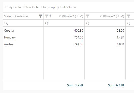
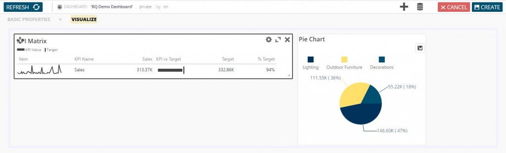
You can notice on picture below that we have removed Decorations item category from visualizations.
Text
You can add description, set a note or just add some text to your dashboard by using “Text” element. You can choose font size, weight, style and color of your text element.
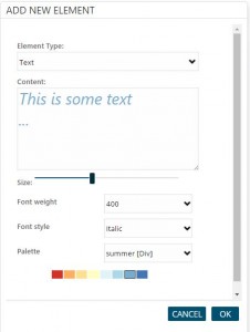
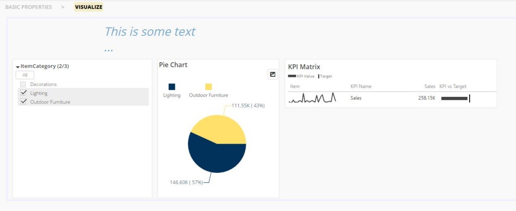
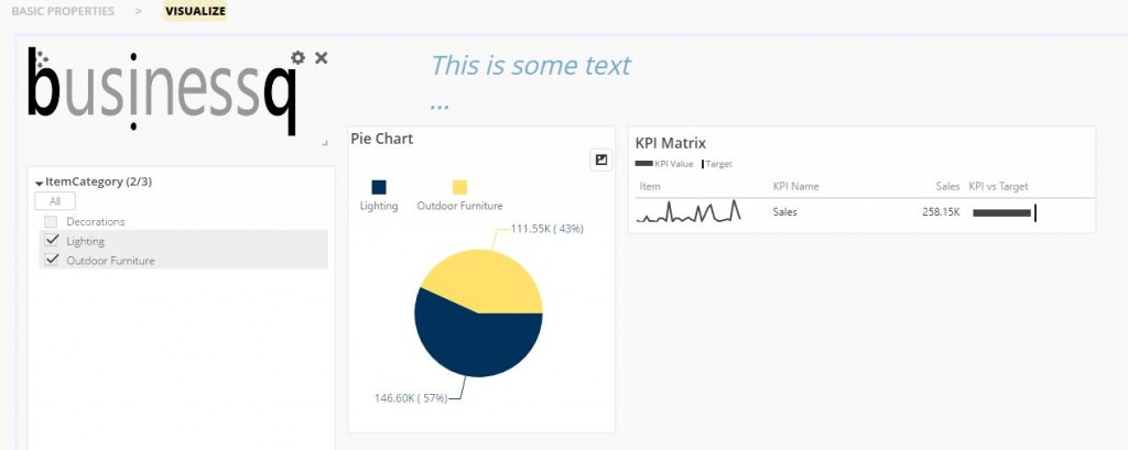
Image from web
“Image from web” element allows you to add image accessible from web on your dashboard.
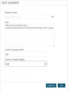
You can change the size of the image element/widget – you may need to do this in order to display entire image. Through settings icon in upper right corner you can change height and width of an image, and its URL.
If you enter only one custom measure (width/height) when you are adding/editing image on the dashboard, the image will be auto resized by maintaining its aspect ratio.
Web page
Add any web page to your dashboard in a few seconds with “Web page” element type.
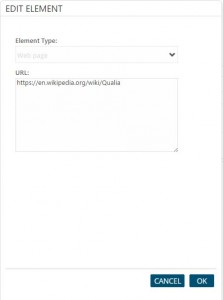
Just select “Web page” element type, paste URL of web page and press “OK” button.
NOTE: If you access BusinessQ through secure HTTPS protocol, you will be able to add only web pages with HTTPS protocol. It is enforced by browsers.
Dashboard Elements Possibilities
If you want to move an element, hover over that element and click “Move” icon in the upper left corner and just drag and drop your element.
By clicking on “Settings” icon:
- – For report visualization element type, you can change name of that element (original name of the visualization will stay on its report in BusinessQ repository, so if you ever decide to remove the custom name, you will automatically get visualization’s original name back).
- – For non-visualization element type, you change all main properties (the same properties you see when creating an non-visualization element).
“Remove” icon allows you to remove that element from dashboard.
In bottom right corner you can see “Resize” icon that allows you to resize your element.
“Maximize” icon is available only on visualization element type. It allows you to maximize that visualization – to bring it into focus by enlarging it over the screen.
Dashboard screenshot
You can take screenshots of your dashboard and download them as .png files.
![]()
When you click on the ‘IMG’ button on the dashboard BusinessQ generate .png file of the dashboard that is currently open and the download will start.
All widget types will appear correctly on the screenshot except the ‘Web page’ widget. ‘Web page’ widget will be displayed as a blank box for security reasons.
This feature is only available when user is logged in to BusinessQ. That means that this feature is unavailable on public dashboards when user is not logged in.
Import and export of entities
BusinessQ allows you to export and import different types of BusinessQ entities.
Entities that you can migrate are dashboards, reports, business models, data sources and tags.
Once you select the type of entities that you want to export, a list will appear below and you can choose specific entities that you want to export.
You can export them with or without their dependencies.
- With dependencies – with other entities that selected exported entities are depended upon. For example, for migrating to a new installation.
- Without dependencies – export just selected entities, and then match depended entities with entities already present on imported installation. For example, for existing installations when you just want to migrate a few reports or dashboards.
Clicking on EXPORT button will create a BQ export file that can be saved as the attachment with ‘.bq‘ extension.
For import, you can choose between pasting content of the exported file as text, or uploading an exported file.
If export included dependencies, clicking on IMPORT button will import all entities.
If export didn’t include dependencies, clicking on IMPORT button will present a dialog where you can match exported entities’ dependencies with existing entities on imported/current instance. For example, if you export a few dashboards without dependencies, you will have to match the reports and tags those exported dashboards are dependent on with reports and tags on the current instance.
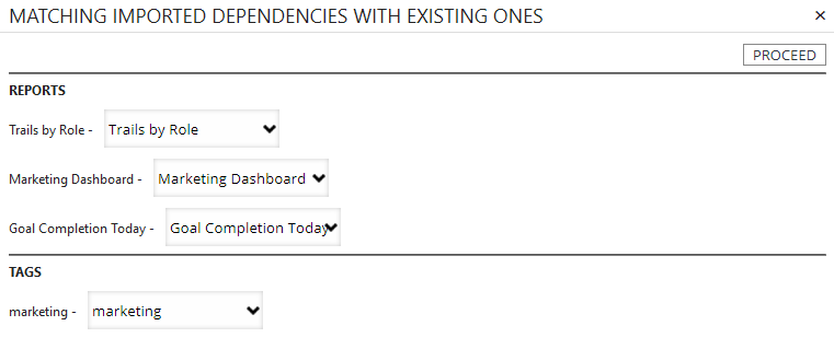
For export you cannot mix and match different entity types – in a single export, you can only export entities of a single type. If you just want to migrate a few reports and dashboards to another instance that already has required business models and data sources, you will first have to export new reports without dependencies, and match dependencies while importing on another instance. And then create another export with new dashboards without dependencies, and again match dependencies while importing on another instance.
SSO Integration
Single sign-on (SSO) allows integration of multiple independent systems or applications. Users authenticate with their credentials on a single system, and can then seamlessly access other connected independent systems without having to authenticate themselves again with the same or different credentials. BusinessQ uses tokens to achieve this integration.
The application which integrates BusinessQ will generate the token by encrypting a message with specific format. It will pass the token to BusinessQ in URL. BusinessQ will, while initializing, read the token from URL, decrypt it and will use decoded message to authenticate the user.
NOTE: if you already have SSO token generation workflow, BusinessQ can accommodate your existing setup, e.g. different encryption algorithm, different message structure, etc.
Hiding the menu
This option allows you to hide the BusinessQ menu inside the iframe and together with manipulating iframe src attribute it is possible to navigate through BusinessQ directly from the application that has embedded BusinessQ. Which allows displaying only some parts of BusinessQ to the end user.
Generating Token
By default, message used for token generation is a JSON string with the following structure:
{
    "UserInfo": {
        "UserName":"email@example.com"
    },
    "RequestDate":"2017-01-01 12:00:00"
}
“UserName” property contains the identifier unique to each user. BusinessQ will check the value against its repository. This means that every user that should be granted an access to BusinessQ, must be in its repository.
“RequestDate” contains the date and time when token was generated. It can be represented in any known format. But to avoid uncertainty, especially with different time zones, we recommend using ISO 8601 standard. Token is valid for 1 hour.
Specified JSON should then be encoded using industry standard AES (Advanced Encryption Standard) encryption algorithm in counter (CTR) mode with key length of 256 bits. Password/key (and on custom solutions, for example initialization vector) is stored in BusinessQ repository and can be updated at any time. The binary output of the encryption algorithm is then encoded using Base64 scheme.
An example of generated token:
Tf0Ku9kRfli1DXyR1YtAsx0Ax66509F3+KiPYDtGGq747ZQFv0Dyw8RFH4KAHmTiMmdPWTIXFG5pANzgc6/R9aC3EzWPhttiSsk/8eEolUR3zAXHYY8JS0k=
Passing Token
The generated token is then passed to BusinessQ in URL by adding two parameters:
- – sso. Indicates SSO mode of authentication, and its value is always ‘1’. (e.g. sso=1).
- – token. Generated token (e.g. token=Tf0Ku9kRfli1DXyR1YtAs…).
There is also an optional parameter for hiding menu:
- – menu. If it’s set to ‘0’, the menu inside BusinessQ will not be displayed (e.g. menu=0).
If the URL to an existing report looks like, for example:
https://your.server/businessq/#/report/1/view
Everything after the ‘#’ sign is part of the navigation within BusinessQ. In this concrete example, it is a report with id 1 displayed in ‘view’ mode (Two basic entities within BusinessQ are reports and dashboards that can be displayed in two modes, edit, and view). For SSO integration, it will look like this, with token value being variable:
https://your.server/businessq/?sso=1&menu=0&token=Tf0Ku9kRfli1DXyR1YtAsx0#/report/1/view
Validating Token
BusinessQ will, while initializing, recognize that it is in SSO mode, and will read the token from URL. Token will be passed to the server where BusinessQ backend will decrypt the token (with password/key read from BusinessQ repository), check its validity (user and time) and allow or deny access depending if the validation passes or not respectively.
NOTE: As mentioned, but it is worth repeating, all token validation, including decryption, is done on server side.
BusinessQ architecture separates frontend and backend. Backend is designed as a REST API. In normal mode of operation (not SSO), BusinessQ backend validates requests from frontend with temporary BQ tokens that backend generates. Those tokens are separate from SSO tokens and SSO integration. When backend validates SSO token, it returns to frontend its regular BQ token and communication between frontend and backend continues normally – like SSO authentication never happened.
To put SSO process into steps:
- – While BusinessQ frontend is initializing/loading, it enters into SSO authentication mode.
- – Frontend sends SSO token to backend for authentication. There is only one backend endpoint that understands and validates SSO token.
- – Backend upon successful validation of SSO token sends to frontend regular BQ token.
- – Communication between frontend and backend continues using regular BQ tokens and SSO token is no longer used.
Other BusinessQ features
Tags
If you are an administrator in BusinessQ, you can find “Tags” item in “Admin” part of the menu. Creating tag is easy – just click button “New” in the “Tags” section. That will open form for tag data.
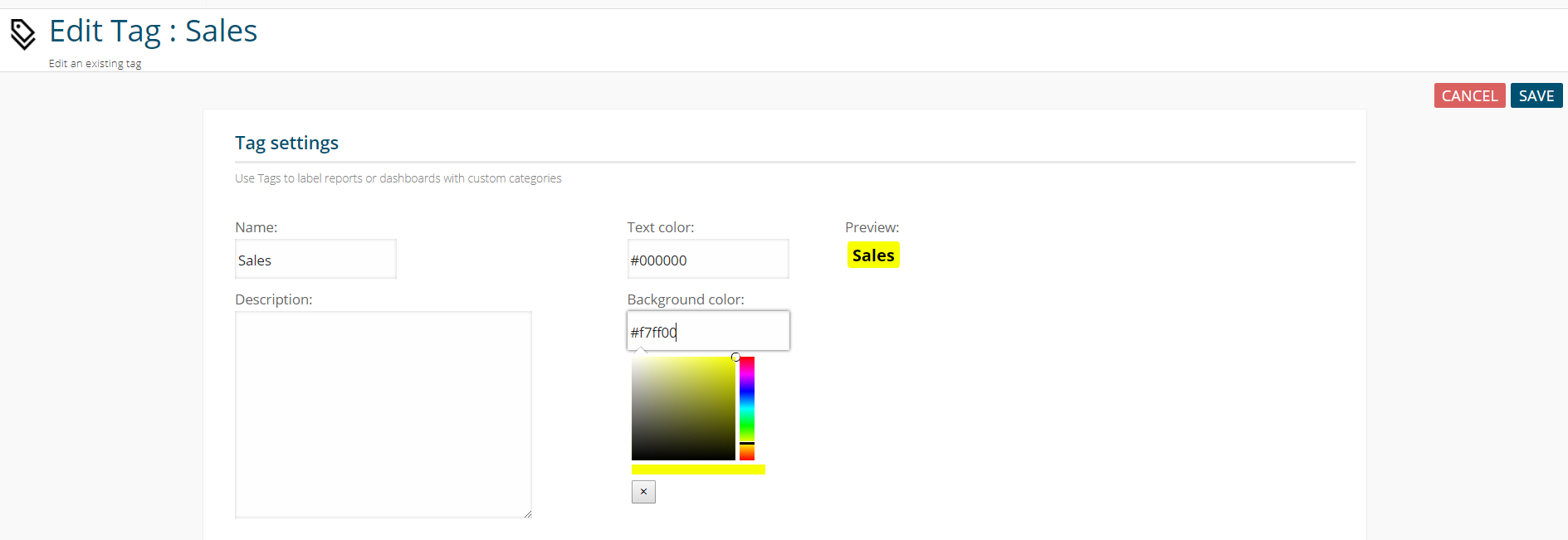
Now you enter tag name and select item text and background color and that’s it! You have a tag. If you wish, you can also add item description.
After this, all users with “Administrator” role will be able to assign tags to reports and dashboards, categorizing them in that way.
All users will be able to see report/dashboard tags on lists – allowing them to easily find what they are looking for – “Sales” report, “Board” dashboards, etc…
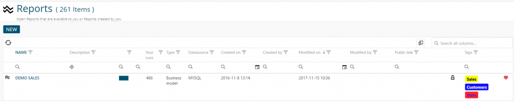
To add a tag on report/dashboard go to item basic properties and by clicking on “+” icon and selecting an item from select box add them on report/dashboard. You can use maximum 3 tags per report/dashboard.
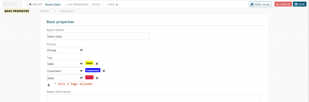
You can remove the tag from report/dashboard by clicking “x” icon on their right side.
But be aware, if you delete a tag from “Tags” section (“Admin” part of the menu) it will also be removed from every report/dashboard that uses it.
Row-level security
Row-level security allows you to create a filter based on Business Model and logged user. That means that you can create filter that will allow user to see only a certain set of data. For example, you can allow user to see only data from one country, not for all of them.
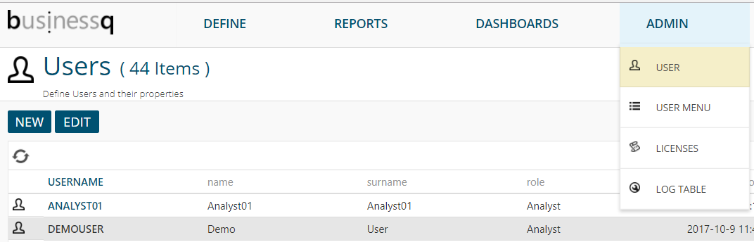
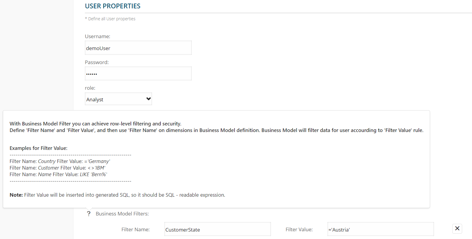
To create business model filter for users you have to go to “User” in “Admin” part of menu. That will open list of all users. You can select and edit existing user or create a new one.
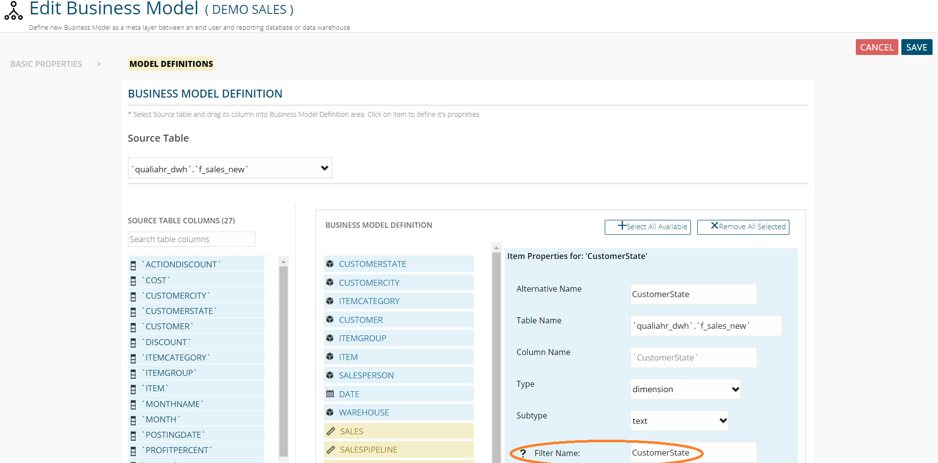
The last thing in user properties is “Business Model Filters”. That is the place where you create a filter for the user. When you go over question mark icon, you will find a little help about how to create filter.
You can set any name in “Filter Name” area (that is the name you will use later in “Business model” definition).
Filter Value will be inserted into SQL, so it should be SQL readable.
After you are done with creating filters in user properties, go to “Business model” in “Define” part of the menu and set that filter name for dimension filter name.
When you open business model, go to “Model definitions”, select dimension connected to your filter and in “Filter name” area put filter name written in “User properties”.
One filter can be used on more business model, but one dimension in business model can only have one filter name.
That’s it! User will now see only filtered data in reports based on Business model with filtered column. Other users will see all data on that reports (unless they also have business model filter defined on their profile).