Whether the type of business you are in, customers are your backbone. Without customers, no…
Use Analytics to track your best and worst selling products
Tracking the sales of each product you sell on or off-line is one of the key ways you can expand your business. In other words, to grow, you need to constantly optimize your stock so that your sales and less successful products don’t hold you back.
It’s essential to look at other reasons why some products sell better than others. For example, it is necessary to see those your competitors sell. If they are selling, what is the price they are selling? Is it higher or lower than yours? Therefore, this can help you understand if there’s anything you can do to change these circumstances to improve sales for specific products.
Why you should track your best-selling items?
Poor selling products can be a drain of money and effort. Above all, by monitoring how your products sell, you can see if changes affect your sales. To increase your item sales, you need to improve something, but it is diverse for physical and online store items. You can include product photos and descriptions for an online store or lower the price if needed.
The first step in this process is to know which of your products are selling and which aren’t. You can spend more time promoting your best sellers when you know this. In that way, you can look for ways to improve poor-performing products.
Carefully analyzing your data is an essential step in building a better, more robust strategy for your business. If you want to keep turning more significant profits, there are zero reasons not to do it.
How to find the best-selling products by using the Analytics | BusinessQ app?
You can use several analyses to detect your best and worst selling items. Not only worst, using Analytics, but you can also find out those sitting on yourself, not selling at all.
Let’s dig deeper into three further analyses of those…
Item categories overview
This report allows you to quickly see which items and from which categories are being sold most over a selected period. The period length in this report is up to 12 months. Because of that, you can get great information about what is selling well.
Use the available Pareto Charts to get information on the best-selling item(s). In these charts, you can see Total Items that contribute to (percentage of) Revenue and Total Items that contribute to (percentage of) Total Number Sold.
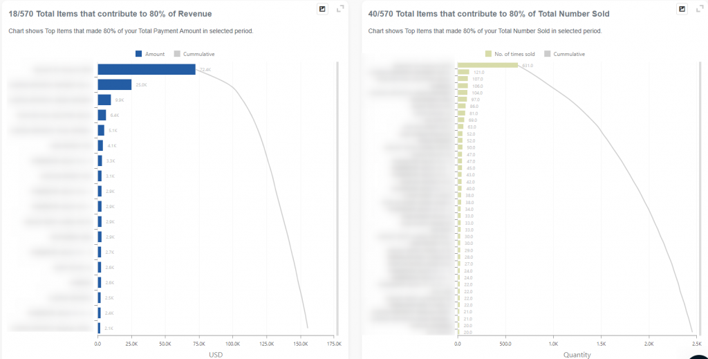
Besides checking the best selling item, in this report, you can find out what is standing on your self and not selling. Item Categories overview report is available in the Basic, Advanced, and Professional tiers and it is part of the Quick report section.
Use this report frequently to know which item sells the most and stands on your shelf. If you have those types of items, get rid of them quickly.
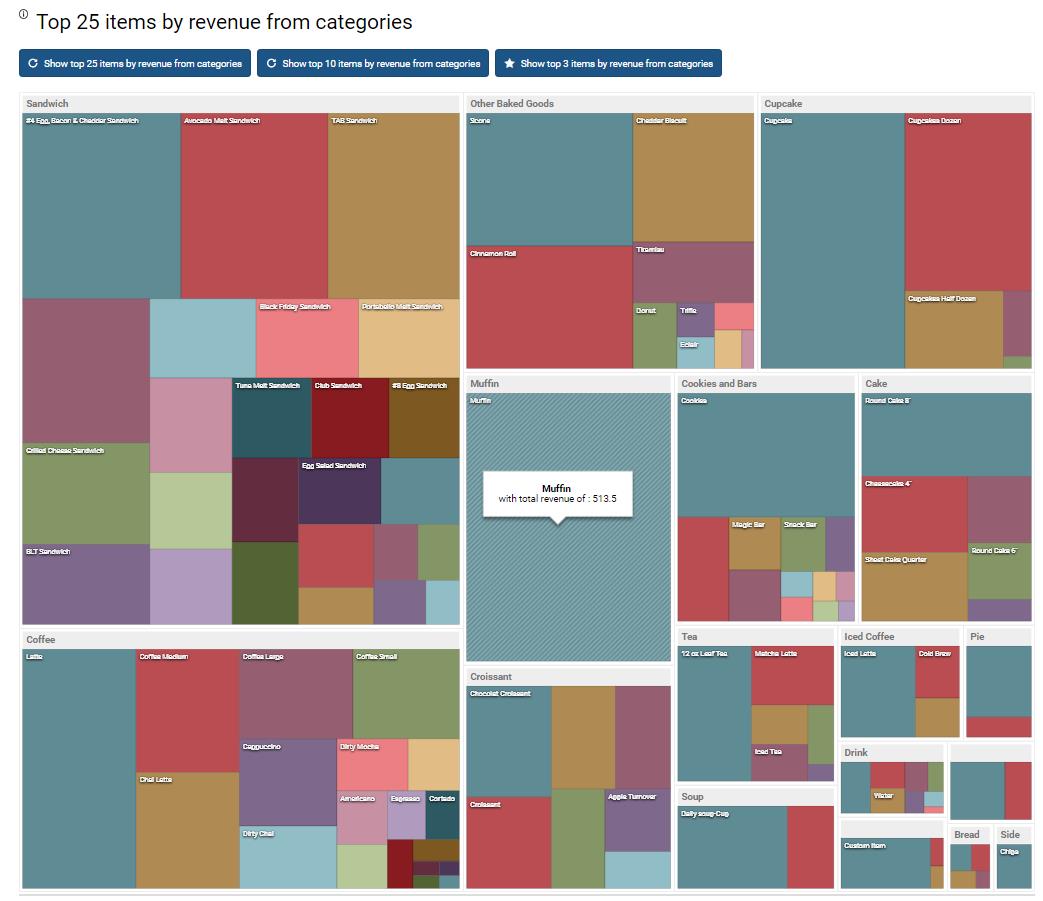
Item categories treemap
Item Categories TreeMap report is a payment-based report, and it’s part of a Quick report section. TreeMap chart provides a hierarchical view of your data and makes it easy to spot patterns, such as which items are a store’s best sellers.
When there is a correlation between color and size in the tree structure, you can see patterns that would be difficult to spot in other ways, for example, when a specific color is particularly relevant.
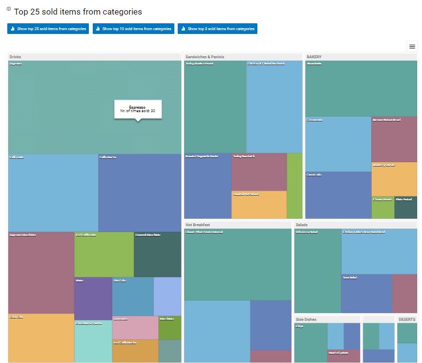
TreeMap report works well with the multilocation feature. If you have more than one location linked, you can use this report to get data on all sites or only one. Therefore, if you select all of the locations, the treeMap table will gather all categories from all locations.
ABC Item analysis
ABC Item analysis is one of the youngest Analytics reports and is available only for the Professional tier users. It uses AI (Artificial Intelligence) models to make calculations. In other words, ABC Item analysis is a classification method that divides items into three categories, A, B, and C.
This analysis is actually an inventory management technique that determines the value of inventory items based on their importance to your business. For instance, based on profitability, the essential items are “Class A” items, the next-most important are Class B, and the least important are Class C.
Bear in mind that this report calculates data from the beginning of your work on Clover.
Here is one topical example of ABC Analysis. From this chart, we can see that 18% of items that are grouped into category A make 87% of the revenue. The best is to check the detailed table under the charts to get more details. In the detailed table, there are only 22 items in category A. So, those 22 items are your gold mine.
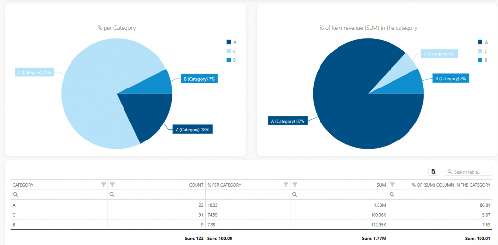
The ABC analysis is also called the Pareto analysis. The Pareto principle says that 80% of the results (output) come from 20% of the efforts (input).
There is a long list of benefits from including ABC analysis in your business, such as improved inventory optimization and forecasting, reduced storage expenses, strategic pricing of the products, etc.
Finding the perfect product is only step one in a seller’s journey. To ensure that the product flies off the shelves, merchants need to optimize their product range. Use Analytics to track your best and worst selling items.
Keeping track of your best-selling products is one of the first things you should do as a shop owner. A modern application like Analytics allows you to do that exceptionally smoothly. Along with several other metrics that can be equally important for you to change to your strategies should the need arise.
Start using Analytics and all mentioned reports now! It provides visualization and readable formats with a user-friendly dashboard.
As always, we want to hear any suggestions you may have. After all, we are building this app for you. Have any new ideas or suggestions? Write to us!
Happy Analyzing!
Your Analytics | BusinessQ App Team
Qualia Data Sciences LTD
Related posts