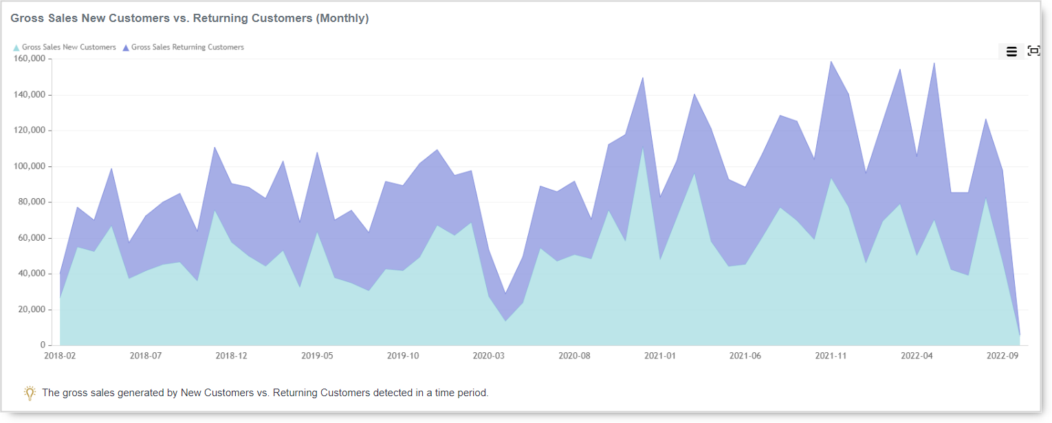
Whether the type of business you are in, customers are your backbone. Without customers, no…
How to create custom report just for your need
How often do you want to have a special, just for your need report, but you thought that it is not possible? More and more apps have tons of predefined reports with so much data, but all you want is an easy and simple report. But don’t worry, we got your back!
Custom report via Pivot table
Analytics | BusinessQ app has such an option, and it’s so simple to use it. To create custom reports, you need to use the Pivot tables reports. Analytics app offers three types of custom reports:
- Item Pivot Level data report and
- Order Pivot Level data report
The difference between those two sections is in the data you want to see. If you want details about items, labels, and so on, use the Pivot Item report. But, if you want more overview information, such as orders, employees, payments, the best is to use the Pivot Order report.
As we all know, firstly, and most importantly, in report creation, is to have a clear picture of what information you want to get. To get any information via Pivot reports is truly simple. Follow a few basic steps and you will have results in no time.
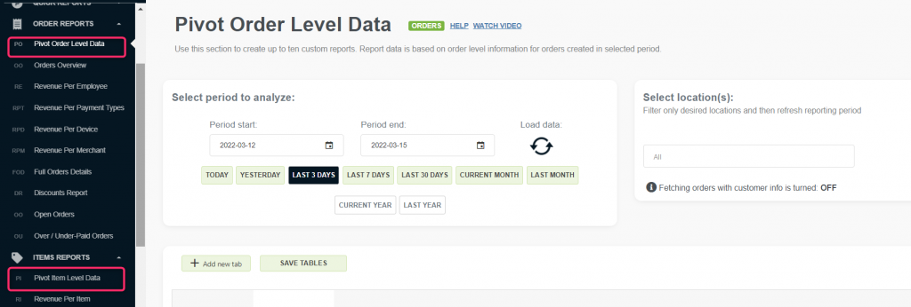
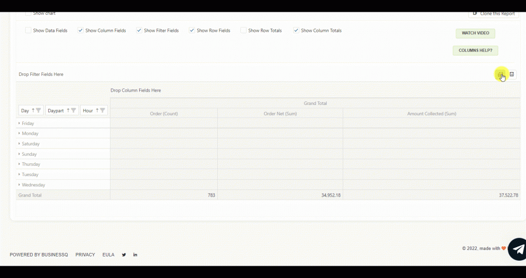
- Open Pivot level data report (Item or Order, depending on what you are looking for)
- Choose a period you want to analyze (when creating new reports start with shorter periods)
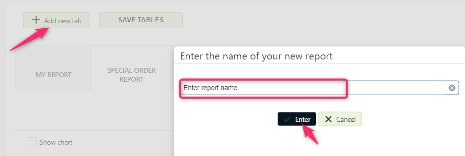
- Create a new custom report by clicking on the “Add new tab” button
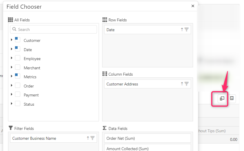
- Open “Column chooser” and ad data you want to see
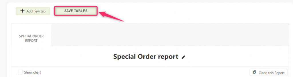
- Save the report
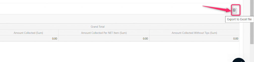
- Export to excel if you want
Let’s go through some cases and how you can use the New Custom report to get the results you need!
Orders per day in a week
For example, you want to know which day in a week is the day when you make the most orders or the most income.
In the Column chooser, you can choose values like Day, Day-part, and Hour. After choosing which values you want to use, place them as row fields. In the Data field, select what you want to see – for example, you can choose Amount collected, Order profit, and many other metrics.
Revenue per Category and Payment label
If your interest is items or categories, you should use the Pivot Item Level report. With the Pivot item report, you will get details about item sales with categories, labels, payments per item, etc.
For example, you want to know the revenue per category and see which payment type (label) was used for each category. Sounds complicated? With Analytics you can even get this kind of information! Isn’t that great?
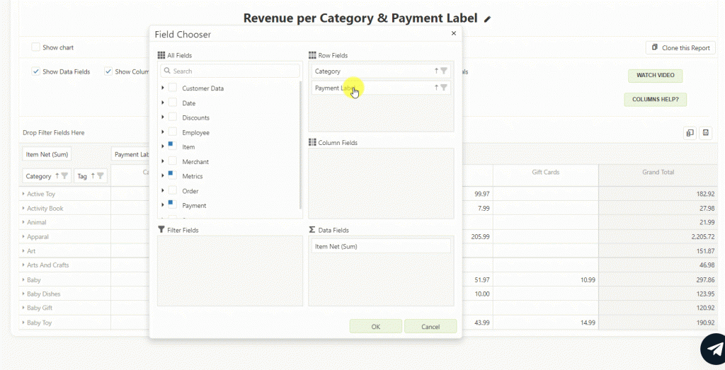
Even crazy ideas, like checking which payment type was used for each category, can be calculated! With the Analytics app, everything is quite simple and possible.
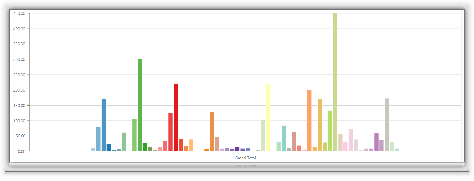
Visualization
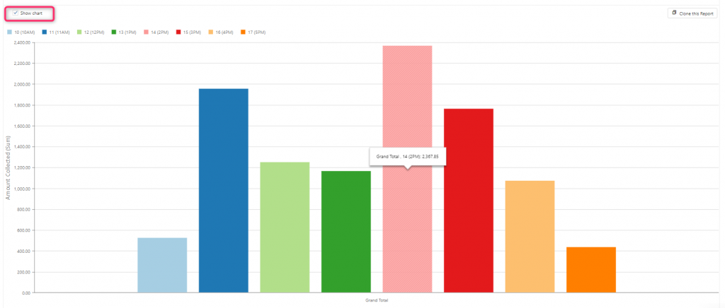
Yes, yes, I know what you will say now. It’s nice to have excel data but for me, a picture says it all!
Some of you prefer to see data in a chart so they can see and compare results. I hope you didn’t forget we can do it all, so yes, there is a chart you can get for each custom report made via pivot tables. To hide or see the chart in each pivot report, click on the “Show chart” button. As you will change the view in the table, that is how the chart will change.
Do you wish to check something similar? For example, you want to compare sales of items on a particular day in a week, plus sales of those items and comparison weekly, but you don’t know how to. No problem, we are here to support you and find the best solution for your need. reply to this email and we will do our best to help you in getting the reports and analysis you need.
If you like this, and you think the Pivot for custom reports would be a good solution for you, check out this video. In the video, you will get some more insights on how to start creating a custom report, add data, save or export to excel. Besides that, you will find extra tips on how to work with pivots to get the best results.
Quick recapitulation of all the information…
Since Pivot Level data reports are part of the ADVANCED & the PROFESSIONAL tiers. Analyzing period is up 10 years for the Professional tier. But, if you use the Advanced tier, all data can be analyzed up to 4 months in light (any time in the past).
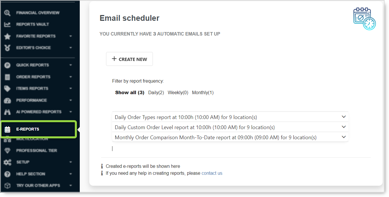
Besides pivots, in the ADVANCED and in the PROFESSIONAL tier, you can create custom e-Reports as well. How to set up a custom eReport, we will talk some other time. So, stay tuned!
If you would like to know more about pivot tables and how to work with them, visit our FAQ web page.
As always, we want to hear any suggestions you may have. After all, we are building this app for you.
We hope that you are as excited about the new changes as we are.
Have any new ideas or suggestions? Write to us!
Happy Analyzing!
Your Analytics | BusinessQ App Team
Related posts