Since the early days, people are faced with making decisions based on choices at the…
BusinessQ Split By Feature
Split by in general
Suppose we have data on selling some items in the last few years. Usually, we have, for each item sold, a single record, with informations about the type of item, sales time, price etc. For each item type, we count those records in which this item appears. In this way, we get the number of items sold for each type. This data can be shown on the chart. If we do the same, but for each year in particular, we will get for each type of item just how much is sold each year. In other words, measures are split by the year.
BusinessQ and split by
In the following example, we’ll show how to use “Split By” feature in BusinessQ. For all types of visualization in BusinessQ, “Spit By” feature is used equally, while in our example we will use the “Vertical Graph” type of visualization. The types of visualization on which you can use the “Spit By” feature in BusinessQ are: Standard Table, Vertical Graph, Horizontal Graph, Scatter Plot, Bubble Plot and KPI Matrix.
Example
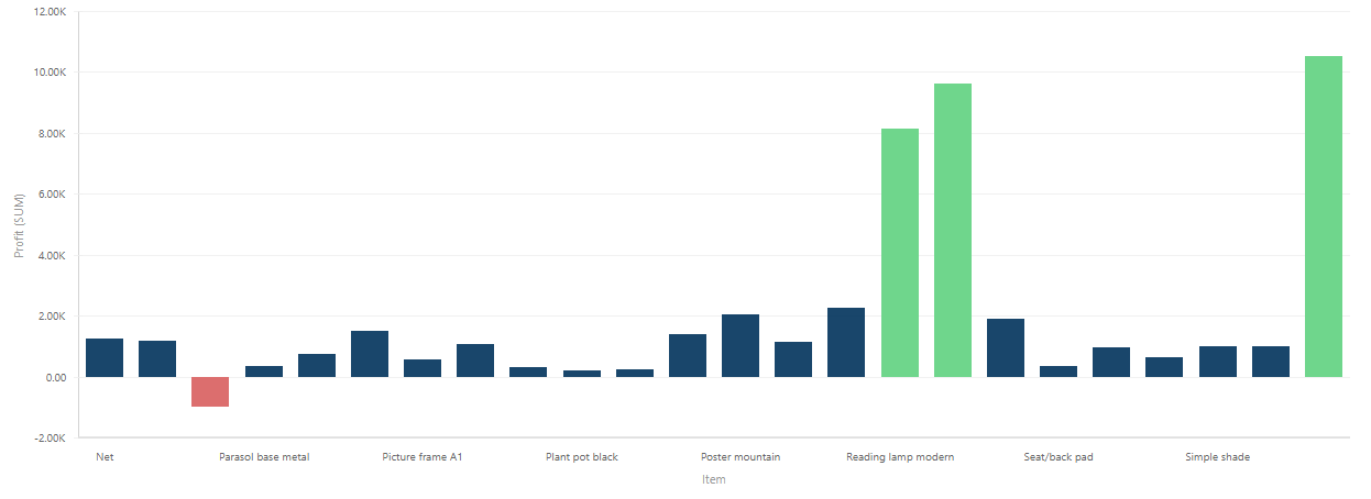
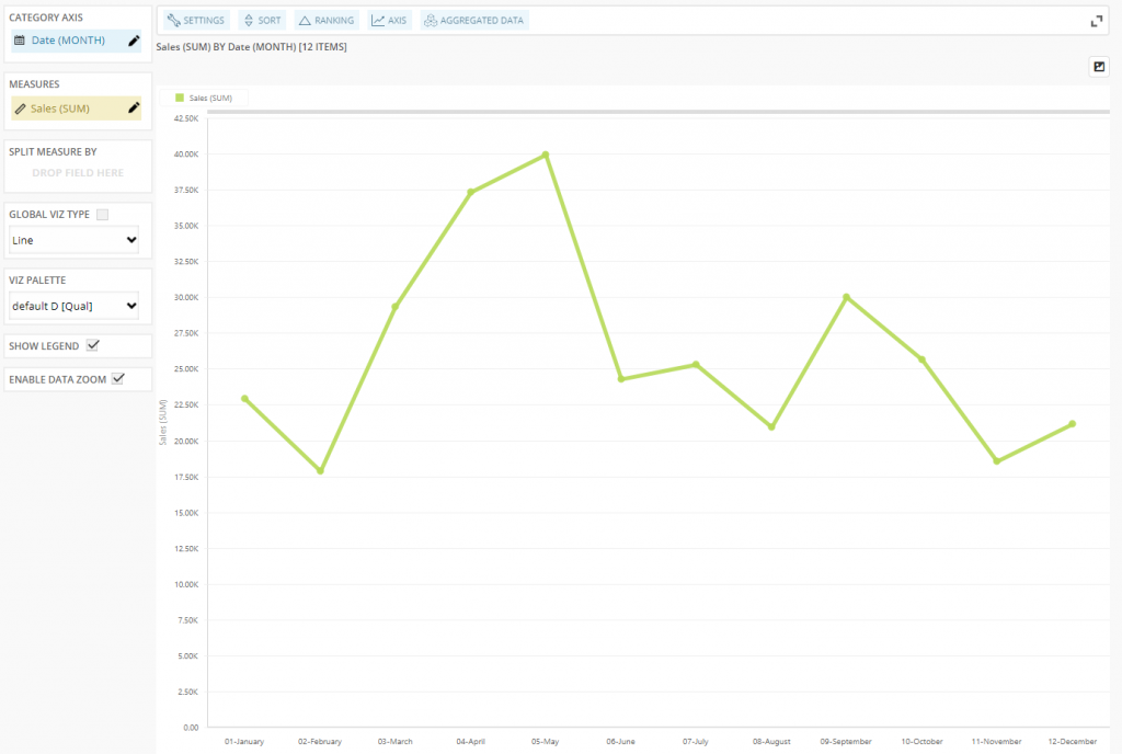
The following figure shows a graph showing the sales amount per Month in a year:
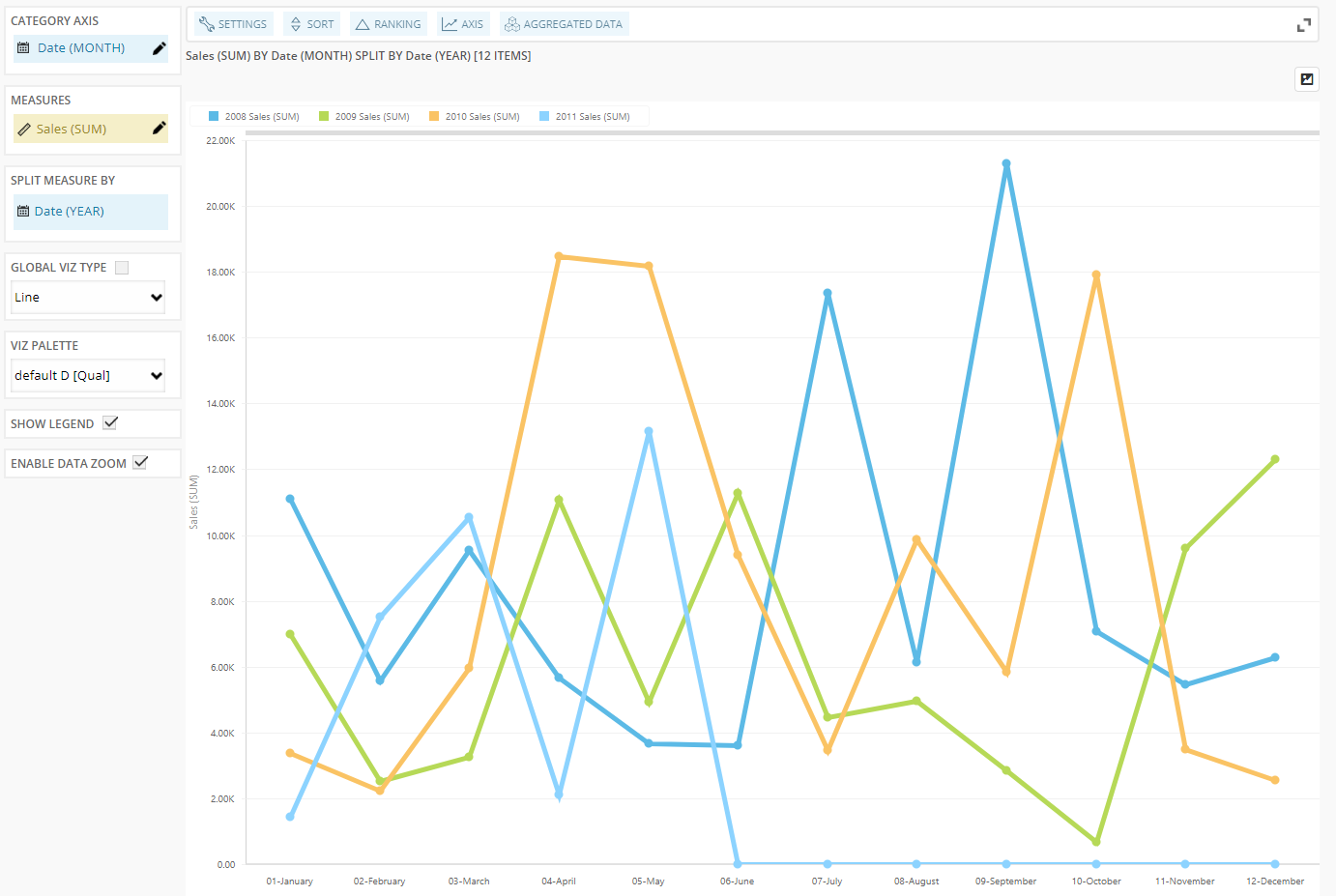
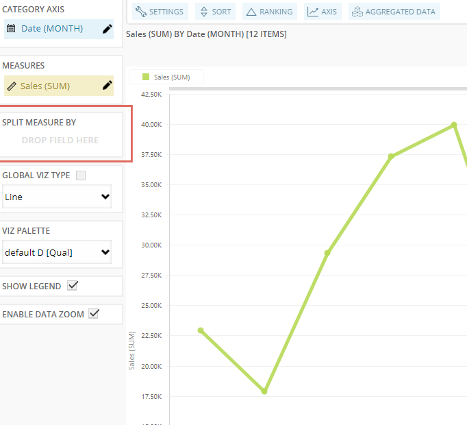
But what if we would like to see Sales per Month in the year, for each year separately? In BusinessQ, we simply drag the “Date (YEAR)” dimension to the “SPLIT MEASURE BY” area. It’s that easy.
As a result we get:
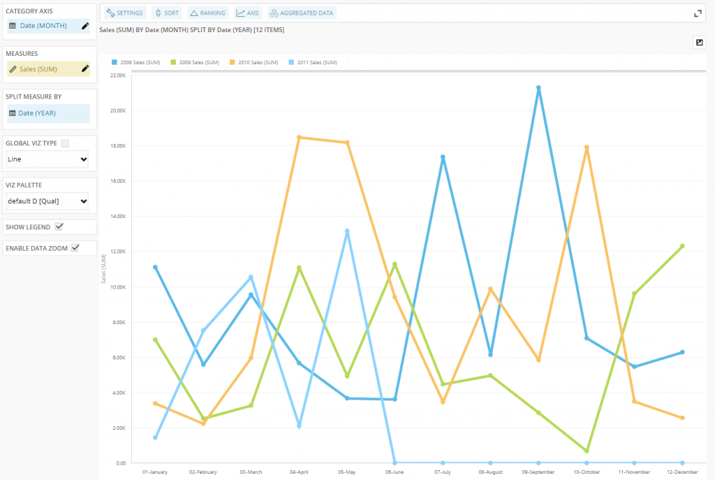
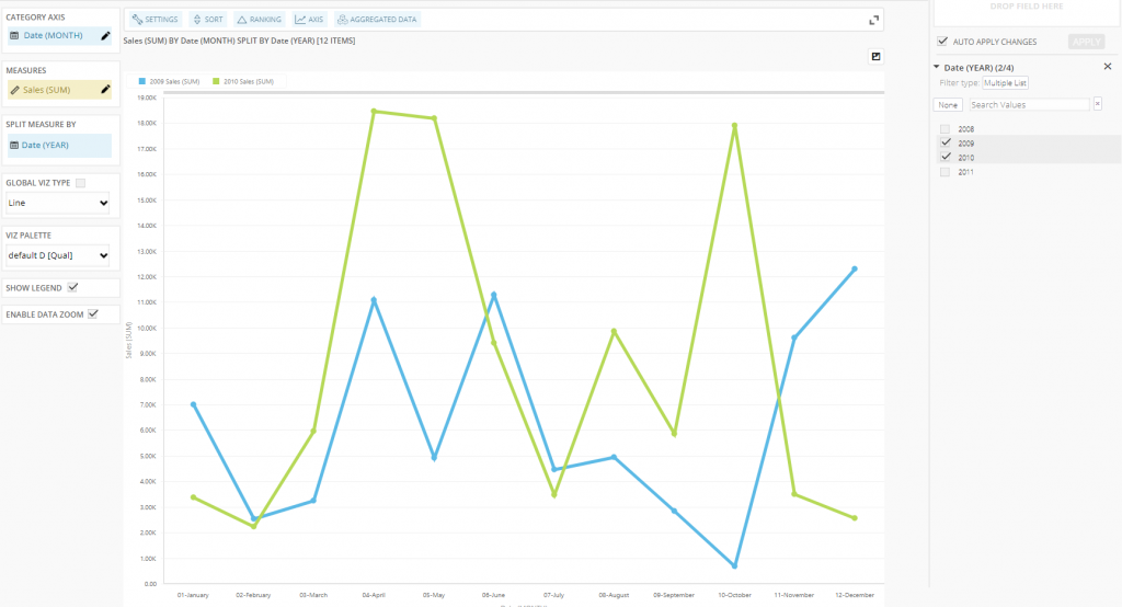
Now we can see the Sales per Month in each year. We can even put local in-memory filter on YEAR(Date) to compare only some years, while discarding others:
We are developers of data visualization software BusinessQ. Try it for free and make reports and dashboards that make sense, without chart junk.
Related posts