BusinessQ v19.0
We are happy to inform you that we have published a new version of BusinessQ (v19.0).
What is new in v19.0 s
SQL view
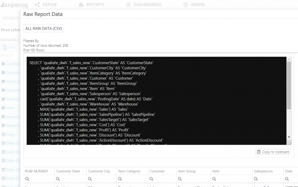
In Raw Report Data part on reports and dashboards Admins can now see SQL that is used to get data. They can copy it to clipboard and use it wherever they need.
How to get started
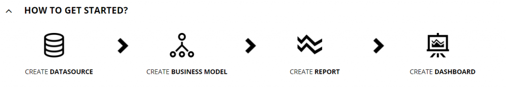
A simpler way to create Datasource, Business Model, Report and Dashboard.
Users can now easily learn how to use BusinessQ in this step by step explanation.
Location: home screen
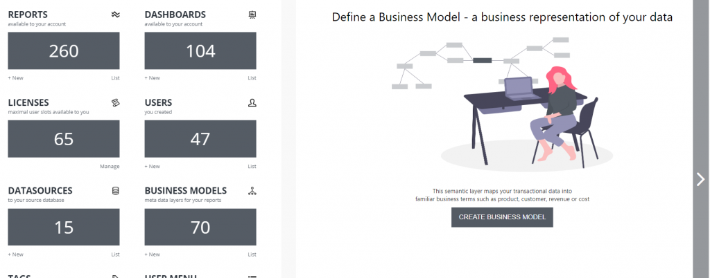
Slide show
Slide show of BusinessQ elements and a little description of every element (Datasource, Business Model, Report and Dashboard). In the slide show, you can also find and run the feature tour.
Location: home screen
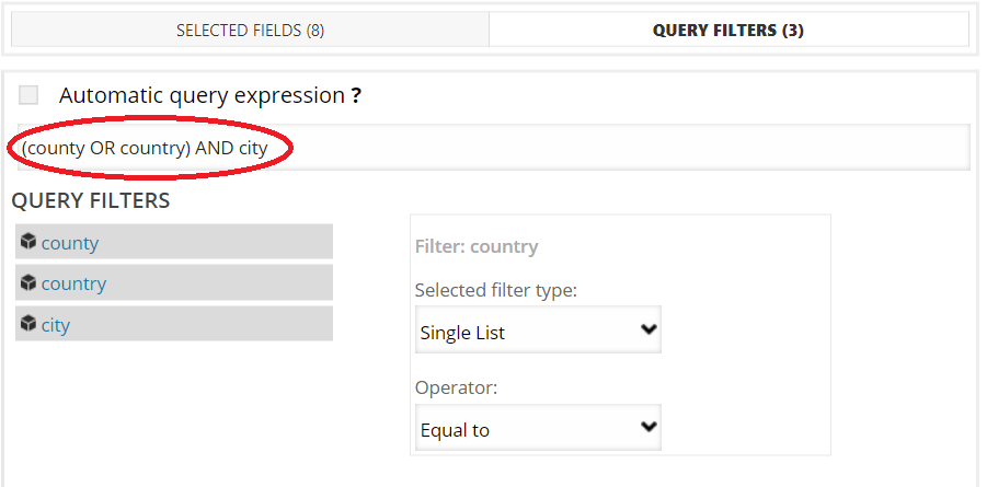
Freehand Query Filter
When you select fields for query filters in your report, the default operator is “AND”.
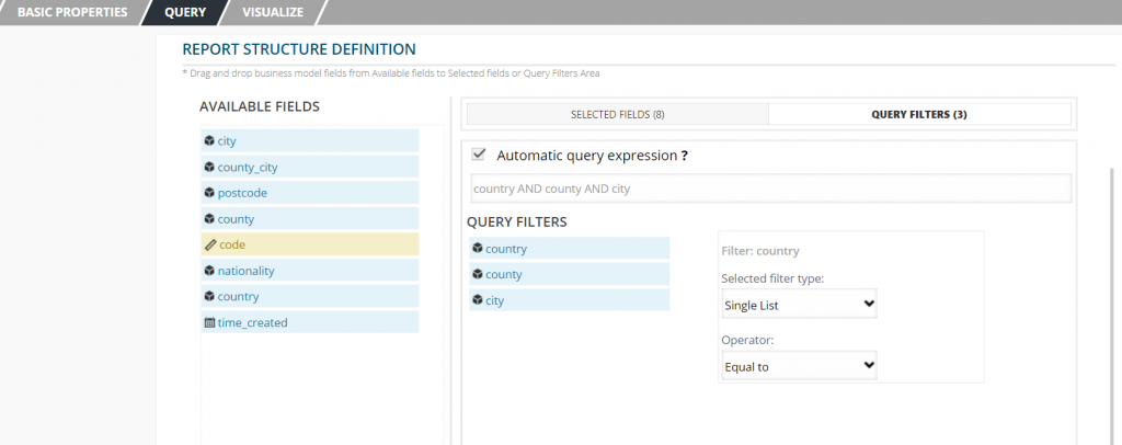
Now you are able to change default operator and enter your own filter expression.
For example:
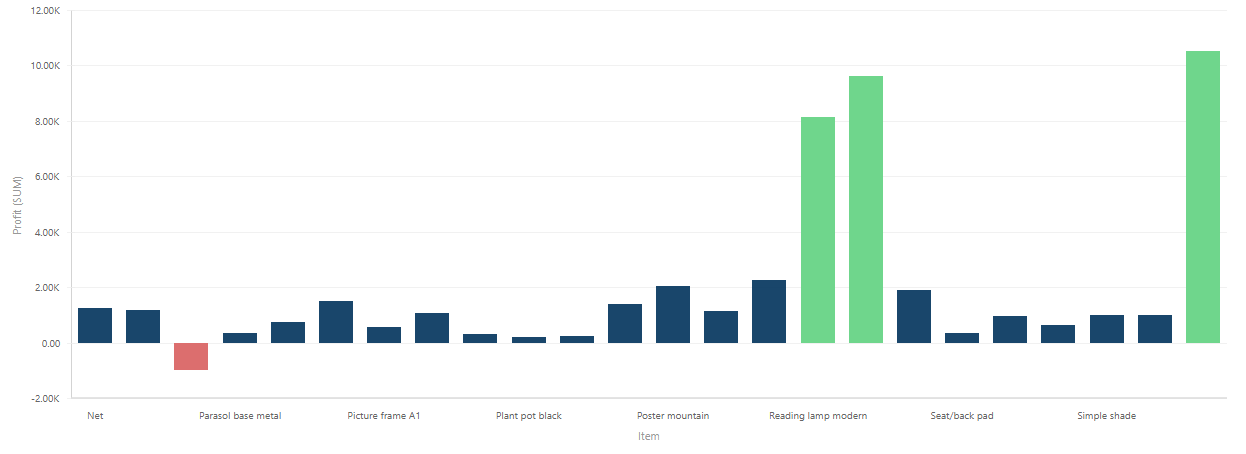
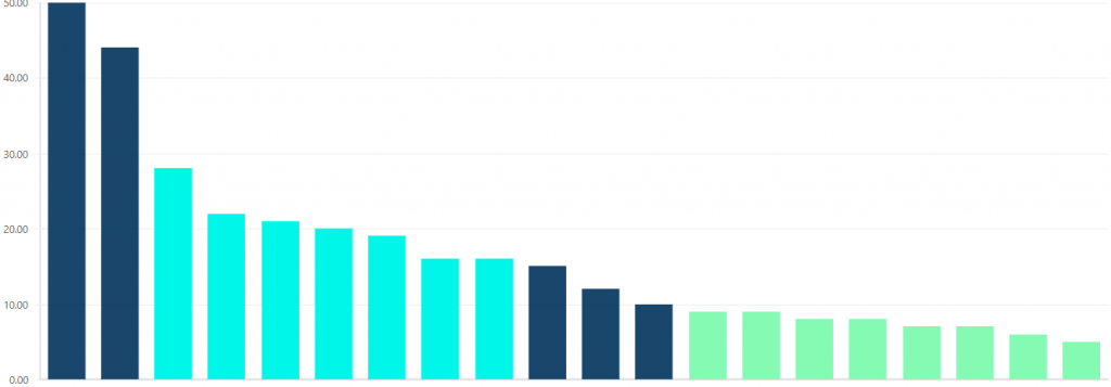
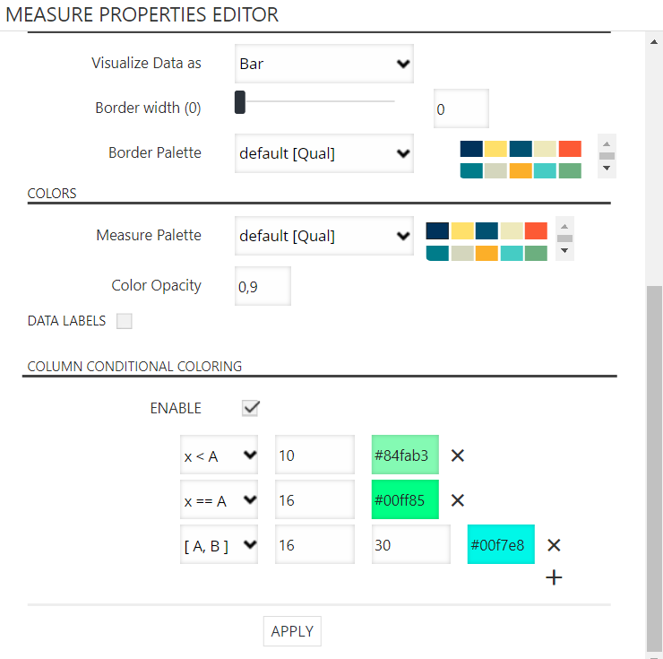
Conditional coloring
You can now use conditional coloring on a vertical or horizontal graph and on scatter and bubble plot.
To use this, you have to go to the properties editor of measure to which you want to put condition.
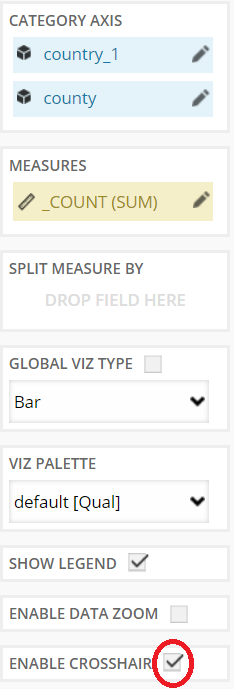
Crosshair option
You can use crosshair option on a vertical or horizontal graph and on scatter and bubble plot. All you have to do is go over the point.
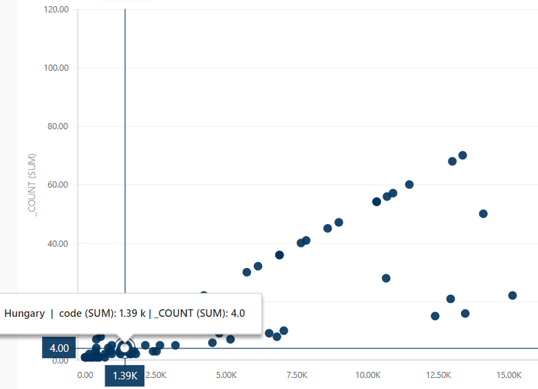
You can enable/disable crosshair by checking/unchecking that option.
Zoom type
Change zoom type to zoom in on one of the axes.
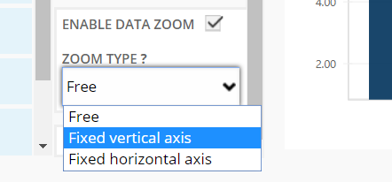
Additionally, you can select the part you want to zoom in.
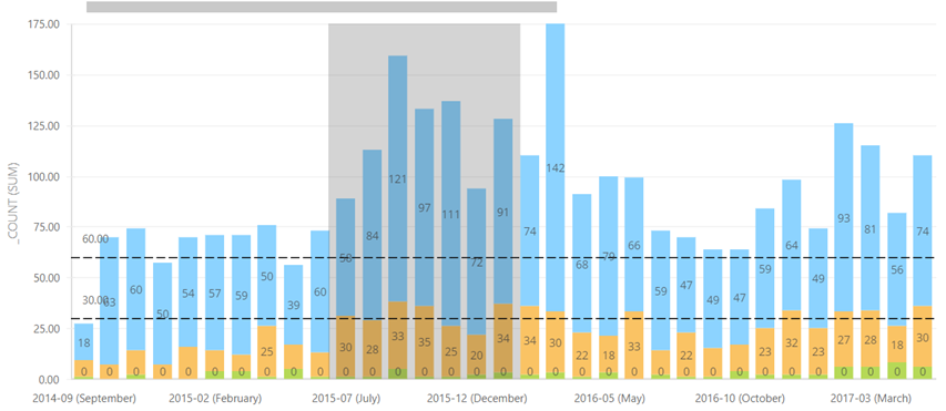
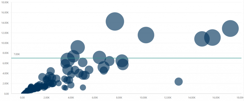
Constant lines on Scatter and Bubble
You can now add constant lines on scatter and bubble plot.
Principle of adding is the same as it is on a vertical and horizontal graph.
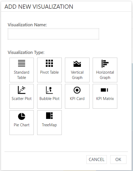
Add new visualization on report
A simpler way to add new visualization. There is no need to go through the select box anymore. Just click button/image of visualization.
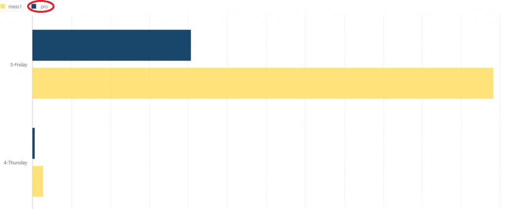
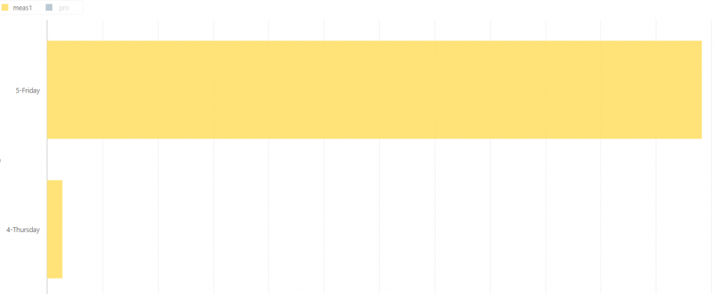
Show/hide measures on graph
You can easily show or hide measure on your vertical or horizontal graph and on scatter and bubble plot.
If you use two or more measures and you wish to see only one or few of them, but you don’t want to remove others just click on the legend to hide measures you don’t want to see.
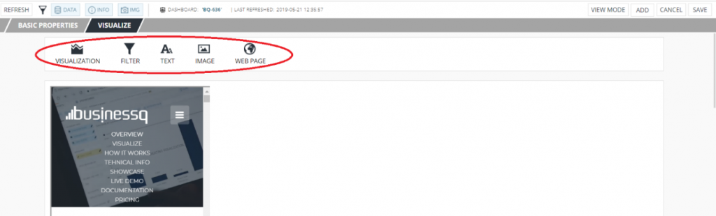
Add new element
There is now a new, simpler way of adding elements. You don’t need to use the “Add” button anymore. You can simply click on element icon you want to use on your dashboard.
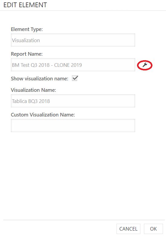
Open report from dashboard
When you go to “Edit” element from the report, you have an option to open that report in a new tab.
Auto resize image
If you enter only one custom measure (width/height) when you are adding/editing image on the dashboard, the image will be auto resized by maintaining its aspect ratio.
We are developers of data visualization software BusinessQ. Try it for free and make reports and dashboards that make sense, without chart junk.
Related posts