Why do I think that dataviz is form of art?
Design and creation of business information dashboard is not an easy job. That is why there is a whole set of rules to help you achieve your goal – to communicate information in clear, clean and unambiguous way.
Philosophy of language
Paul Grice was a famous English scholar, best known for his innovative work in philosophy of language, linguistics and artificial intelligence. Grice’s concept of speaker’s meaning was an ingenious refinement of the crude idea that communication is a matter of intentionally affecting another person’s psychological states. He discovered that there is a distinctive, rational means by which the effect is achieved: by way of getting one’s audience to recognize one’s intention to achieve it.
He noted that all conversations follow a basic set of rules, which people use to express themselves when speaking. The four basic rules, also known as Maxims are those of Quality, Quantity, Relevance and Manner.
Maxim of Quality
The first rule – the information you communicate have to be true; don’t communicate anything for which you lack adequate evidence.
Maxim of Quantity
When communicating, you are expected to provide just enough information to get their point across. Do not make your contribution more informative than is required.
Maxim of Relation
According to this rule, you are expected to stay on the topic. In short, to be relevant.
Maxim of Manner
What you communicate should be direct, clear, and to the point. Avoid obscurity of expression, ambiguity and be brief.
Connection with dashboards
What is very interesting is the fact that all these rules can be applied to business dashboard design, because they are indeed a mean of communication. They communicate numbers in tables, graphs or other symbols to company’s analysts, managers or executives on all level. Grice’s rules are very important because if you follow them, you will be explicitly clear and direct, just what you need to be when designing a dashboard.
So, if you want to design high quality dashboard with just as much information as needed, a dashboard that is relevant, concise, brief, direct and clear, just be aware of Grice’s four Maxims and incorporate them in your work.
We know that the best way to show time trends is line chart. But, what size? What line weight? What colour?
We know that we should use soft colors when we present categorical data on graph. But which colour exactly?
We know that the most important information on the dashboard should be in the upper left corner. But what data? How big will that space be? How to achieve the best data-to-ink ratio, while maintaining clarity?
But the beautiful thing is, because no rule is completely specific, there is always a need to be creative. That is why I see dataviz as a form of art.
If that was not a case, all dashboards will look almost the same.
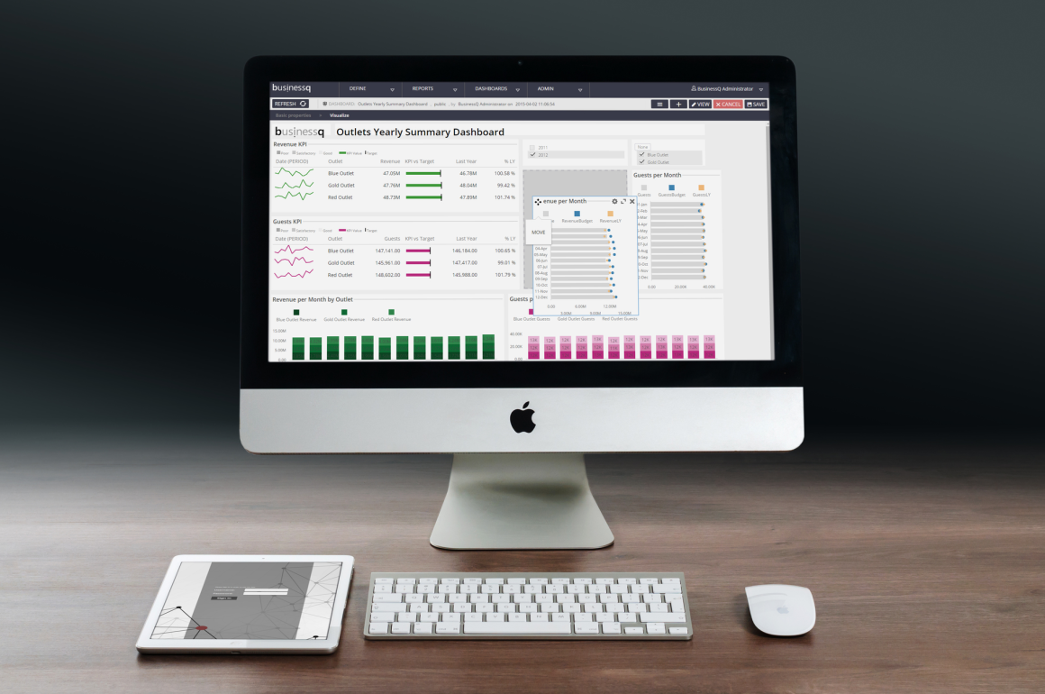
We are developers of data visualization software BusinessQ. Try it for free and make reports and dashboards that makes sense, without chart junk.
Related posts