Chartjunk and why to avoid them
Term chartjunk refers to all visualizations, charts, and graphs that are not necessary while transferring information they stand for. Chartjunk can easily drag you off the optimal decision. That is done by bad or inappropriate visualizations you aren’t able to read correctly or it takes too long for you to understand what visualization is trying to tell.
In order to produce just best practice visualizations, in BusinessQ is not even possible to produce a chart which could be classified as junk. We specialized in worlds best practice of clean, easy to use and easy to understand visualizations.
One of the best ways to show you how to visualize your data in a proper way is to teach you what practice should be avoided.
Here are a few examples of bad visualization:
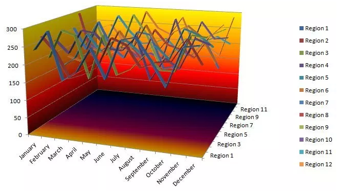
Picture 1: Chartjunk[1]
I assume that visualization on Picture 1 speaks for itself. Just try to conclude anything while relying on the information which it represents. Let’s just say that among other things the big problem with that visualization is Data-Ink ratio. We will talk more about that topic in the next blog post.
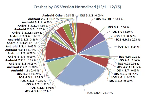
Picture 2: Pie Chart Junk[2]
As you can see, the chart in picture 2 is not easy to handle and you should have a calculator and spare time to figure out the information you need. It would be much better to group data by the bigger categories. The pie with more than 5-10 wedges is not easy to read and by that, it doesn’t make sense. It would be better to choose some other, more appropriate visualization, like bar chart.
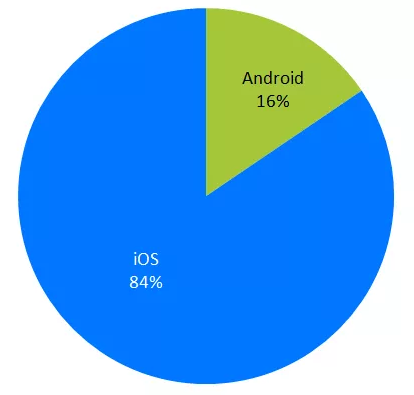
Picture 3: Pie chart without junk[3]
Even more interesting possibility in representing data is the ability to “drill down” through the data. It enables you to have clear visualizations without junk, but also allows you to search for more information related to data. It enables you to have your cake and eat it too. “Drill downs” and “drill ups” are possibilities we included in our softare, of course; in BusinessQ, whenever is appropriate, you will have the ability to “drill down”.
Try it with your data, we’re sure you’ll like it!
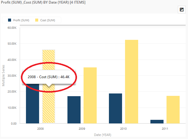
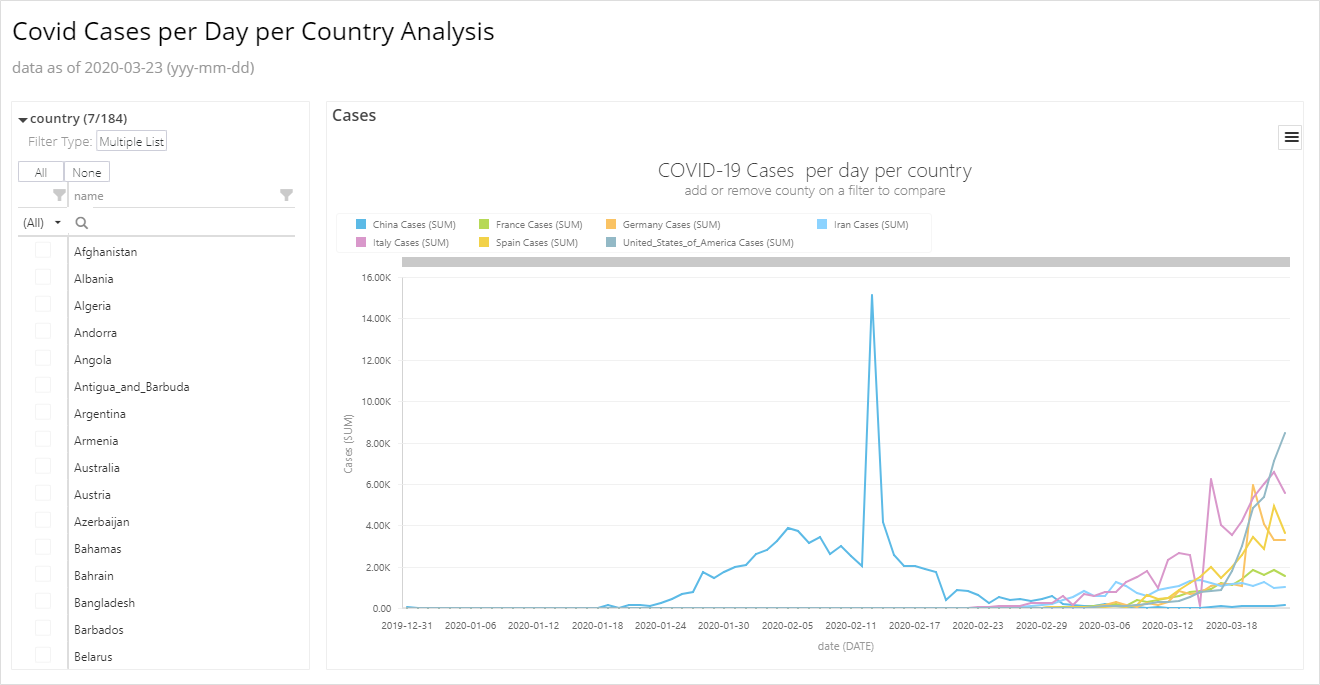
Picture 4: Drill down in BusinessQ
As picture 4 displays, after clicking on, for example, the year 2008, you drill down into the visualization and in the next step you can see more info about required data:
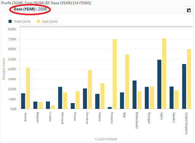
Picture 5: First level of drill down in BusinessQ
You can drill down as long as it is possible (depends on granularity of data you bring to software) with your data. The same way is to drill up; you just have to choose on which level you want to be drilled up.
Here is the example of “drill down” with our data! Just click a few times and you’ll figure out the benefits in analysis yourself!
But, after little intermezzo, let’s get back to chartjunk.
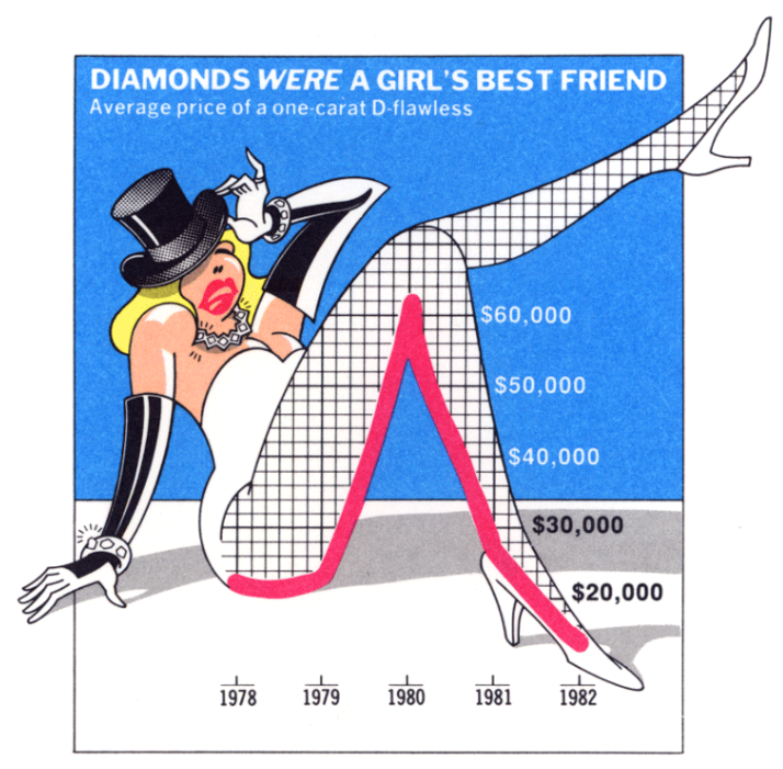
The interesting thing to know while studying chartjunk is that some say that sometimes chartjunk can be effective[4], like the following:

Picture 6: Marketing effective chartjunk[5]
But, to make that kind of chartjunk, firstly was created non-chartjunk, which has been enriched with the appropriate picture:
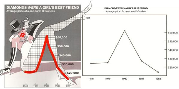
Picture 7: Chartjunk based on non-chartjunk[6]
While chartjunk sometimes can look nice and shiny, business best practice shows that it’s much better to rely on clear, easy to read visualizations. Decision makers need to have the right information at right time, and it is impossible if the chart is too complicated. Good, quality visualizations enable the decision maker to keep the business under control and to react on time when the moment is right.
If you need advice while composing visualizations, just ping us, we’ll be happy to help!
What is your opinion about this topic? Please leave a comment, we would like to discuss it with you!
[1] McMullin, M. Chart Junk is Destroying Your Pie Charts, Michael McMullin’s web site. URL: http://www.mrmcmullin.com/2017/05/chart-junk/ [accessed: Feb. 27, 2019]
[2] Ibid.
[3] Ibid.
[4] Harang. Principles of Information Visualization (Visualization Wheel, Data-Ink Ratio, Chart Junk, Lie Factor, Truthful Art), Data Playground website. URL: https://harangdev.github.io/applied-data-science-with-python/applied-data-plotting-in-python/1/ [accessed: Feb. 27, 2019]
[5] Pradilla, D. Drawing the world by hand, Daniel Pradilla website. URL: https://www.danielpradilla.info/blog/tag/charts/page/2/ [accessed: Feb. 27, 2019]
[6] 8 Red Flags about the “Useful chartjunk” paper, Junk Charts website. URL: https://junkcharts.typepad.com/junk_charts/2010/05/8-red-flags-about-the-useful-chartjunk-paper.html [accessed: Feb. 27, 2019]
We are developers of data visualization software BusinessQ. Try it for free and make reports and dashboards that make sense, without chart junk.
Related posts