SCATTER PLOT: Definition and examples I BusinessQ
Definition
Scatter plot is a powerful, two-dimensional data visualization tool. It can provide the decision maker with a lot of information. This visualization uses dots to represent the values obtained for variables plotted along the axis x and the other plotted along the axis y.[1] Points which are plotted along those axes are showing the relationship between two sets of data.[2]
The live presentation of the scatter plot and other visualizations can be seen in a live demo of BusinessQ HERE
Please note that the BusinessQ live demo has great possibility: you can change categories, measures, visualization types, and other features in order to see how various visualization types with same or different data sets would look like. Those possibilities are limited by the type of data sets so you can produce as many variations as data sets allow you to.
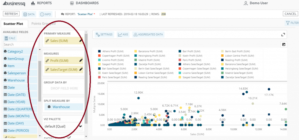
Picture 1: How to define visualization
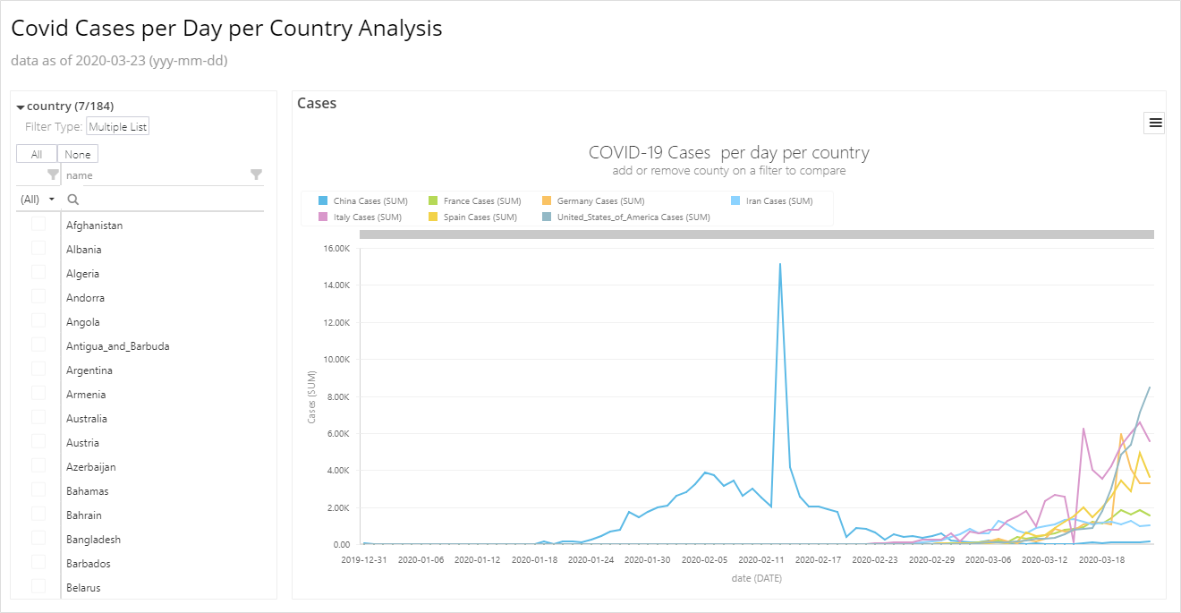
Also, pay attention that you can “turn off” measures on the legend panel by simply clicking on the one you don’t want to be visualized. The same way you can “turn on” ones which are “turned off”:
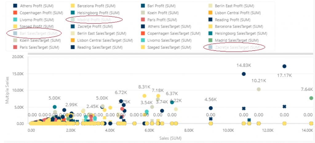
Picture 2: Visualizing measures
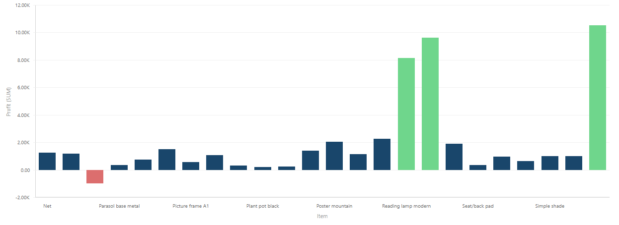
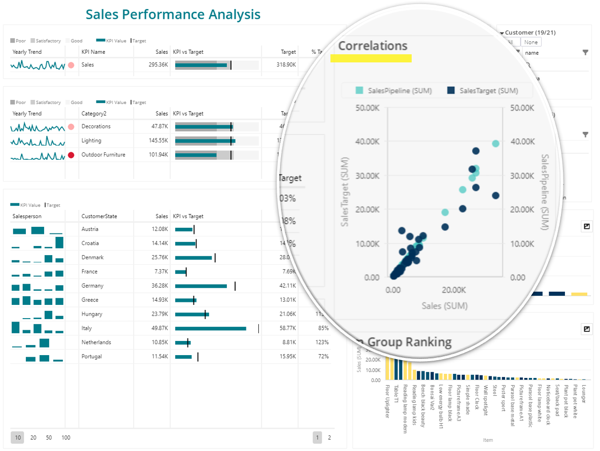
As scatter plot visualize the correlation, here are school examples of positive and negative correlations to show you the importance of understanding scatter plot visualizations:
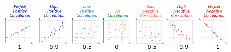
Picture 3: Correlations displaying[3]
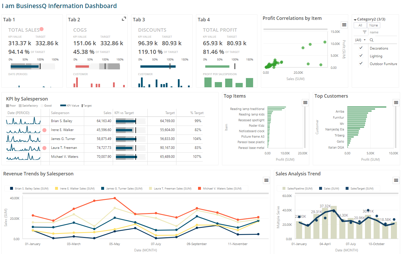
Like any other visualization in BusinessQ, you can add Scatter Plots into your BusinessQ dashboard.
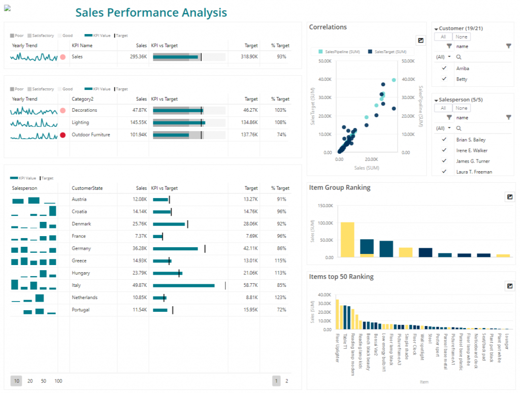
Picture 4: BusinessQ dashboard example
We strongly recommend you to take a look at our visualizations and try to compose your own visualizations for free!
If you need a hand in any step, just ping us, we’ll assist you as soon as possible!
We would also be more than happy to hear your impressions, write to us!
[1] What is a Scatter Plot and When to Use It, Chartio website. URL: https://chartio.com/learn/dashboards-and-charts/what-is-a-scatter-plot/ [accessed: Feb. 18, 2019]
[2] Scatter Plots, Math is Fun website. URL: https://www.mathsisfun.com/data/scatter-xy-plots.html [accessed: Feb. 18, 2019]
[3] Ibid.
We are developers of data visualization software BusinessQ. Try it for free and make reports and dashboards that make sense, without chart junk.
Related posts