Be the best in your business – learn how to use KPI visualizations
KPI is a short term for Key Performance Indicators. “A KPI is a measurable value that demonstrates how effectively a company is achieving key business objectives.” [1] Organizations use KPI visualizations at multiple levels to track performance measures.[2] Most KPIs companies look for can be categorized in one of the following categories[3]:
- Revenue improvement
- Cost reduction
- Process cycle-time improvement
- Increased customer satisfaction.
It is a great value if decision makers know how to read KPI visualizations. Those visualizations give them a quick overview and insight into their business. By that, KPI visualizations help decision-makers to focus on the most important things. Really important is to be alerted on time when the business is not going by the plan. When the decision maker is aware of the issue in the early beginnings, there is still time to make some changes. Those changes can be crucial to achieve the best performance possible or to decide about the next steps.
KPI Cards and KPI Matrix in BusinessQ are famous by the simplicity and bullet charts – best practice visualization in this matter.
KPI CARD
In order to explain better and to show you KPI Matrix and Cards, visualizations are described more detailed.
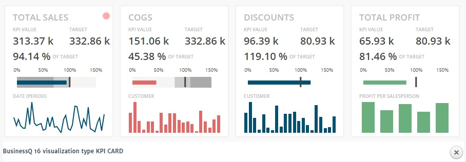
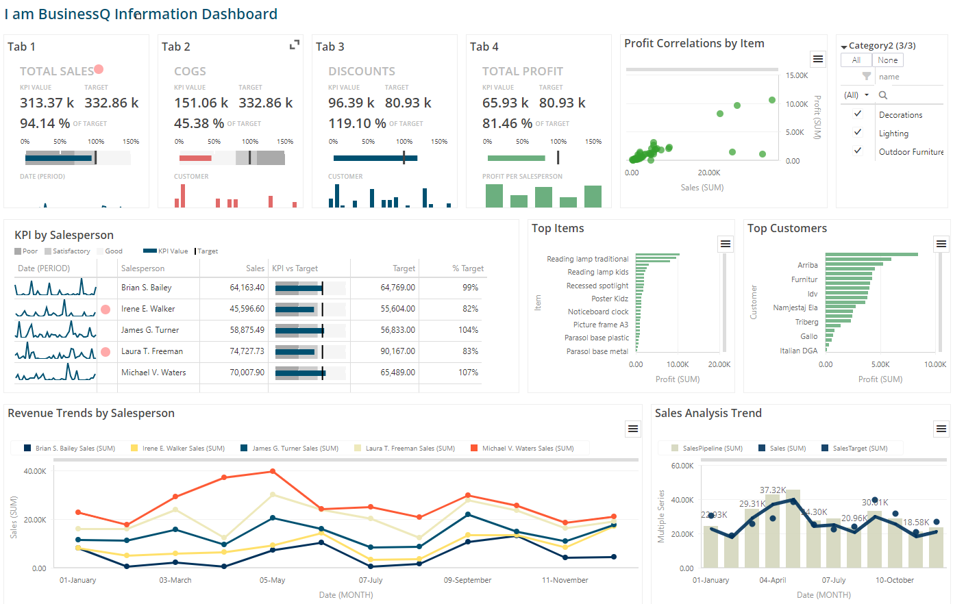
Picture 1: BusinessQ visualization – an example of KPI Cards
On picture 1 which shows a few examples of KPI Cards, you can see how simple it is to notify all the important information. Let’s see what the wealth of information is available in BusinessQ KPI Card:
- First value displayed, KPI Value, shows the exact number succeed at the moment of reading the card.
- Secondly displayed is target showed as the exact number which the company needs to accomplish in a specific category.
- Right below there can be found the percentage of target accomplishment.
- Tightly connected to those numbers, there is a bullet chart which is adjusted according to business needs. Bullet chart shows how far KPI value is from targeted value. With grey coloring in three tones, the viewer can easily, by just one look, notify if KPI Value is in a good, poor or satisfactory area. From grey area can also be seen how far the value is from other groups and how is it close to another. For example, we are in the “poor” area, but how deep? Just there, very close to satisfactory, or much poorer than that? There is also mark which represents the targeted value so it is obvious how far your value is from targeted value.
- On the bottom, there can be seen the trend of the value. It is a different thing if the trend is going up or down, of course, and you would like to be informed about it. Alternatively, sparkchart can show KPI value per some category, like a customer, salesperson etc…
- Besides described, red alert gives you heads up when your data aren’t as expected. Alert is also in coloring tones. Hot red stands as a warning for values which are in the poor area, through light red for satisfactory, until non-alert which means that data is in the good area.
So, all this info is presented on ONE BusinessQ KPI card. We tried to push Data to ink ratio to its limits.
KPI MATRIX
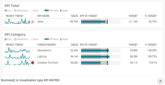
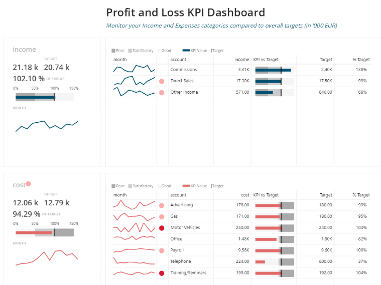
Picture 2: BusinessQ visualization – an example of KPI Matrix
KPI Matrix is very similar to KPI Cards. Has the same visualization logic, but can show you data distributed in more categories so you can see KPI Value for each entity in a particular category. For example, for all salesperson, all years etc.
For the best performance, the decision maker has to consider both KPI Cards and KPI Matrix. They supplement each other and provide a decision maker with information he needs to know to manage the business effectively.
For direct insight, take a look at our demo and try BusinessQ for free!
If you’re still uncertain if you need to keep track of KPIs, the answer is simple – YES, start doing this as soon as possible. No matter how big your company is, you have to achieve goals if you want to stay competitive. As Peter Drucker, famous management consultant, educator, and author says: “What gets measured gets done.”[4]
Please share your KPI experience with us, what’s the best practice in your business model?
If you have troubles to make a decision which KPI to display and how, we would be glad to help!
[1] What is KPI? Measure your performance against key business objectives, Klipfolio website. URL: https://www.klipfolio.com/resources/articles/what-is-a-key-performance-indicator [accessed: Feb. 04, 2019]
[2] Ibid.
[3] Watch KPIs, Watch Revenue Spike, PNMsoft website. URL: http://www.pnmsoft.com/resources/bpm-tutorial/key-performance-indicators/ [accessed: Feb. 05, 2019]
[4] What is Key Performance Indicator (KPI)?, KPI.org website. URL: https://kpi.org/KPI-Basics [accessed: Feb. 05, 2019]
We are developers of data visualization software BusinessQ. Try it for free and make reports and dashboards that make sense, without chart junk.
Related posts