LINE CHART: Definition and Examples | BusinessQ
Definition
A line graph is a chart that uses one or several lines to “show patterns in the data, such as trends, fluctuations, cycles, rates of change and how two datasets vary in relation to one another.”[1]
The live presentation of the line chart and other visualizations can be seen in a live demo of BusinessQ* HERE
*Please note that the BusinessQ live demo has great possibility: you can change categories, measures, visualization types, and other features in order to see how various visualization types with same or different data sets would look like. Those possibilities are limited by the type of data sets so you can produce as many variations as data sets allow you to.
Look for the part where you can change chart look and features look as presented:
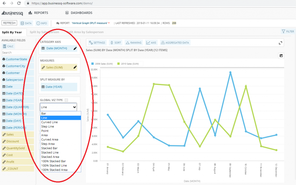
We strongly recommend you to check the described demo and try it, we would be glad to hear your impressions.
So, let’s get back to Line chart:
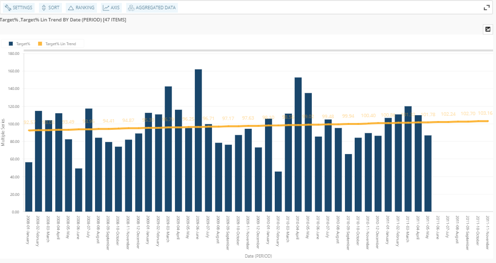
Stephen Few, a great and worldwide recognized expert for data visualization, in one of his books[2] states: “Line graphs do an exceptional job of revealing the shape of data – its movement up and down from one value to the next – especially as it changes through time.” Also, his opinion is that line charts are often the best means to present a quick overview of a time series while creating dashboards.[3]
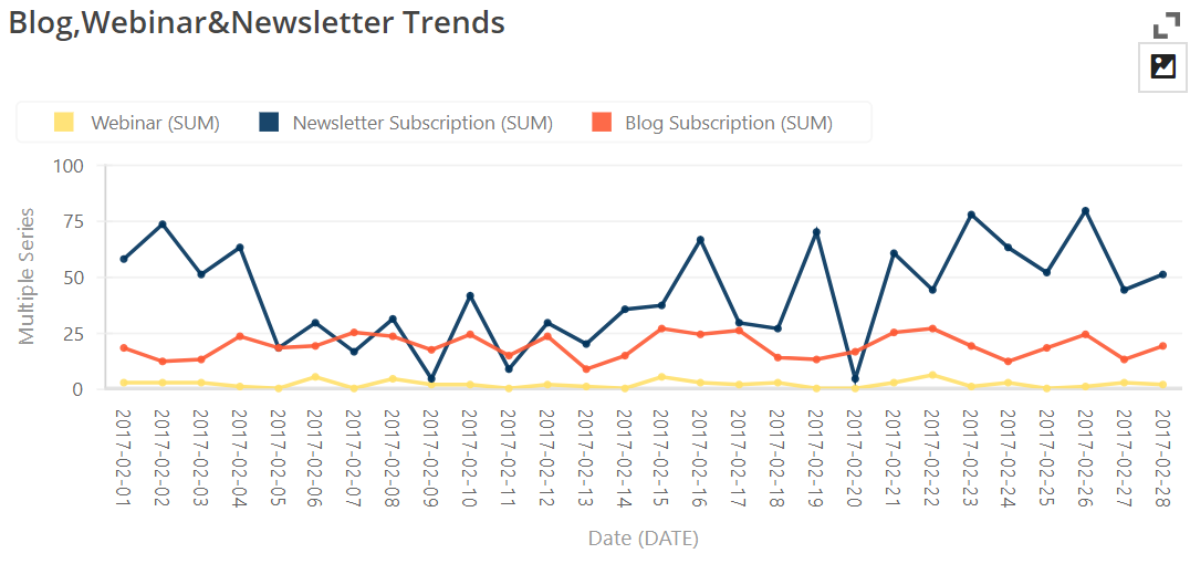
A line chart can display a trend:
As HubSpot states[4], “a line graph reveals trends or progress over time and can be used to show many different categories of data. You should use it when you chart a continuous data set.”
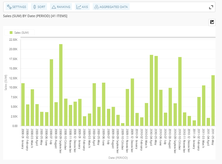
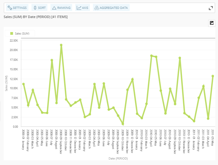
In order to see why line chart is a great solution to present continuity of the data, here is an example with bar chart which does represent data really good, but can not present continuous flow which is characteristic for time-related data, such as months of the year:
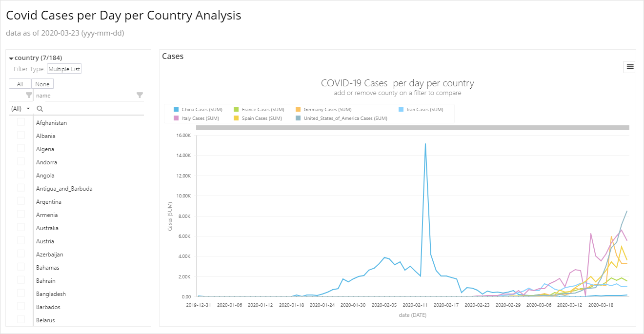
Another example is how multiple series can be displayed in one visualization, where you can see how easy it becomes to compare trends and ratio of multiple series. If necessary, one can make a decision based on information by just one look at the chart. With this kind of visualization, complicated and numerous information become visible, easy to notice to the human eye:

In conclusion, if you are a decision maker, we are strongly encouraging you to make decisions based on visualizations and graphs, and not just on a hunch, spreadsheets or raw data. We’re certain you’ll fall in love with easily readable, visualized data.
[1] Few, S. (2006.) Information Dashboard Design: The Effective Visual Communication of Data. First Edition. Italy: O’Reilly
[2] Ibid.
[3] Ibid.
[4] Oetting, J. Data Visualization 101: How to Choose the Right Chart or Graph for Your Data, HubSpot website. URL: https://blog.hubspot.com/marketing/types-of-graphs-for-data-visualization [accessed: Jan. 14, 2019]
We are developers of data visualization software BusinessQ. Try it for free and make reports and dashboards that make sense, without chart junk.
Related posts