Bar chart : Definition and Examples | BusinessQ
Definition
A bar graph (or bar chart) is a chart that uses bars to show comparisons between categories of data. The bars can be either horizontal or vertical, so in BusinessQ we have both horizontal and vertical graph components.
You can see bar chart live demo in BusinessQ HERE .
Bar graph can have one category axis and up to two numerical axes. Category axis describes the types of categories being compared, and the numerical axes represent the values of the data.
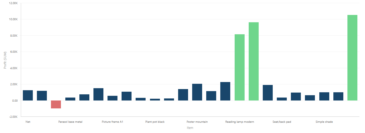
Bar graph can be used to represent: Ranking, Nominal Comparisons, Part-to-whole, Deviation, or Distribution.
Nominal Comparison in BusinessQ:
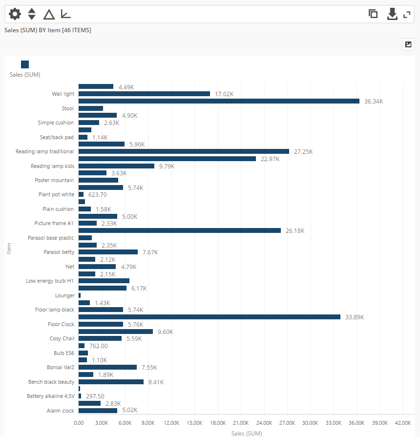
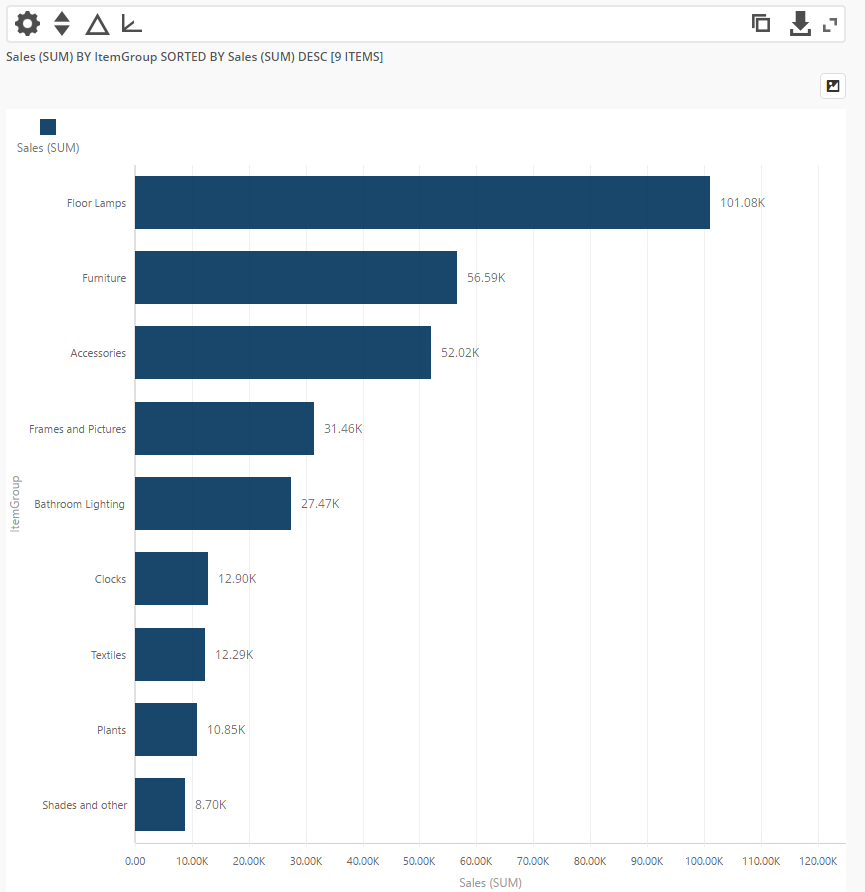
Ranking in BusinessQ:
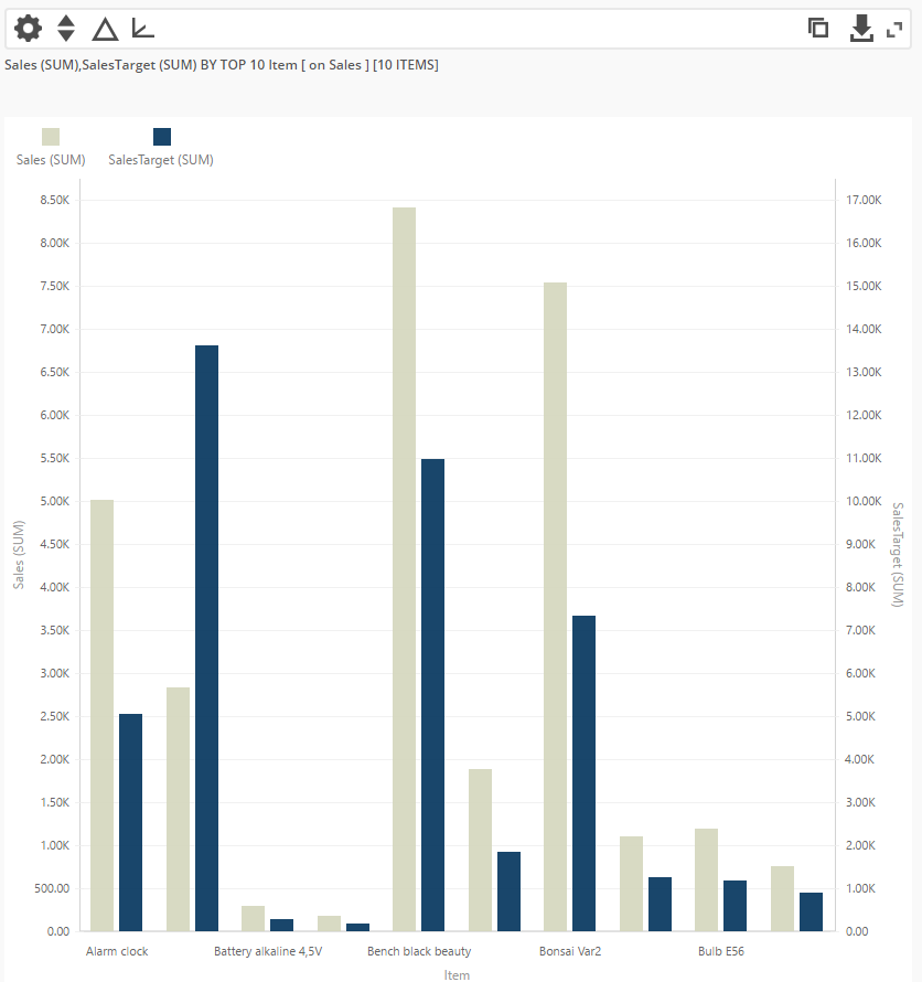
Nominal Comparison with 2 numerical axes in BusinessQ:
We are developers of data visualization software BusinessQ. Try it for free and make reports and dashboards that makes sense, without chart junk.
Related posts