Stacked Bar chart : Definition and Examples | BusinessQ
Definition
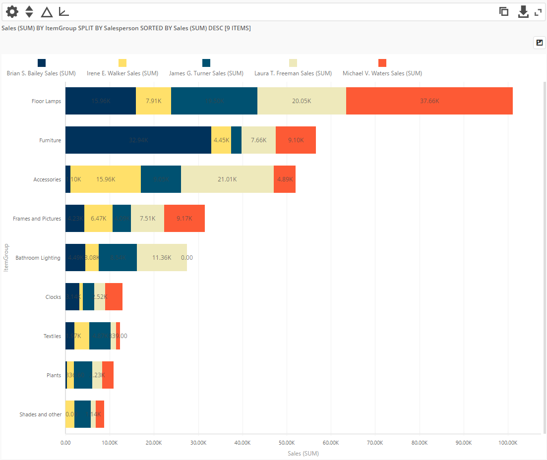
A stacked bar graph (or stacked bar chart) is a chart that uses bars to show comparisons between categories of data, but with ability to break down and compare parts of a whole. Each bar in the chart represents a whole, and segments in the bar represent different parts or categories of that whole.
Stacked bars do a good job of featuring the total and also providing a hint as to how the total for each category value is divided into parts.
The bars can be either horizontal or vertical, so in BusinessQ we have both horizontal and vertical graph components.
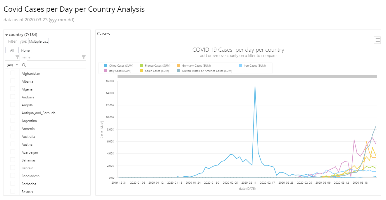
You can see bar chart live demo in BusinessQ HERE .
Stacked Bar graph can have one category axis and up to two numerical axes. Category axis describes the types of categories being compared, and the numerical axes represent the values of the data.
Stacked Bar graph can be used to represent: Ranking, Nominal Comparisons, Part-to-whole, Deviation, or Distribution.
Here are some examples from BusinessQ software;
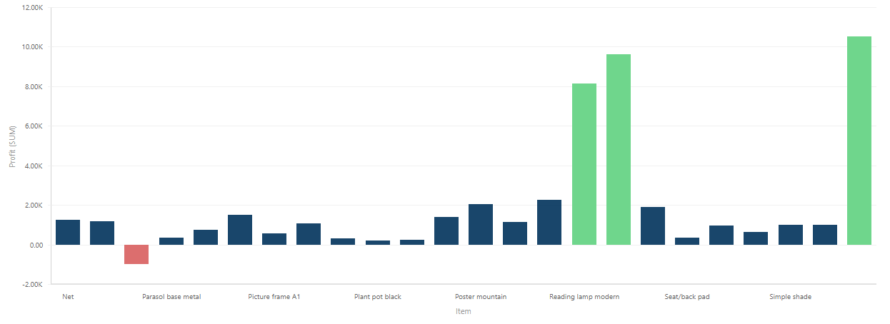
Nominal Comparison:
Ranking:
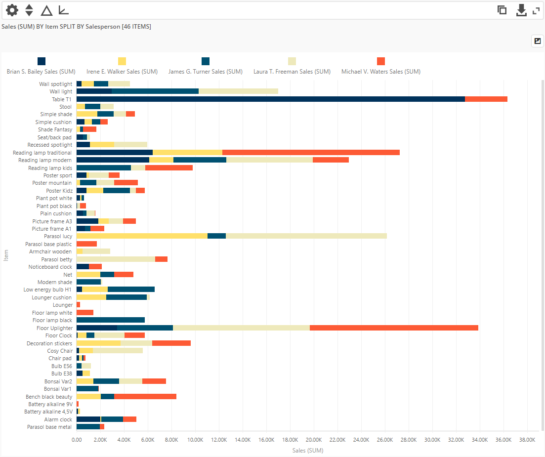
Nominal Comparison with 2 numerical axes :

We are developers of data visualization software BusinessQ. Try it for free and make reports and dashboards that makes sense, without chart junk.
Related posts