When is pie chart better than bar graph?
Yes, it is true. There ARE situations where pie chart is better way of displaying quantitative information than bar chart.
We already, like many others, wrote about “evil” pie charts. It was pretty hot topic recently. But, in order to approach that issue with completeness, I decided to write about cases when pie chart is the best way to visualize data out there.
CASE 1
Consider this Sales per Item Group data visualized in bar graph:
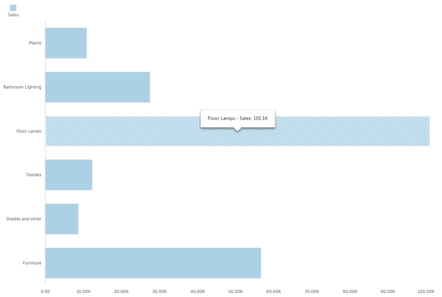
Question: Floor Lamps Sales was 101.1K. Is it more or less then 50% of total sales?
Answer: I don’t know. I have to make some other graph to see that.
But, let’s see pie chart of the same data:
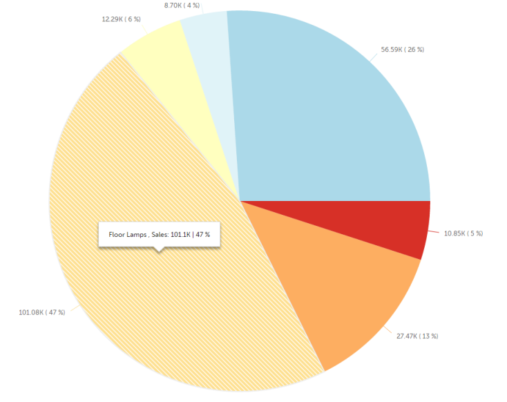
It is obvious, even without tooltip, that Floor lamps Sales is just a little smaller then 50%. We can simply see that because on pie, it is very easy to see what is quarter of pie, half pie etc…
CASE 2
Consider this Sales per Item Group data visualized in bar graph:
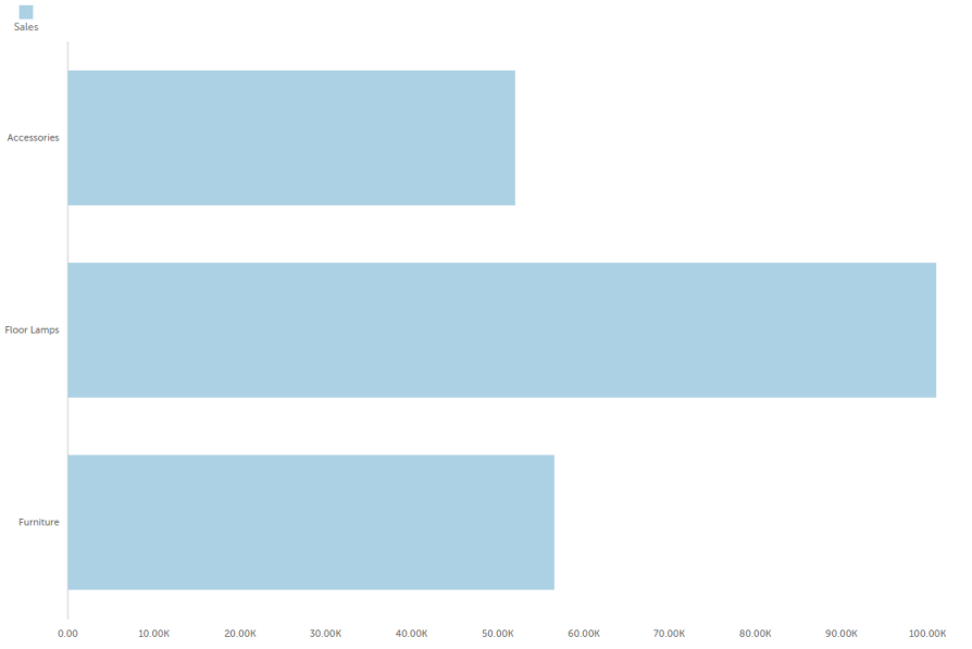
Question: Is SUM of sales from Furniture and Accessories together more than sales from Floor Lamps?
Answer: I don’t know. I have to make some other graph to see that.
So, let’s see pie chart of the same data:
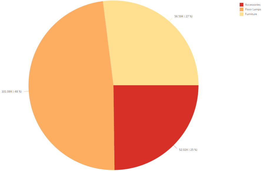
Immediately you can see that SUM of sales from Furniture and Accessories together is a little more than sales from Floor Lamps.
For conclusion, let’s remind that we wanted to approach the “evil pie chart” issue with completeness and integrity. Conclusion is, sometimes pies are the best way to visualize data – for example – to compare if sum of N category values if more than 50% of sales.
We are developers of data visualization software BusinessQ. Try it for free and make reports and dashboards that makes sense, without chart junk.

