The power of data visualization: Anscombe’s story
The concept of using graphical representations of data instead of just plain tables was actually a hard to sell 10 or more years ago.
At that time the most important example consultants had when arguing for graphs in dashboards was Anscombe’s quartet.
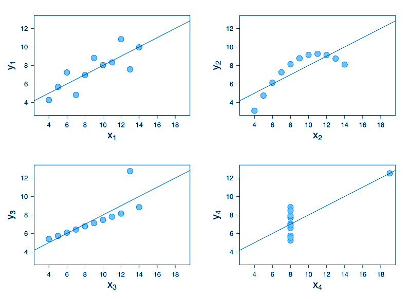
So, what was all that about? In 1973, the statistician Francis J. Anscombe published a paper titled “Graphs in Statistical Analysis”. In the paper he wanted to demonstrate the importance of graphing data before analyzing it.
Consider this four different datasets:
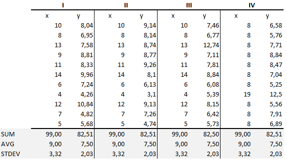
These four datasets are known as Anscombe’s quartet; what is really interesting is the fact that these four datasets have nearly identical simple statistical properties. It is clearly obvious from the picture, we did SUM, AVERAGE and STANDARD DEVIATION in Excel for every dataset to prove the point. They are all indeed the same.
So, if you are a Manager and you are still (!) working with Excel spreadsheets, those data could be your sales data. Now, what business decision can you make from those data just by staring in the spreadsheet for minutes or even hours? What business insight can you get? Even if you don’t just stare at the table data like this one, and you do some statistical computation, you will not get any better answer – all four data sets are behaving the same.
But…
If you just visualize this data:
In a fraction of second you will just know the difference among data sets. You will just know them because out brain is a pattern detecting machine, we have beautiful software in our mind called pre-attentive processing.
So, if you are a Manager, what would you like more, staring at the spreadsheet for hours without ever having a chance to understand your (sales?) data, or knowing the story of your business at a glance?
It is rhetorical question, of course.
Anscombe’s quartet will always be a powerful example of the insights that can be obtained from graphical visualization of quantitative data.
We are developers of data visualization software BusinessQ. Try it for free and make reports and dashboards that makes sense, without chart junk.
Related posts