Whether the type of business you are in, customers are your backbone. Without customers, no…
Analytics: Period Comparison Overview Report
Have you ever thought about comparing two different periods, for example, last week with the current week? Or last year’s month with the current month? Well, this is now available in our brand new Period Comparison Overview in Analytics App!
Our new Overview gives you two short summaries for selected periods, table for period comparison per merchant, two charts and a table with period comparison per tender, and two charts with period comparison per employee. This combined, gives you complete overview of every basic segment of your business for selected periods.
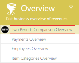
You can easily find Period Comparison Overview under Overview -> Period Comparison Overview, as shown on picture below.
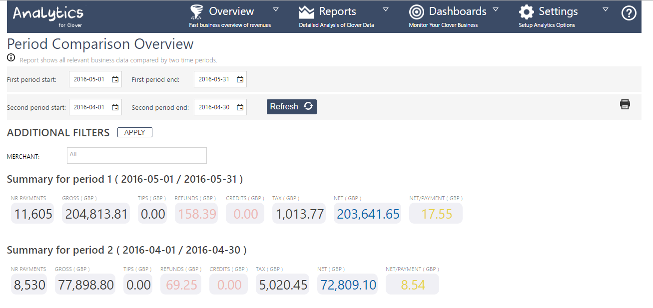
Short summary for periods
Gives quick overview of both selected periods by showing total number of payments, gross, tax, net and more..
PERIOD COMPARISON PER MERCHANT
This table shows you gross payment and number of transactions for all your merchant locations for the selected periods. It also shows the percentage for gross payments and number of transactions of the first selected period in comparison with the second period.
PERIOD COMPARISON PER TENDER
This comparison visually shows your gross payment amount per tender per period and per card types. Among the two mentioned charts, we have put two tables which lists all your tenders and also gives you clear percentage of gross payment for first period compared with the second period.
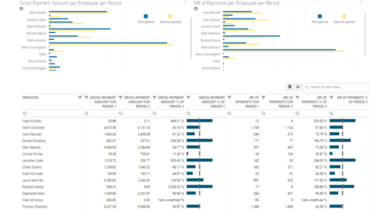
PERIOD COMPARISON PER EMPLOYEE
With our two charts you will easily see how your employees were performing in different periods taking into account both the gross payment amount and the number of payments per period. Below charts, we also put a table which list all your employees and shows gross payment amount they made in both periods, as well as number of payments they had.
We hope you will find this new overview useful.
Happy Analyzing!
Your Analytics for Clover Team

