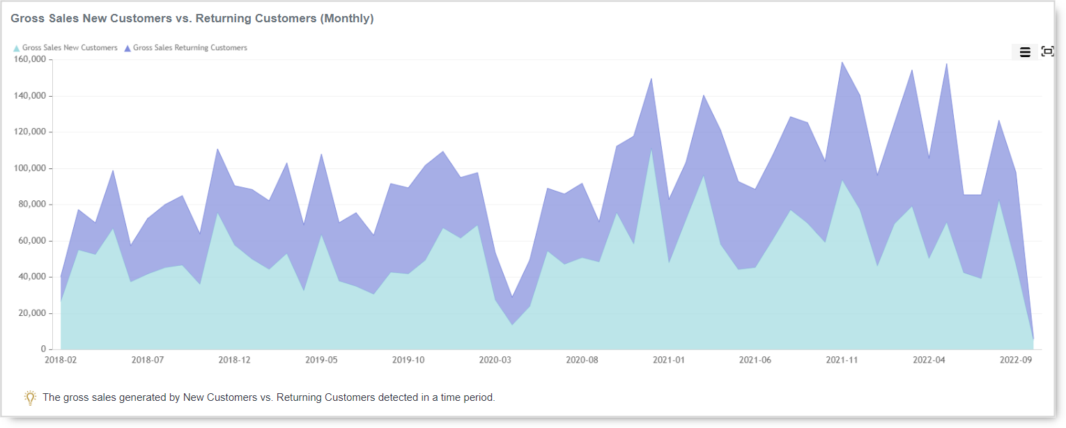
Whether the type of business you are in, customers are your backbone. Without customers, no…
Pareto chart
A Pareto chart named after Vilfredo Pareto, is a type of chart that contains both bars and a line graph, where individual values are represented in descending order by bars, and the cumulative total is represented by the line.
In today’s blog entry for our Analytics App for Clover, we are explaining how to read Pareto chart on our fast overview Item Categories report.
Vilfredo Pareto was Italian Economist who estimated that 20% of Italians own 80% of overall Italian wealth and soon after that, the rule came up saying that 20% of some size was enough to explain 80% of that size.
Benefits of learning how to read Pareto chart can occur in following scenarios:
Sales Planning: when you plan to sell your products, it’s probably that 20% of your products will make up 80% of the traffic.
Expenses Planning: Of all the costs, 20% of the costs make up 80% of the overall cost
Time management: Of all the activities you do, 20% make up 80% of your success
The Pareto rule is not “scientifically” established or proven, but it is practically applicable and widely used.
You can use Pareto principle in many situations, in your private life as well, for example. Marriage: If you agree with your wife in 20% of essential things, then you have an 80% successful marriage. This is not scientifically proven, but it is in practice.
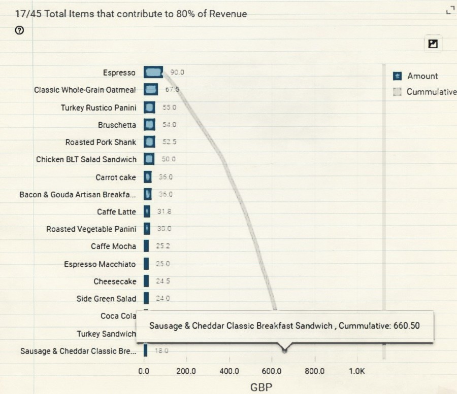
An example from our report:
In the selected period of time, let’s say we earned Payment amount of 831.35$.
We opened Analytics Fast overview ‘Items Categories’ report which is based on payments and we can see two Pareto charts:
1st one is showing you items that contribute 80% of overall payments in the selected period of time.
The second chart is showing you items that contribute to 80% of the overall total number of sold items.
The second chart is showing you items that contribute to 80% of the overall total number of sold items.

The first chart is showing you Items (Bars) and their overall payment amount.It also has a cumulative line starting from the best item by payments and going to the X-axis where in the end shows a cumulative value of 80% of overall payments.
So you can see that in selected period of time there were 45 items sold, but 17 items generated 80% of payments which was 660.50$

660.50$/831.35$ *100 = 80%
We hope that you will find this chart in this report useful and if you have any questions, please do not hesitate to ask
Happy Analyzing!
Your Analytics for Clover Team
Related posts