Whether the type of business you are in, customers are your backbone. Without customers, no…
Analytics App – Item Categories TreeMap
Hi, everyone!
In today’s blog entry for our Analytics App for Clover, we are explaining the usefulness of Item Categories TreeMap report.
Report Facts:
- Report is based on payments
- Very Fast Report
- Period selection up to 365 days
- Fewer details
A TreeMap chart provides a hierarchical view of your data and makes it easy to spot patterns, such as which items are a store’s best sellers.
TreeMaps are economical in a way that they can be used within a limited space and yet display a large number of items simultaneously.
When there is a correlation between color and size in the tree structure, you are able to see patterns that would be difficult to spot in other ways, for example, when a certain color is particularly relevant.
So, once you open report you will see a familiar calendar that can be found on almost all of our reports and predefined time buttons to choose from, as well as choosing all or some of locations if you are using our multilocation feature.
Below you can choose preferred colors for tiles of treeMap. Choose colors that are most suiting for your eyes and remember that colors are going to be represented in rectangles with ‘best’ colored item being in the upper left corner going to the other ‘weaker’ colored items to the bottom right corner.

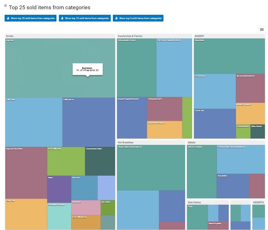
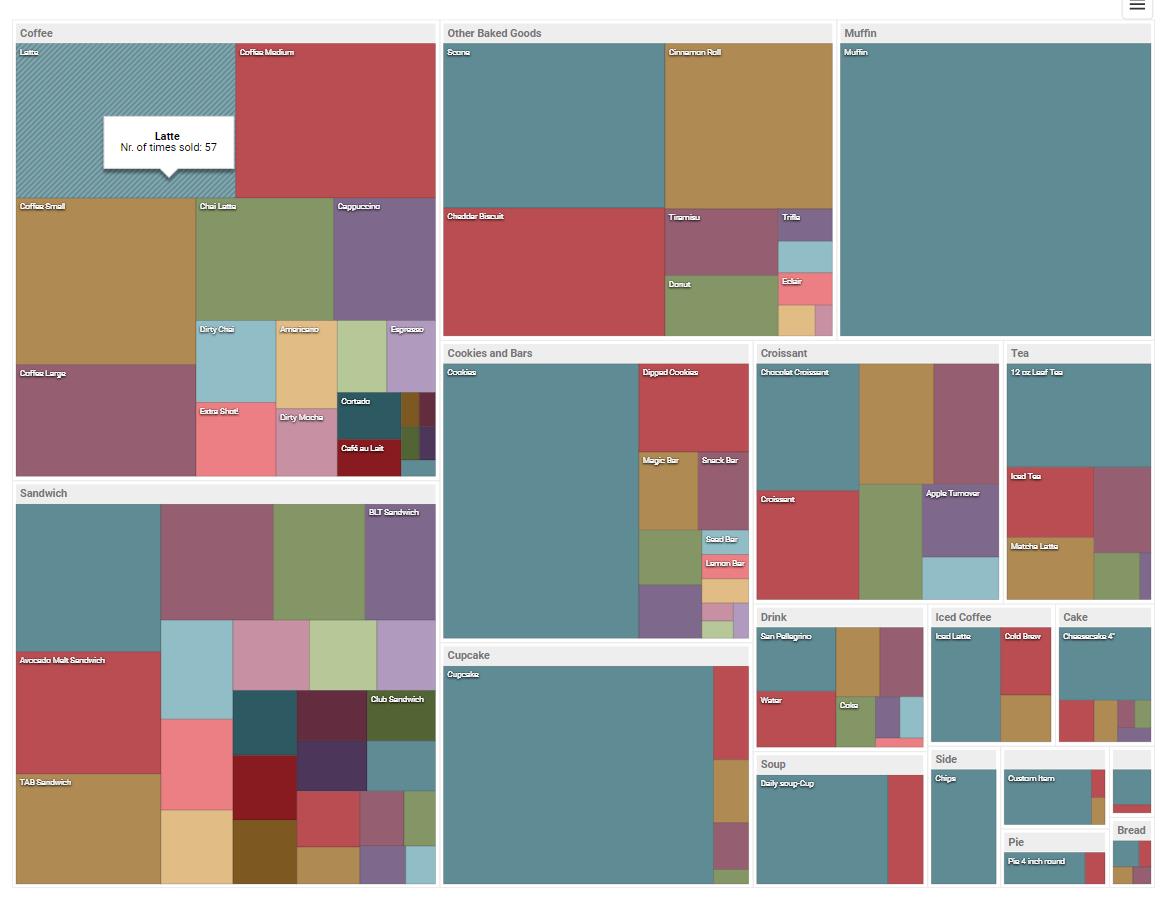
Once you load data by pressing refresh you will see two TreeMap tables. First one is showing you Top 25 sold items from categories meaning that you will see the best category (with the most sales) in the upper left corner with its items represented as rectangles with different colors depending which color palette you choose. Hovering over item ‘rectangles’ you can see information about the item such as items name and number of times it was sold. Above treeMap Table, you can select to show top 25/10 or top 3 items from categories.
In the right corner of the table, you can easily export treeMap with one click in the picture format of your choice (PNG, JPEG, GIF, PDF, PNG).
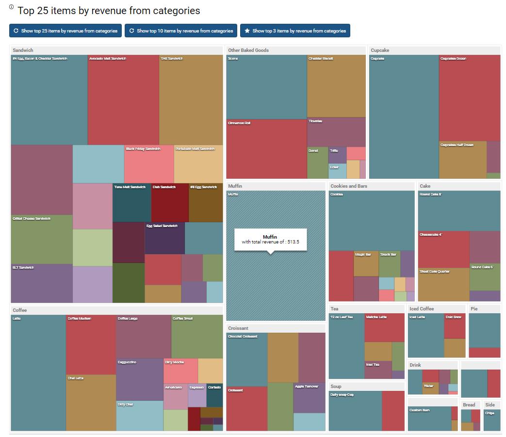
Second treeMap table is showing you Top 25 items by revenue from categories meaning that you will see the best-earning category (with the most revenue) in the upper left corner with its items represented as rectangles with different colors depending which color palette you choose. Hovering over item ‘rectangles’ you can see information about the item such as items name and items total revenue. Above treeMap Table, you can select to show top 25/10 or top 3 items from categories.
In the right corner of the table, you can easily export treeMap with one click in the picture format of your choice (PNG, JPEG, GIF, PDF, PNG).
TreeMap report works well with the multilocation feature which means that if you have more than one location and multilocation feature on, that you can select them from additional filters like shown in the picture below:

If you select all of the locations, the treeMap table will gather all categories from all locations and if locations category names and item names in those categories match it will add them up and show them as one rectangle for category and one rectangle for the item.If you are thinking of using this report and you have multilocation feature, beware that all item names/categories are the same on all locations.
We hope that you will find this report useful and if you have any questions, please do not hesitate to ask
Happy Analyzing!
Your Analytics for Clover Team
Related posts