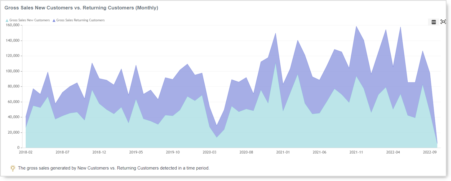
Whether the type of business you are in, customers are your backbone. Without customers, no…
Analytics App – New version 18.02 – New design and features
Hi, everyone!
We would like to tell you about some changes that we did.
The most noticeable change is once you log in, you will see a new welcome screen and new colors for the main menu.
1. Welcome Screen
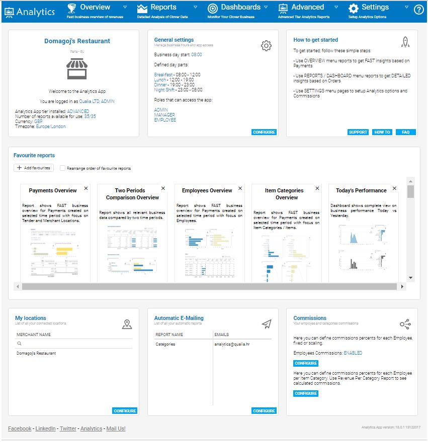
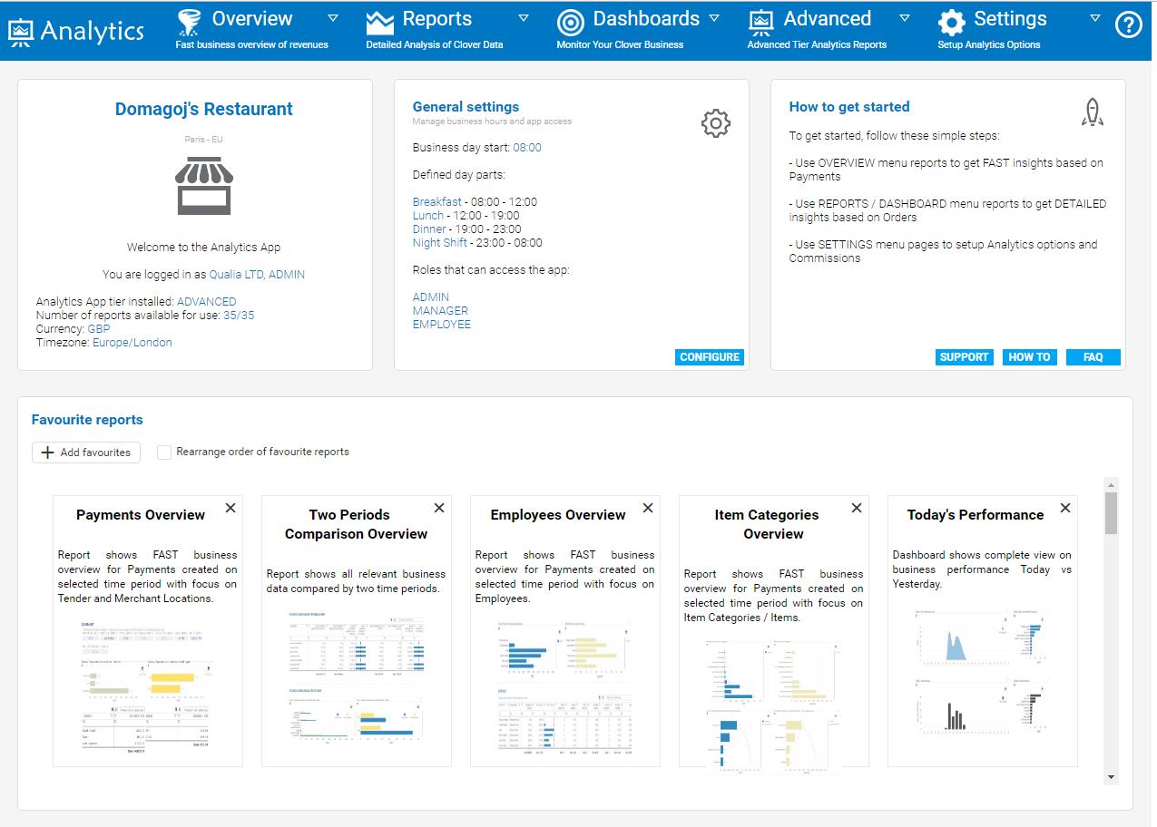
We re-arranged welcome screen to suit your needs as a dashboard, you will see all of the settings available on one page.
You will notice first three sections with first one showing you your company information as well as who are you logged in as.
The second section is showing you general settings, Start of business day hour, your dayparts if you defined them (dayparts are important if you want to use Revenue per Day Part report), and which employee roles have access to Analytics. Soon we will add a selection of languages so you will be able to choose a preferred language for Analytics app. The third section is telling you differences between our types of reports and offers you three buttons, ‘support’ button is to mail us, ‘how to’ button is to access our help page and ‘FAQ’ button is to access our FAQ page. After that you will see the bigger section with favorite reports, you can change their position, choose and add or remove favorite reports which are used for quick access. If you still haven’t logged in to Analytics here is the picture how welcome screen looks now:
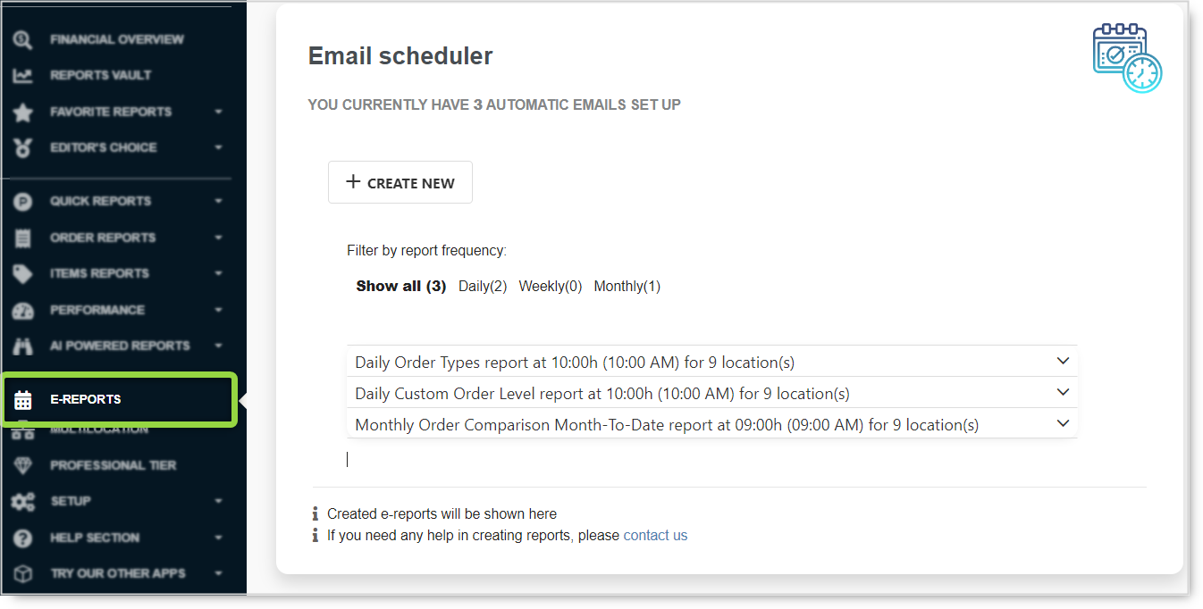
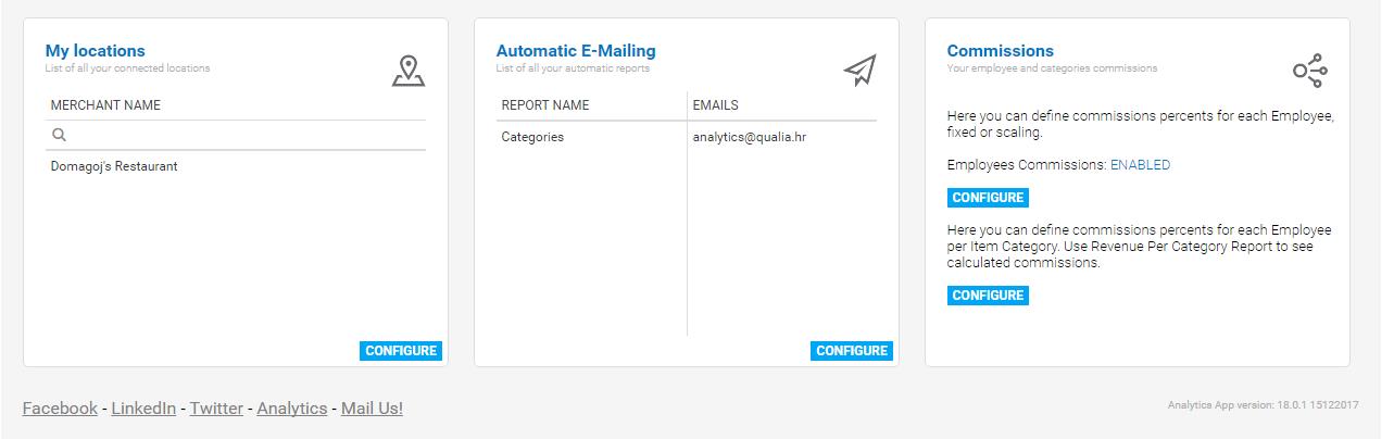
Followed by three more sections with information about multilocation feature and all of your linked locations if you are using this feature.You can read more about the multilocation feature here. Next section will show you all of your automatic emailing. You can read about that feature here. And final and the last section will show you employee commissions if you have it enabled or disabled. You can read more about commissions here. Underneath that last commission’s section, you can see Analytics version number.
Here is the whole welcome screen picture:
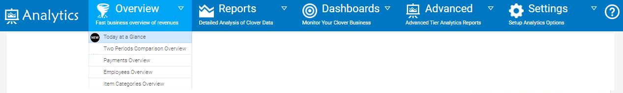
And that’s not all, we moved Today at a Glance report to the Overview Section. You can read more about this report here.
And this is how to access it:
2. New TreeMap report
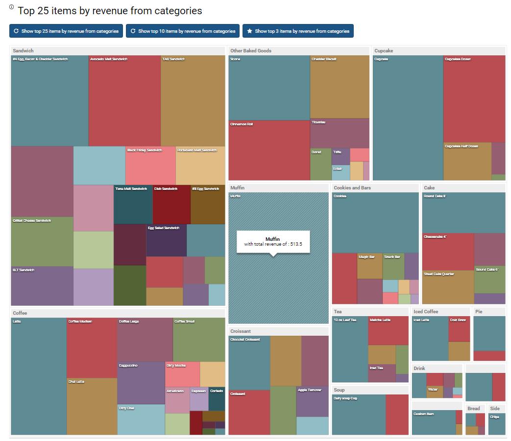
And even that’s not all, we have added a new report for our Advanced tier users called Items Categories TreeMap report which will visualize top selling items as well as items that are bringing you most of the revenue. You can read more about this report here, and here is how one part of the report looks like:
And final change that we made is concerning Full Orders Details report where we added a new column called daypart.
If you by some chance unable to see this changes, please try and refresh Analytics App by pressing F5 key on your keyboard ( To refresh page )
We hope you are happy with these changes and if you wish you can send us any feedback with suggestions and your opinions of what should be done to improve Analytics app
We hope that you will find this changes positive and if you have any questions, please do not hesitate to ask
Happy Analyzing!
Your Analytics for Clover Team
Related posts