Whether the type of business you are in, customers are your backbone. Without customers, no…
Analytics App – Comparison dashboards
Hi, everyone!
In today’s blog entry for our Analytics App for Clover, we are explaining how easy it is to compare certain days in Analytics App.
For purposes of comparing certain days, Analytics App is offering to its BASIC and ADVANCED TIER users dashboards called Today’s performance, Day vs Day, Month to date and report available on all TIERS called Today at a Glance.
Comparing days is something every business owner/manager should be using in order to find out how their business advances or regresses over the time.
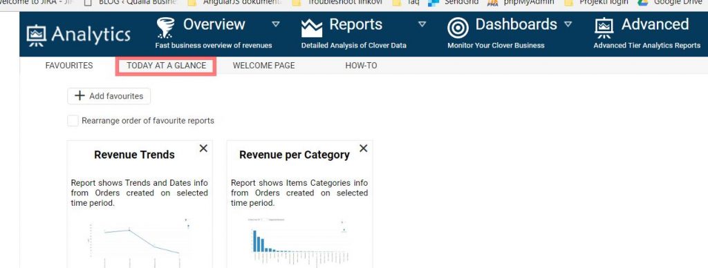
- Today at a Glance report
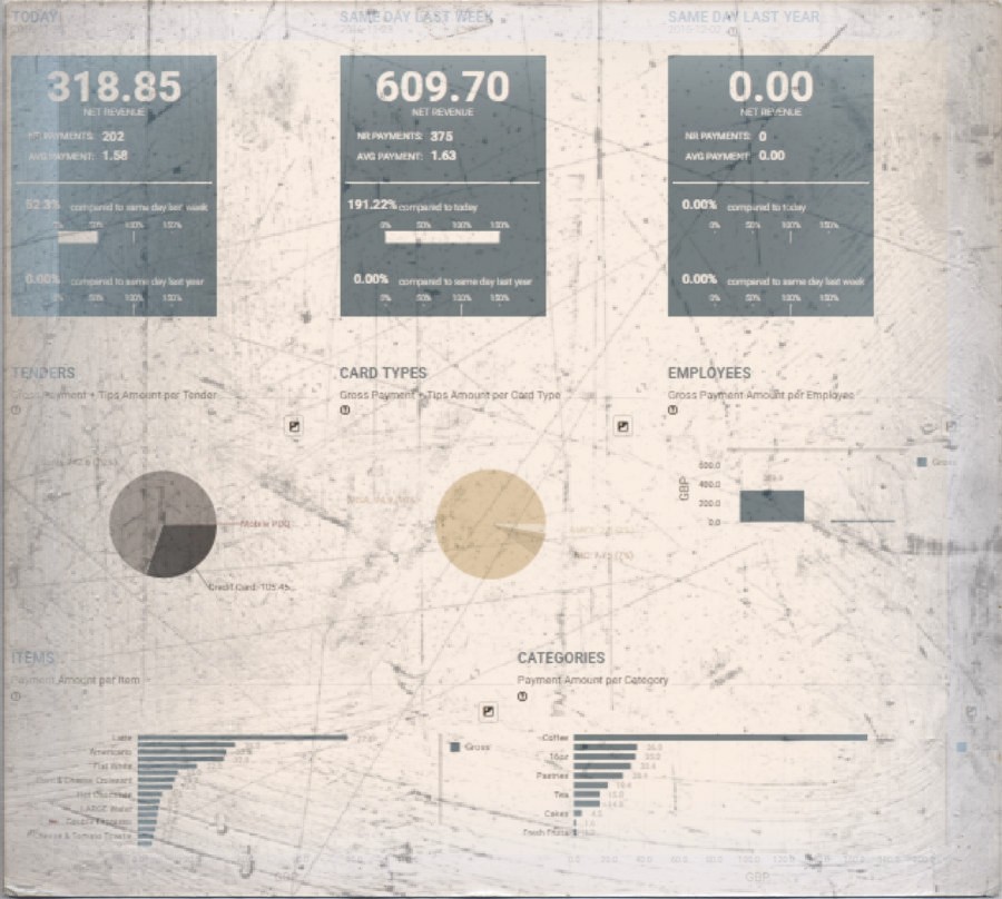
Today at a Glance is a report which shows you today’s data about most important aspects of your business including comparisons with the same day last week and the same day last year, today’s payments per tenders, card types, employees, items, categories and details per merchant locations.
This report is available on all TIERS and can be found on the welcome page once you logged to your Analytics App.
Once you enter the Report you will see following information:

By comparing data from today, from the same day last week and the same day last year, you will see how your business advances or regresses over the time.
Data shown for all the dates separately is net revenue, a number of payments and average payment amount. After this information, we will compare net revenue from today’s date with other two dates.

* Please note that the same day last year is not the same date as today. Same day last year is the closest day last year that falls on the same day in the week as today. For example, if today is Saturday, same day last year will also be Saturday even if it doesn’t fall on the same date as today.
CHARTS
TODAY AT A GLANCE report comes with two pie charts (for Tenders and Card Types), one vertical bar chart (for Employees), two horizontal bar charts (for Items and Categories) and one table (for Locations details).

Above mentioned charts will help you to visually interpret data that is crucial for making business decisions.
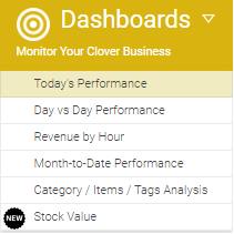
2. Today’s performance dashboard
Today’s Performance can be accessed through:
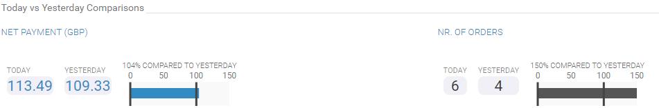
The dashboard shows a complete view on business performance Today vs Yesterday.
Once you open it, you can quickly see Today vs Yesterday’s comparison in NET payments and number of orders.
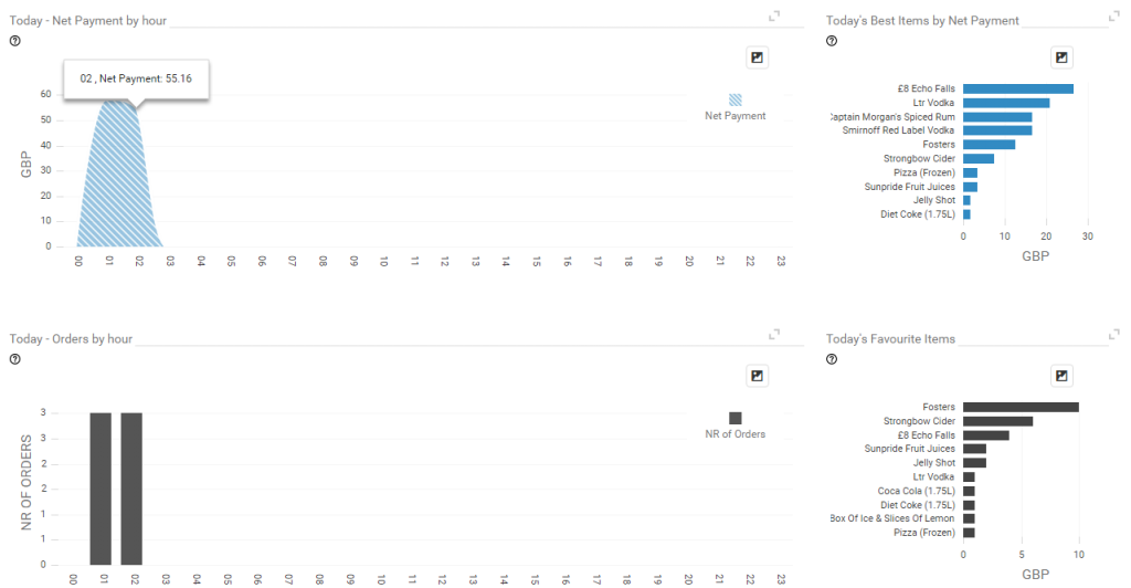
After that comparison, you can see the first graph showing you Today’s NET payments per hour followed by Today’s Best Items by NET payment.
The second graph is there to visualize Today’s Orders by the hour, followed by today’s favorite items.
The second graph is there to visualize Today’s Orders by the hour, followed by today’s favorite items.
3. Day vs Day dashboard
Day vs Day Dashboard can be accessed through:
This Dashboard is showing the same information/graphs as Dashboard Today’s Performance.
The difference is that in Day vs Day dashboard, you can choose which two days you want to compare whilst in Today’s Performance dashboard automatically selects a current day and compares it to yesterday’s.

After you selected desired days you wish to compare, you will get the same charts as in previously mentioned Today’s performance dashboard showing you NET payments per hour, Orders per hour followed by selected day1 Best Items by Net Payment and Favourite Items (number of times an item was on order)
4. Month to date dashboard

You can open it via Dashboards menu:
First of all, what is Month-to-date (MTD)? If you are looking the dashboard on 16-November, then Month-to-date means a period of 16 days from the beginning of the November until 16th of November. This dashboard will compare Revenue and Number of orders from MTD period with Last Month Period.
What is it good for? If you are looking at performance on the end of the month and you see that you already achieved values from the last month, you can consider this month as a successful one.
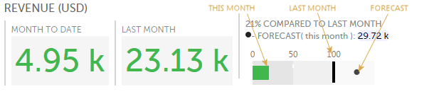
On the above picture, we can see that so far this month (4.95k) we are on 21% of Revenue from the last Month (23.13k). Moreover, we can see that if we keep up at the same pace, we will earn 29.72k in Revenue by the end of this month (FORECAST, presented with the black dot ).
The same metrics you can see about Number of orders, too.

On Revenue Trend section you can track the trend of your incomes per day. See if you are earning more on weekends or if your revenue is constantly rising of maybe declining?

On Average Revenue graph track on which days you have the biggest orders:

Number of Orders by hour distribution is great to see when is the peak of your selling activity during one day. You can see, for this month, how much orders do you have on every hour. Maybe from this chart, you can decide to transfer an employee to help here for some hours, or you will decide that you can close earlier because revenue is not so big after 10 pm, for example.

Check how much Revenue does every your employee brings to you:

… or how much you earn per payment method. By Cash, Credit Card of something else?
Month-to-Date Performance dashboard is a powerful tool for monitoring your business, to compare current month with the last one, even to see forecast for Revenue. This Dashboard will inform you on all important aspects of your business on monthly scale.
We hope that you will find these dashboards useful and if you have any questions please do not hesitate to ask
Happy Analyzing!
Your Analytics for Clover Team
Related posts