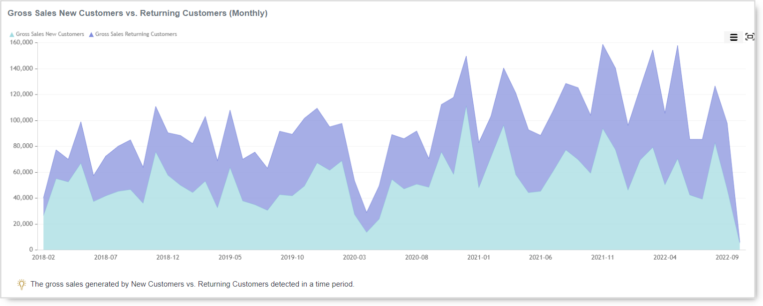
Whether the type of business you are in, customers are your backbone. Without customers, no…
Analytics App – Revenue by Hour Dashboard – Why is it so great?
Hi, everyone!
In today’s blog entry for our Analytics App for Clover, we are explaining why Revenue by Hour dashboard should be used and what information you can learn from it.
Revenue by Hour Dashboard is great when you need answers to questions like
- What is my Revenue and number of orders per Hour in a day for the custom date range?
- What do I sell and in what part o a day?
- Can I close my shop earlier (because I don’t do any significant revenue later in a day)?
- When can I expect the most orders in a Day, when is the peak?
- For every Hour I want to see Revenue by Item Tag.
- For every Hour I want to see Revenue by Order Type
- What order type do people buy in what part of the day?
- …
But how do I see that information?
You can see it easily once you open Revenue by hour Dashboard which is a privilege of BASIC or ADVANCED Analytics Tier. The dashboard can be accessed from the main menu like shown in the picture below:

By default, you will see your data from TODAY. As you already probably know you can select custom date filter range on period start/end fields and press Refresh to get the data.

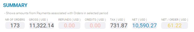
Once you have selected your desired period you wish to analyze data will be shown to you, first as a one-line summary for the selected period where you can see how many orders were taken, amounts for GROSS and NET values, refunds, credits, and tax.
After the summary, you will have 6 charts which can be exported or printed with just one click.
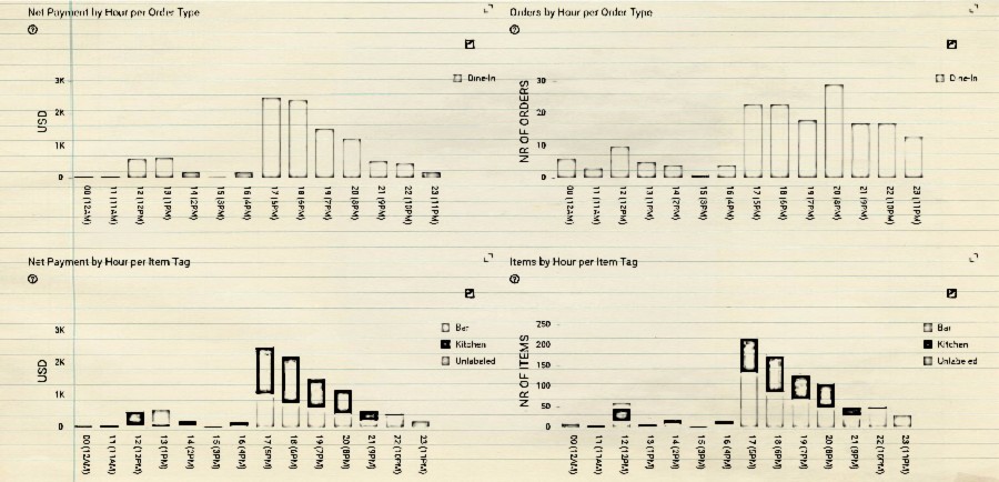
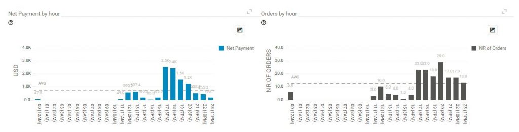
- Net payment by hour
- Nr. of Orders by hour
-with those two charts, you can easily spot in what times are rush hours and for example you might want to add more help staff by simply removing one from work hours when there are not many orders going on or moving shifts so they overlap possible rush hours to maximize your profits.
Next two charts will show you:
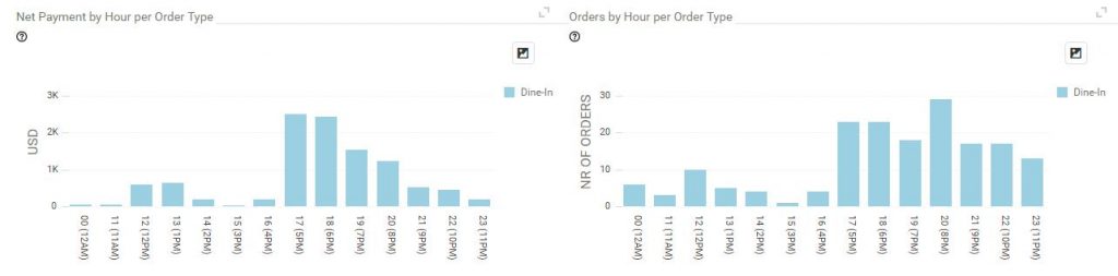
- Net Payment by hour per Order Type
- Orders By Hour per Order Type
With these charts, you can spot with ease which types of Orders are happening in what times and in what measures. If you have online orders, takeouts, dine-ins or similar types of orders you will find out the usefulness of these charts by comparing and learning which of the order types are giving you the most of the revenue. You might learn that your online orders are weaker than takeouts and then you might want to investigate the reasons why and maybe advertise more your in your online sales.
And last two charts showing you:
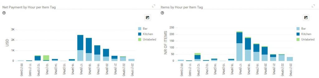
- Net Payment by Hour per Item Tag
- Items by hour by Item Tag
If you assigned Item Tag names in your Clover station, these charts can be valuable for you. You could see with just a glimpse of an eye which Item Tag is being sold most and at what times.
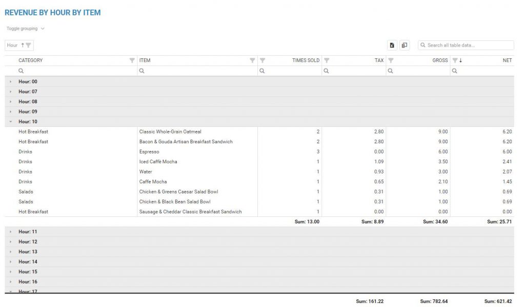
Finally, all the details by Hour are presented in the table which you can easily export with one click to Excel, arrange it with details you want to see/hide by removing/adding columns from column chooser. Search specific information in the table or simply just filter information the way you want.

As well with the table which shows you Items sold in specific hours.
As a conclusion, Revenue by Hour Dashboard is a powerful tool for monitor your Net payments and Number of orders for custom date range by Hour.
Happy Analyzing!
Your Analytics for Clover Team
Related posts