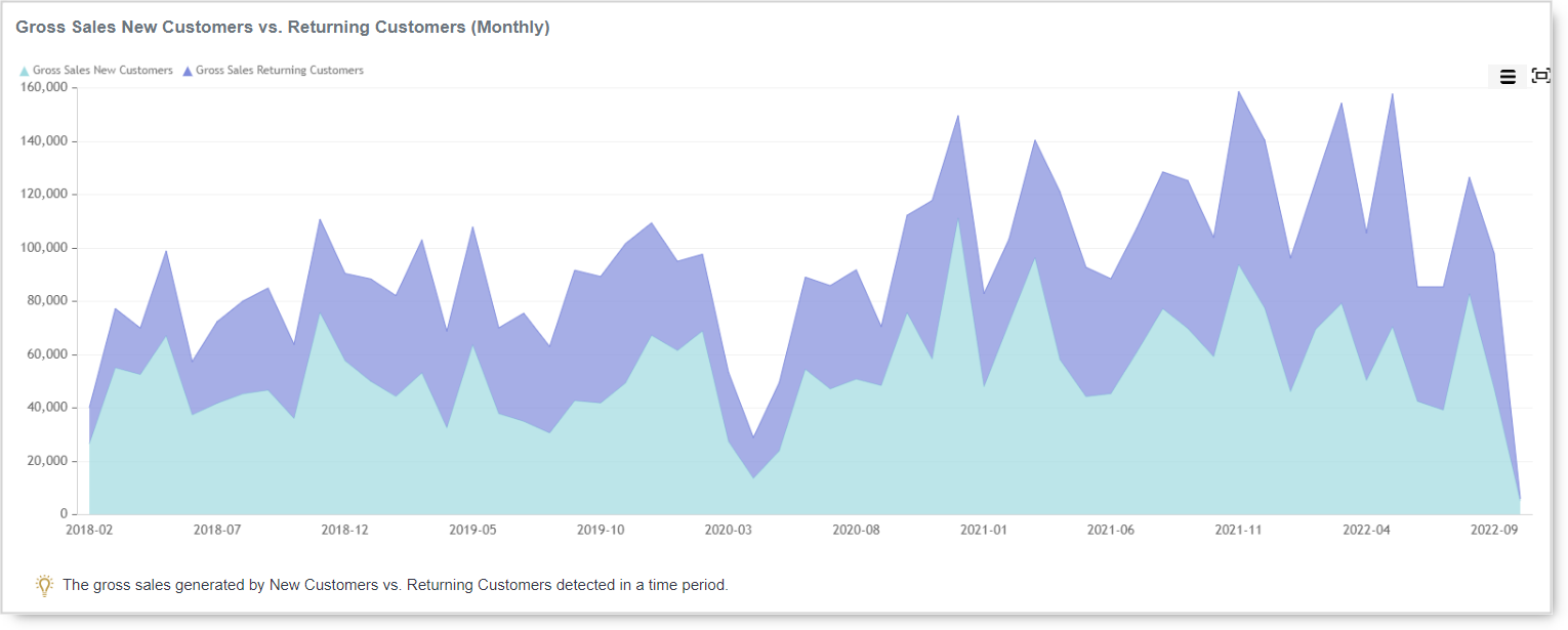
Whether the type of business you are in, customers are your backbone. Without customers, no…
Analytics App – Create your own report!
Hi, everyone!
In today’s blog entry for our Analytics App for Clover, we are explaining how to create your own Custom reports:
Custom reports are a privilege of Advanced Tier, along with Master Summary report/dashboard which summarizes all the important aspects of your business in one place.
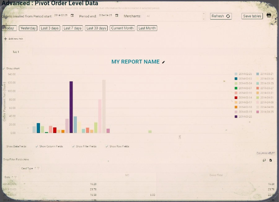
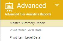
You can access it from the Advanced menu shown in the picture below:
There are two types of custom reports you can use. Pivot Order Level Data and Pivot Item Level Data. The difference is that Pivot Order report is based on orders and Pivot Item is based on items we extracted from those Orders to give you even more data to analyze.
In both reports, you are able to create and save reports for later use.
This following example is copied from our FAQ page and is explaining basic information you need to know about naming your report, saving it, choosing columns and other information which will help you start creating your own reports, at the end of this blog we have added few more examples of how your table could look like.
When you first open this report, it will look like this:
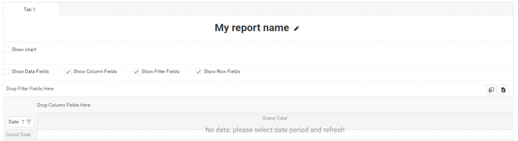
To show any data in this pivot table, you need to click on one of the ‘Time buttons’ or select date periods and press Refresh button.
TABS
Pivot Order Level Data report can have up to 10 tabs, and each tab will have its own pivot table. This way you can create up to 10 custom reports.
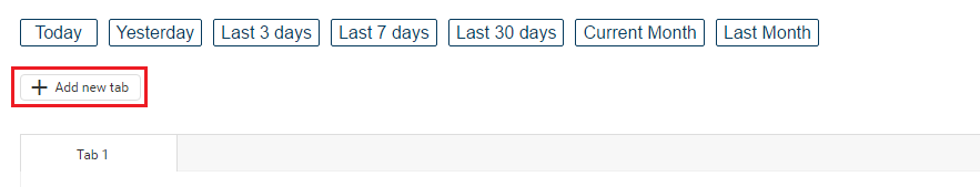
To add a new tab, press on the ‘+Add new tab’ button:
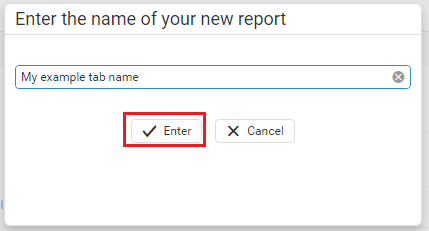
Once you pressed ‘+Add new tab’ button, you can enter tab’s name and press ‘Enter’ button:
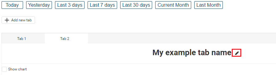
If you at any time wish to change tab’s name, you can do it easily by pressing on the ‘pencil’ icon next to the tab’s name:
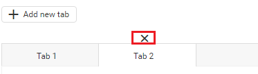
To remove a tab, hover over tab you wish to remove, and the ‘X’ button will appear:
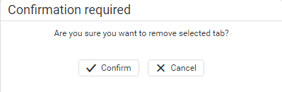
When you click on the ‘X’ button, a confirmation window will appear. Press ‘Confirm’ to remove tab completely.
CHOOSING COLUMNS FOR PIVOT TABLE
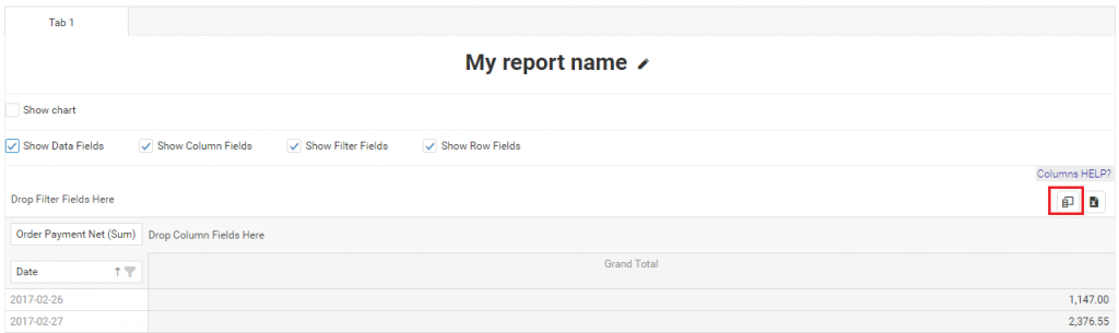
To be able to choose columns, you need to click on one of the ‘Time buttons’ or select date periods and press Refresh button. When you have the data, you should click on the Column Chooser icon:
When Column Chooser is opened, you will find the list of all available fields in ‘All Fields’ area:
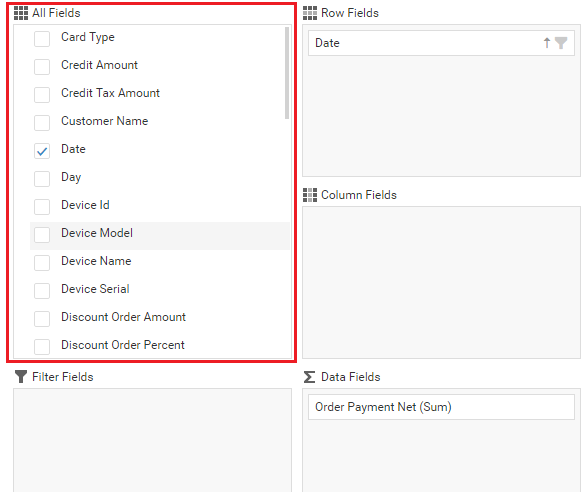
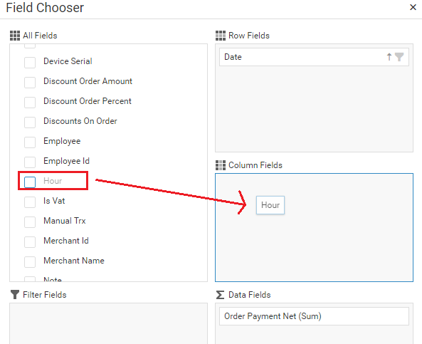
From there you can easily drag&drop fields into the pivot table. You can drop fields as pivot columns, rows, data fields or filter fields. For example, I will drag Hour field to Columns:
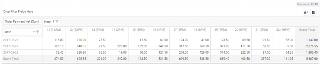
Almost instantly, you will see changes in Pivot table:
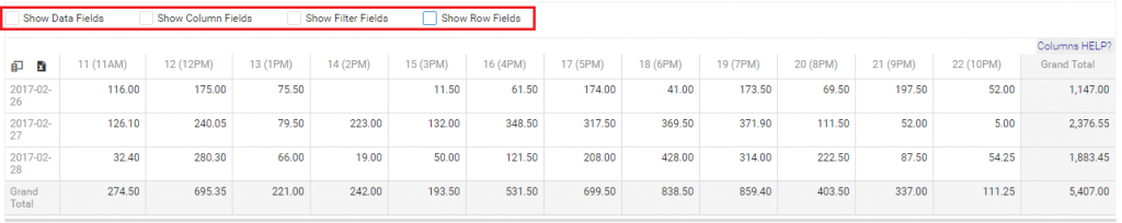
If you don’t want to see names of columns, rows, filter or data fields, you can unselect them in Field Panela area. This is how the same table as above looks like after removing names:
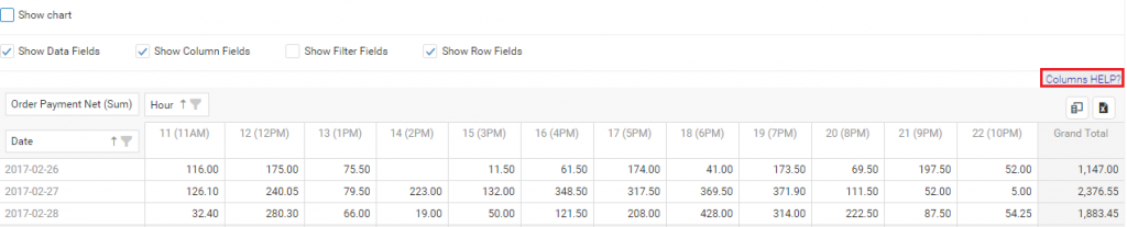
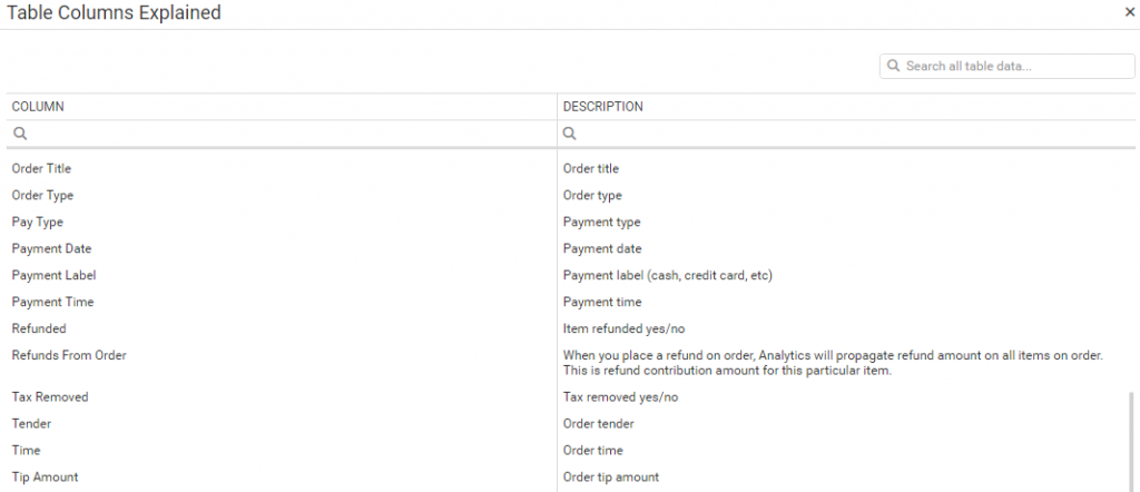
If you don’t know what each field in Column Chooser represent, you can click at the ‘Columns HELP?’ button:
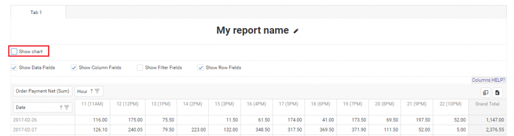
INTEGRATION WITH CHART
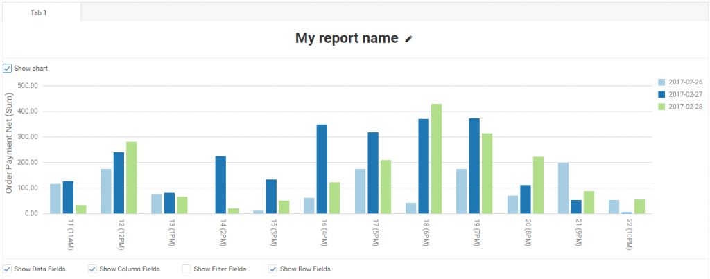
All pivot data can be visualized. You can enable chart integration by clicking on the ‘Show Chart’ checkbox:
This is how my example chart looks like when I integrate it with my pivot table from above:
SAVING PIVOT TABLES
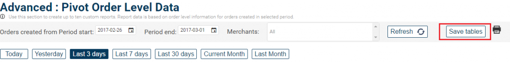
At the top right corner of the Pivot Order Level Data report you can find ‘Save tables’ button. This way you can preserve all 10 of your tables/reports for future usage.
Additional examples:
In this video example, you can see the process of creating a report which will show you Payments types in the selected period of time.
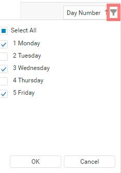
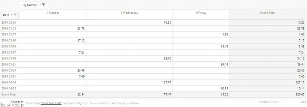
In this example you can achieve a report that will show you only Monday, Wednesday and Friday profits in the selected period of time:
That can easily be achieved by choosing days you want to see in the list by clicking on Funnel icon:
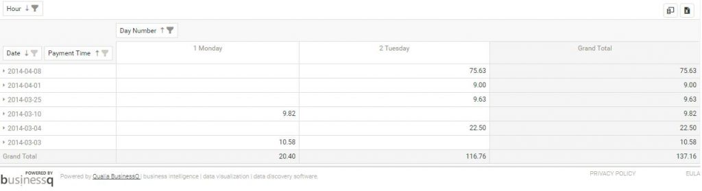
In this example, you can see the possibility of analyzing the selected period of time with filters set on Hour collumn where we included only Payment time that occurred from hours 07 am – 12 pm and filtered Days to show only Monday and Tuesday.
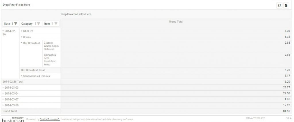
In this example, we simply group data by Date, Category and then by Item, so by expanding date, you will see summary for each category and their overall revenue with the possibility to expand further to see exactly which items from which category were sold in the selected period of time:
With available columns, you build your own reports that will suit your needs. We hope that this blog post helped you with overall understanding of how to create custom report and if you are interested in making a special custom report but you are stuck, please send us your Merchant ID with description of your custom report you were trying to create on clover@qualia.hr
Happy Analyzing!
Your Analytics for Clover Team
Related posts