When to use Bar, Line or Area graph and Why?
If you are report builder, you probably often ask yourself – which graph is the best to visualize my data – area graph, bar graph, something else ?
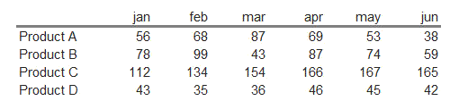
Report builders are often in situation that they are presented with data about products revenue like :
Then they are asked to visualize that data graphically in their report. Unfortunately, they will also very often try to do that in unappropriate way, with Pie charts. Edward Tufte in “The Visual Display of Quantitative Information” wrote that the only worse design than a pie chart is several of them, for then the viewer is asked to compare quantities located in spatial disarray both within and between pies. Indeed, it is impossible to compare Products Revenues over time with pies:
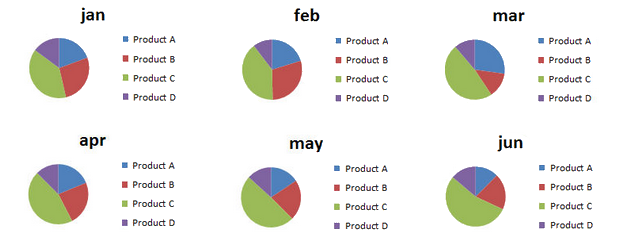
Moreover, it is very difficult to compare values within just on pie, for one month.
In order to make this visualization better, we can show the data in bar charts:
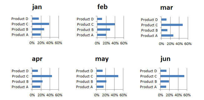
Now with much more ease you can say how Product A’s revenue behave trought time compared relatively with other Products.
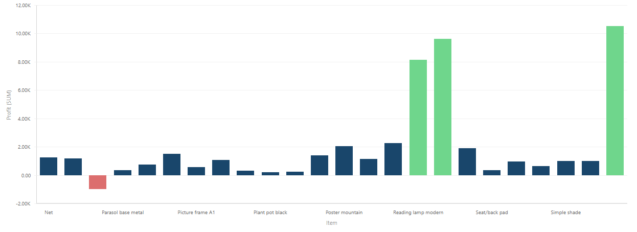
You can show Revenues absolutely, too, if you are more interested in absolute Revenue values:
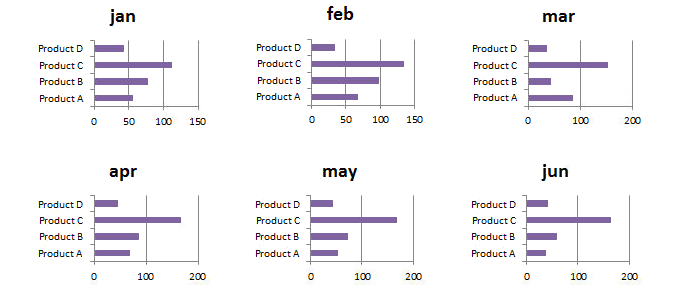
We definitelly made an inprovement, but if we want to see more easily changes in revenue over time, we have to change something. In order to do that, let’s visualize the same data in line chart:
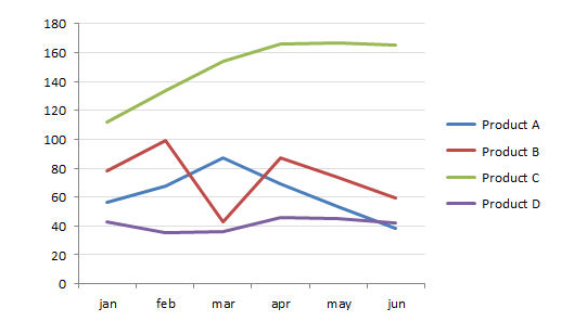
Now we alowed the data to tell it’s story even better. We can see exactly what was happening with revenues over time. But, what we do not know, what was happening with Total revenues in time. If there are only few categories, we can add TOTAL category in graph and he will appear on the top.
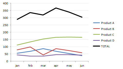
In case of many categories that will not be such a good idea because Total value will be too dominant in the graph scale:
If we want to show how exactly total revenues changed trought time we can use Area graph. It will also give us a sense of each product’s portion of total revenues in a month.
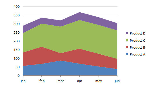
So, area graph is great to show the change of total revenue over time with sense of product portions in revenue, while line graph is great to show how eash product’s revenue change over time. Compare ProductD in both graphs: In line graph we see steady revenue over time a little below 50, but in area graph we see it just stacked on top of contrubutions from all other products.
It is important to know what exactly we want to show and emphasize in our reports. Then we have to know what type of graph will do the job the best.
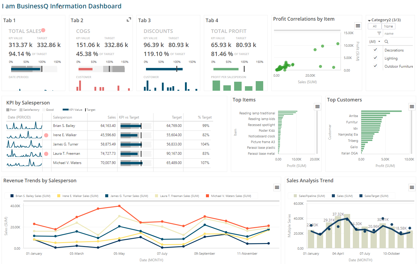
We are developers of data visualization software BusinessQ. Try it for free and make reports and dashboards that makes sense, without chart junk.
Related posts