Whether the type of business you are in, customers are your backbone. Without customers, no…
Analytics App How to : Pivot Order Level
Hello everybody!
In today’s post we are going deeper into the examination of Analytics app for Clover: Pivot Order Level Data Report and all the things you can achieve with it!
This report enables you to create your own custom reports (up to ten different reports) or to make an ad-hoc analysis. You can do this by selecting any order based data from your Clover system and combine and pivot them in any way you see fit.
After you are done and satisfied with reports you have made, you can save them for later use! So with our 30+ reports, you can have your own custom reports! Isn’t that cool?
We will start with few examples of what could be achieved.
Once you enter report you can see that design is very similar to the design of other reports which allows users more intuitive work. So when you enter Pivot Order Level report, your screen should look something like this:
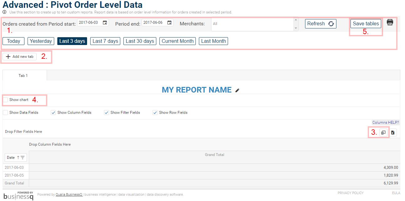
Report screen explained:
- You can see that you have the same menu for choosing date period with little addition of Save tables button
- Add new tab, allows you to create up to 10 tabs/reports for a quick change of already saved reports.
- Field Chooser – essential in creating reports
- Show chart – option to show/hide visualization of your newly created report
- Save tables – after you are done with creating your report, click on save button and save it for later use.
Now, let’s start creating a custom report!
In the creation of a report, you must have a clear picture of what information you want to get.
For purpose of this example, let’s say we want to see all Payment types and their sums from orders in last 7 days and we will group them by year, week, date and hour.
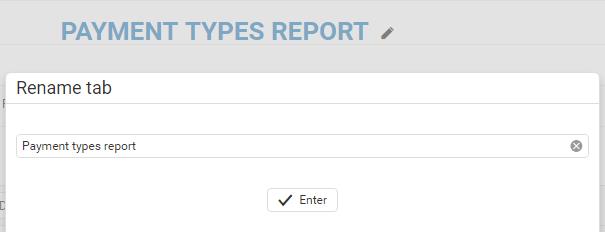
I will start by giving this report a name by simply clicking on the pencil icon next to default name of a report.
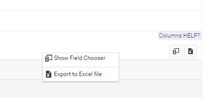
After choosing a name we are going to the most important part in the creation of a report. And that is opening a Field Chooser.
You can open a Field chooser either clicking second mouse button on a table or by clicking Field chooser icon
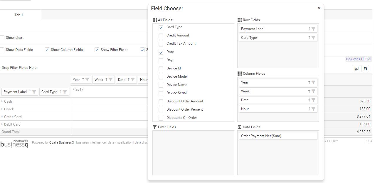
If you open a Field Chooser without having previously selected date period you want to extract data from, field chooser will look empty like on this picture:
![]()
For the purpose of this example, I selected date period – ‘Last 7 days’ from above filter to fetch data I want to examine in this report.
Next step is arranging fields we want in Field chooser which can be achieved by drag & drop or clicking on a checkbox next to a field name.
When you drop a chosen field somewhere in a field chooser or a table, you can see an instant change in a table.
And that’s it, our custom report is done! Easy right? 🙂
Now let’s see what we got from that report.
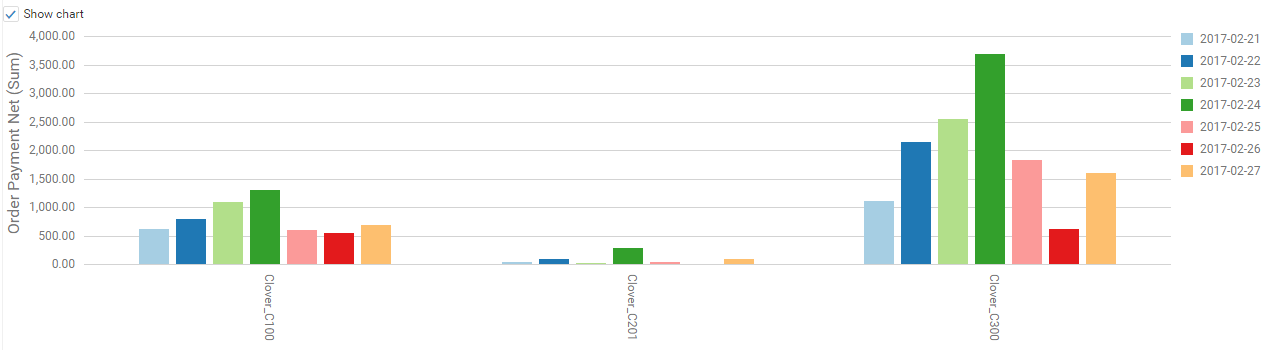
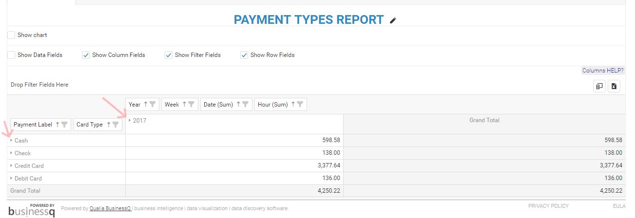
On the picture below you can see how our report for last 7 days looks like. You can see that customers in our virtual shop/restaurant/etc. are mostly purchasing with a credit card. We have pinpointed with red arrow fields that you can expand to see more information. As you can see now, it is only showing for the current year ( 2017), after we expand that year we will get which week of the year and after we expanded week, we will get to the full date of order and eventually we can break orders by the hour.
After we expanded column of a 2017-05-30 date, we got orders and their payment methods used by hours:
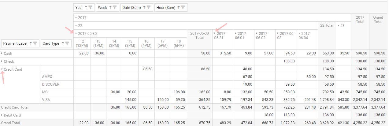
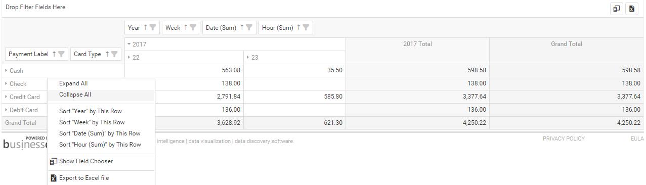
Now you can choose to concentrate on one specific day, like on the picture above, we can see hourly payment types for 30th of May, while for other dates we only see total sums. That can easily be changed by clicking the second mouse button on a table. After you do that, a small popup window shows up and you can choose to expand or collapse all data on a table if you wish to do so.
The beauty of this custom report is that you can easily save it by clicking on a Save button we mentioned at the beginning of this article. You can even expand some fields and then save report so every time you open that report, those fields will be expanded.
Video example for this custom report:
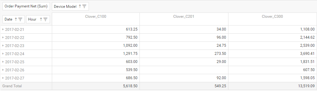
For example #2, you can get Net amount by Date, drill down to an Hour with a breakdown per Device Model:
That is not all, you have an option to visualize your pivot data in a chart!
If you have any further questions or concerns, please don’t hesitate to let us know at clover@qualia.hr.
Yours,
Analytics App Team
Related posts