Embedded BI
(and White Label BI Solutions)
Improve your app’s BI experience by integrating reports and dashboards directly into your application.
Embedded BI Overview
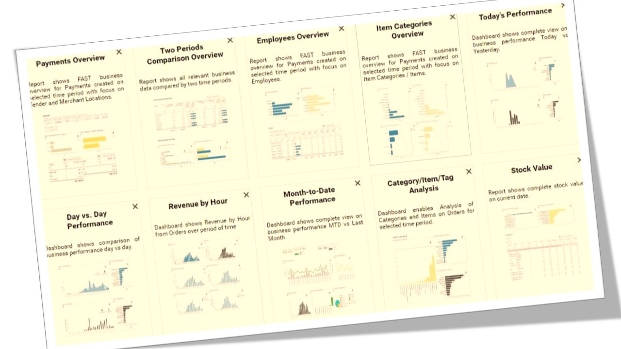
BusinessQ Embedded BI allows integration of standard features normally associated with BI software – e.g. data visualization with reports and dashboards or analytics tools – with your app. BI information is typically managed by a BI portal and is placed within your app’s user interface. See live demo or showcase to better understand what type of visual apps you can build with BusinessQ.
Reasons for embedding BI into your App
Why Emebdded analytics? You have a great app but it does not have a BI or analytic module? Or you do have it but your development team has to build custom static reports for each client request which takes a lot of time?
– Keep your development focus on your strengths that made your app great.
– No need for developing inhouse BI module which will require time, education for your development team and finally add complexity to your app. Or simplify your app by removing existing complex static reporting code.
– Make embedded BI look and feel just like your app – white labeling.
– With embedded BI your users can create (with simple drag-and-drop interface) and consume cutting edge reports and dashboards that follow leading industry standards and best practices in data visualization and deploy them faster – user self-service.
– Embed BI easily by following standard HTML methods.
– Embed BI securely into your on-premise or cloud app by using single sign-on token – SSO and SaaS.
What Embedding provides ?
All the BI features that standalone BusinessQ application provides.
-Run your embedded BI on open-source technologies – no additional costs or restricting licenses.
–Connect embedded BI to your data residing in your relational databases, e.g. Oracle, Microsoft SQL Server, PostgreSQL, MySQL.
-Have different types of user levels:
- viewer – for data consumer,
- administrator – for IT experts managing BI information
-Manage how your users access data with:
- report and dashboard level security – have users access just those reports and dashboards that are intended for them, e.g. have one set of reports for HR department and another for sales department.
- row level security – have specific user access only data that he or she can see, e.g. regional managers can only access data from their regions.
- multi-tenancy – if you have multi-tenant SaaS app.
– Allow your users deeper analysis of data with interactive reports and dashboards
- business dimensions and measures formatting,
- calculations – custom measure and dimension fields,
- different types of aggregation across multiple measures and dimensions,
- pivoting,
- filtering,
- sorting,
- top/bottom ranking,
- drill down through multiple levels of selected dimensions (e.g. item categories à items).
- regression trends, predictive analytics / forecasting
-Choose between various visualization types that best fit your data
- Standard or pivot table,
- Vertical or horizontal graph,
- Scatter or bubble plot,
- KPI card or matrix,
- Pie chart.
- Special visualization components dedicated to presenting KPI – Key Performance Indicators.
- Combine all the data and visualizations from various reports that connect to multiple data sources into a single dashboard.
- Specifically made color palettes that enhance the meaning and clarity of quantitative data.


